A good chart starts
with a clear question.
50 finished charts. The data behind every point. See how each one works, then make it your own.
Free SVG + PNGOriginal CSV dataNo signup
Explore chart examples
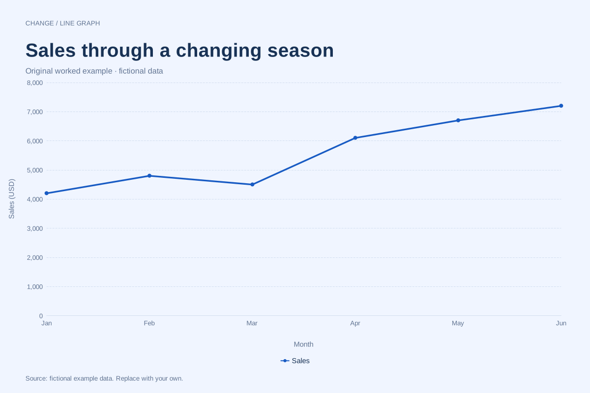
Line graph · Worked exampleA monthly sales line chart connects sales totals in calendar order. This editable example shows six fictional monthly totals in US dollars, including a March dip and a stronger second quarter.
Editable chart + original data 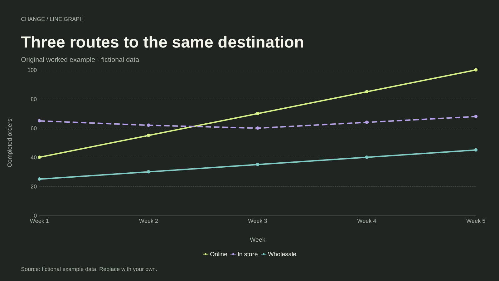
Line graph · Worked exampleA multiple line graph compares two or more series on the same ordered axis. This example follows online, in-store and wholesale orders over five weeks, using one shared unit and a separate line for each channel.
Editable chart + original data 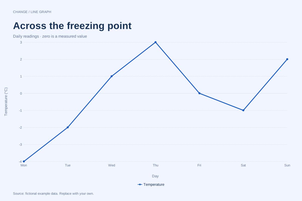
Line graph · Worked exampleA line graph can show positive, zero and negative observations on the same numeric axis. This fictional week of temperature readings crosses 0°C several times, making the sign of each value meaningful.
Editable chart + original data 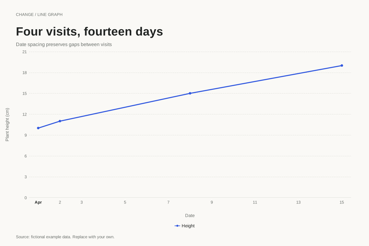
Line graph · Worked exampleUse a time axis when observations occur on irregular dates. This plant-height example spaces four visits by their actual dates, preserving gaps of one, six and seven days instead of making every visit look equally far apart.
Editable chart + original data 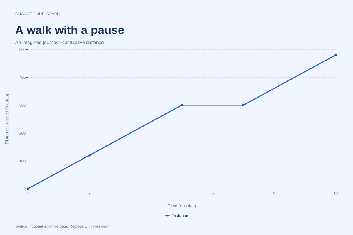
Line graph · Worked exampleA distance–time graph plots cumulative distance travelled against elapsed time. In this worked example, a walker covers 300 metres in five minutes, pauses for two minutes, then reaches 480 metres at ten minutes.
Editable chart + original data 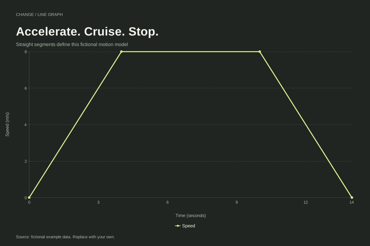
Line graph · Worked exampleA speed–time graph shows how speed changes over time. This example accelerates from 0 to 8 m/s in four seconds, stays at 8 m/s for six seconds, and returns to rest at fourteen seconds.
Editable chart + original data 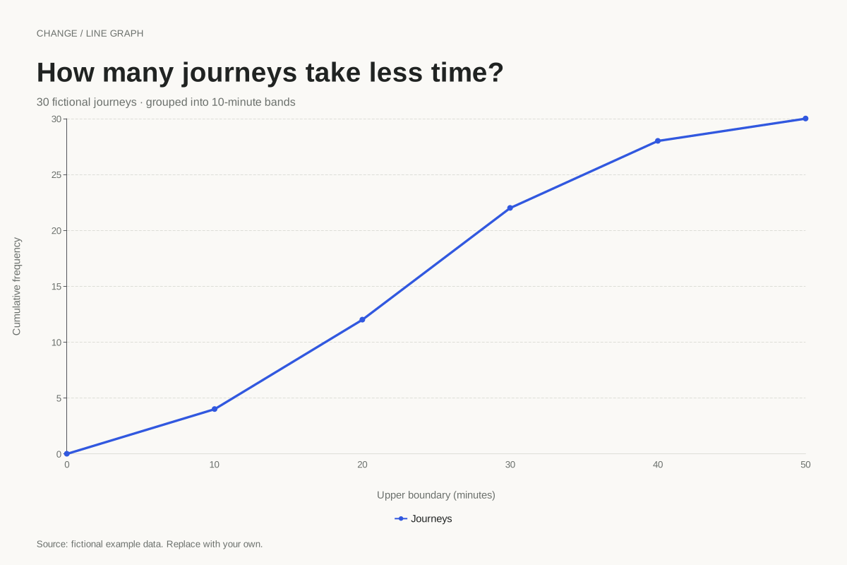
Line graph · Worked exampleA cumulative frequency graph shows how many observations fall below successive boundaries. This example accumulates 30 fictional journey times in ten-minute bands, starting at zero and ending at the full sample count.
Editable chart + original data 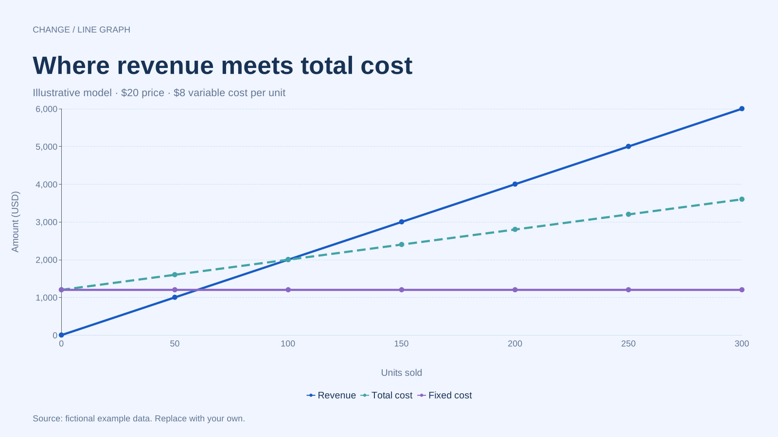
Line graph · Worked exampleA break-even chart compares revenue with total cost at different sales volumes. This fictional example uses a $20 selling price, an $8 variable cost per unit and $1,200 in fixed costs, reaching break-even at 100 units.
Editable chart + original data 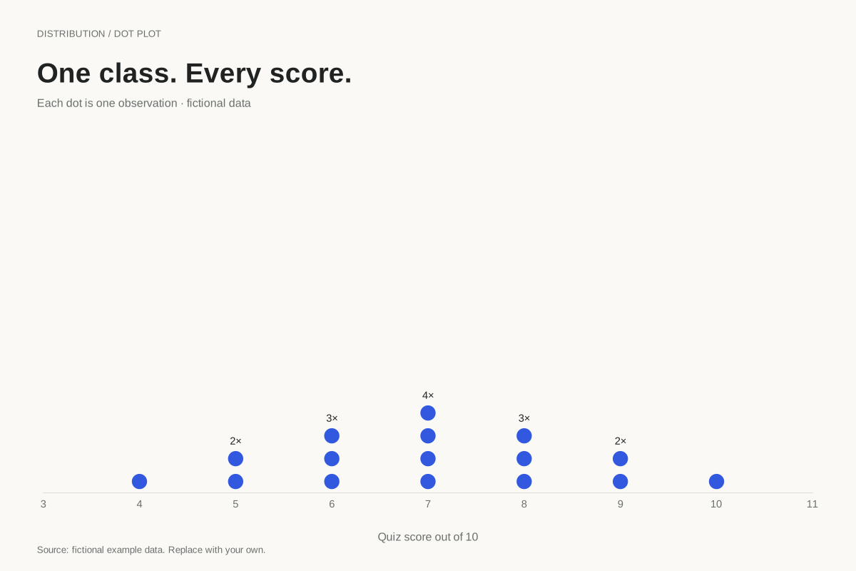
Dot plot · Worked exampleA stacked dot plot places one dot for each observation above its numeric value. This example shows all 16 fictional quiz scores on a ten-point scale, so repeated scores are visible as taller stacks.
Editable chart + original data 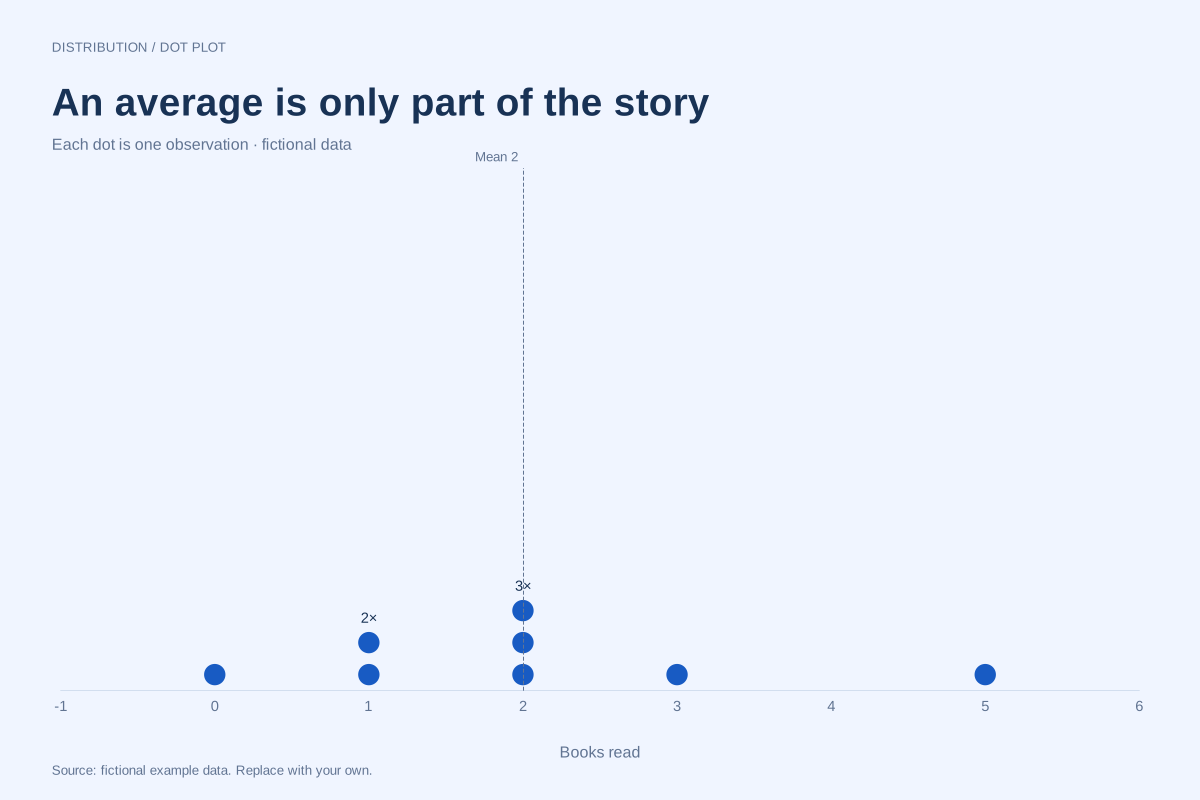
Dot plot · Worked exampleA dot plot can show the observations behind the mean and median. In this eight-person fictional reading example, the values are 0, 1, 1, 2, 2, 2, 3 and 5 books: both the mean and median are 2.
Editable chart + original data 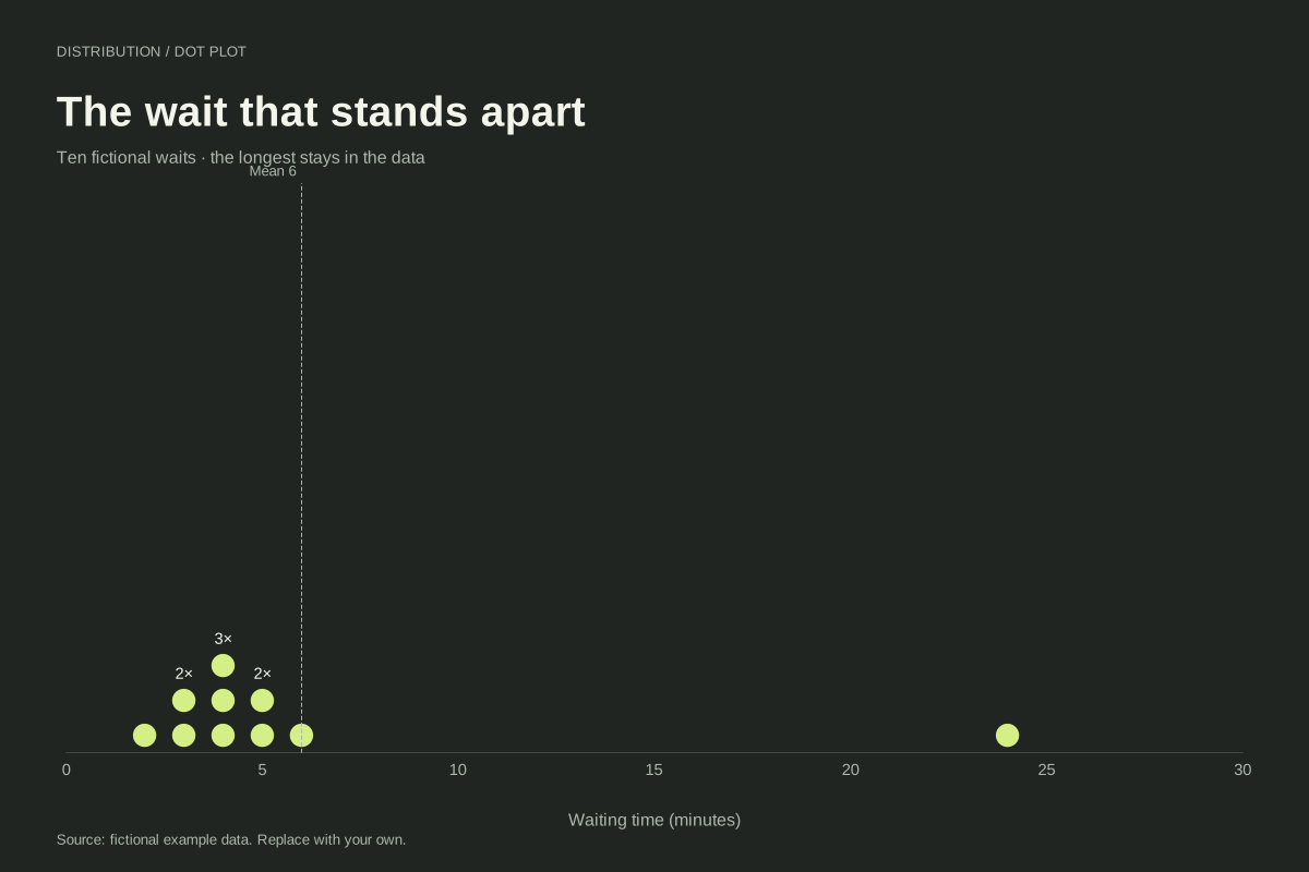
Dot plot · Worked exampleA dot plot keeps an unusually large observation visible beside the rest of a dataset. Here nine fictional waits lie between 2 and 6 minutes, while one wait lasts 24 minutes. All ten observations remain in the chart.
Editable chart + original data 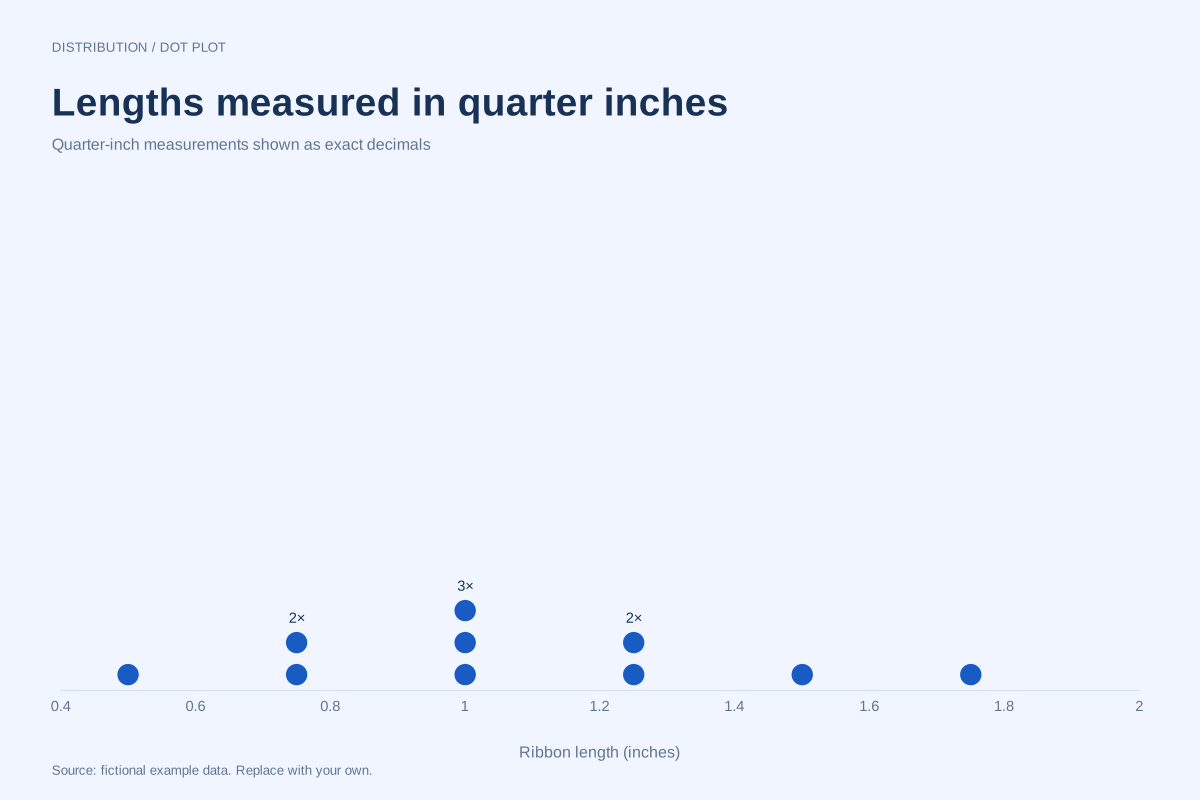
Dot plot · Worked exampleThis fraction dot plot represents quarter-inch ribbon lengths using exact decimal equivalents. Each dot is one ribbon, with repeated lengths stacked together. The axis displays decimals such as 0.75 and 1.25 rather than typeset fractions.
Editable chart + original data 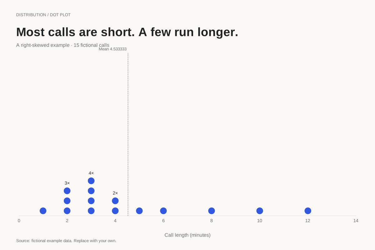
Dot plot · Worked exampleA right-skewed dot plot has a longer tail toward larger values. This fictional collection of fifteen call lengths concentrates around two to four minutes, with a few longer calls extending the right side to twelve minutes.
Editable chart + original data 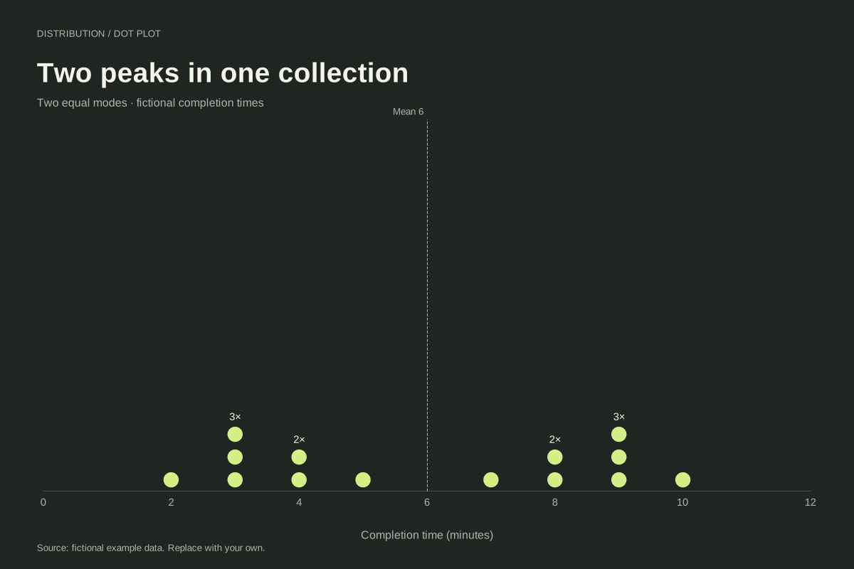
Dot plot · Worked exampleA bimodal dot plot has two peaks or concentrations, which need not be equally high. This constructed completion-time dataset has equally tall stacks at 3 and 9 minutes, creating two peaks with a gap around the centre.
Editable chart + original data 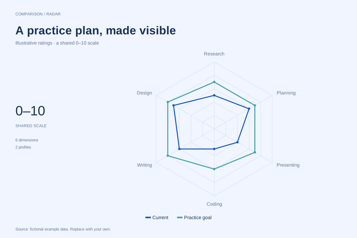
Radar chart · Worked exampleA skills radar chart compares ratings across several named capabilities on a common scale. This fictional example places current self-ratings beside practice goals for six skills, making the gaps available for discussion.
Editable chart + original data 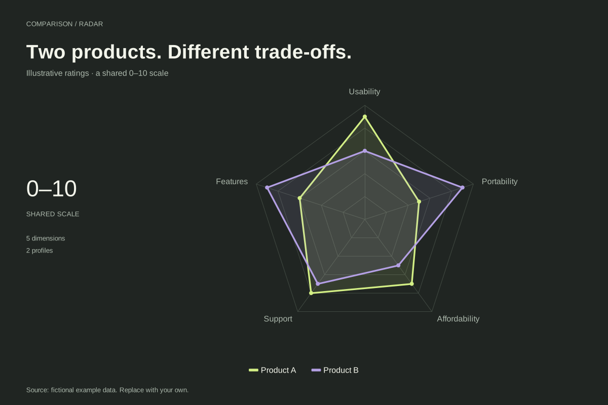
Radar chart · Worked exampleA product comparison radar chart displays two products across a shared set of rated criteria. This fictional example compares usability, features, support, affordability and portability on a common 0–10 scale.
Editable chart + original data 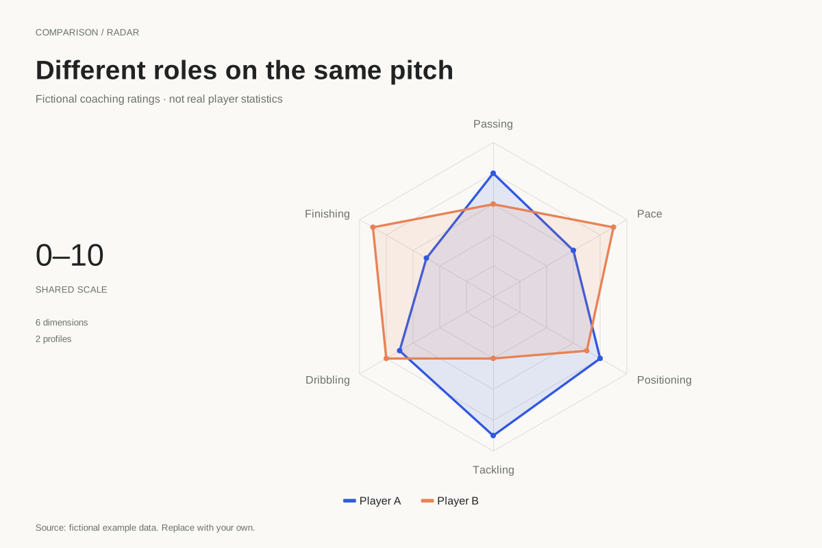
Radar chart · Worked exampleA football radar chart compares profiles across named dimensions. This example uses fictional coaching ratings for two players across passing, finishing, dribbling, tackling, positioning and pace, all on a shared 0–10 scale.
Editable chart + original data 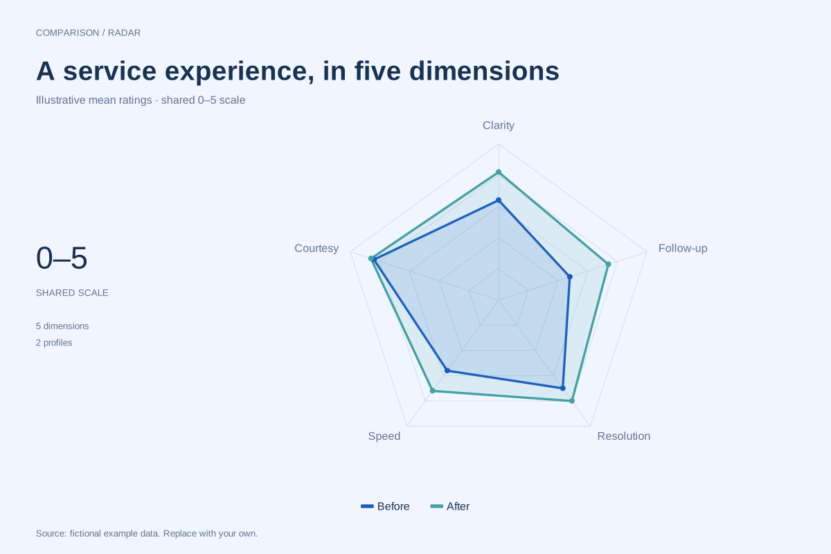
Radar chart · Worked exampleA customer satisfaction radar chart compares ratings for different parts of an experience. This fictional before-and-after example uses a common 0–5 plotting scale across clarity, courtesy, speed, resolution and follow-up.
Editable chart + original data 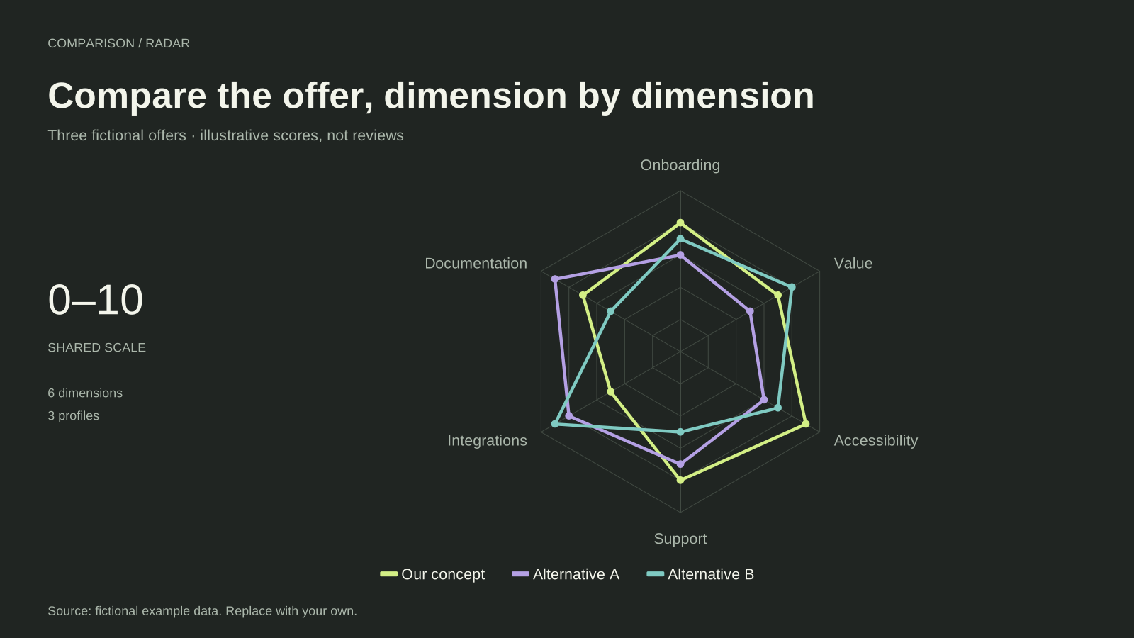
Radar chart · Worked exampleA competitor analysis radar chart compares several offers against the same criteria. This editable example uses three fictional profiles across onboarding, documentation, integrations, support, accessibility and value.
Editable chart + original data 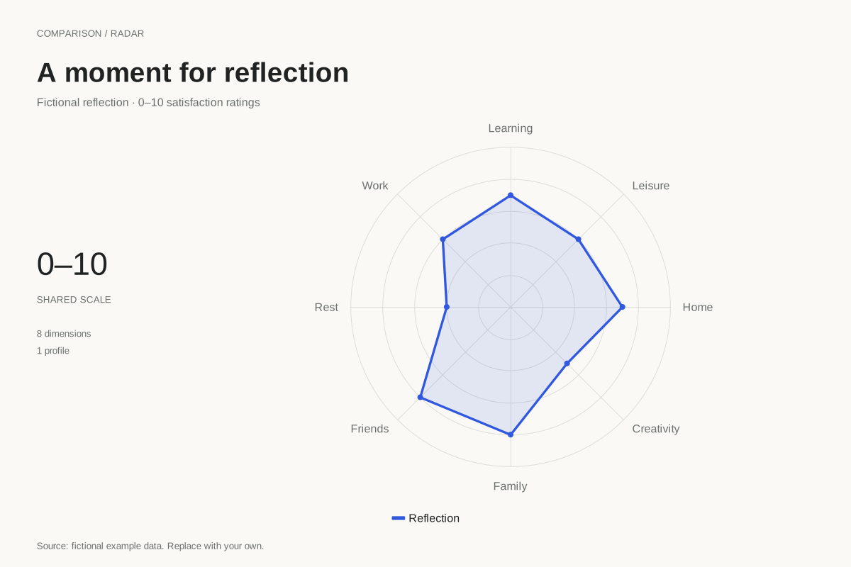
Radar chart · Worked exampleA wheel of life chart places personal reflection ratings around a circle. This example uses a radar polygon with eight fictional 0–10 satisfaction ratings, offering a starting point for a private reflection exercise.
Editable chart + original data 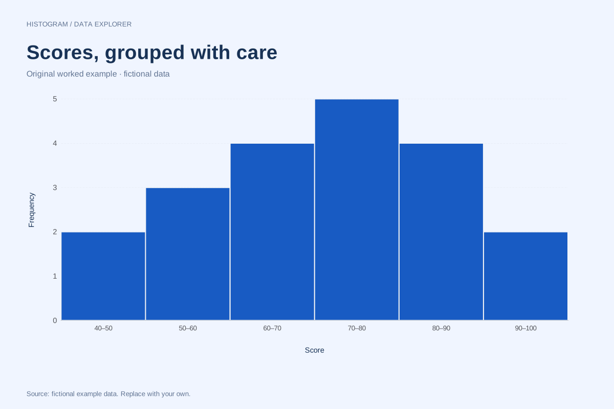
Histogram of class scores with ten-point bins
Histogram · Fictional dataThis histogram groups twenty fictional scores into ten-point intervals from 40 to 100. The count in each interval makes the concentration easier to compare while the downloadable list preserves every original score.
Explore chart & data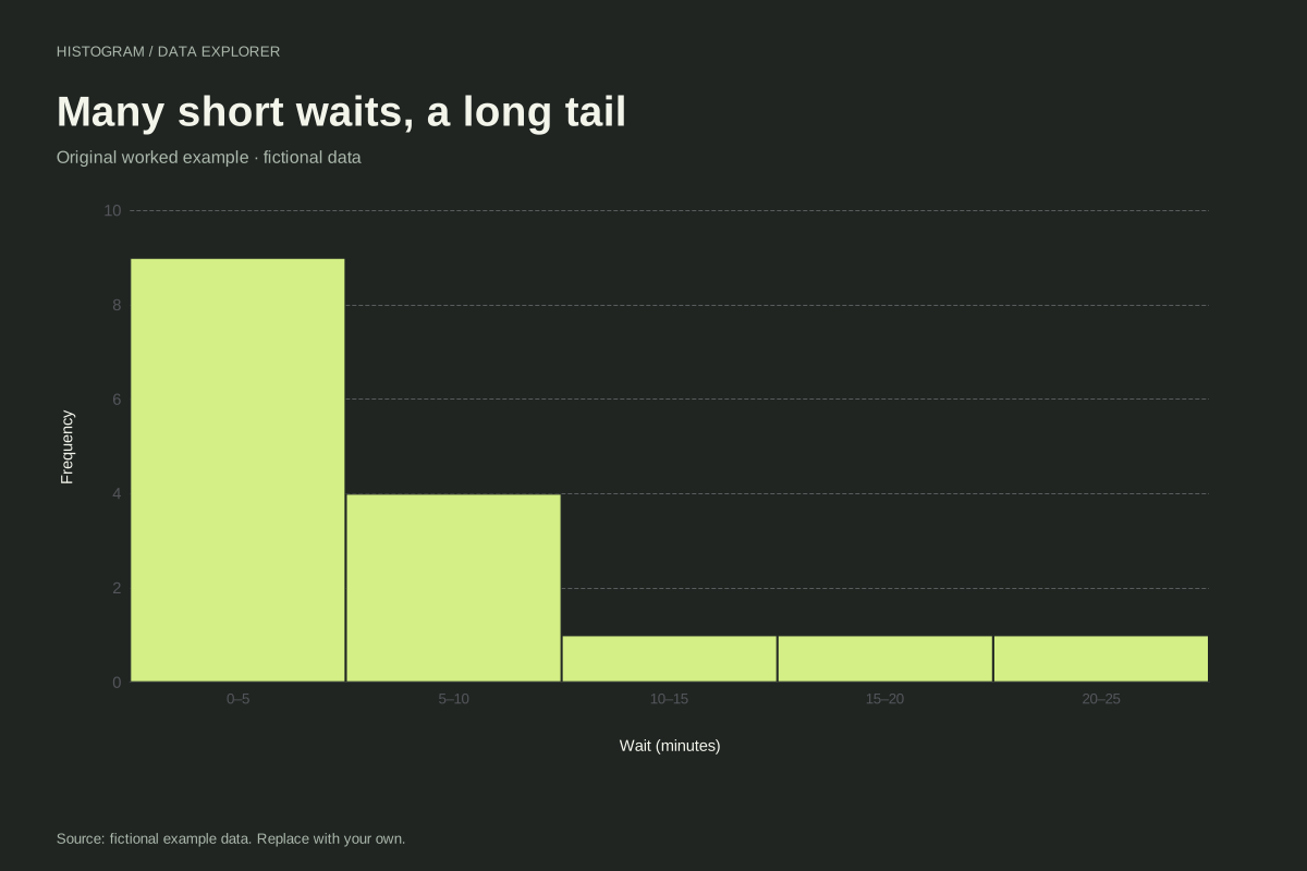
Right-skewed waiting-time histogram
Histogram · Fictional dataThis waiting-time histogram shows a concentration of short waits and a tail toward longer durations. Sixteen fictional observations are grouped into five-minute bins, making both the main cluster and the long waits visible.
Explore chart & data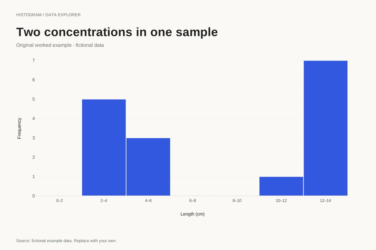
Bimodal histogram example with a gap
Histogram · Fictional dataThis constructed histogram places two clusters of fictional lengths on one numeric scale. The groups lie around 2–5 cm and 11–14 cm, separated by empty intervals that stay visible in the chart.
Explore chart & data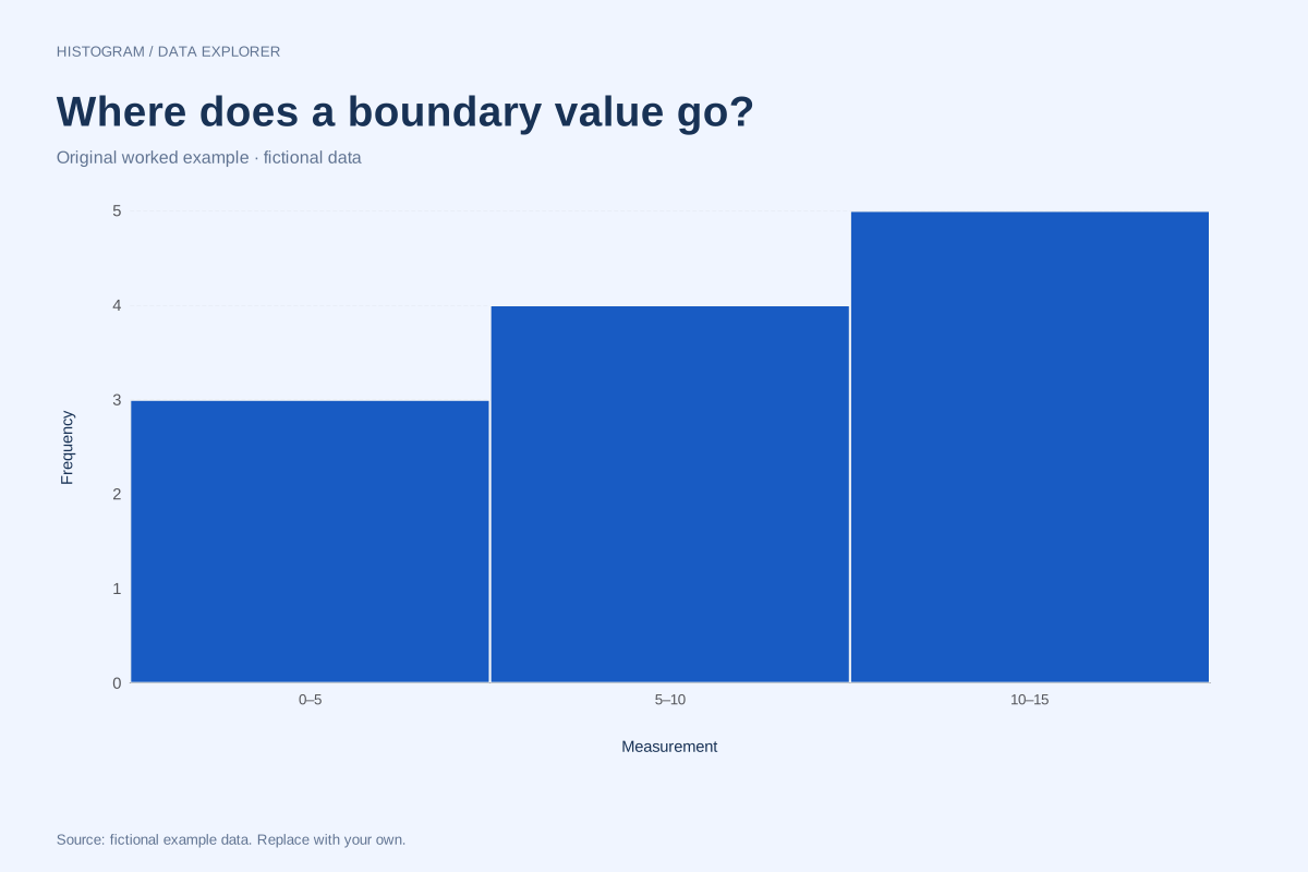
Histogram bin boundaries: where exact endpoints go
Histogram · Fictional dataA value on a bin boundary must be assigned once. This twelve-observation example makes the boundary convention visible by placing repeated values exactly at 5 and 10, with a final observation at 15.
Explore chart & data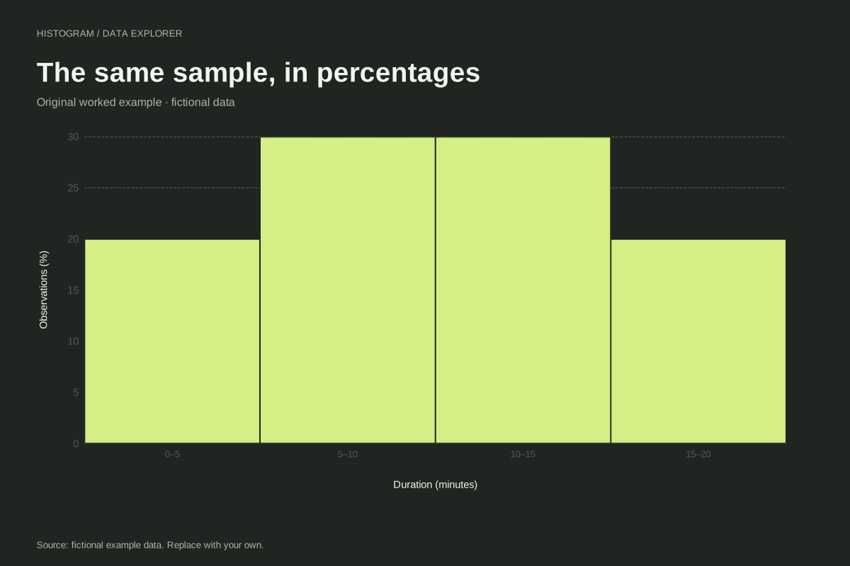
Relative frequency histogram with a worked percentage table
Histogram · Fictional dataA relative frequency histogram expresses each bin count as a share of all observations. Here twenty fictional values become four bars of 20%, 30%, 30% and 20%, preserving the shape of the count histogram.
Explore chart & data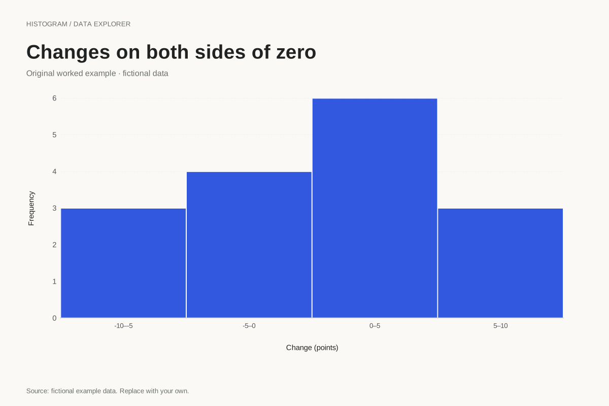
Histogram with negative and positive observations
Histogram · Fictional dataHistograms can include values below zero. This fictional set represents signed measurement differences, grouped into equal five-unit intervals from −10 to 10. Zero is a value on the axis, not a missing-data code.
Explore chart & data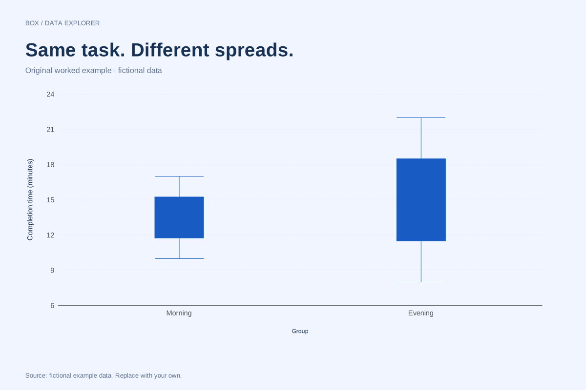
Side-by-side box plots comparing two groups
Box plot · Fictional dataThese box plots compare fictional morning and evening completion times. Both groups contain eight observations, but the evening sample has a wider middle spread and a higher median.
Explore chart & data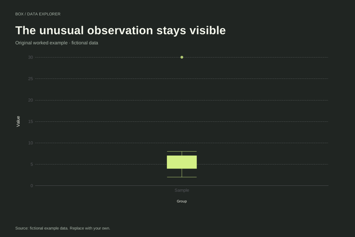
Box plot with an outlier and visible fences calculation
Box plot · Fictional dataThis box plot keeps a large fictional observation visible as a separate point. The nine values run from 2 to 30, with most between 2 and 8. The 1.5 × IQR rule determines where the whiskers stop.
Explore chart & data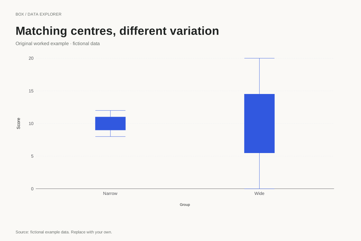
Box plots with equal medians and different spreads
Box plot · Fictional dataTwo groups can have the same median while looking very different in a box plot. These fictional samples both centre on 10, but the wide group has a much larger IQR and observed range.
Explore chart & data
Box plot quartiles for a five-value sample
Box plot · Fictional dataQuartile conventions can visibly change a small-sample box plot. This example uses 2, 4, 7, 10 and 16 with the median-of-halves method, excluding the overall middle observation when forming the halves.
Explore chart & data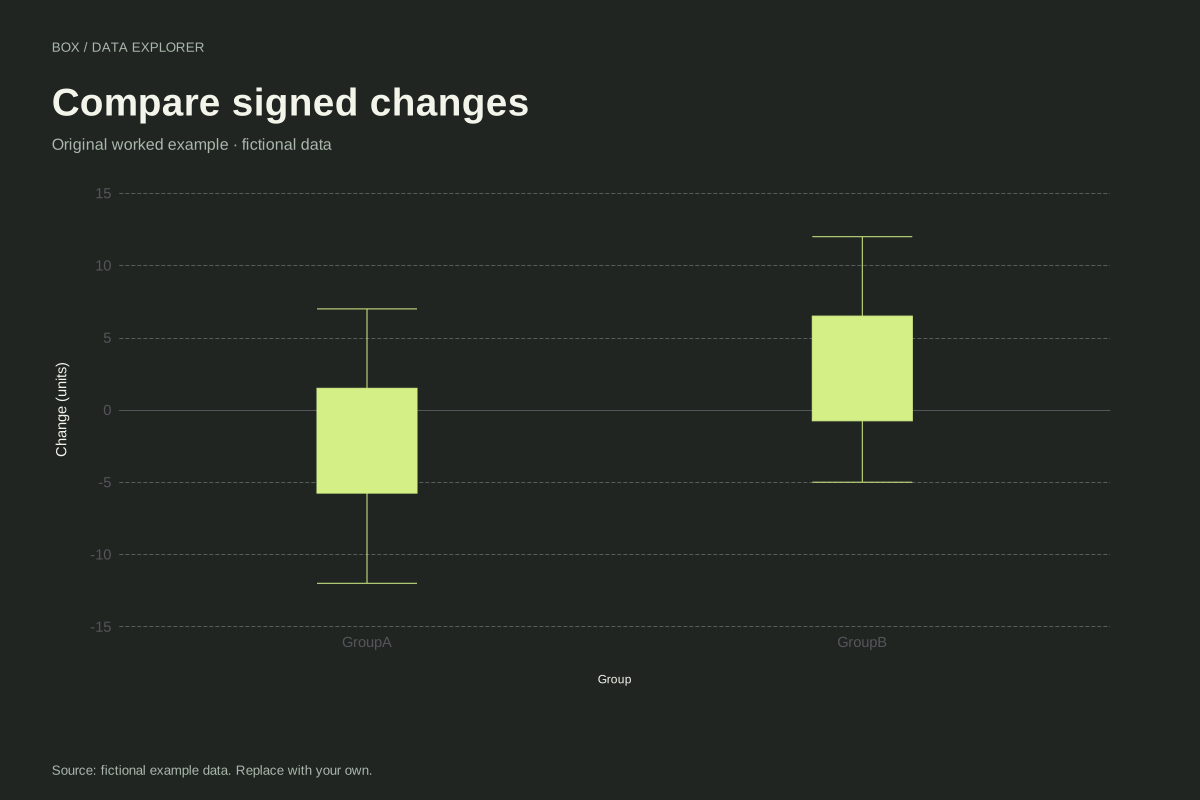
Box plots of signed changes around zero
Box plot · Fictional dataThese box plots compare signed fictional changes for two groups. Negative observations remain valid values, and the zero reference helps distinguish decreases from increases without forcing the whole distribution above zero.
Explore chart & data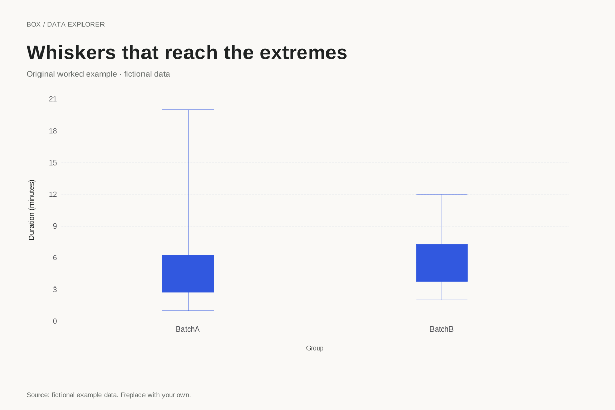
Minimum-to-maximum box plot whiskers
Box plot · Fictional dataA box plot can use whiskers that reach the observed minimum and maximum. This example selects that convention explicitly, so large observations are included in the whisker range rather than drawn as separate IQR flags.
Explore chart & data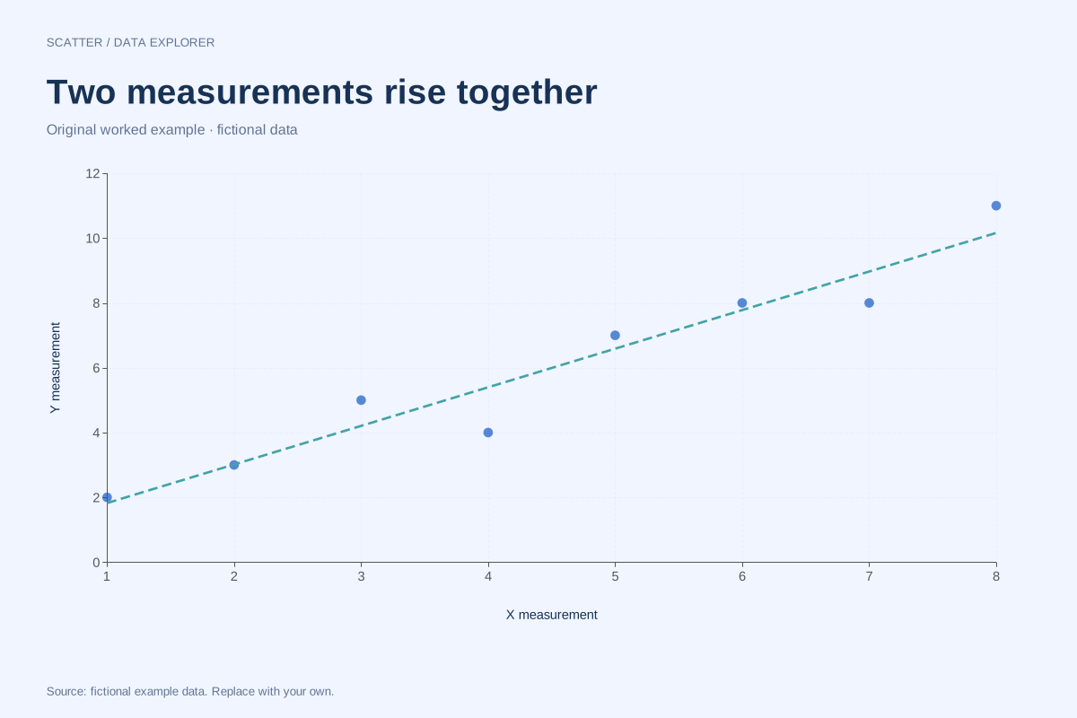
Positive correlation scatter plot with a fitted line
Scatter plot · Fictional dataThis fictional scatter plot shows a positive linear association: larger X measurements generally accompany larger Y measurements. Each point is one paired observation, and the dashed line is an optional least-squares summary.
Explore chart & data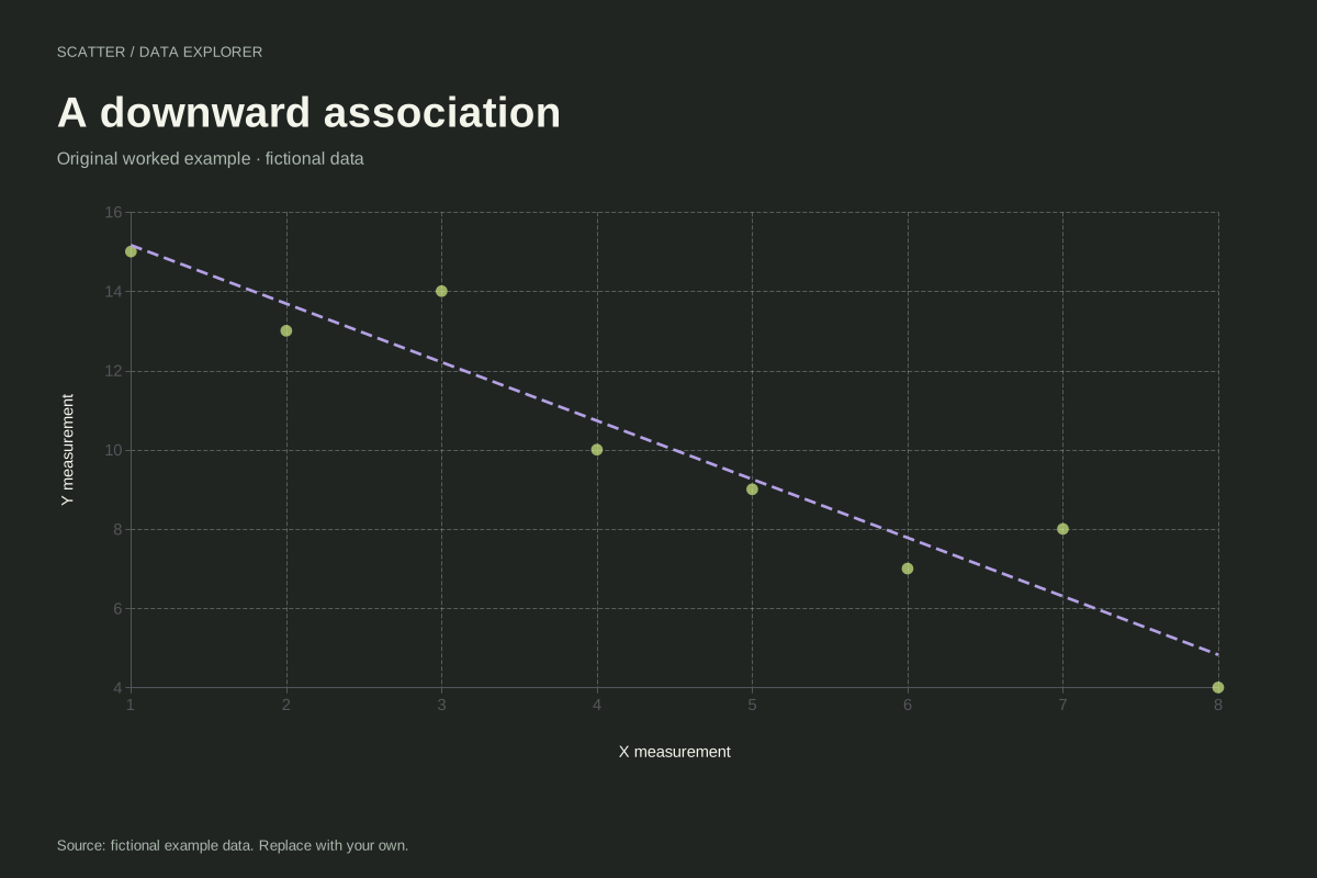
Negative correlation scatter plot example
Scatter plot · Fictional dataThis fictional scatter plot shows an overall downward relationship. Larger X values tend to accompany smaller Y values, while individual observations still depart from a perfectly descending line.
Explore chart & data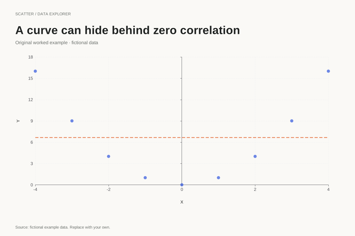
Curved scatter plot with zero Pearson correlation
Scatter plot · Fictional dataA zero Pearson correlation does not mean there is no relationship. This exact teaching example uses Y = X² for nine X values from −4 to 4, producing a clear U-shaped pattern with zero linear correlation.
Explore chart & data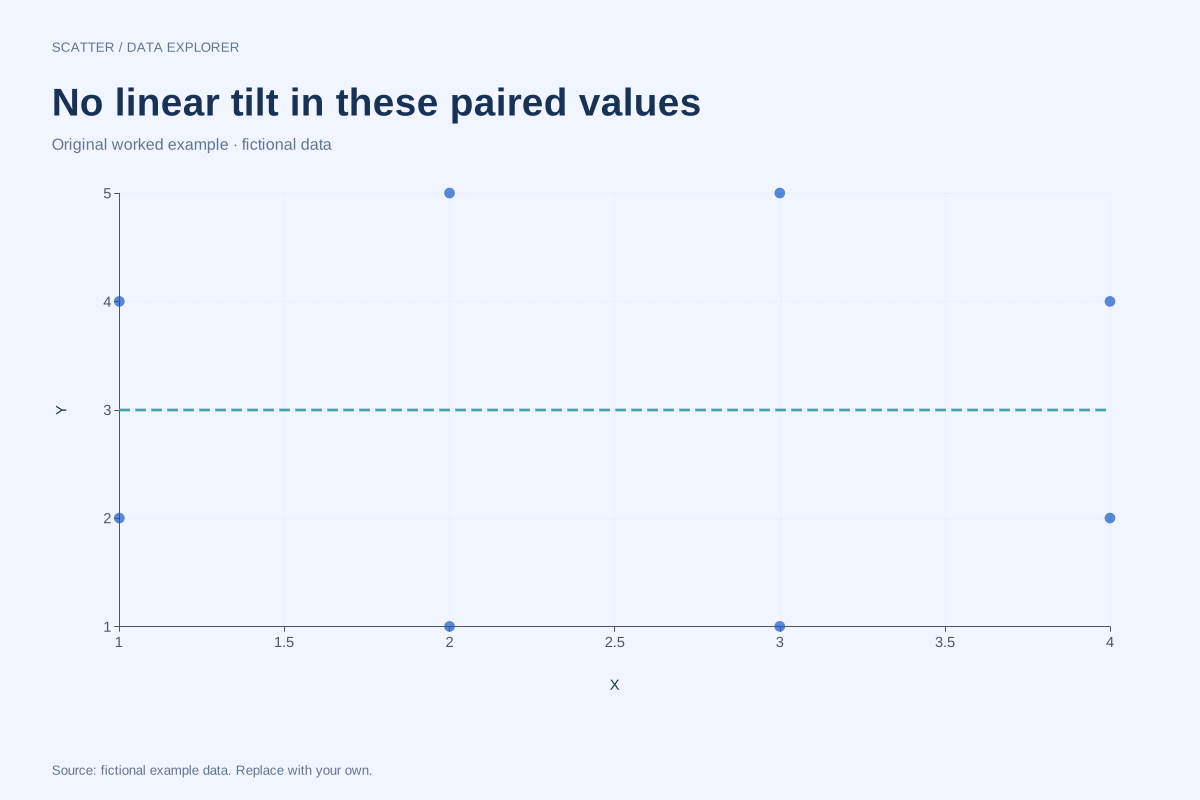
Scatter plot with no linear correlation
Scatter plot · Fictional dataThis balanced set of eight fictional pairs has zero Pearson correlation. Its points show no overall rising or falling straight-line trend, while the complete coordinates remain available for checking the calculation.
Explore chart & data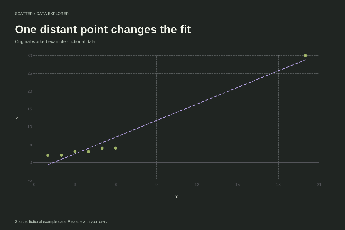
Scatter plot with an influential high-X observation
Scatter plot · Fictional dataAn observation far from the other X values can strongly affect a fitted line. This fictional example contains six nearby pairs and one point at (20, 30), making its influence on the linear summary easy to inspect.
Explore chart & data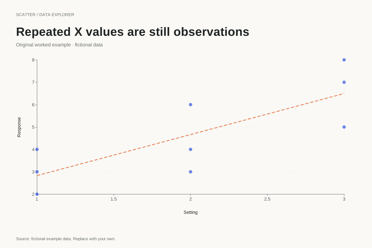
Scatter plot with repeated X measurements
Scatter plot · Fictional dataRepeated X values are valid in a scatter plot. This example keeps nine paired observations at three X positions, showing the variation in Y within each position without aggregating the observations into averages.
Explore chart & data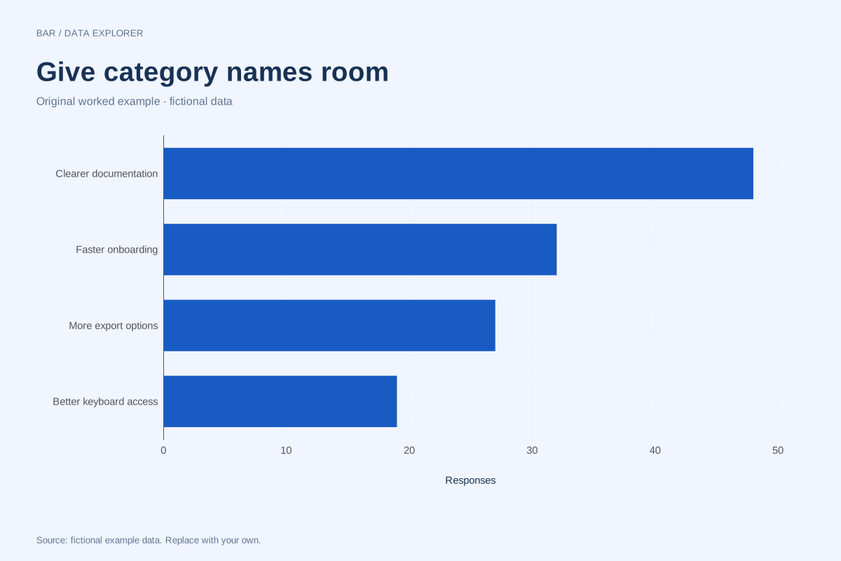
Horizontal bar chart example with long category labels
Bar chart · Fictional dataHorizontal bars give longer category names room to remain readable. This fictional feedback summary compares four requested improvements using response counts, with a shared numeric baseline.
Explore chart & data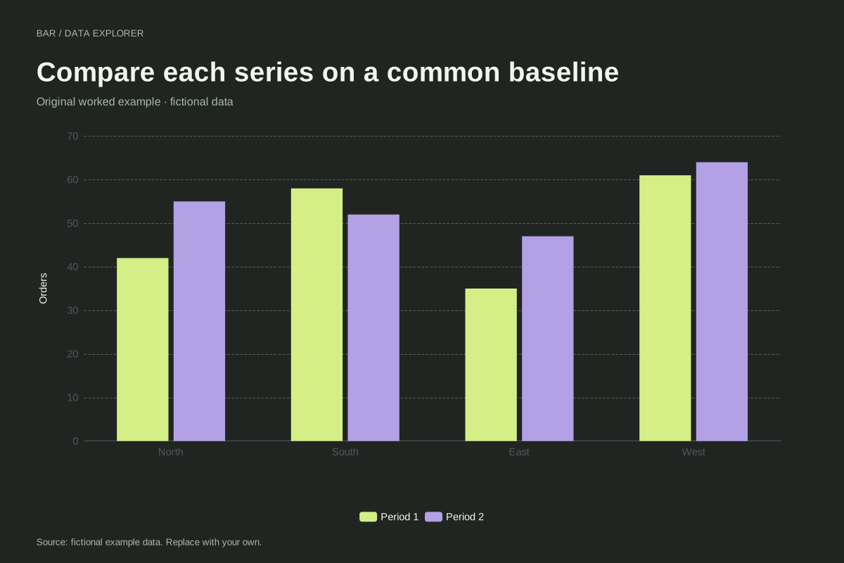
Grouped bar chart comparing two periods
Bar chart · Fictional dataA grouped bar chart places two series beside each other within every category. This fictional regional example compares orders in two reporting periods, preserving a common baseline for direct comparisons.
Explore chart & data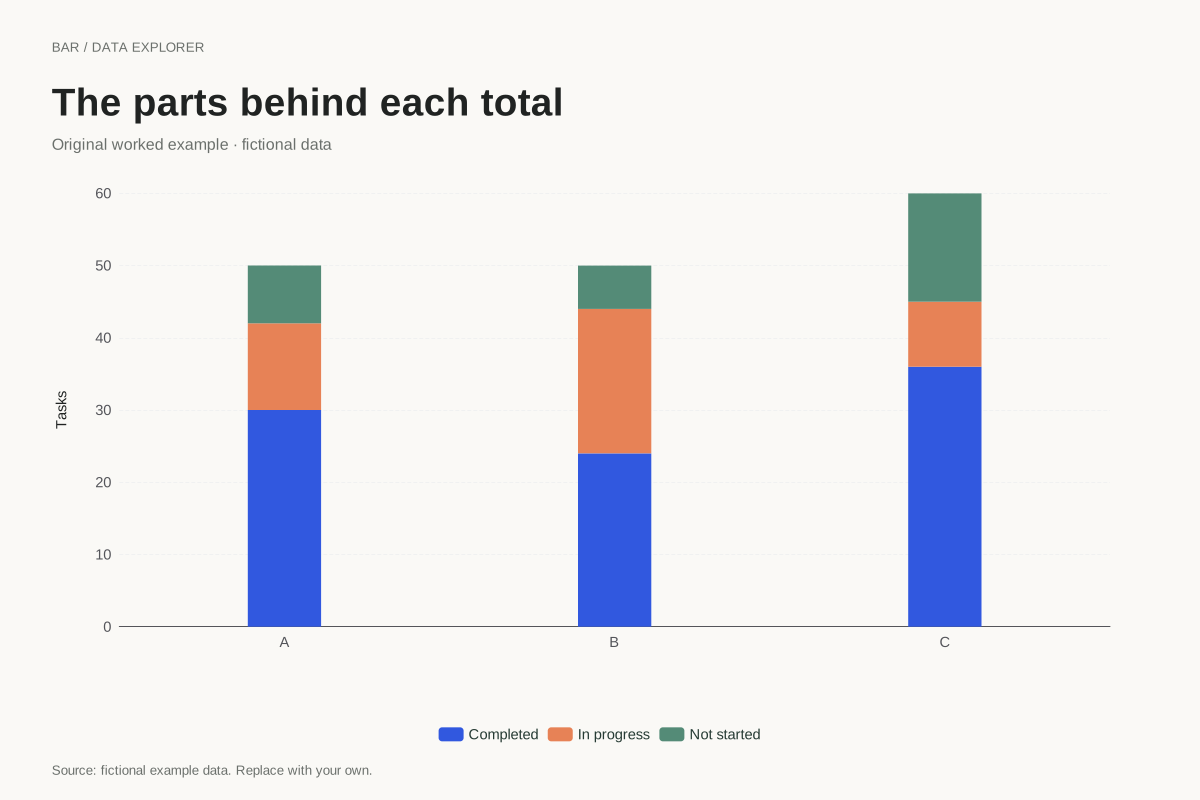
Stacked bar chart showing task composition
Bar chart · Fictional dataThis stacked bar chart shows completed, in-progress and not-started tasks within three fictional teams. Each full bar represents the team’s task total, and the coloured segments account for its parts.
Explore chart & data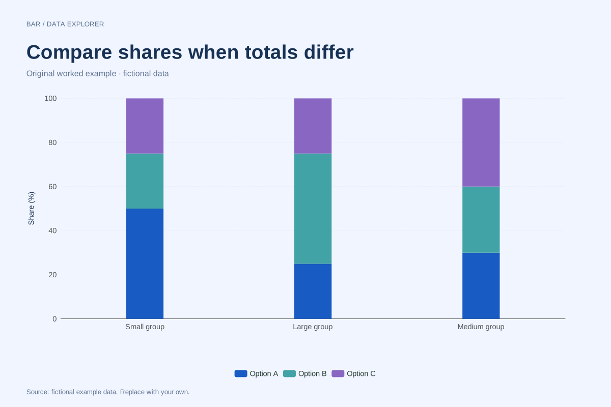
100% stacked bars with unequal totals
Bar chart · Fictional dataA 100% stacked chart compares composition after dividing each category by its own total. This example uses totals of 40, 200 and 100 so readers can see why equal bar heights do not mean equal counts.
Explore chart & data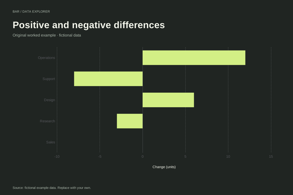
Diverging bar chart with positive and negative changes
Bar chart · Fictional dataA diverging bar chart places positive and negative values on opposite sides of zero. These five fictional departmental changes preserve their signs, including an exact zero for Sales.
Explore chart & data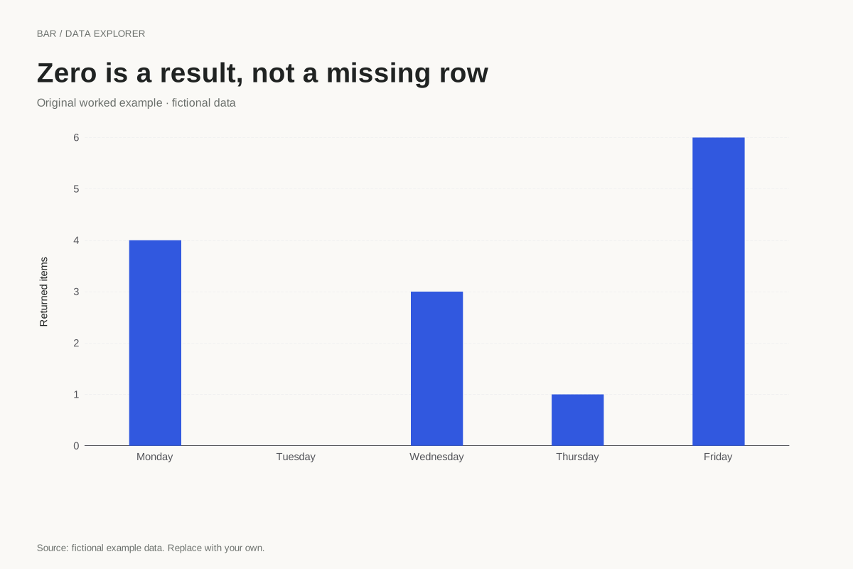
Bar chart with an explicit zero category
Bar chart · Fictional dataA category with zero observations should remain distinguishable from a missing record. This fictional weekday summary includes Tuesday with an explicit zero, preserving the complete sequence of reported days.
Explore chart & data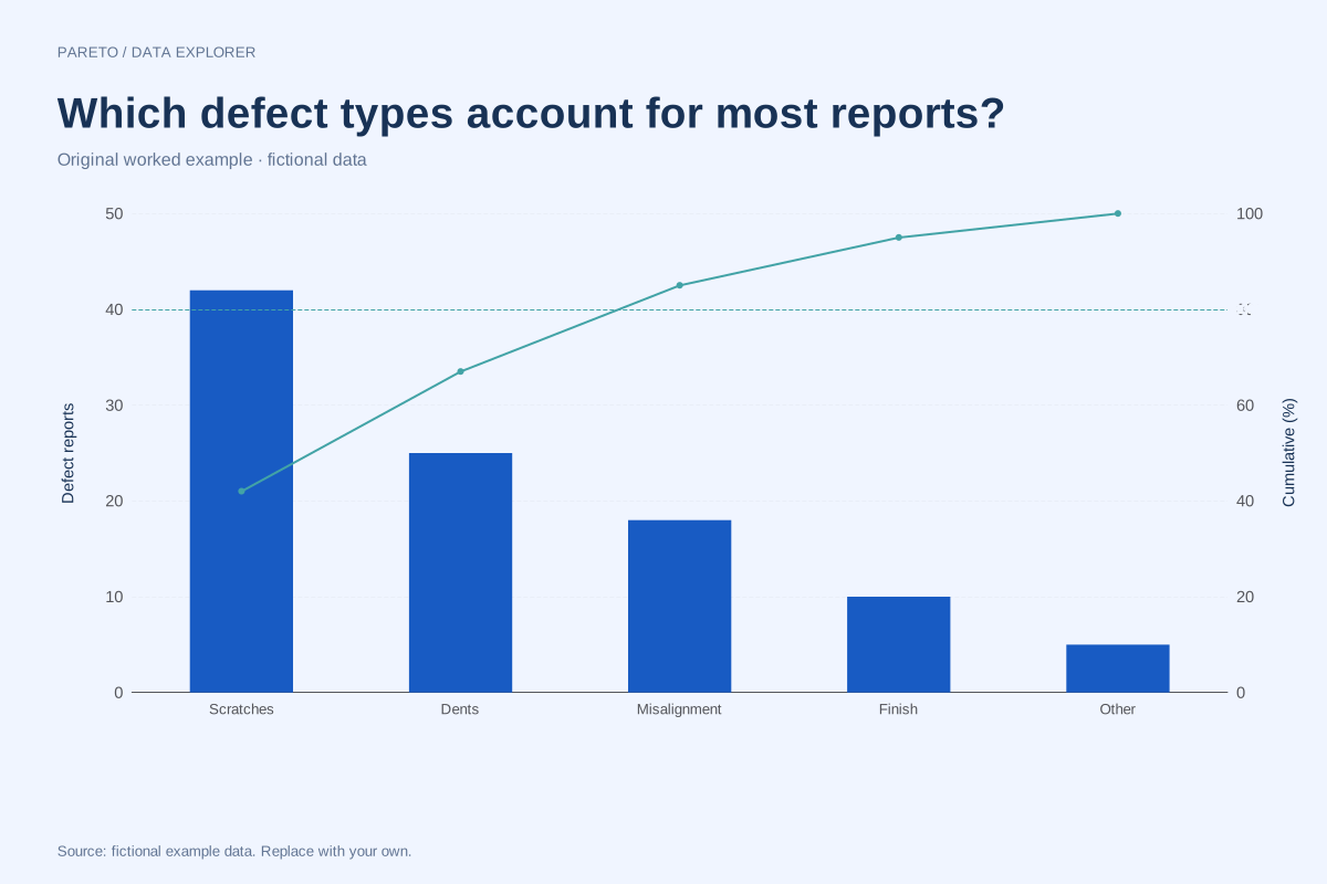
Pareto chart of defect counts with cumulative percentages
Pareto chart · Fictional dataThis Pareto chart ranks five fictional defect categories by reported count. The bars show the counts, and the line tracks their cumulative share of the 100 reports in the example.
Explore chart & data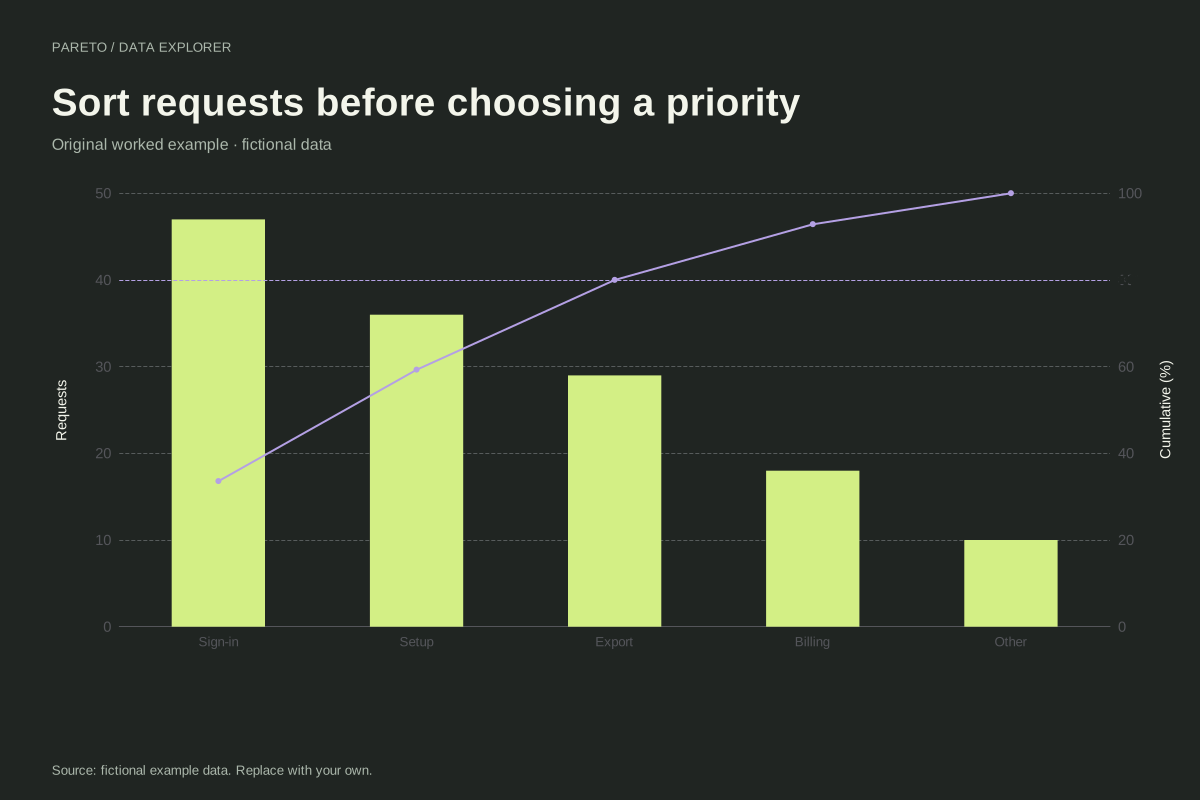
Pareto chart of support requests
Pareto chart · Fictional dataThis fictional support example begins with unsorted category counts. The Pareto maker places sign-in, setup, export, billing and other requests in descending order and recalculates cumulative percentages.
Explore chart & data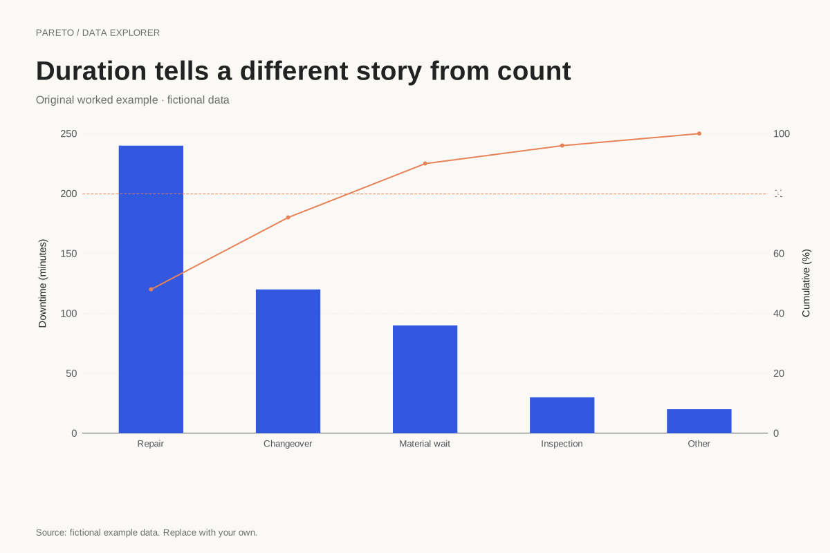
Pareto chart of downtime measured in minutes
Pareto chart · Fictional dataA Pareto chart can rank duration rather than incident count. This fictional example totals 500 downtime minutes across five categories, so the largest bars identify where the recorded time accumulated.
Explore chart & data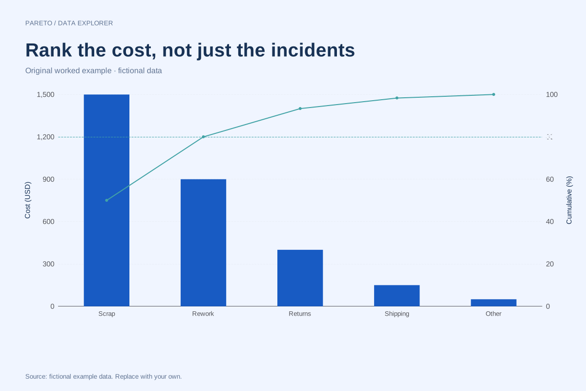
Cost-based Pareto chart with a different priority measure
Pareto chart · Fictional dataA cost-based Pareto ranks categories by a shared monetary measure rather than incident frequency. This fictional example totals 3,000 units of cost, making the cumulative calculation reproducible without implying a real business benchmark.
Explore chart & data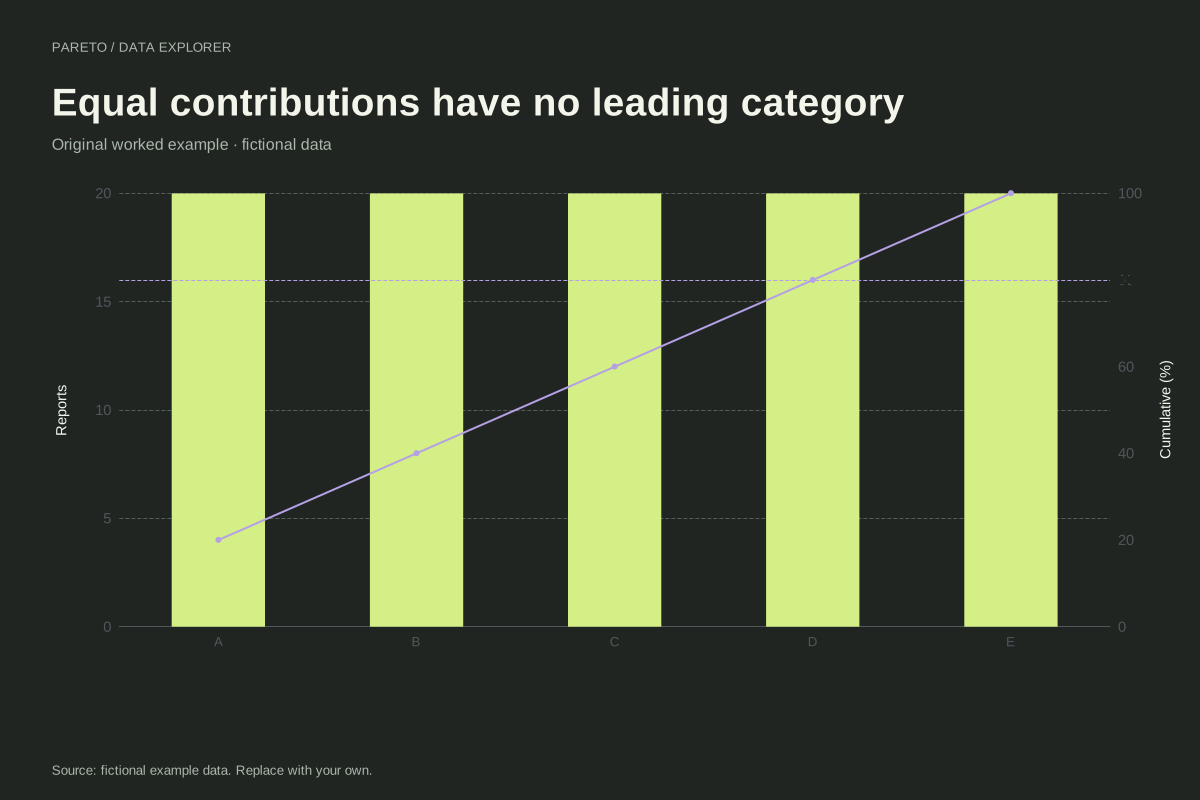
Pareto chart where every category has equal weight
Pareto chart · Fictional dataA Pareto chart need not reveal a dominant category. This example assigns 20 observations to each of five fictional categories, creating equal bars and a cumulative line that rises in identical steps.
Explore chart & data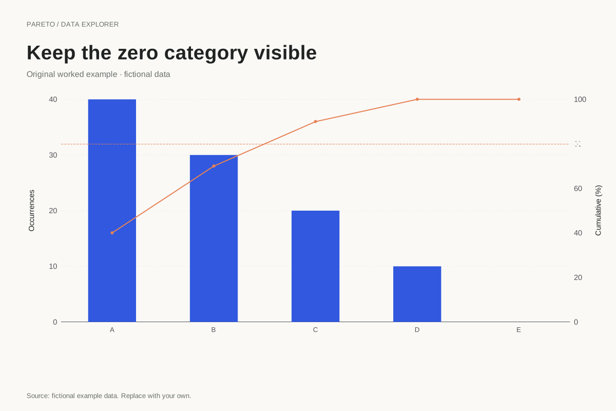
Pareto chart retaining a zero-count category
Pareto chart · Fictional dataA zero-count category can remain in a Pareto chart when the overall total is positive. This fictional example places an explicit zero after four positive categories, leaving the cumulative line at 100% for the final step.
Explore chart & dataNo examples match. Try another phrase or choose all types.
Start with a finished publication chart
Twelve additional templates include comparisons, group gaps, rankings and trends. Choose a visual, replace its data, retain its design and download. Each template states whether its source is fictional or public data.
Finished examples you can check and reuse
Every example pairs a chart with its exact data, a worked interpretation, input guidance and limitations. The 50 worked-example datasets above are fictional and created for this library by SupaMakers. They illustrate methods, not real-world findings or benchmarks.
Download a chart immediately, or choose “Edit this chart” to load the same data, scale and style into a free chart maker. Editing runs in your browser. Use the CSV as a starting point, replace it with your own evidence and update the source note before sharing.