How to read this chart
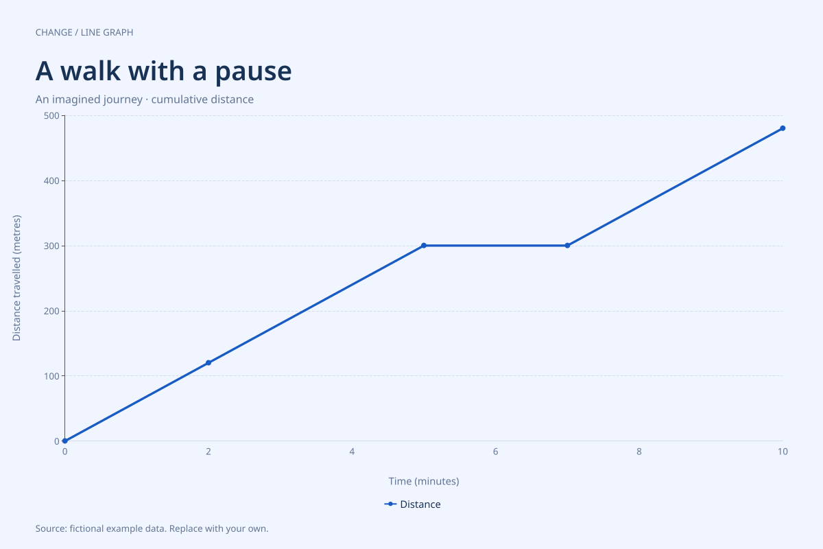
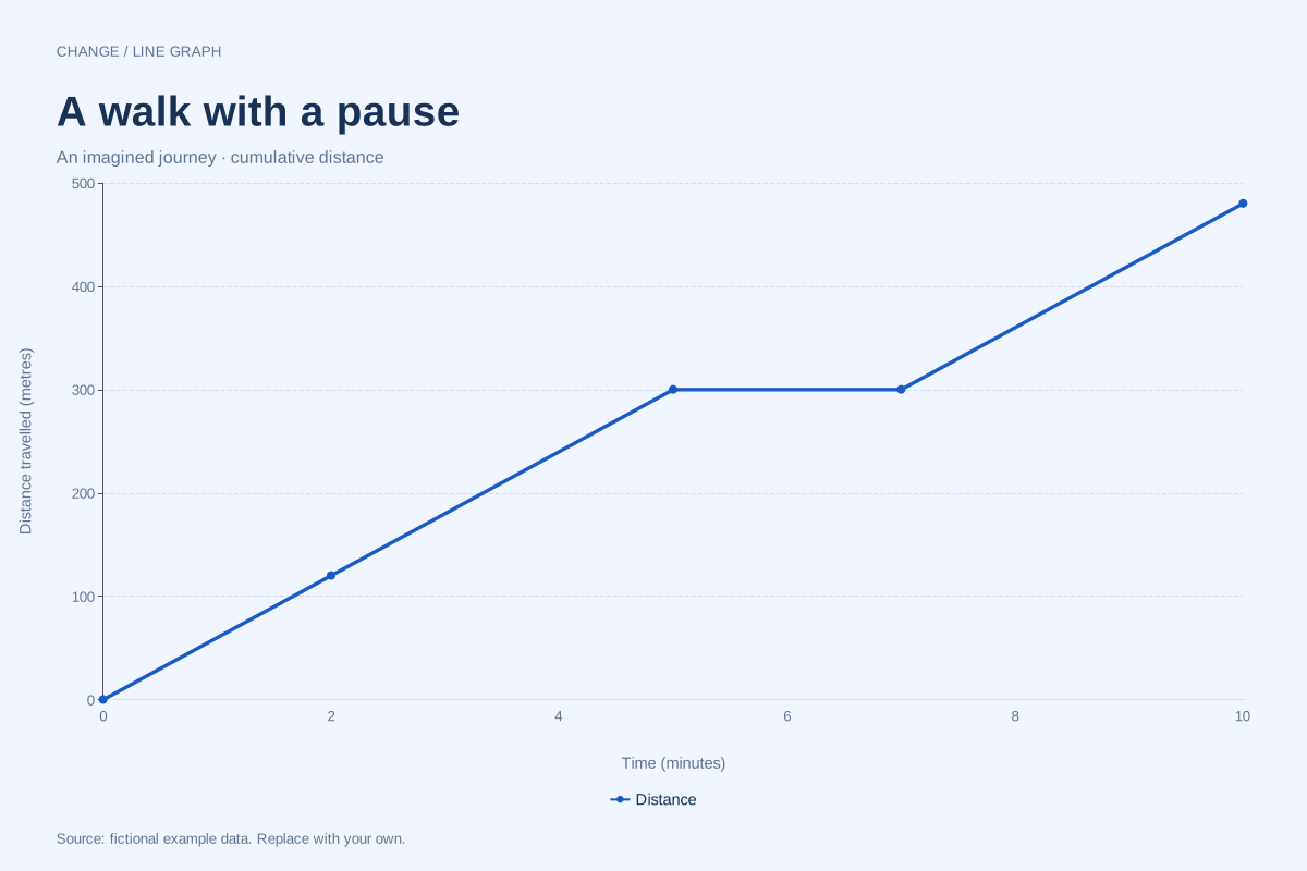
From 0 to 5 minutes, the rise is 300 metres over 5 minutes, so the average speed is 60 metres per minute. Between minutes 5 and 7 the distance remains 300 metres: the horizontal segment represents the pause.
From minute 7 to minute 10, distance increases by 180 metres over 3 minutes, again 60 metres per minute. Across the whole journey, including the pause, average speed is 480 ÷ 10 = 48 metres per minute. Reading only the moving segments would miss the effect of stopped time.
Build it with your own data
Enter elapsed minutes as numeric x values and cumulative metres as y values. Numeric spacing matters here: the intervals are 2, 3, 2 and 3 minutes. Category spacing would make unequal durations appear equal and distort the slopes.
Read a segment’s average speed as change in distance divided by change in time. Keep units attached to the answer. The example’s straight moving segments define a simple constant-speed model for each interval; the markers are the supplied observations.
Open this example in the line graph maker Replace the data, inspect the preview and download your version. SVG, PNG and PDF exports are available in the editor.
What this example cannot tell you
Cumulative distance travelled cannot decrease. A graph that falls may instead represent position or distance from a starting point, where direction matters. This imagined journey is a teaching model and does not establish how a real walker accelerated between observations.
Does a flat distance–time line mean constant speed?
It means zero speed over that interval in this cumulative-distance model: time passes without additional distance. A straight rising line represents a constant positive speed in the model. A steeper rising line represents a larger distance change per unit time.
Method background: OpenStax Physics: position–time graphs and slope. Our dataset and worked calculation are original fictional examples.
Created and reviewed by SupaMakers for ChartsAI · September 8, 2026. Source code and reuse terms.