How to read this chart
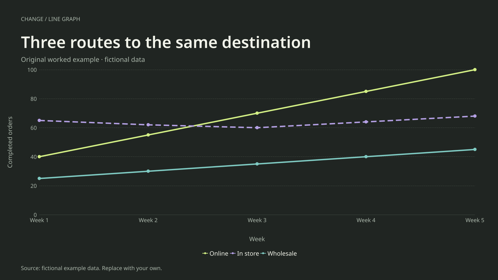
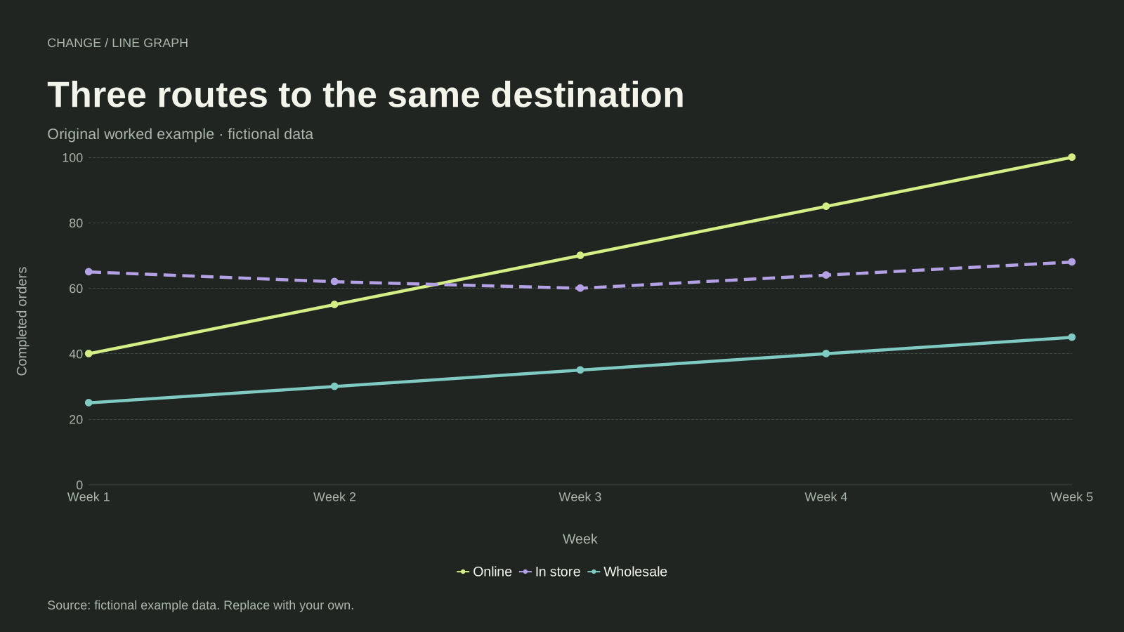
Online orders rise from 40 to 100, while in-store orders move from 65 to 68 and wholesale orders rise from 25 to 45. Online first exceeds in-store at Week 3, where the plotted totals are 70 and 60.
The online increase is 60 orders. Wholesale grows by 20 orders, even though its proportional increase is also substantial. Comparing the slopes answers an absolute-change question; comparing percentage growth requires a separate calculation with each channel’s own starting value.
Build it with your own data
Arrange a table with Week as its first column and one column for each channel. Every row must describe the same reporting window across all three channels. Keep the series names short enough to read in the legend.
All lines share the completed-orders axis. This avoids mixing counts with revenue or conversion percentages. Use the legend and markers to identify series, then read their values at the same week. The wide export gives the three lines and legend more space.
Open this example in the line graph maker Replace the data, inspect the preview and download your version. SVG, PNG and PDF exports are available in the editor.
What this example cannot tell you
The straight segment between Week 2 and Week 3 does not reveal the exact day when online orders overtook in-store orders. These are weekly totals, not continuously observed cumulative counts. The channel names and numbers are fictional.
Can I compare revenue and orders on these lines?
Use a common measure for the lines on this chart. Revenue and order counts have different units. Create separate charts, or explicitly calculate a common indexed measure in your source table and label it accurately; this example has no secondary axis.
Created and reviewed by SupaMakers for ChartsAI · September 8, 2026. Source code and reuse terms.