How to read this chart
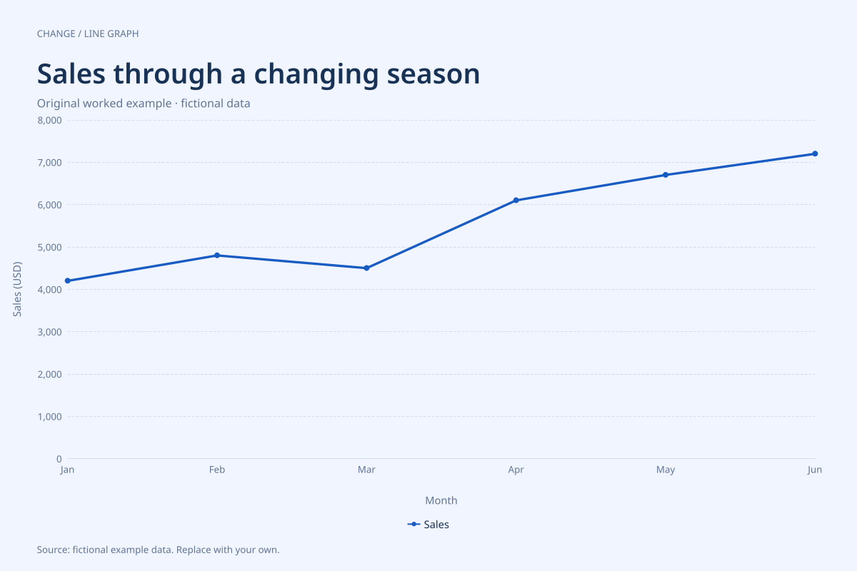
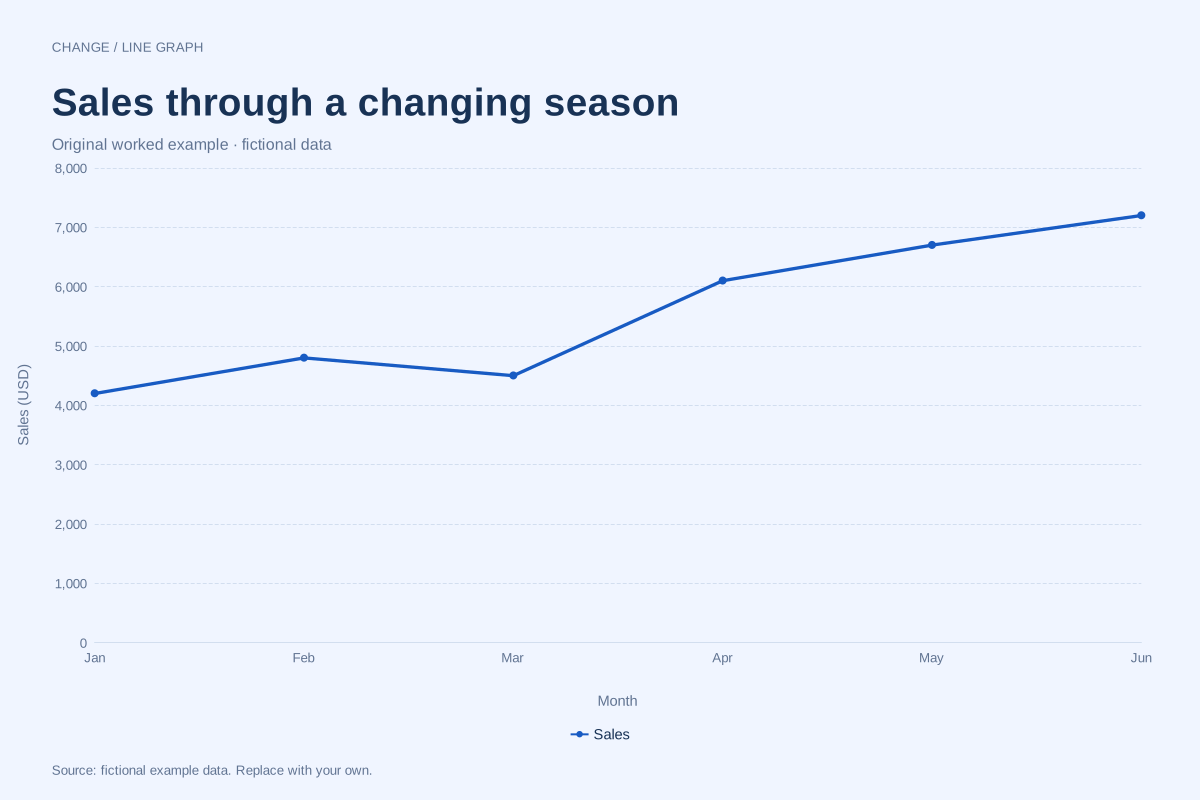
January starts at $4,200 and June ends at $7,200: a rise of $3,000, or about 71.4% relative to January. The line does not rise every month. March falls $300 from February before April increases by $1,600.
The six monthly totals add to $33,500. That total describes this six-month period; the June point alone describes June. Joining the points helps readers follow the sequence without confusing a monthly amount with a cumulative total.
Build it with your own data
Use one row per month and one numeric column per sales series. Keep months in calendar order, identify the currency, and use the same definition of sales throughout: orders booked, invoices issued and cash received are different measures.
This chart uses equally spaced category labels because each point represents a consecutive month. The vertical axis includes zero. Replace the six figures with your totals, then update the title, currency and source before exporting a report.
Open this example in the line graph maker Replace the data, inspect the preview and download your version. SVG, PNG and PDF exports are available in the editor.
What this example cannot tell you
These invented figures are not a business benchmark or a seasonal forecast. Six points cannot establish that a pattern repeats annually. Discounts, refunds and tax treatment must be handled consistently in your own source data.
Should missing sales months be entered as zero?
Only enter zero if sales were actually zero. A missing record is unknown, not zero. Resolve the missing month in your source data before making a continuous monthly comparison; the editor does not infer missing totals.
Created and reviewed by SupaMakers for ChartsAI · September 8, 2026. Source code and reuse terms.