How to read this chart
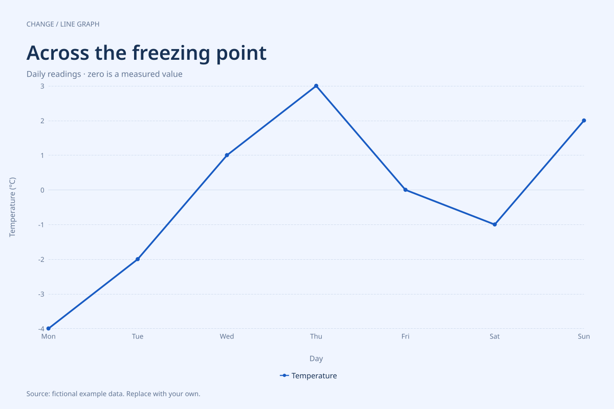
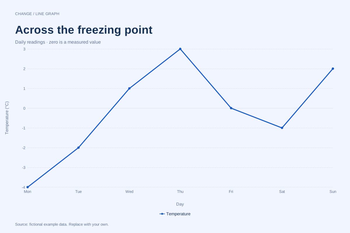
Monday is −4°C and Thursday is 3°C, a difference of 7°C. Friday is exactly 0°C. Saturday falls below freezing again at −1°C before Sunday reaches 2°C. A zero observation belongs in the data just like any other measured value.
The observed range is 7°C, from the lowest reading of −4°C to the highest of 3°C. There are three negative readings, three positive readings and one zero. The connecting line makes the sequence visible while the markers identify actual observations.
Build it with your own data
Enter signed numbers in the temperature column, including a normal minus sign for readings below zero. Use one consistent unit. Celsius and Fahrenheit readings cannot be mixed in the same column without converting them first.
Days use a category axis in their original order. The vertical scale spans both sides of zero, and the chart preserves negative values instead of clipping or replacing them. Update the time-of-day convention in your subtitle if these are daily morning readings rather than daily averages.
Open this example in the line graph maker Replace the data, inspect the preview and download your version. SVG, PNG and PDF exports are available in the editor.
What this example cannot tell you
The line crossing zero between two days is an interpolation, not a recorded freezing time. These seven points cannot describe the highest or lowest temperature within each day. Percentage changes across Celsius zero would also be misleading because Celsius has an arbitrary reference zero.
Does the zero-baseline option erase negative values?
No. Including zero in the axis range does not turn negative values into zero or remove them. The chart must still show the full observed range. Keep the source values signed and check the data table when interpreting a crossing.
Method background: Office for National Statistics: axes and gridlines. Our dataset and worked calculation are original fictional examples.
Created and reviewed by SupaMakers for ChartsAI · September 8, 2026. Source code and reuse terms.