A clearer picture.
A few clicks away.
Free online chart makers for small datasets and useful comparisons. Start with a working example, add your values, and download your chart.
Dot plot maker
Every observation, accounted for. Turn scores, timings or measurements into a clear distribution.
Import data. Export PNG · SVG · PDFRadar chart maker
Compare skills, products or survey scores. Put the strengths and differences in one picture.
Up to 5 profiles · PNG · SVG · PDFLine graph maker
Track changes over time. Compare multiple lines with clear labels and accurate numeric or date spacing.
Up to 5 series · PNG · SVG · PDFExplore distributions, relationships and categories
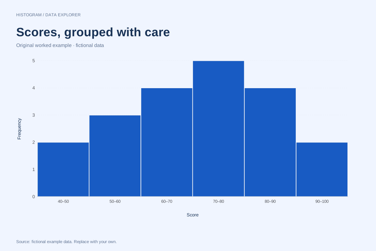
Histogram maker
Group individual numeric observations into equal-width intervals. Choose a bin count or explicit start and width, inspect every frequency, and switch between counts and percentages.
Open the maker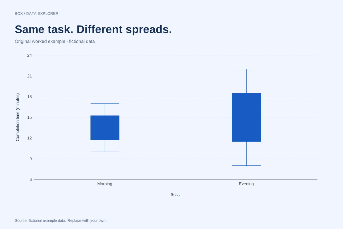
Box plot maker
Compare distributions using calculated quartiles, medians and whiskers. Choose linear-interpolated quartiles or the exclusive median-of-halves method, and keep outlying observations visible.
Open the maker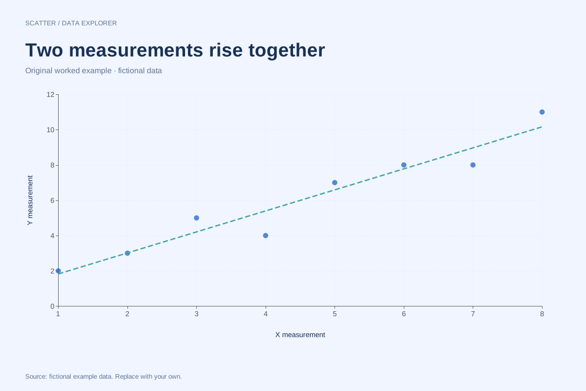
Scatter plot maker
Plot paired X and Y measurements without joining the observations. Inspect Pearson correlation and optionally draw the ordinary least-squares regression line with an intercept.
Open the maker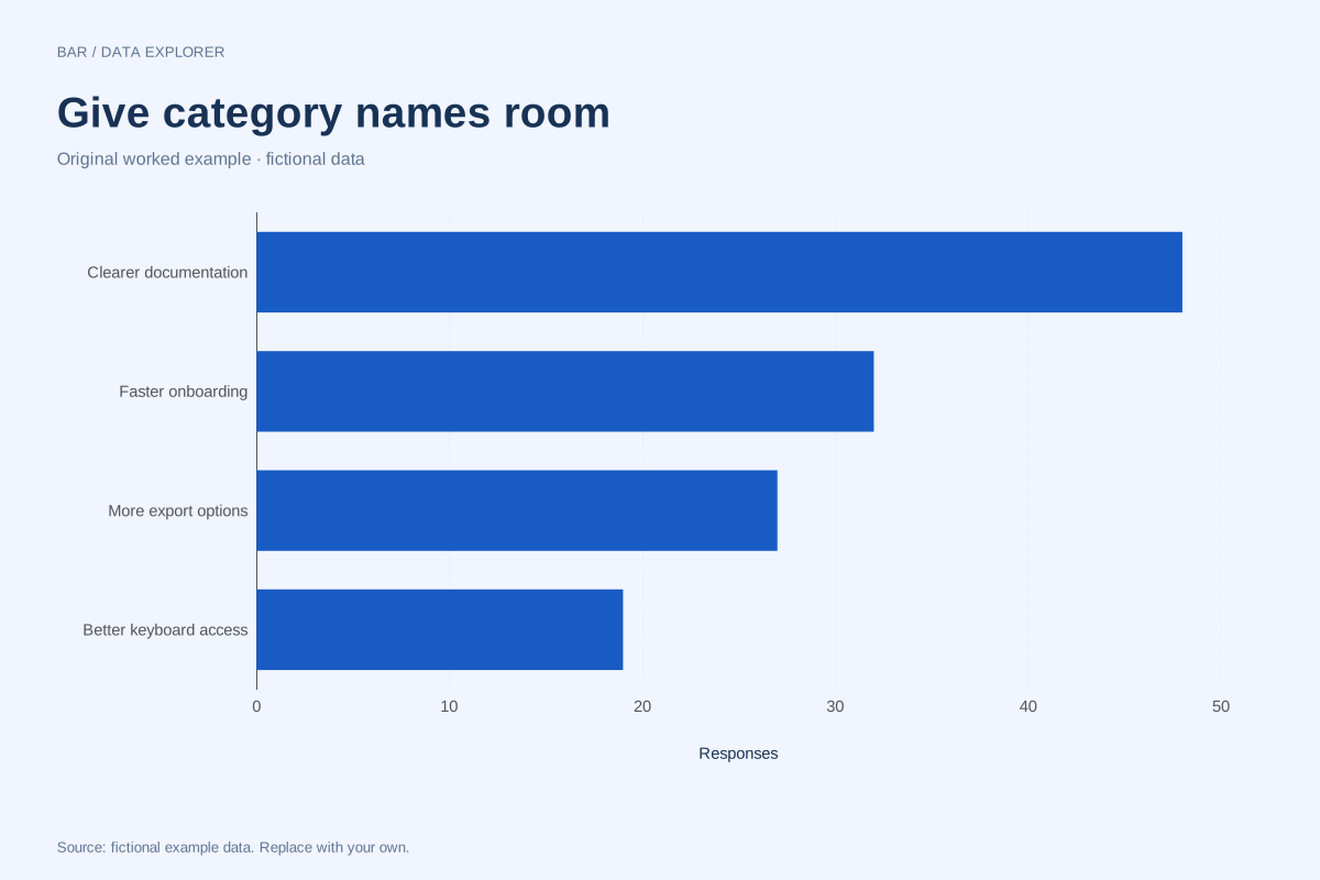
Bar chart maker
Compare named categories with grouped, stacked or 100% stacked bars. Switch orientation for long labels and keep exact values available alongside the graphic.
Open the maker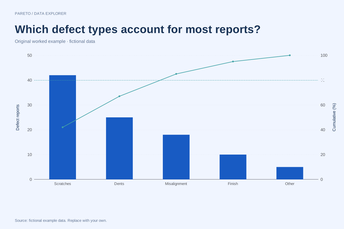
Pareto chart maker
Sort category values from largest to smallest and calculate their running share of the total. Bars show the chosen measure; the line uses a separate 0–100% axis.
Open the makerCharts for articles and publications
Make editorial charts with annotations, captions and sources. Explore dumbbell comparisons, slopegraphs and small multiples, with free publication downloads.
Choose the chart that fits your question
| You want to… | Start here | Your data |
|---|---|---|
| See how individual numeric values are distributed | Dot plot maker | One numeric column, such as scores or waiting times |
| Compare profiles across several dimensions | Radar chart maker | Dimension names and comparable scores for each series |
| See how values change across ordered points | Line graph maker | Ordered labels, dates or numeric positions and one to five numeric series |
| See the shape of a distribution | Histogram maker | One numeric column; choose explicit bins |
| Compare group medians and spread | Box plot maker | Group names and individual numeric observations |
| Inspect a relationship between two measurements | Scatter plot maker | Paired X and Y numeric columns |
| Compare amounts across categories | Bar chart maker | Category names and one or more numeric series |
| Rank categories and their cumulative contribution | Pareto chart maker | Unique categories and nonnegative values |
| Show the gap between two measures per group | Dumbbell chart maker | Group names and two comparable measures |
| Compare values at two endpoints | Slopegraph maker | Group names and two comparable endpoint values |
| Compare trends across separate panels | Small multiples maker | Ordered numeric/date positions and several series |
All tools process data in your browser. Import a spreadsheet and choose your columns in a preview. Missing values are flagged, and downloads have no watermark. Looking for something to fill in by hand? Explore our printable trackers.
See the chart. Understand the data.
Explore distance–time graphs, dot plot distributions and radar profiles. Every example includes the original values, a worked explanation and free downloads.
Explore the example library →Make the maths visible.
Explore number lines, slope, transformations, quadratic graphs and coordinate planes. Free practice worksheets with separate answer keys.
Explore five free math tools ↗