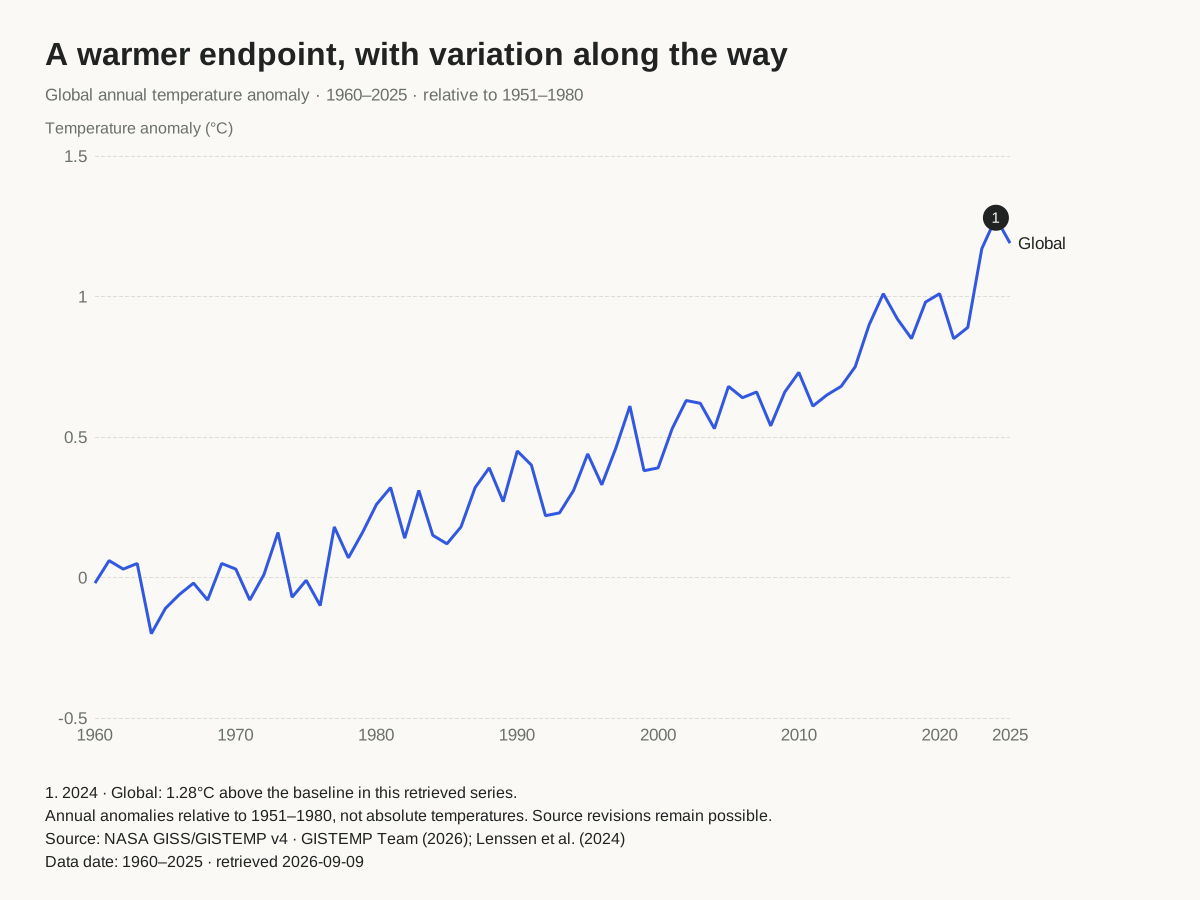
Annotated line graph
Explain a trend with direct series labels and notes anchored to observations.
Free chart tools for articles, newsletters and reports. Add your data, tell readers what it means, and publish a graphic with its source and context intact.
Twelve editable examples for before/after comparisons, group gaps, rankings and trends. Choose a visual, replace its data and keep the design. Every example includes a source table, project and graphics.
The chart type should serve the comparison you want a reader to make. A long time series needs a different view from a two-period comparison; overlapping lines may need separate panels. These previews are made by the same native chart renderer used for your downloads.
Explain a trend with direct series labels and notes anchored to observations.
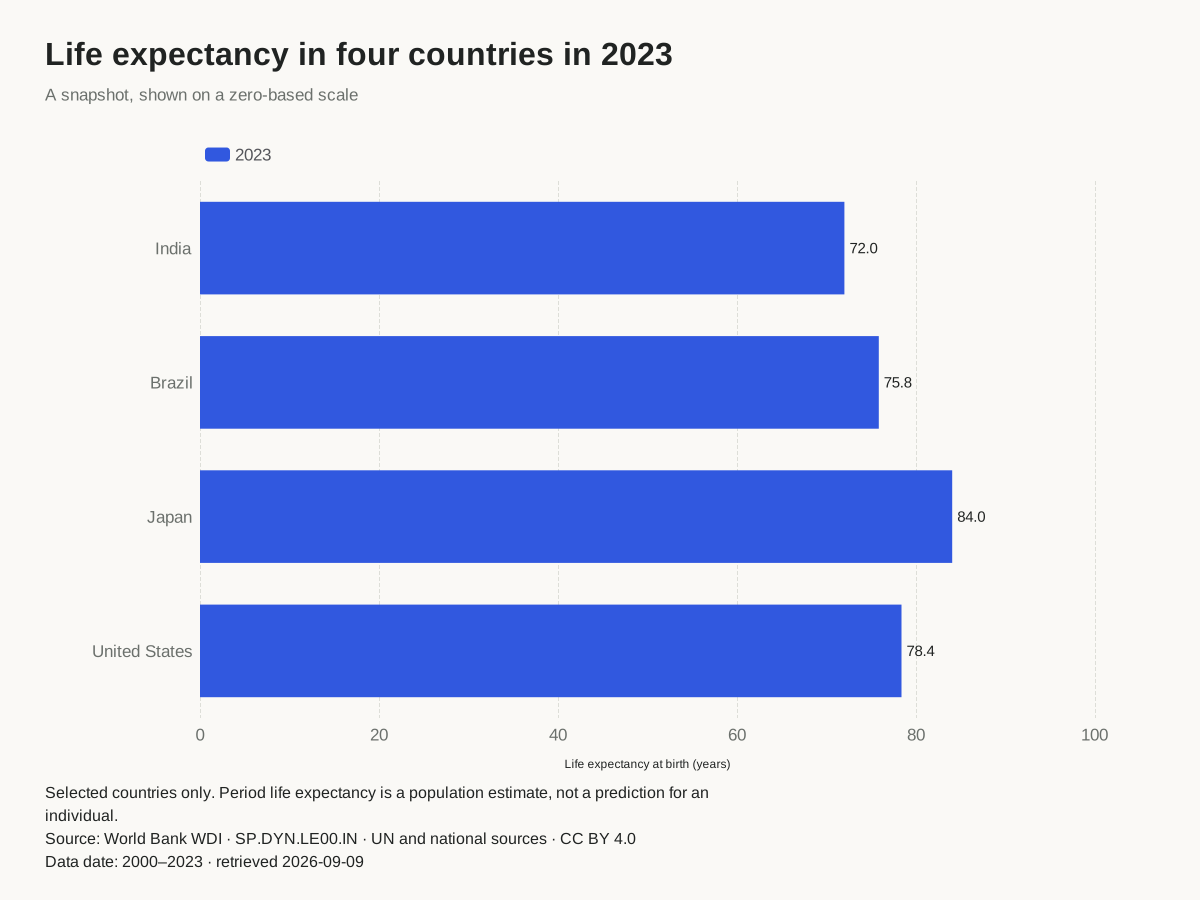
Compare categories with a zero-based scale, exact labels and a publication caption.
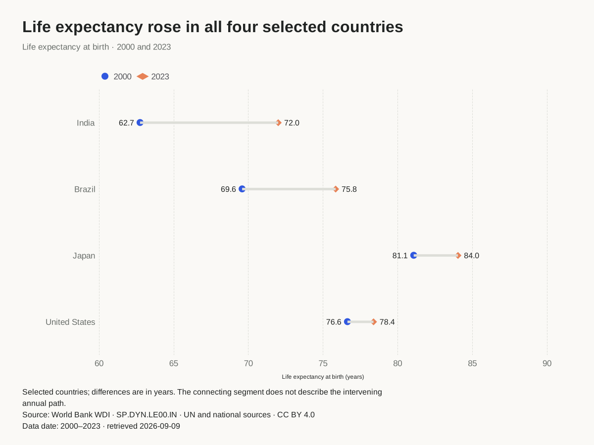
Compare two values for each category. Keep the endpoints and the gap in view.
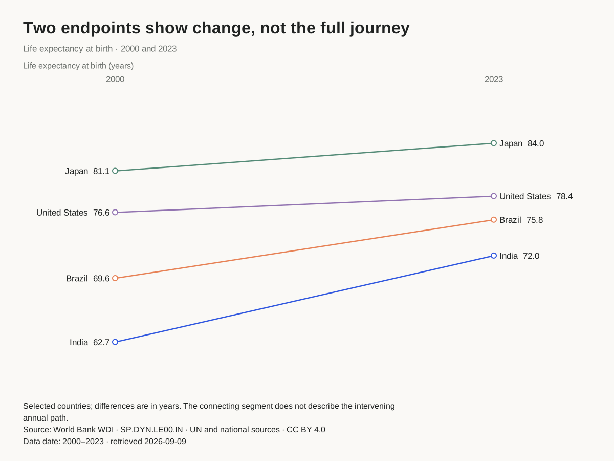
Compare two periods, with category names and values at both ends.
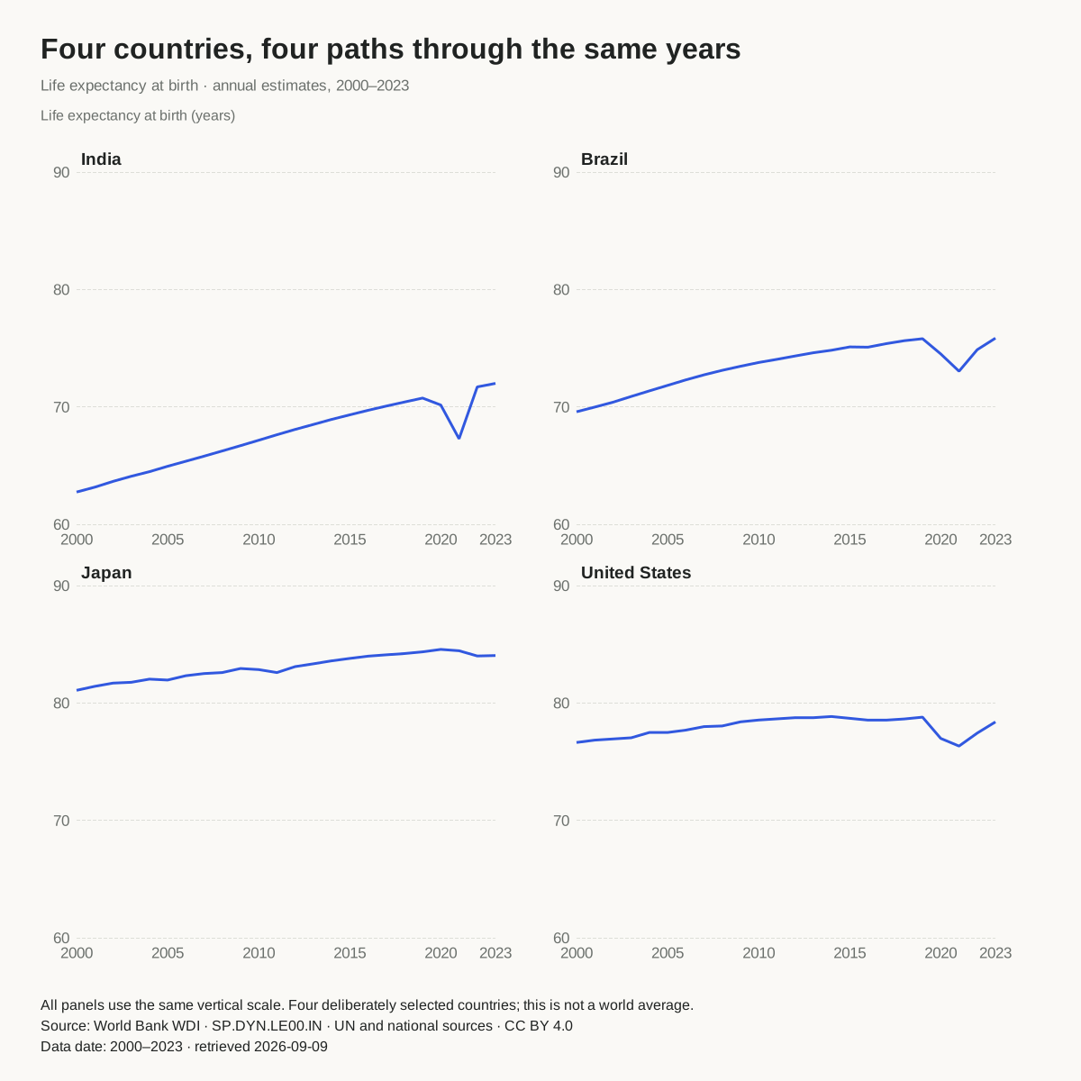
Give each series its own panel while preserving one shared value scale.
Every source-based resource includes the selected values, retrieval date, original interpretation and reusable downloads. They are worked examples of chart construction, not a live news feed or a substitute for reporting.
Compare endpoints, a current snapshot within the chosen period, and complete annual paths. See why a positive difference between 2000 and 2023 does not mean improvement in every intervening year.
Plot annual anomalies against the stated 1951–1980 baseline, retain the year spacing, and attach a note to a measured year. Download all 66 selected annual estimates.
Upload or paste your table and select the columns. The importer lets you inspect sheets, row ranges, headers and number formats; it does not expect your full workbook to match a private template. Missing or ambiguous selected values are reported before they replace the chart.
Next add a headline, unit, caption, source credit, source link and data period. Optional numbered annotations refer to exact rows and series. The same notes appear below the plot in downloaded graphics. Direct labels and the visible data table help readers identify the values without relying solely on color or hover.
Download a vector SVG, PNG, PDF, source CSV or editable project. A self-contained HTML figure includes the chart and accessible data table without external scripts, analytics or a hosted ChartsAI dependency. Upload it to your own site when you choose. Your private data is not placed in a public link or sent to another service.
For animation, the line workflow can export a compatible project for the AnimCharts editorial lab, subject to its smaller dated-series limits. You choose when to open that downloaded file there. Read the publishing guide for formats, accessibility, revisions and reuse.
Made by SupaMakers. All tools remain free. No forced watermark or ChartsAI credit; retain any attribution required by the data you use. Public source and licenses.