Life expectancy: change between endpoints
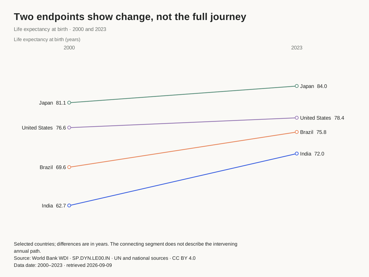
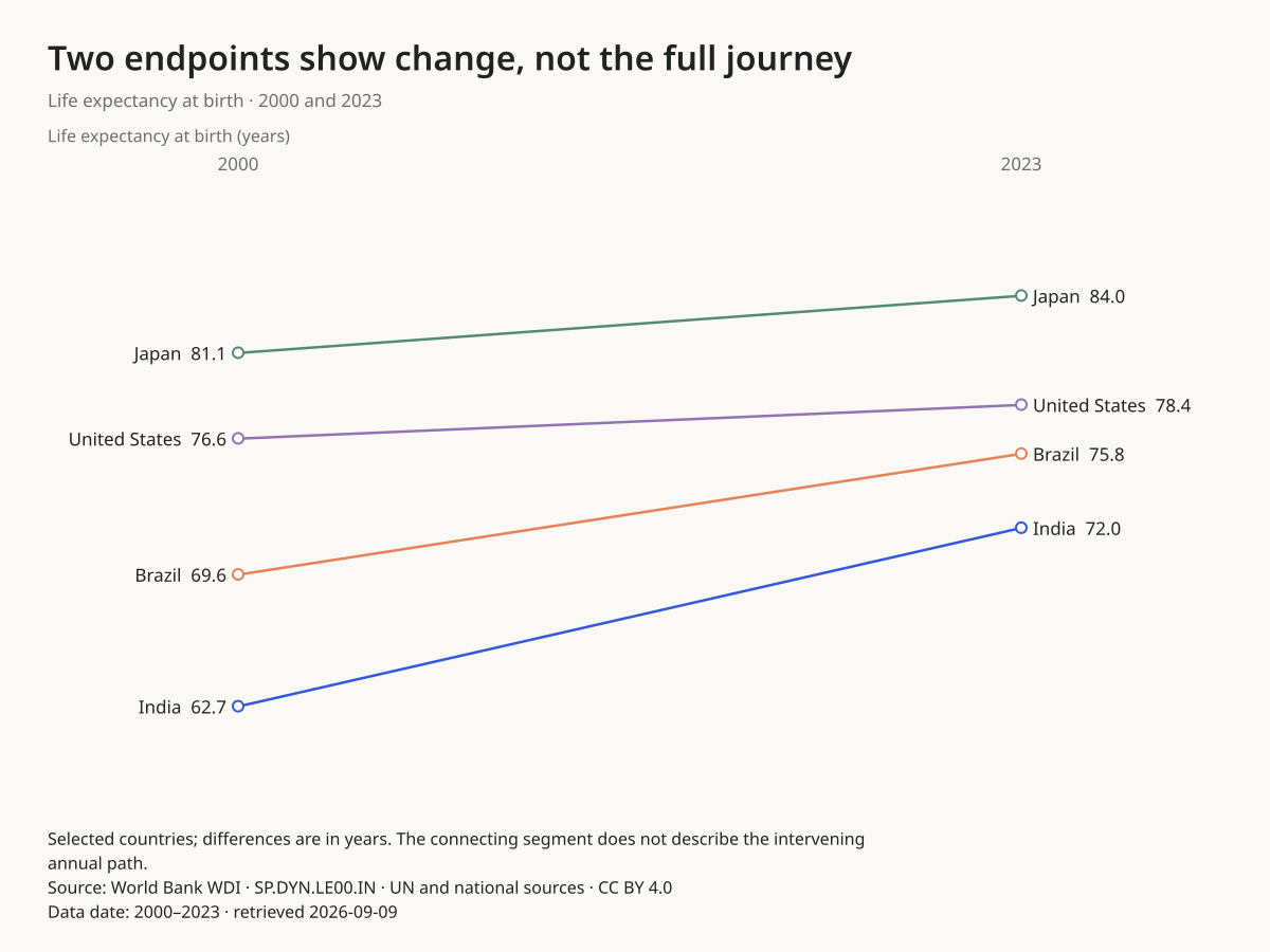
Which countries rose, and by how much?
All four endpoint differences are positive. India rises by 9.254 years; Japan has the highest endpoint in both selected years.
Before you publish: The connecting segment is not an annual trend. Open the full annual series before describing uninterrupted improvement.
Use this chartOpens this exact design and data in the maker. Upload or paste replacements; review the units and write your own headline.
Read the source, selection and full annual series. Values were retained from the September 9, 2026 retrieval.
Service waiting times
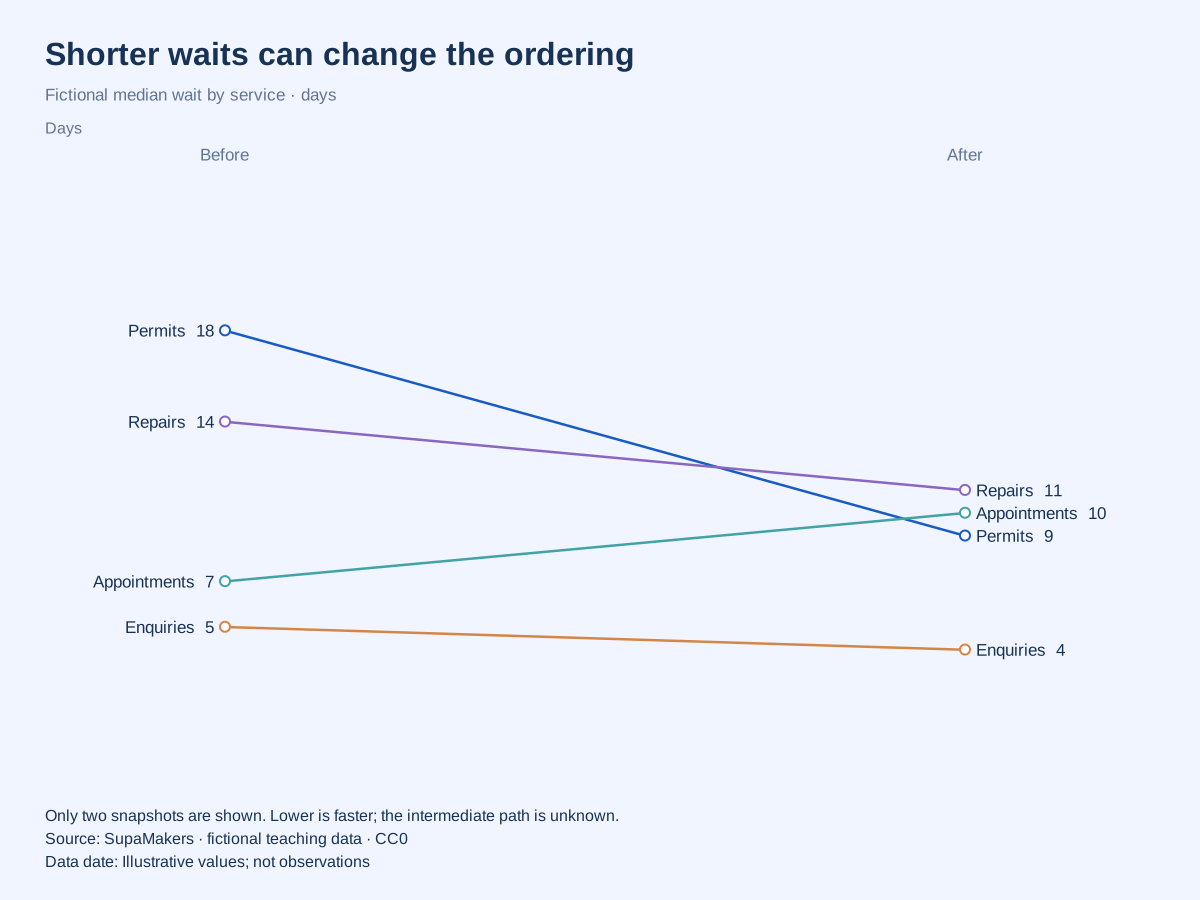
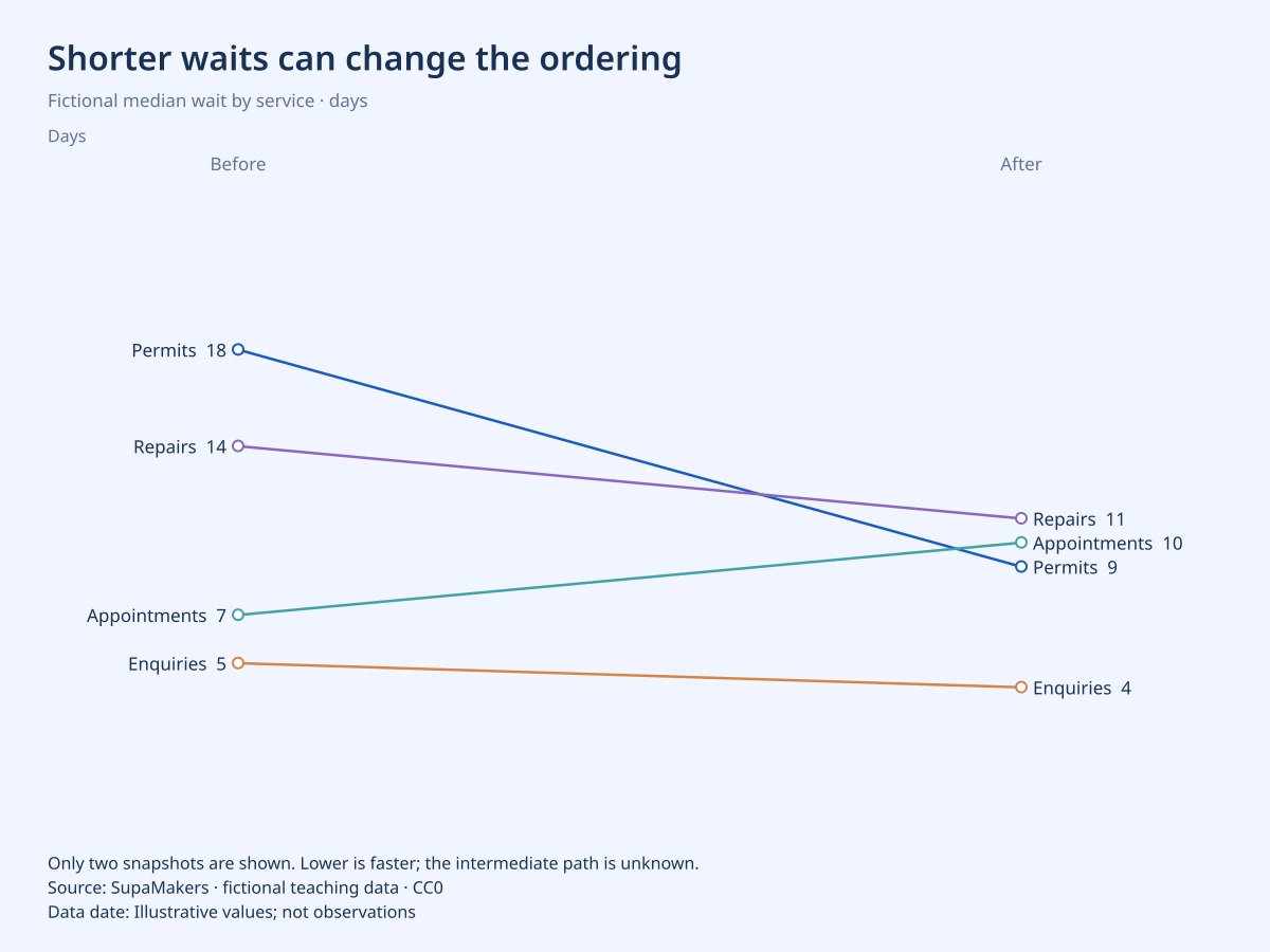
Did the ordering of services change?
In this fictional comparison, permits fall from 18 to 9 days while appointments rise from 7 to 10. Their lines cross as their order changes.
Before you publish: Lower values are better here. Median waits do not describe the longest waits, demand levels or service quality.
Use this chartOpens this exact design and data in the maker. Upload or paste replacements; review the units and write your own headline.
All values in this example are invented for teaching. They are not research findings, actual organizations or reported performance.
Ranking changes in league points
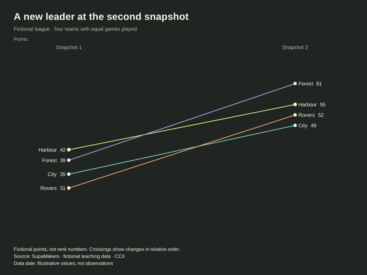
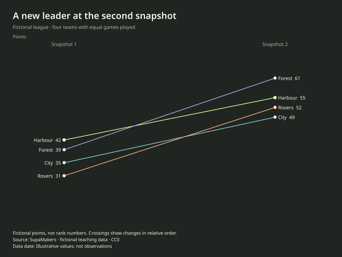
Who changed position between two snapshots?
Harbour leads the fictional first snapshot with 42 points, but Forest leads the second with 61. Points determine vertical position; line crossings reveal order changes.
Before you publish: These are points, not rank numbers. Rank gaps are not equal point gaps, and teams need comparable games played for a meaningful real comparison.
Use this chartOpens this exact design and data in the maker. Upload or paste replacements; review the units and write your own headline.
All values in this example are invented for teaching. They are not research findings, actual organizations or reported performance.
Energy use across two periods
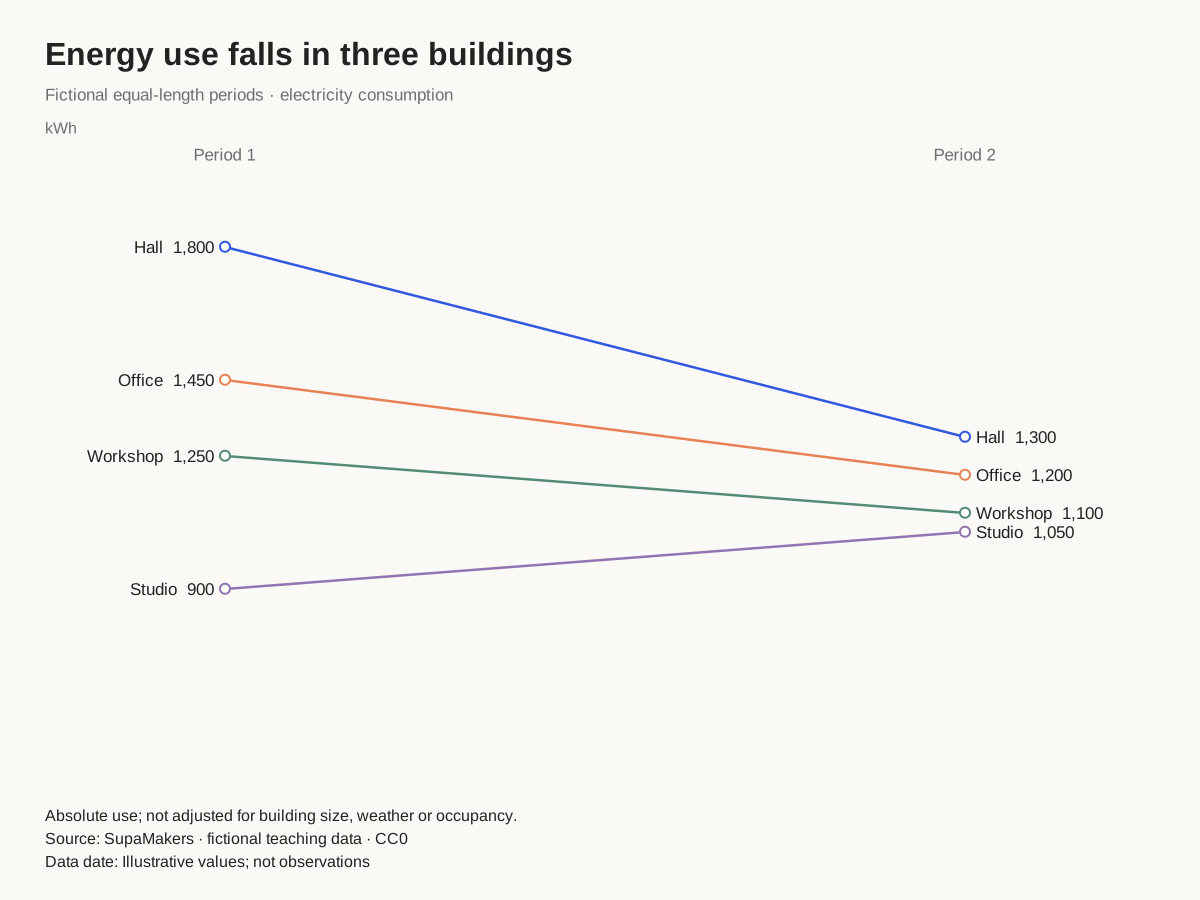
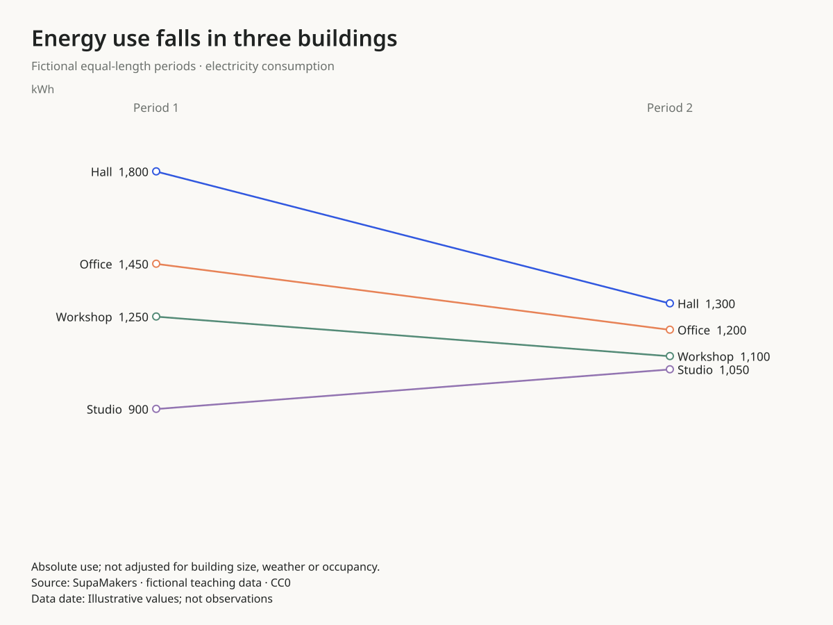
Which buildings used less energy?
The fictional hall drops from 1,800 to 1,300 kWh, while the studio increases from 900 to 1,050 kWh. The chart retains absolute levels.
Before you publish: Absolute kWh do not adjust for floor area, weather or occupancy. A decrease alone does not establish improved efficiency.
Use this chartOpens this exact design and data in the maker. Upload or paste replacements; review the units and write your own headline.
All values in this example are invented for teaching. They are not research findings, actual organizations or reported performance.
When this chart works
Use a slopegraph to show a small set of categories at two comparable snapshots. Direct names and values at both ends let readers follow one item. Crossings can reveal changes in relative order, while the endpoint positions retain the original measurement.
How to read the comparison
Read both the level and the signed change. A steeper line represents a larger difference when all categories share the same unit and snapshots. It is not a rate per day unless the time interval and calculation establish one. Changing the canvas aspect ratio changes apparent steepness without changing values.
When to choose another chart
Do not infer the missing path between snapshots. A straight rising connector can hide a long intervening decline. Crowded or nearly equal endpoints also become hard to read; reduce the selection explicitly or use a dumbbell chart. Our maker supports up to 12 categories, but fewer may be clearer.
Replace the data without rebuilding the design
One category column and exactly two numeric columns. Name the columns with the two snapshots or conditions. Do not paste rank numbers when you intend to show points, money or another measured quantity.
Choose “Use this chart”, upload CSV or Excel or paste spreadsheet cells, and explicitly select the columns. The palette, canvas, decimal preference and label settings remain. Unchanged sample headlines, sources, units and notes are cleared when you apply replacement data; write the context for your own observations. Custom text you have entered is preserved. Review the result before downloading.
Data processing and exports happen in your browser. Download a project to keep an editable copy. SVG is vector; PNG has the selected pixel dimensions; PDF contains a raster rendering. No account or payment is needed.
Can a slopegraph show ranking changes?
Yes. Categories can change vertical order between snapshots, as the league-points example shows. This plots the actual points. It is not a bump chart with a dedicated ordinal rank axis.
Explore another comparison
Open the maker · Publishing and accessibility guide · Source code
Made by SupaMakers. Reviewed September 9, 2026.