Life expectancy: four annual paths
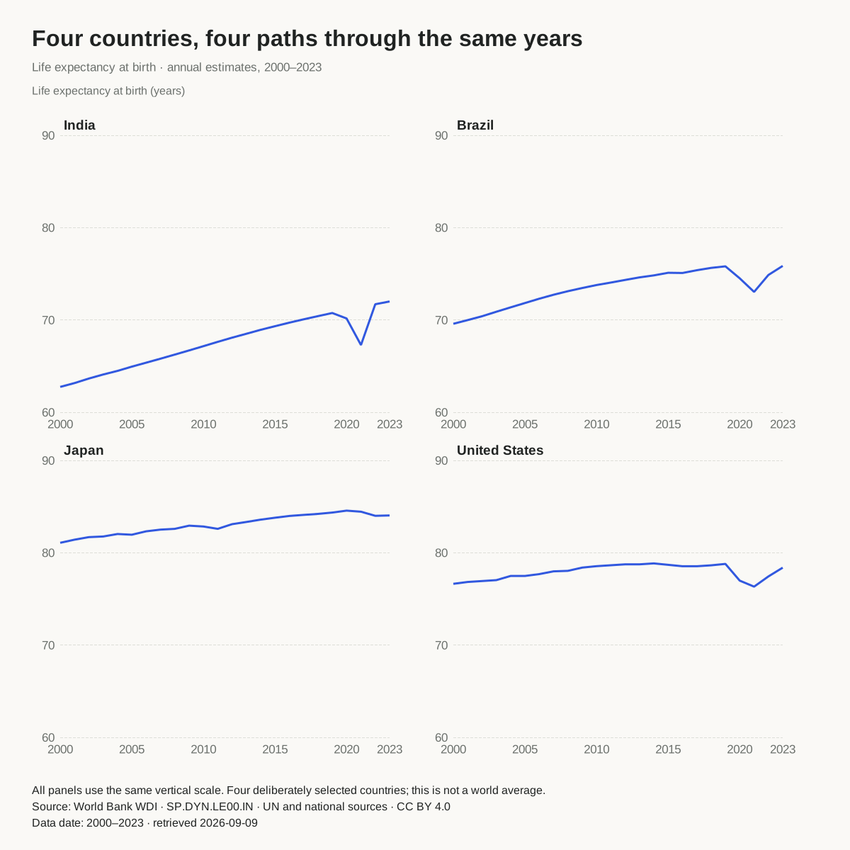
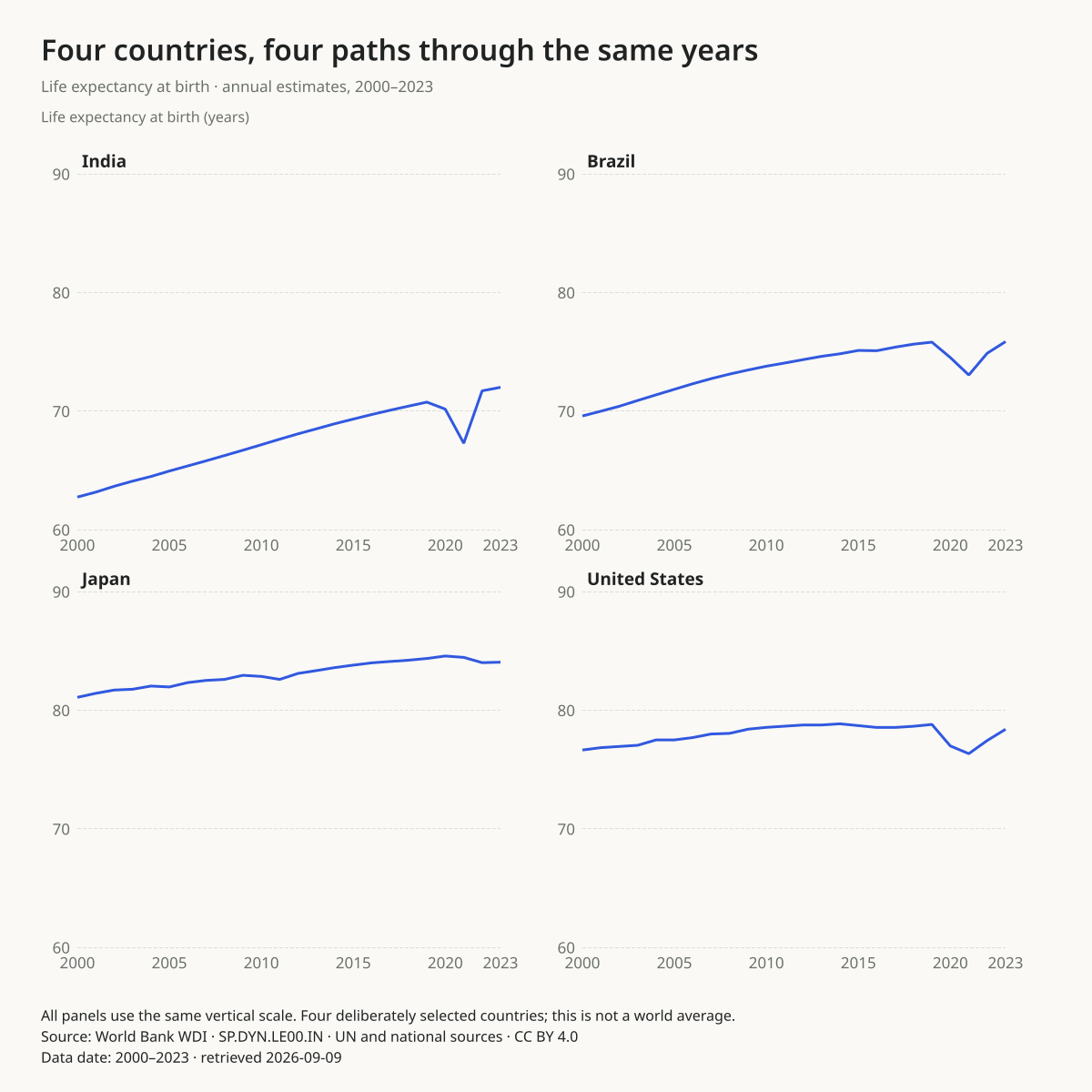
Do the endpoints hide interruptions?
The same 60–90-year axis makes levels comparable. Annual paths expose dips that disappear from the paired endpoint views.
Before you publish: Separate panels share a scale, not a claim that these countries represent the world. Period life expectancy is not an individual prediction.
Use this chartOpens this exact design and data in the maker. Upload or paste replacements; review the units and write your own headline.
Read the source, selection and full annual series. Values were retained from the September 9, 2026 retrieval.
Monthly visits by library branch
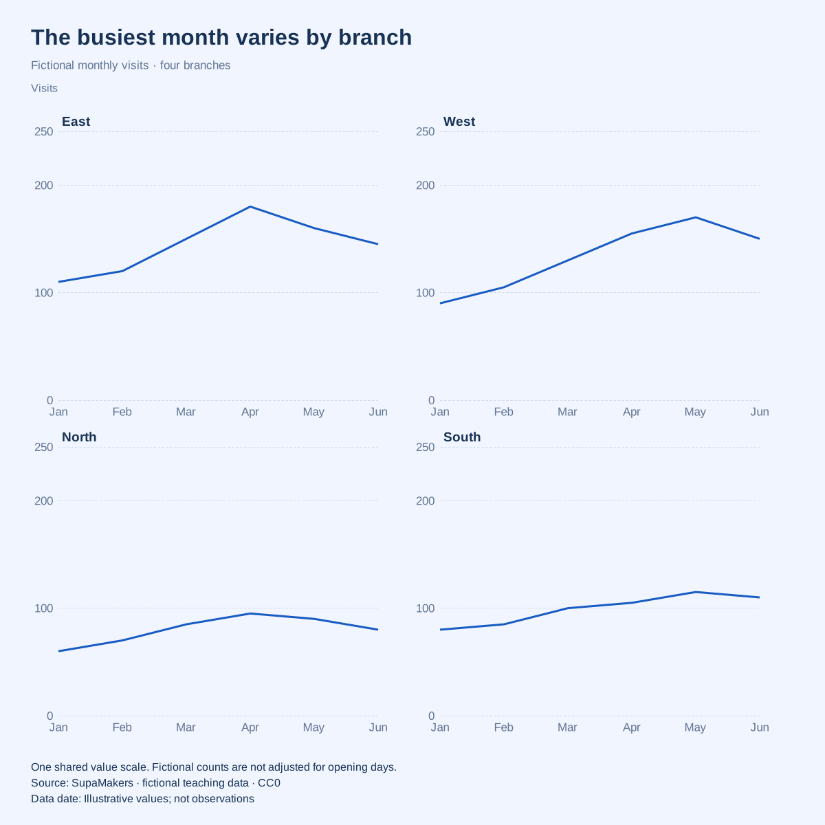
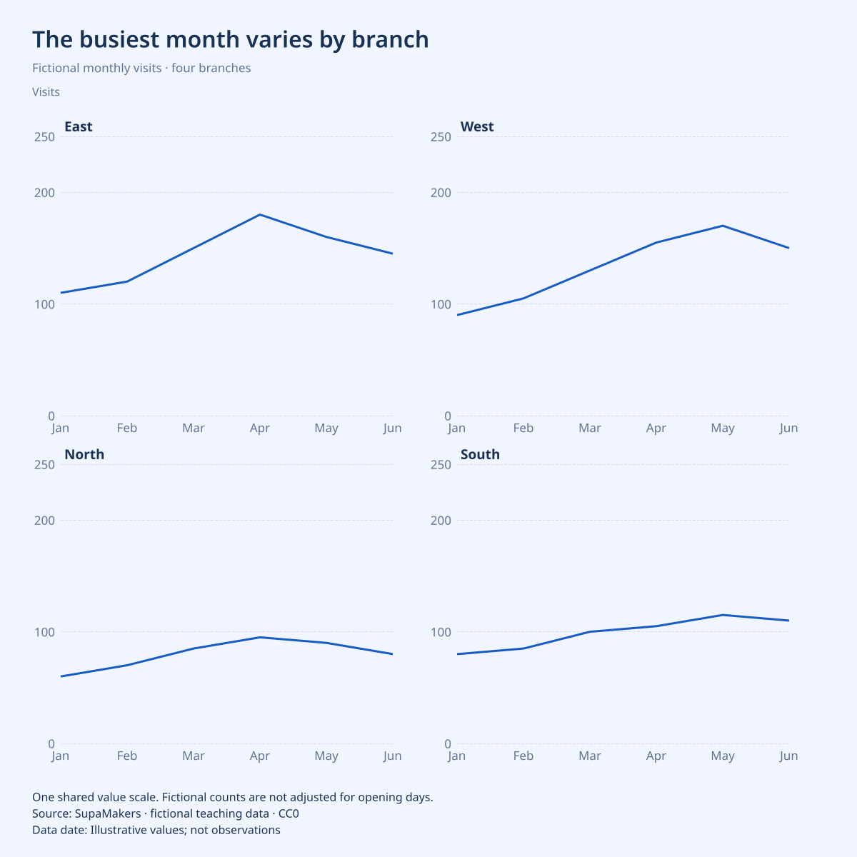
Do branches peak at the same time?
In the fictional data East peaks at 180 visits in April, while West peaks at 170 in May. The shared axis preserves the difference in levels.
Before you publish: Counts do not adjust for opening days, catchment size or branch capacity. Do not describe a busier branch as more effective from these values alone.
Use this chartOpens this exact design and data in the maker. Upload or paste replacements; review the units and write your own headline.
All values in this example are invented for teaching. They are not research findings, actual organizations or reported performance.
Seasonal orders by product
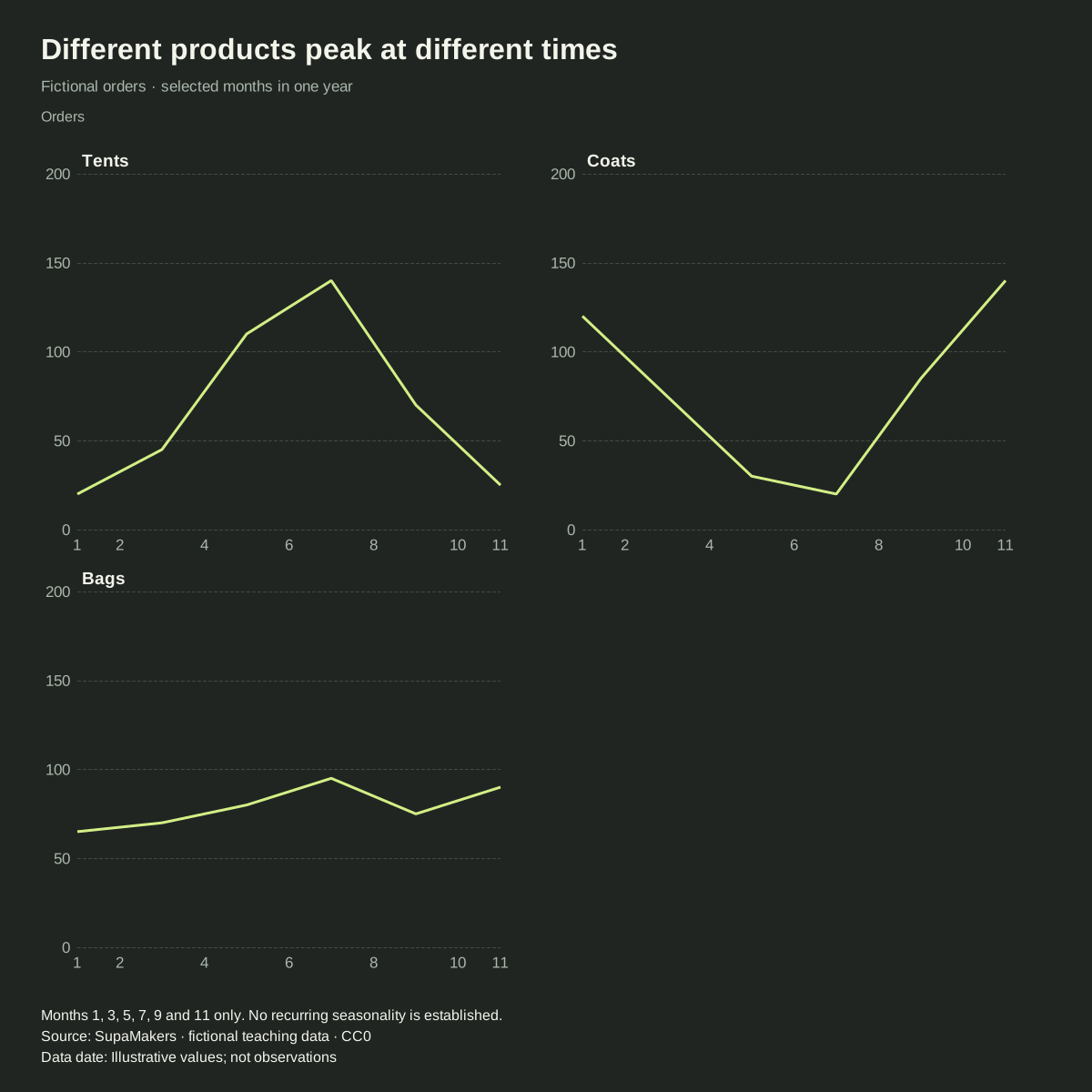
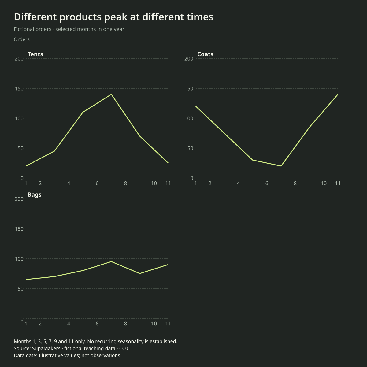
Do different products follow the same seasonal pattern?
The fictional tent series peaks in July at 140 orders; the coat series peaks in November at 140. Equal panel scales make the opposite timing visible.
Before you publish: Six selected months do not establish a recurring seasonal pattern. This numeric month axis preserves the gaps; it does not invent the intervening values.
Use this chartOpens this exact design and data in the maker. Upload or paste replacements; review the units and write your own headline.
All values in this example are invented for teaching. They are not research findings, actual organizations or reported performance.
On-time departures by route
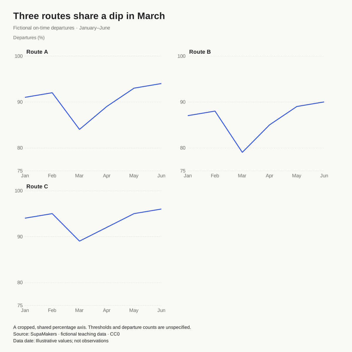
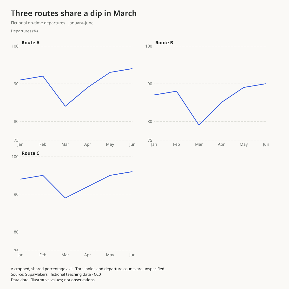
Is a dip shared across routes?
All three fictional routes dip in March. Route A falls from 92% in February to 84% in March, an 8 percentage-point decrease.
Before you publish: The shared dip does not identify a cause. Real reporting needs a consistent on-time threshold, departure counts and the treatment of cancellations.
Use this chartOpens this exact design and data in the maker. Upload or paste replacements; review the units and write your own headline.
All values in this example are invented for teaching. They are not research findings, actual organizations or reported performance.
When this chart works
Use repeated panels when the reader needs to inspect each series and compare it with the others. The same numeric range makes a given vertical distance mean the same amount in every panel. Panel titles identify the series without relying on a multicolor legend.
How to read the comparison
Compare levels first, then direction, timing and interruptions. Peaks in different panels can happen in different months even if endpoint changes look similar. Repeated shapes alone do not establish a shared cause. Separate panels also sacrifice the exact crossings that an overlaid line chart can show.
When to choose another chart
Do not independently rescale panels when their levels are meant to be compared. A cropped common scale is permitted but must stay explicit. Different units or definitions need a different design; this maker does not normalize series or silently fill missing values.
Replace the data without rebuilding the design
One ordered label, numeric position or date column, followed by one to five numeric series. Each row needs a value for every selected series. Numeric/date positions must increase; categorical labels keep their supplied order. Three or more panels use the square canvas.
Choose “Use this chart”, upload CSV or Excel or paste spreadsheet cells, and explicitly select the columns. The palette, canvas, decimal preference and label settings remain. Unchanged sample headlines, sources, units and notes are cleared when you apply replacement data; write the context for your own observations. Custom text you have entered is preserved. Review the result before downloading.
Data processing and exports happen in your browser. Download a project to keep an editable copy. SVG is vector; PNG has the selected pixel dimensions; PDF contains a raster rendering. No account or payment is needed.
Are trellis charts and small multiples the same?
Trellis and panel charts are related names for repeated-chart arrangements. This collection specifically supplies line panels with one shared value scale; it does not promise every possible trellis chart type.
Explore another comparison
Open the maker · Publishing and accessibility guide · Source code
Made by SupaMakers. Reviewed September 9, 2026.