Life expectancy: the gap between two years
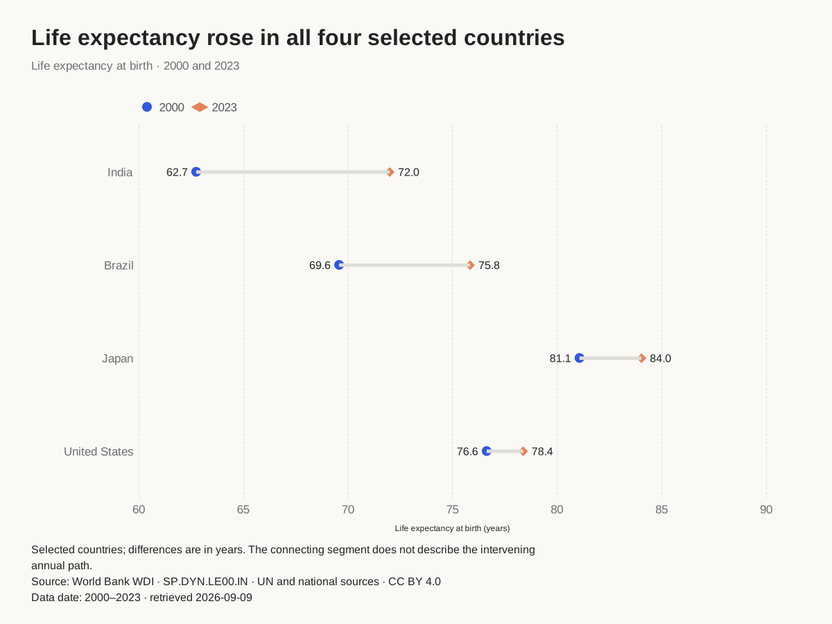
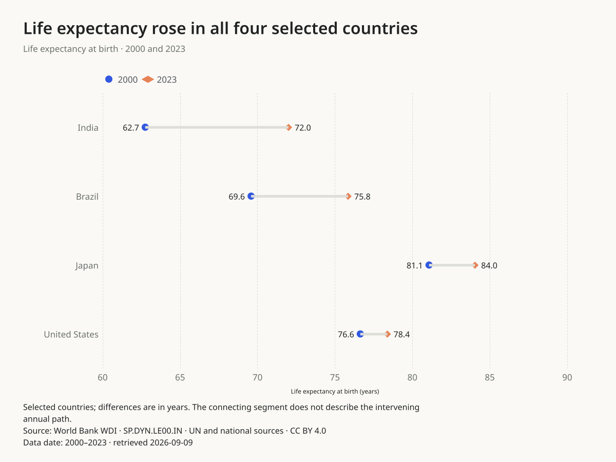
How far apart are the two endpoints for each country?
India moves from 62.749 to 72.003 years: a difference of 9.254 years. The chart rounds labels to one decimal; the CSV retains source precision.
Before you publish: These four selected countries are not a representative world sample. Endpoints conceal the annual path.
Use this chartOpens this exact design and data in the maker. Upload or paste replacements; review the units and write your own headline.
Read the source, selection and full annual series. Values were retained from the September 9, 2026 retrieval.
Commute times for two groups
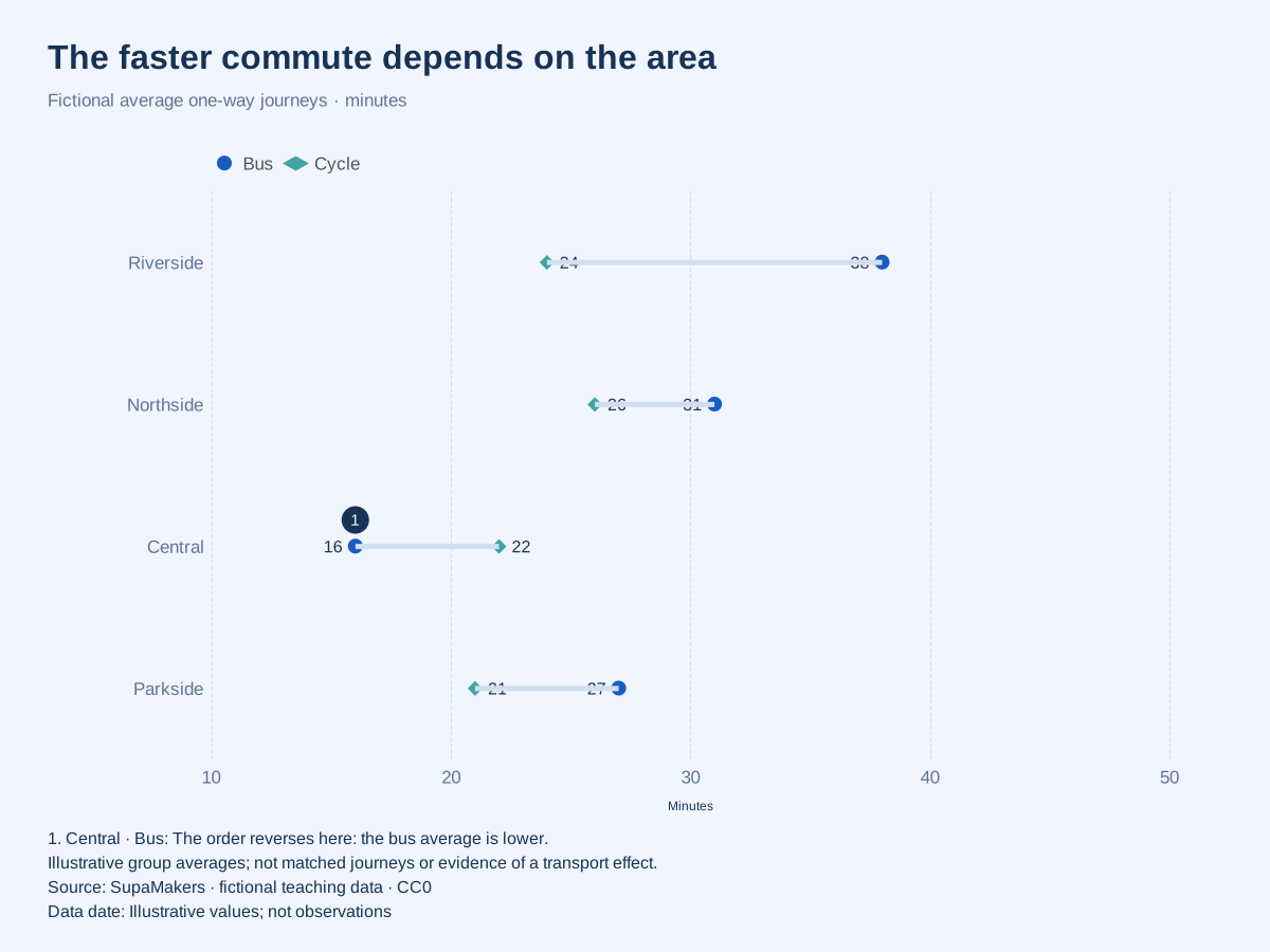
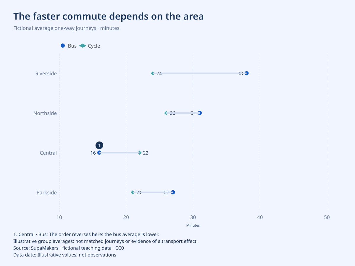
Where is the group difference largest?
The fictional Riverside journey is 38 minutes for bus riders and 24 for cyclists, a 14-minute gap. At Central the order reverses: 16 versus 22 minutes.
Before you publish: Group averages are not matched journeys or a causal effect of changing transport. Traffic, routes and travellers may differ.
Use this chartOpens this exact design and data in the maker. Upload or paste replacements; review the units and write your own headline.
All values in this example are invented for teaching. They are not research findings, actual organizations or reported performance.
Survey gaps in library access
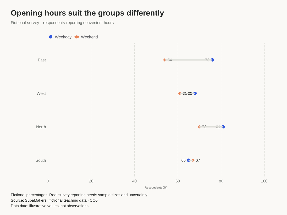
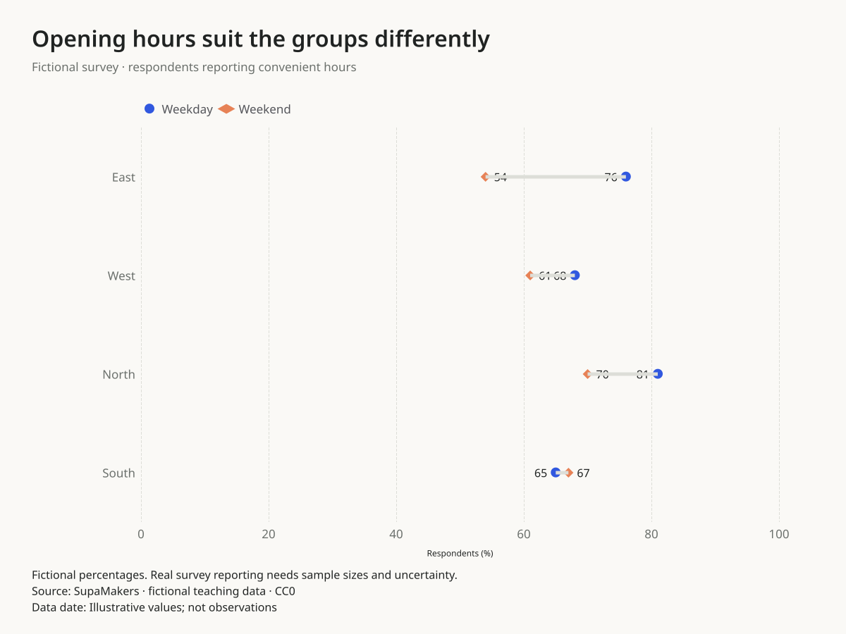
Do two groups report the same access?
At East branch, 76% of the fictional weekday group and 54% of the weekend group report convenient hours: a 22 percentage-point difference.
Before you publish: Subtracting two percentages produces percentage points, not percent change. A real survey also needs question wording, sample sizes and uncertainty.
Use this chartOpens this exact design and data in the maker. Upload or paste replacements; review the units and write your own headline.
All values in this example are invented for teaching. They are not research findings, actual organizations or reported performance.
Delivery times before and after
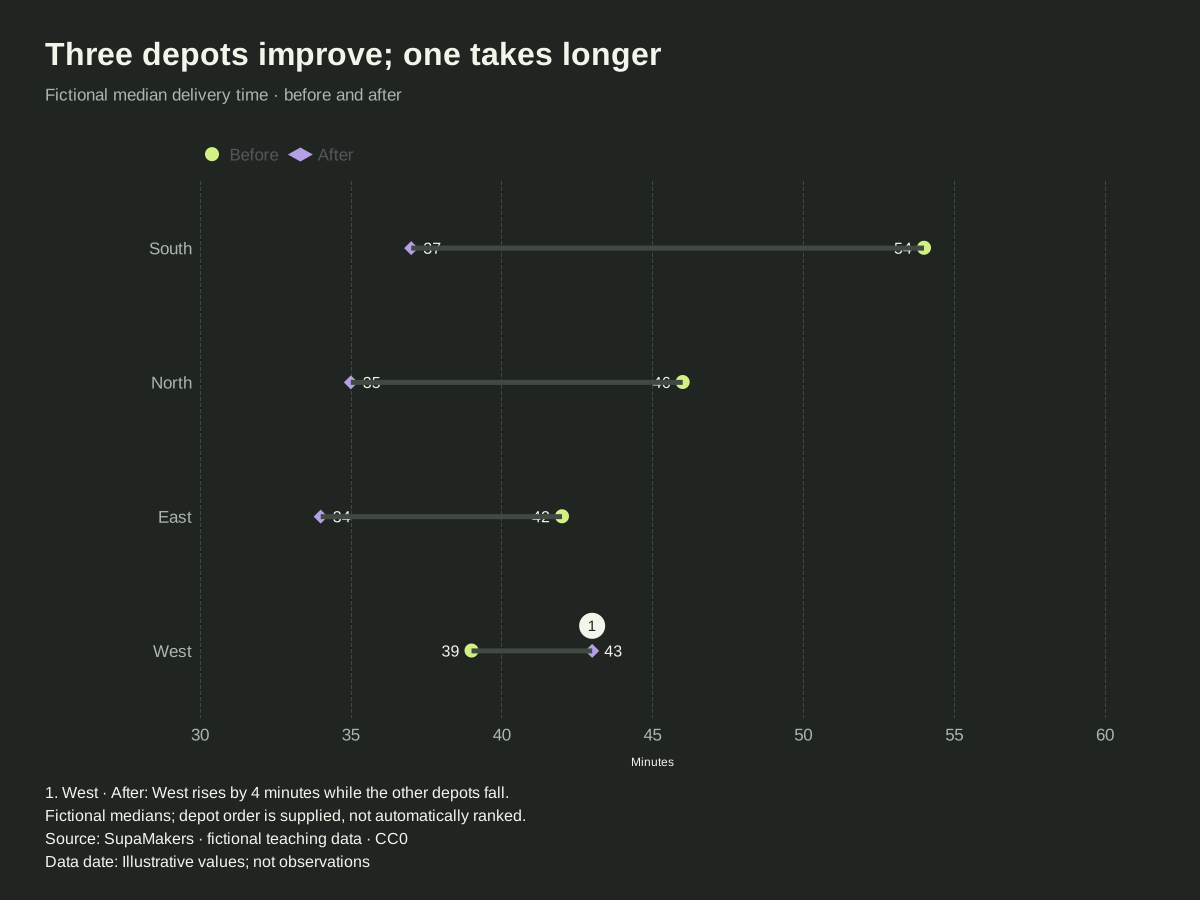
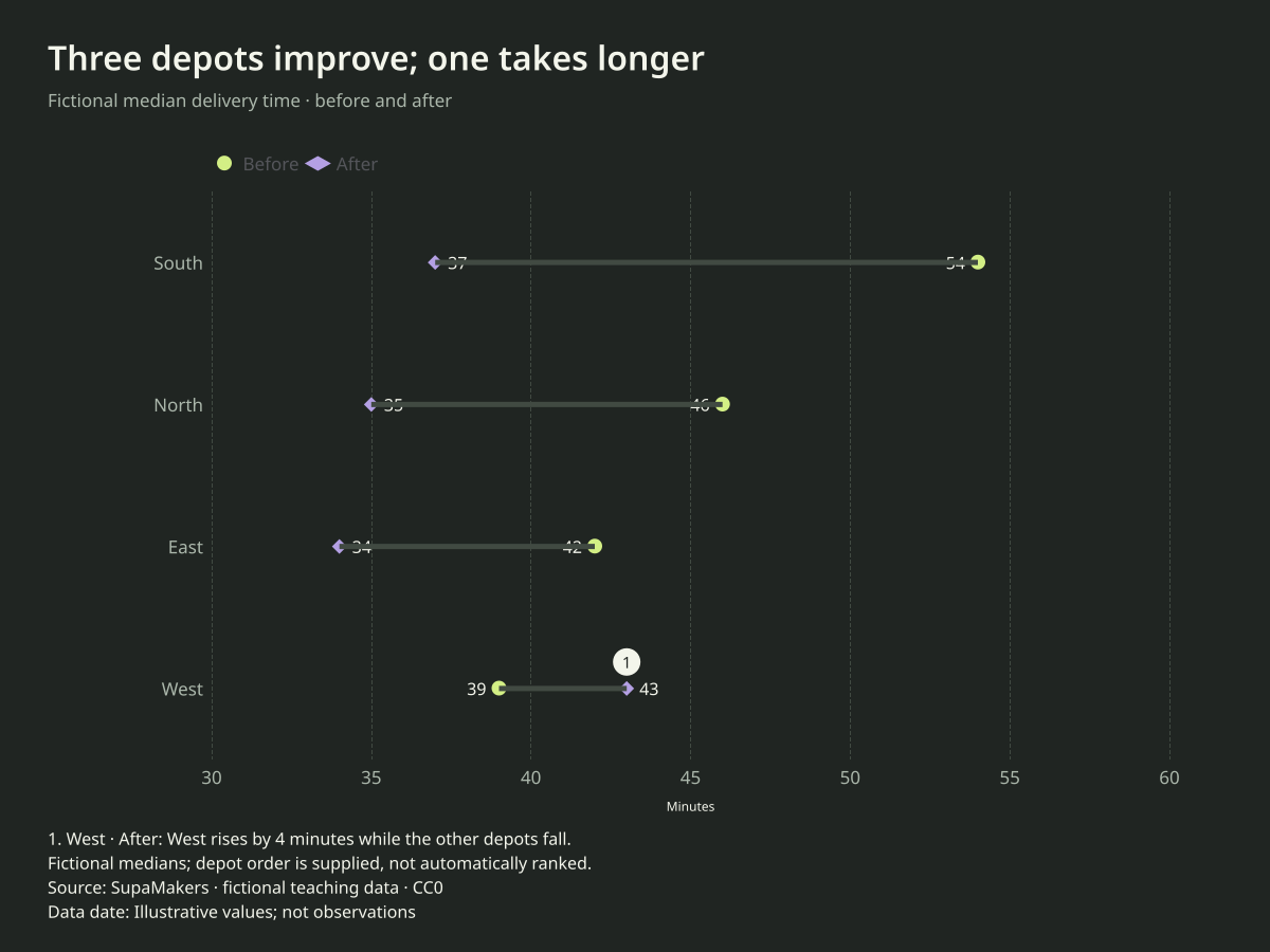
Which depot saw the largest reduction?
South falls from 54 to 37 minutes, a 17-minute reduction. West rises from 39 to 43 minutes, so the pattern is not universal.
Before you publish: A before/after comparison does not isolate the cause. Use comparable routes, time windows and definitions before making a real operational claim.
Use this chartOpens this exact design and data in the maker. Upload or paste replacements; review the units and write your own headline.
All values in this example are invented for teaching. They are not research findings, actual organizations or reported performance.
When this chart works
Use a dumbbell when readers need both endpoints and the distance between them. Two named series let you compare years, groups or conditions without stacking two bars for every category. A circle and diamond distinguish the series even when colors are difficult to tell apart.
How to read the comparison
Start with the unit and legend, then read the endpoints. Compute a signed difference as second value minus first. The gap length is absolute distance; a point moving left can mean improvement for waiting time but deterioration for an outcome where more is better. Explain that meaning in the headline.
When to choose another chart
The connector is not a time series, confidence interval or distribution. It contains no observations between its endpoints. If the intermediate path matters, use a line chart or small multiples. If the two columns have different units, the paired comparison is not valid.
Replace the data without rebuilding the design
One category column and exactly two numeric columns. Select those columns from your spreadsheet; extra columns can stay unselected. Up to 30 categories are supported. Row order is retained.
Choose “Use this chart”, upload CSV or Excel or paste spreadsheet cells, and explicitly select the columns. The palette, canvas, decimal preference and label settings remain. Unchanged sample headlines, sources, units and notes are cleared when you apply replacement data; write the context for your own observations. Custom text you have entered is preserved. Review the result before downloading.
Data processing and exports happen in your browser. Download a project to keep an editable copy. SVG is vector; PNG has the selected pixel dimensions; PDF contains a raster rendering. No account or payment is needed.
Is this the same as a dot plot?
Our distribution dot plot stacks individual observations at their values. These dumbbell examples connect two values for each named category. The tasks and input tables differ.
Explore another comparison
Open the maker · Publishing and accessibility guide · Source code
Made by SupaMakers. Reviewed September 9, 2026.