Bar chart maker.
Upload a CSV or Excel file, or paste your data. Choose the columns to plot, preview your bar chart, and download it free.
Preview your bar chart
Each category compares the selected series. Change the arrangement below.
Blueprint styleDownload your chart
PNG for slides · SVG for editing · PDF for printing
Calculated values
100% mode divides each series value by its category total. Other modes preserve the supplied values.
| Category | Responses |
|---|---|
| Clearer documentation | 48 |
| Faster onboarding | 32 |
| More export options | 27 |
| Better keyboard access | 19 |
Inspect every input row (4)
| Category | Responses |
|---|---|
| Clearer documentation | 48 |
| Faster onboarding | 32 |
| More export options | 27 |
| Better keyboard access | 19 |
Use grouped horizontal bars with direct labels, annotations, a caption and source link. Your original chart stays here when you return.
How to make a bar chart
Compare named categories with grouped, stacked or 100% stacked bars. Switch orientation for long labels and keep exact values available alongside the graphic.
- Upload a file or paste spreadsheet cells. Choose the columns and check the preview before creating your chart.
- Inspect every selected row. Missing or invalid numbers need correction; they are never filled with zero.
- Set the calculation options, then inspect the calculated values below the chart.
- Edit the title, labels and source note. Download an image, PDF, original CSV or ECharts configuration.
The editor accepts up to 2,000 observations for distributions and scatter plots, eight box-plot groups, or 50 bar/Pareto categories. A bar chart can include up to five series. Spreadsheet preview accepts files up to 8 MB, 2,000 rows and 100 columns. Data stays in your browser.
Give categories a common baseline
Bars compare magnitudes through length. A numeric axis that includes zero makes those lengths interpretable. Negative values extend in the opposite direction. Category labels are kept in the supplied order, so a chronological or meaningful custom order survives import. Use a Pareto chart if you intentionally want a descending ranking and cumulative share.
Grouped and stacked answer different questions
Grouped bars place series side by side for direct within-category comparisons. Stacked bars accumulate parts to show their combined size. Interior stacked segments do not share a baseline, so small differences between those segments can be harder to judge. With signed stacks, positive and negative contributions accumulate on opposite sides of zero.
Normalize only when the question is about shares
100% stacked mode divides each value by its category total, making every full bar the same height or length. All values must be nonnegative and every category must have a positive total. This transformation is explicit, and the calculated table shows the percentages. The input CSV retains the original counts or amounts.
Make labels and units readable
Horizontal bars give longer category names more space. Keep series units comparable: a dollar value and a headcount should not be stacked together. The tool accepts up to 50 distinct categories and five series, but fewer categories usually produce a more readable export. Duplicate category names are rejected so aggregation remains a deliberate source-data decision.
Method references
Built by SupaMakers. Inspect the open source calculations and reuse terms.
Worked bar chart examples
Explore the collection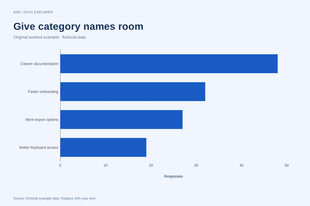
Horizontal bar chart example with long category labels
Horizontal bars give longer category names room to remain readable. This fictional feedback summary compares four requested improvements using response counts, with a shared numeric baseline.
Explore chart & data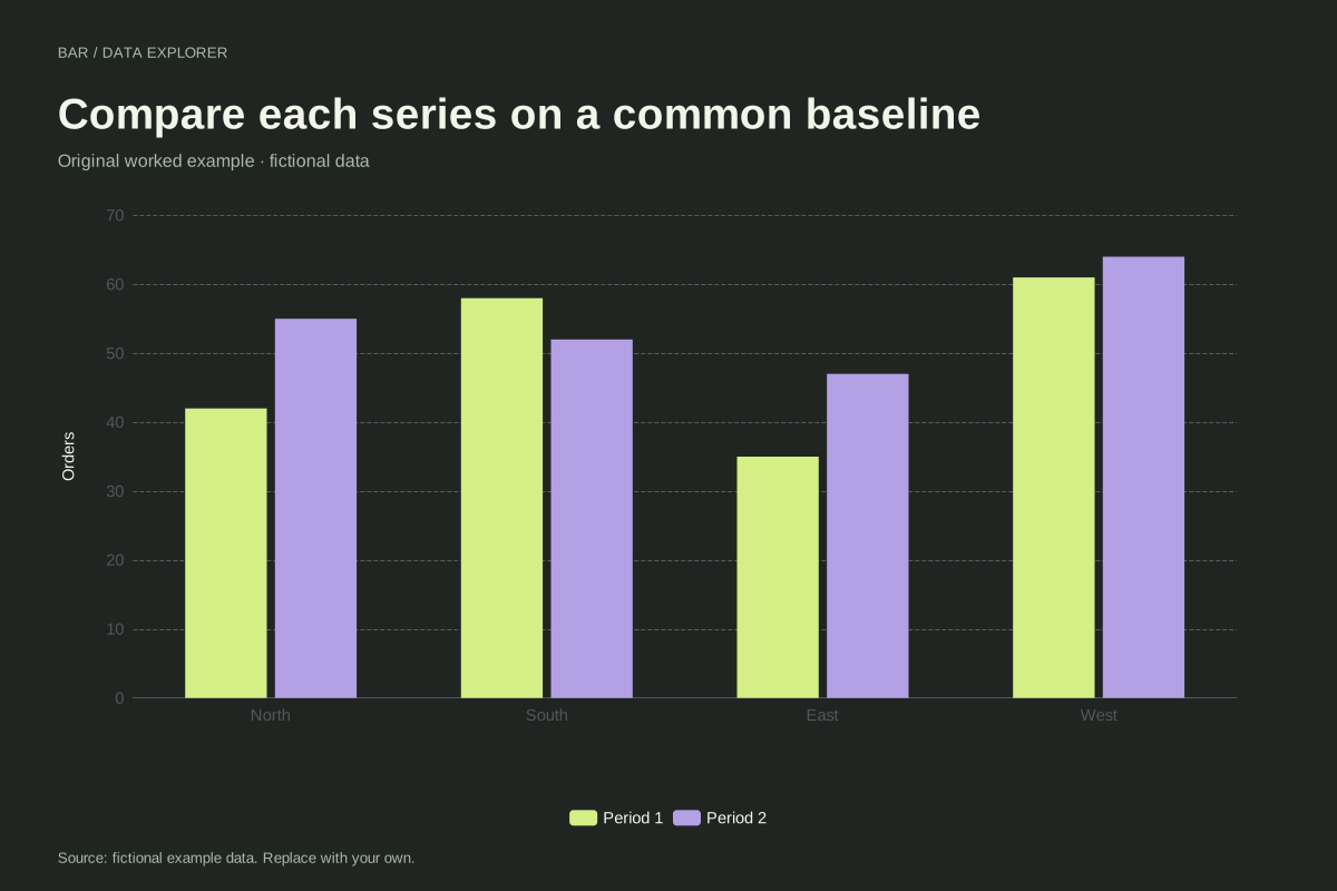
Grouped bar chart comparing two periods
A grouped bar chart places two series beside each other within every category. This fictional regional example compares orders in two reporting periods, preserving a common baseline for direct comparisons.
Explore chart & data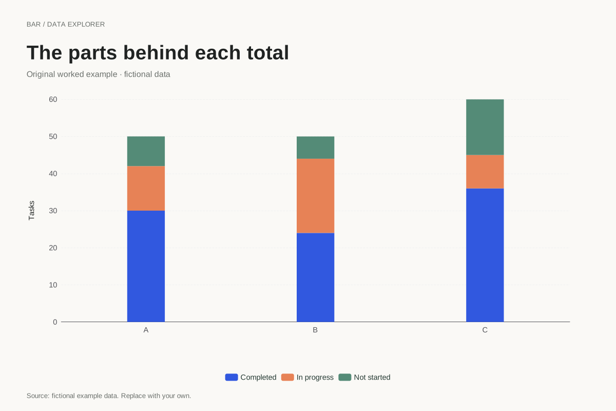
Stacked bar chart showing task composition
This stacked bar chart shows completed, in-progress and not-started tasks within three fictional teams. Each full bar represents the team’s task total, and the coloured segments account for its parts.
Explore chart & data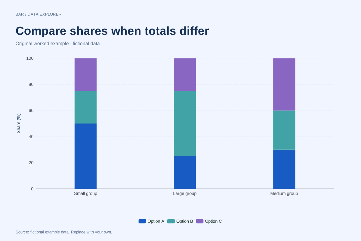
100% stacked bars with unequal totals
A 100% stacked chart compares composition after dividing each category by its own total. This example uses totals of 40, 200 and 100 so readers can see why equal bar heights do not mean equal counts.
Explore chart & data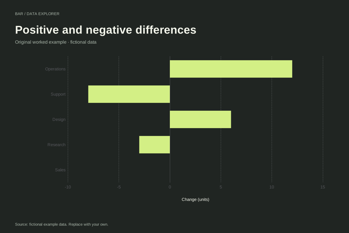
Diverging bar chart with positive and negative changes
A diverging bar chart places positive and negative values on opposite sides of zero. These five fictional departmental changes preserve their signs, including an exact zero for Sales.
Explore chart & data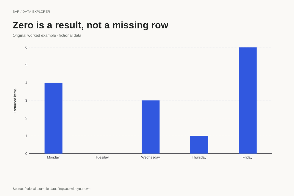
Bar chart with an explicit zero category
A category with zero observations should remain distinguishable from a missing record. This fictional weekday summary includes Tuesday with an explicit zero, preserving the complete sequence of reported days.
Explore chart & dataRead and draw bar graphs on paper
Use bar graph worksheets with answers to practice reading scales, comparing categories and drawing bars.