How to read this chart
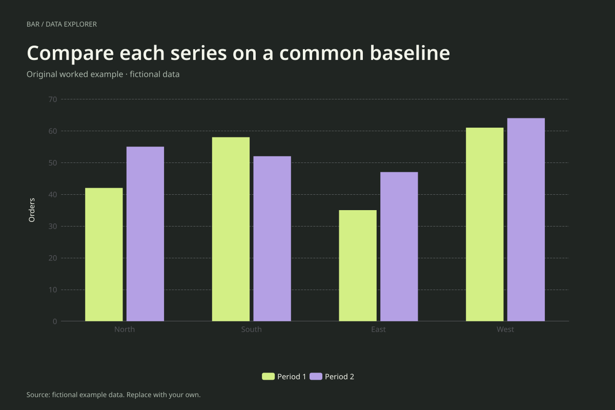
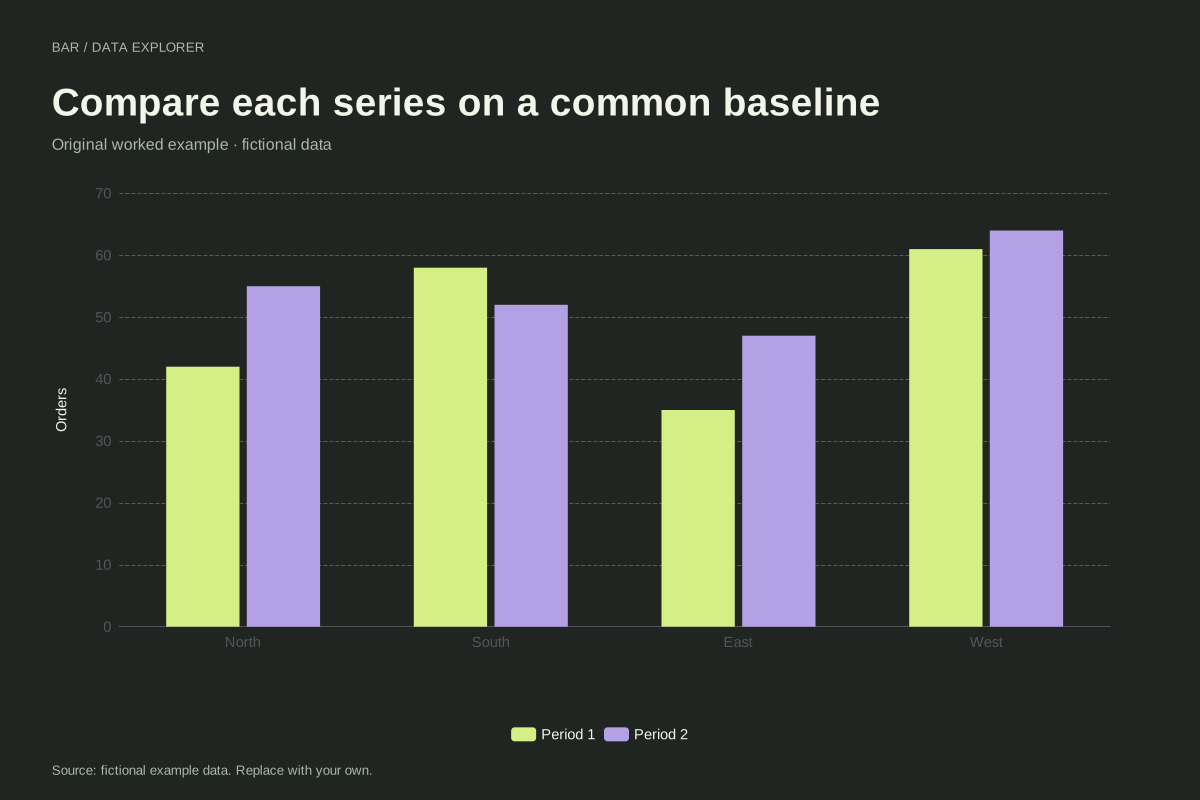
North rises from 42 to 55 orders, East from 35 to 47 and West from 61 to 64. South falls from 58 to 52. The absolute changes are +13, +12, +3 and −6 respectively, so not every region moves in the same direction.
Period 1 totals 196 orders and Period 2 totals 218, an increase of 22 overall. Those aggregate totals do not reveal South’s decline by themselves. The grouped view keeps within-region changes visible alongside the broader pattern.
Try the calculation yourself
Compare this layout with stacked mode in the editor. A stack emphasizes the combined heights of the two periods, but adding periods is often not the question. Keep grouped mode when the task is comparing Period 1 with Period 2 within each region.
Open this exact example, change the data or calculation settings, and compare the result. The CSV preserves the input rows; the ECharts JSON contains drawing options.
What this example cannot tell you
The orders and region labels are invented. The chart does not account for differing period lengths, exposure or regional size. Comparing counts fairly requires those definitions to be consistent, and a higher count is not necessarily a higher rate.
When are grouped bars preferable to stacked bars?
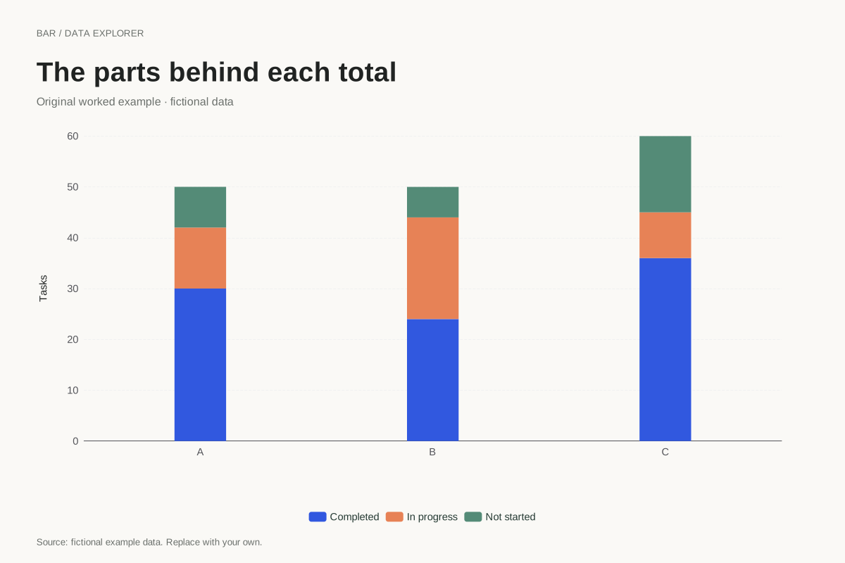
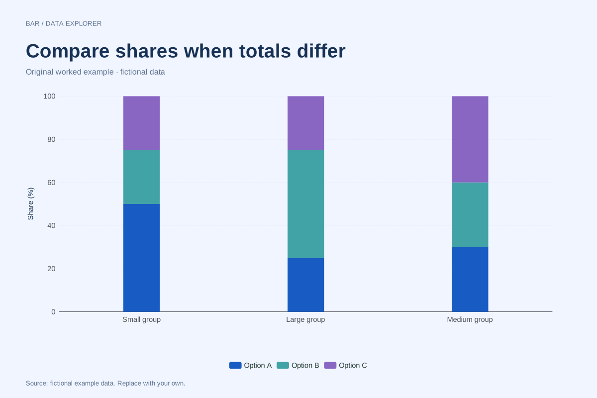
Use grouped bars when each series needs direct comparison from a common baseline. Stacks work better for meaningful parts of a total. In this example the main question is change between periods, so neighbouring bars make that comparison easier to inspect.
Calculation convention
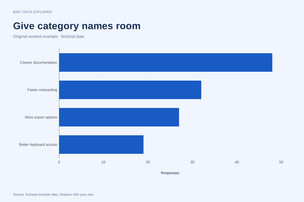
Bars compare magnitudes through length. A numeric axis that includes zero makes those lengths interpretable. Negative values extend in the opposite direction. Category labels are kept in the supplied order, so a chronological or meaningful custom order survives import. Use a Pareto chart if you intentionally want a descending ranking and cumulative share.
Method background: ONS: axes and gridlines.
Created by SupaMakers for ChartsAI · September 8, 2026. Source and reuse terms.