Bar chart examples
Compare named categories with grouped, stacked or 100% stacked bars. Switch orientation for long labels and keep exact values available alongside the graphic. These worked examples make the input values, method and interpretation available together.
Make your own bar chart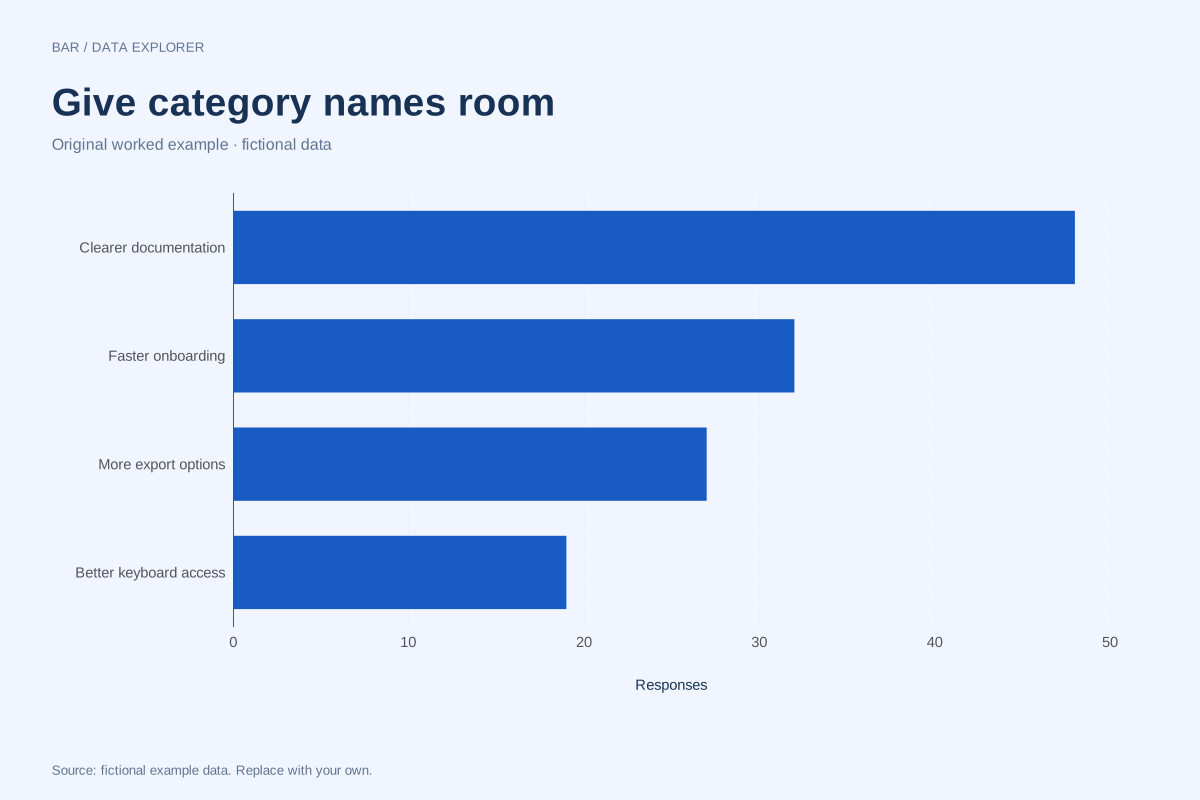
Horizontal bar chart example with long category labels
Horizontal bars give longer category names room to remain readable. This fictional feedback summary compares four requested improvements using response counts, with a shared numeric baseline.
Explore chart & data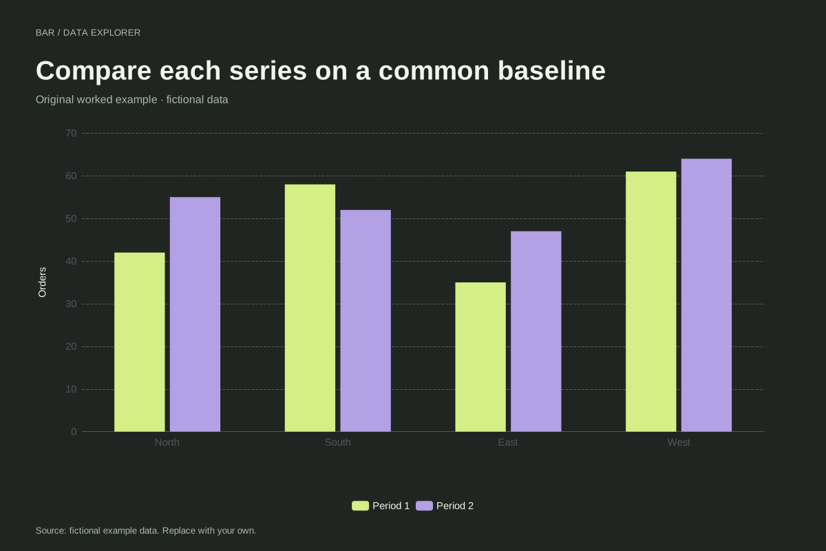
Grouped bar chart comparing two periods
A grouped bar chart places two series beside each other within every category. This fictional regional example compares orders in two reporting periods, preserving a common baseline for direct comparisons.
Explore chart & data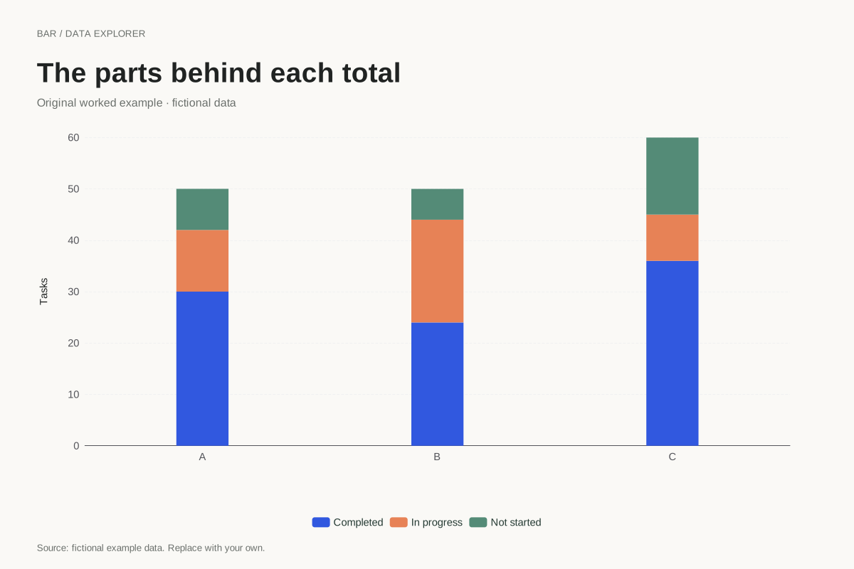
Stacked bar chart showing task composition
This stacked bar chart shows completed, in-progress and not-started tasks within three fictional teams. Each full bar represents the team’s task total, and the coloured segments account for its parts.
Explore chart & data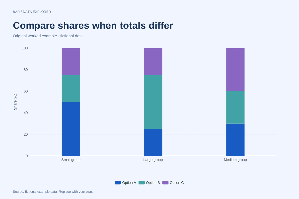
100% stacked bars with unequal totals
A 100% stacked chart compares composition after dividing each category by its own total. This example uses totals of 40, 200 and 100 so readers can see why equal bar heights do not mean equal counts.
Explore chart & data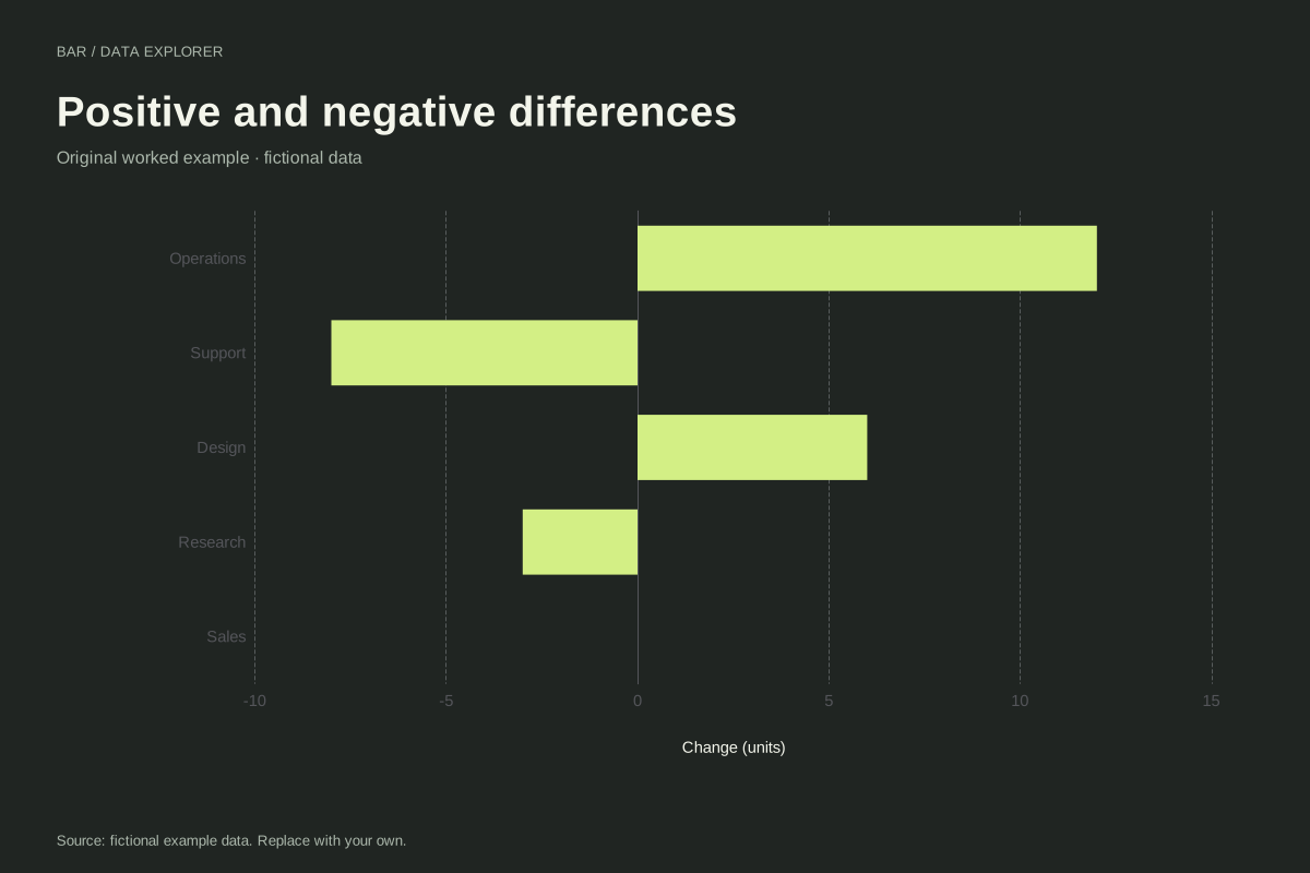
Diverging bar chart with positive and negative changes
A diverging bar chart places positive and negative values on opposite sides of zero. These five fictional departmental changes preserve their signs, including an exact zero for Sales.
Explore chart & data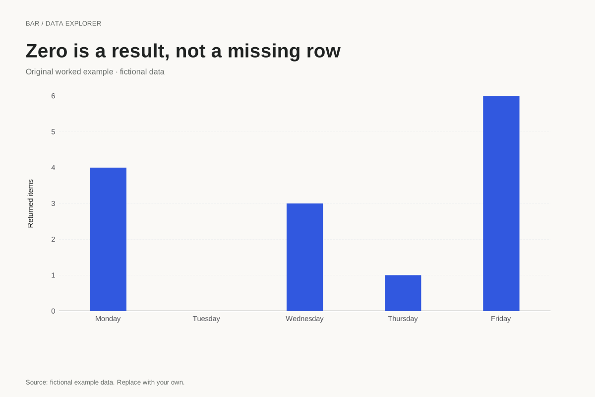
Bar chart with an explicit zero category
A category with zero observations should remain distinguishable from a missing record. This fictional weekday summary includes Tuesday with an explicit zero, preserving the complete sequence of reported days.
Explore chart & dataChoose between amounts, parts and shares
Grouped bars compare each series from a common baseline. Ordinary stacks emphasize meaningful totals and their components. Percentage stacks instead compare composition after dividing each category by its own total. The collection includes a worked case for each question, with raw counts retained even when the plotted values become percentages. Changing the layout should follow a change in the question, not just a preference for a different silhouette.
Use labels and signs as part of the explanation
The horizontal example gives longer category names room and preserves the supplied ranking. The diverging example places signed changes on opposite sides of zero. The weekday case keeps a recorded zero visible as a labelled category with no bar length. These details help distinguish direction, absence and naming choices. They also show why a blank cell cannot be replaced with zero simply to complete a chart.
Prepare categories before asking the chart to compare them
Enter a unique category label followed by one to five comparable numeric measures. Repeated categories need an explicit aggregation in the source, and overlapping parts should not be stacked as if they formed a distinct-item total. Use the input and calculated tables to inspect exactly what a bar encodes. A longer bar does not automatically mean better performance, and a higher percentage does not necessarily correspond to a larger absolute count.
Every dataset in this collection is original and fictional. Use the examples to learn a calculation or start a chart, and replace the source note when adding your own observations. Explore the complete chart library.