How to read this chart
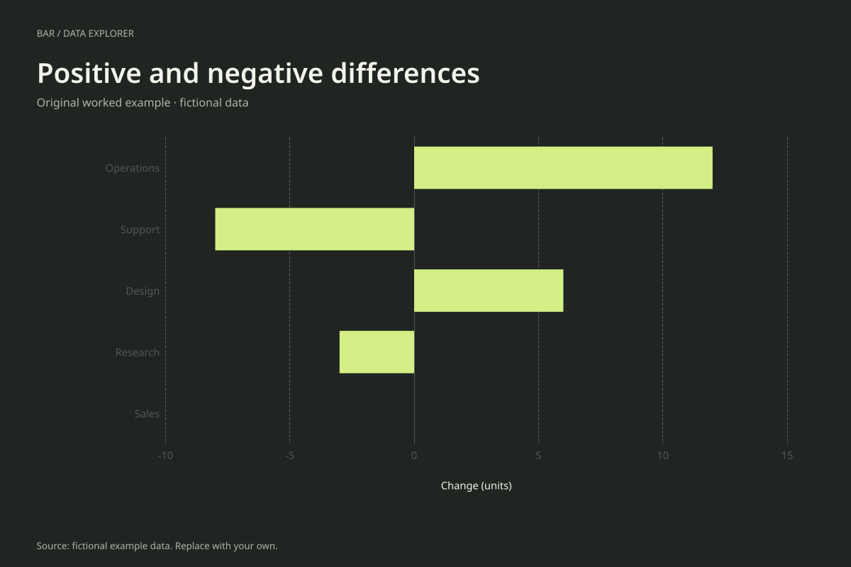
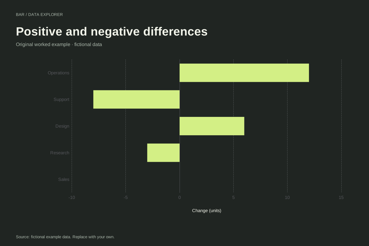
Operations is +12, Support −8, Design +6, Research −3 and Sales 0. The signed total is +7, calculated as 12 − 8 + 6 − 3 + 0. The sum of absolute magnitudes is 29, which answers a different question about total movement.
The zero baseline is the shared reference from which bar lengths extend. A negative bar is not a missing value, and the zero category remains labelled even though its bar has no visible length. The data table distinguishes zero from absence.
Try the calculation yourself
Use a clearly defined difference, such as current minus previous, consistently across categories. If the values are percentage-point changes, label them that way rather than calling them percent growth. Toggle orientation to choose the most readable category labels.
Open this exact example, change the data or calculation settings, and compare the result. The CSV preserves the input rows; the ECharts JSON contains drawing options.
What this example cannot tell you
The changes are invented and do not describe departmental performance. Adding them is meaningful only when their units and definitions are compatible. Percentage changes with different denominators generally cannot be added as though they were absolute counts.
Can signed values be used in 100% stacked mode?
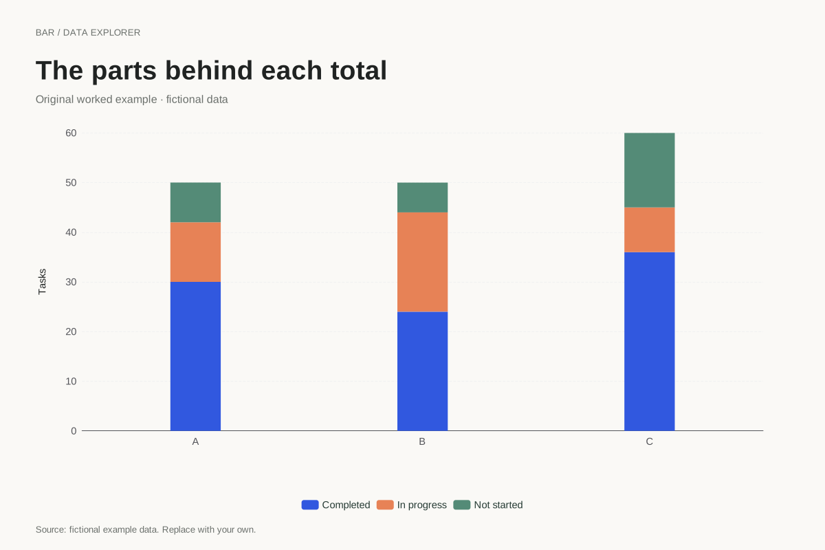
This maker rejects them in percentage mode because that mode represents nonnegative parts of a positive total. Use grouped or ordinary stacked values for signed measurements, and keep the zero reference visible so direction remains interpretable.
Calculation convention
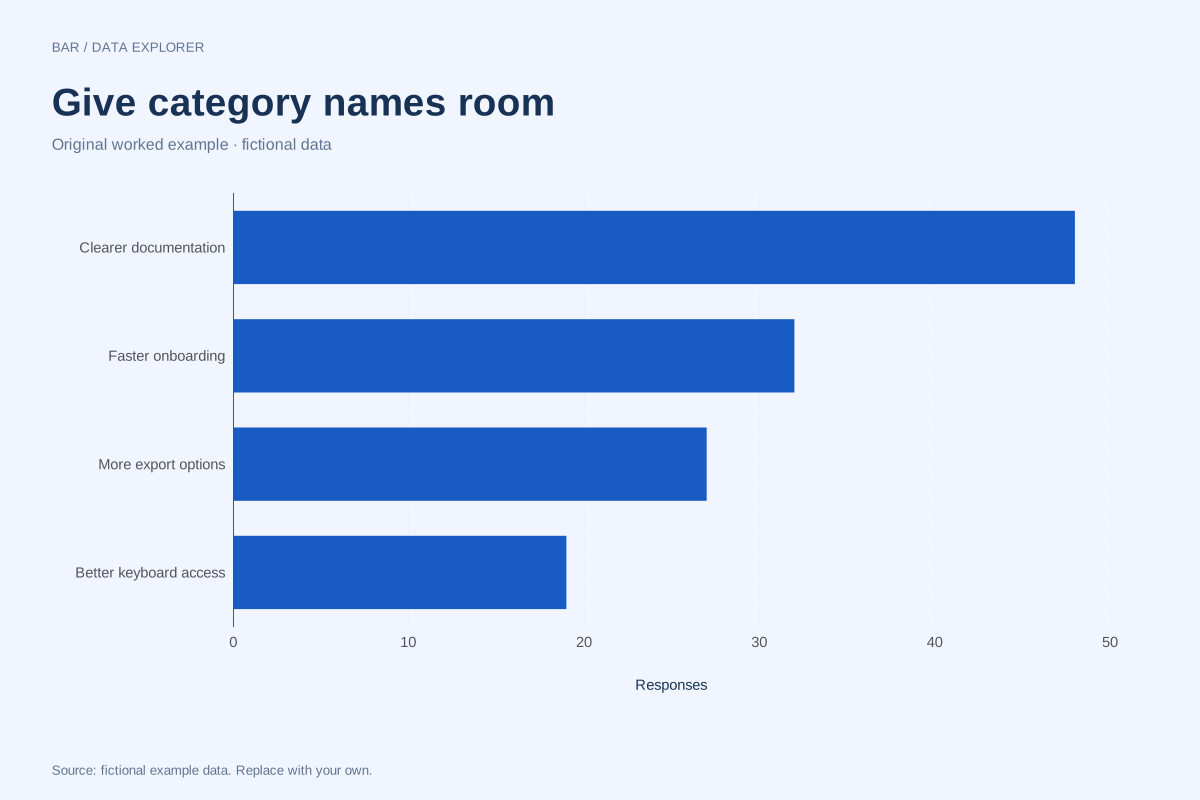
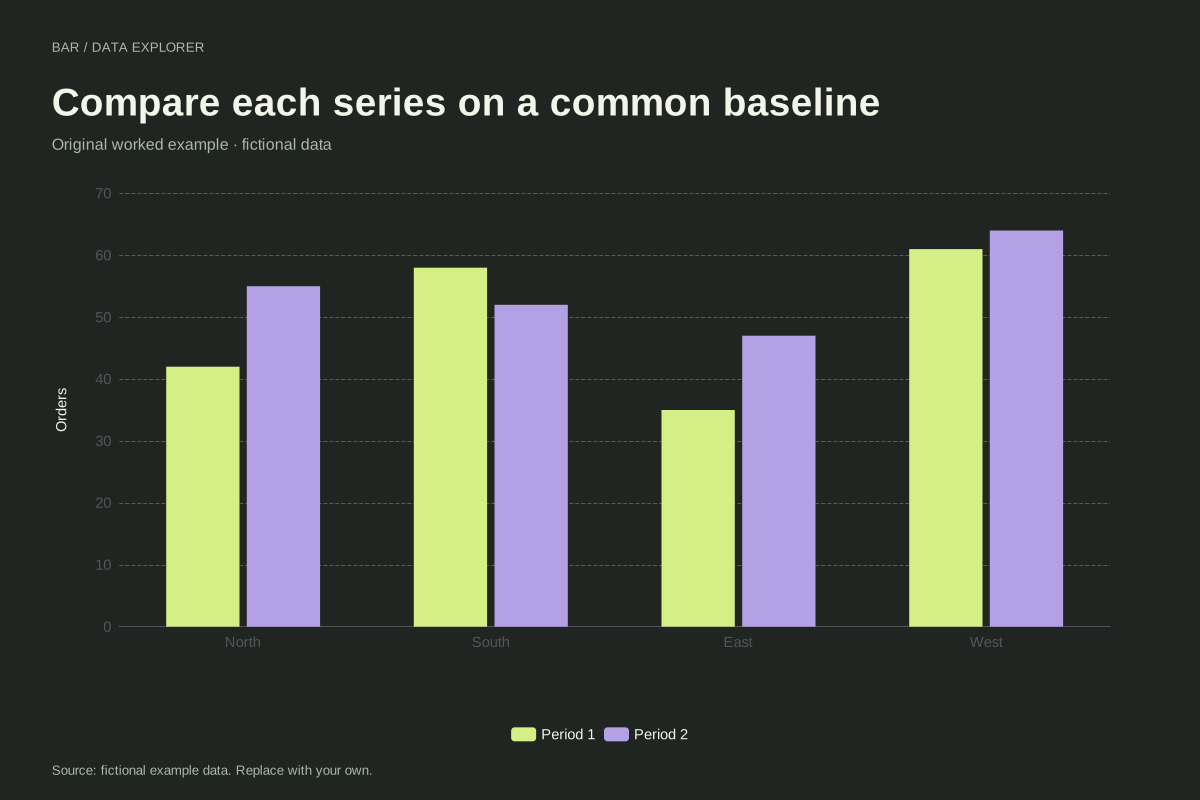
Bars compare magnitudes through length. A numeric axis that includes zero makes those lengths interpretable. Negative values extend in the opposite direction. Category labels are kept in the supplied order, so a chronological or meaningful custom order survives import. Use a Pareto chart if you intentionally want a descending ranking and cumulative share.
Method background: ONS: axes and gridlines.
Created by SupaMakers for ChartsAI · September 8, 2026. Source and reuse terms.