How to read this chart
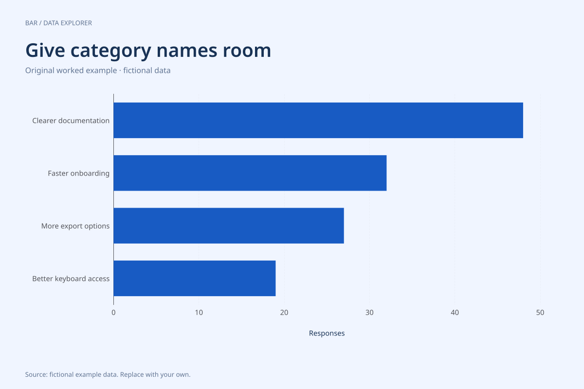
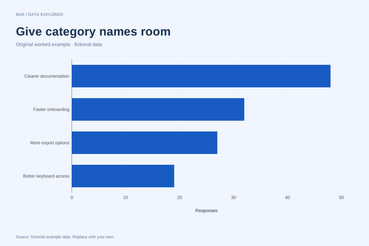
Clearer documentation has 48 responses, faster onboarding 32, more export options 27 and better keyboard access 19. The difference between the first and last categories is 29 responses. Reading the bar endpoints against the same axis makes that absolute difference visible.
The counts sum to 126 selections. That total is not necessarily 126 people: a survey allowing multiple choices could produce several selections per respondent. The chart needs the original survey design before counts can be translated into percentages of people.
Try the calculation yourself
Switch to vertical orientation and compare the labels. Horizontal orientation is useful when category names become hard to read beneath narrow columns. Keep the order deliberate; this example already lists counts from high to low, but the bar maker does not reorder your rows automatically.
Open this exact example, change the data or calculation settings, and compare the result. The CSV preserves the input rows; the ECharts JSON contains drawing options.
What this example cannot tell you
The feedback is fictional and should not be presented as a product survey. Counts do not show request severity, respondent representativeness or development cost. A longer bar indicates more recorded selections, not an automatic roadmap priority.
Should category names be shortened to fit?
Use horizontal bars first when the names carry useful meaning. Shortening can help, but abbreviations should remain understandable without guessing. The original labels stay in the data table and CSV even if a dense chart has to truncate visible axis text.
Calculation convention
Bars compare magnitudes through length. A numeric axis that includes zero makes those lengths interpretable. Negative values extend in the opposite direction. Category labels are kept in the supplied order, so a chronological or meaningful custom order survives import. Use a Pareto chart if you intentionally want a descending ranking and cumulative share.
Method background: ONS: axes and gridlines.
Created by SupaMakers for ChartsAI · September 8, 2026. Source and reuse terms.