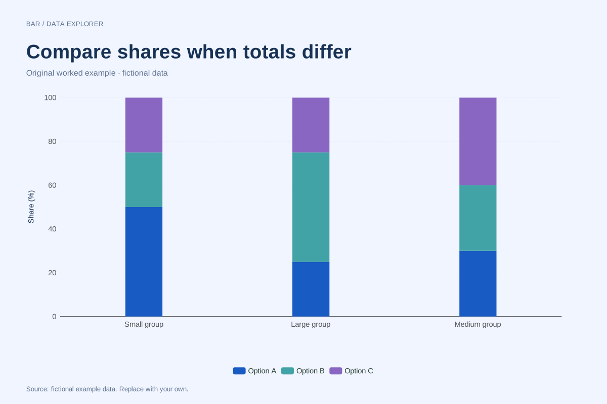
How to read this chart
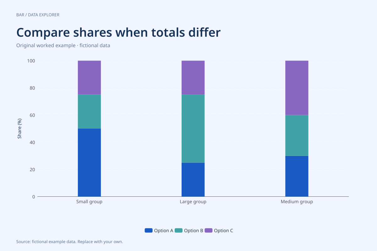
The small group contains 20, 10 and 10, giving shares of 50%, 25% and 25%. The large group contains 50, 100 and 50, giving 25%, 50% and 25%. The medium group contains 30, 30 and 40, giving 30%, 30% and 40%.
The large group has the most observations in the first series, 50, but a smaller first-series share than the small group, 25% versus 50%. Counts and proportions answer different questions; neither can substitute for the other without considering the denominator.
Try the calculation yourself
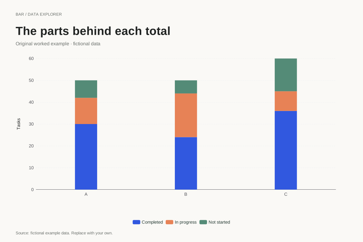
Switch to ordinary stacked mode to compare totals, then return to percentage mode for composition. Keep the original CSV alongside the chart so readers can recover the denominators. The calculated table reports transformed percentages while the CSV retains counts.
Open this exact example, change the data or calculation settings, and compare the result. The CSV preserves the input rows; the ECharts JSON contains drawing options.
What this example cannot tell you
The groups and counts are fictional. Every category needs a positive total and nonnegative parts. A zero-total category has no defined percentage composition and is rejected rather than displayed as a misleading empty 100% bar.
Why are all bars the same height?
Each bar is divided by its own category total, making its full height 100%. This intentionally removes differences in total size. Report counts separately when group size matters, especially when comparing a small sample with a much larger one.
Calculation convention
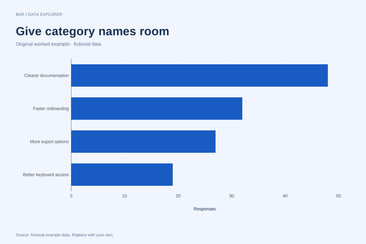
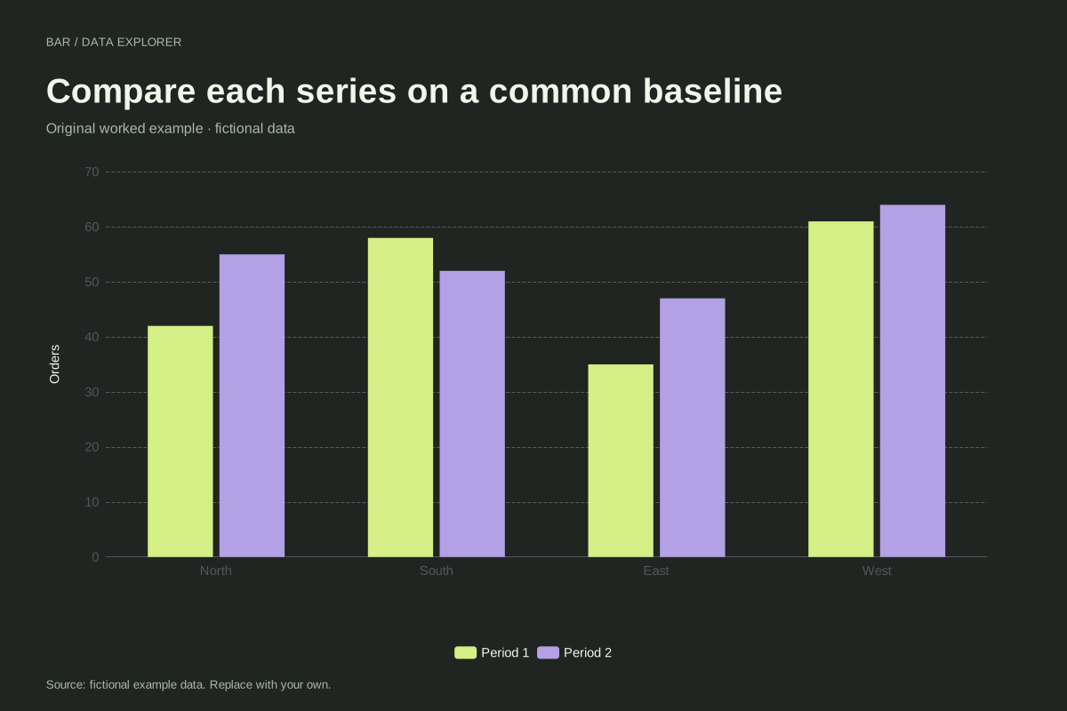
Bars compare magnitudes through length. A numeric axis that includes zero makes those lengths interpretable. Negative values extend in the opposite direction. Category labels are kept in the supplied order, so a chronological or meaningful custom order survives import. Use a Pareto chart if you intentionally want a descending ranking and cumulative share.
Method background: ONS: axes and gridlines.
Created by SupaMakers for ChartsAI · September 8, 2026. Source and reuse terms.