How to read this chart
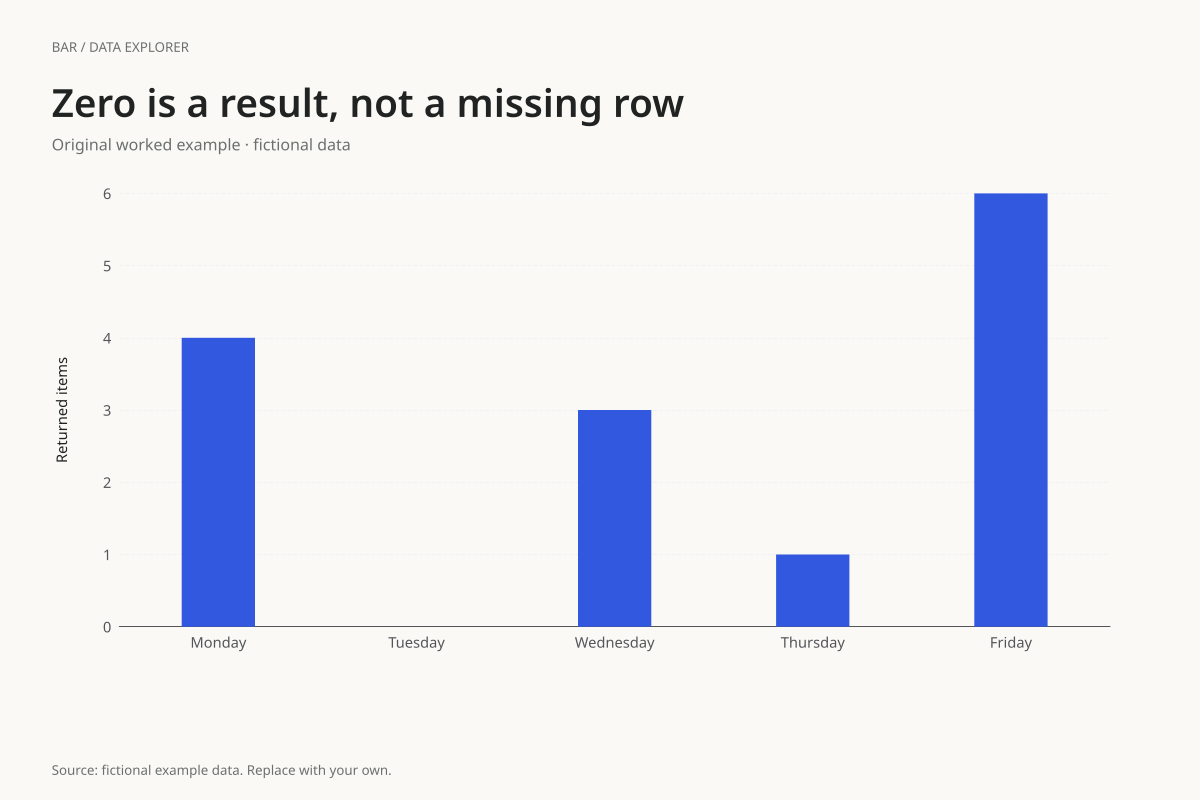
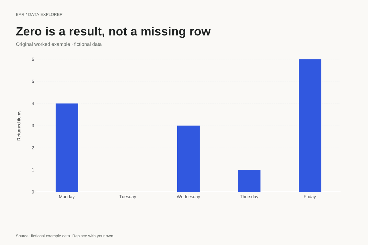
The counts are Monday 4, Tuesday 0, Wednesday 3, Thursday 1 and Friday 6. They total 14. Tuesday has no bar length, but its label and table row remain present. Removing the category would hide the fact that a zero was recorded.
The zero does not prove that no underlying event could have occurred. It means the supplied count is zero under the stated collection process. A blank cell would instead be incomplete input and would require correction before this maker could render the table.
Try the calculation yourself
Replace Tuesday’s zero with an empty cell and try applying the data to see the validation message. Restore zero only if it is a known observation. If a day was not measured, explain the gap in your reporting rather than converting absence into a numerical count.
Open this exact example, change the data or calculation settings, and compare the result. The CSV preserves the input rows; the ECharts JSON contains drawing options.
What this example cannot tell you
The counts are fictional and do not establish a weekly pattern. One five-day period provides no information about seasonality or typical weekday performance. The bars preserve supplied order without inferring a time-series model.
Why is Tuesday still on the axis?
Its category is part of the input and its value is explicitly zero. Keeping it communicates a recorded zero and preserves the intended comparison. Missing data and zero are different states, even when a chart might otherwise make both look like an absent bar.
Calculation convention
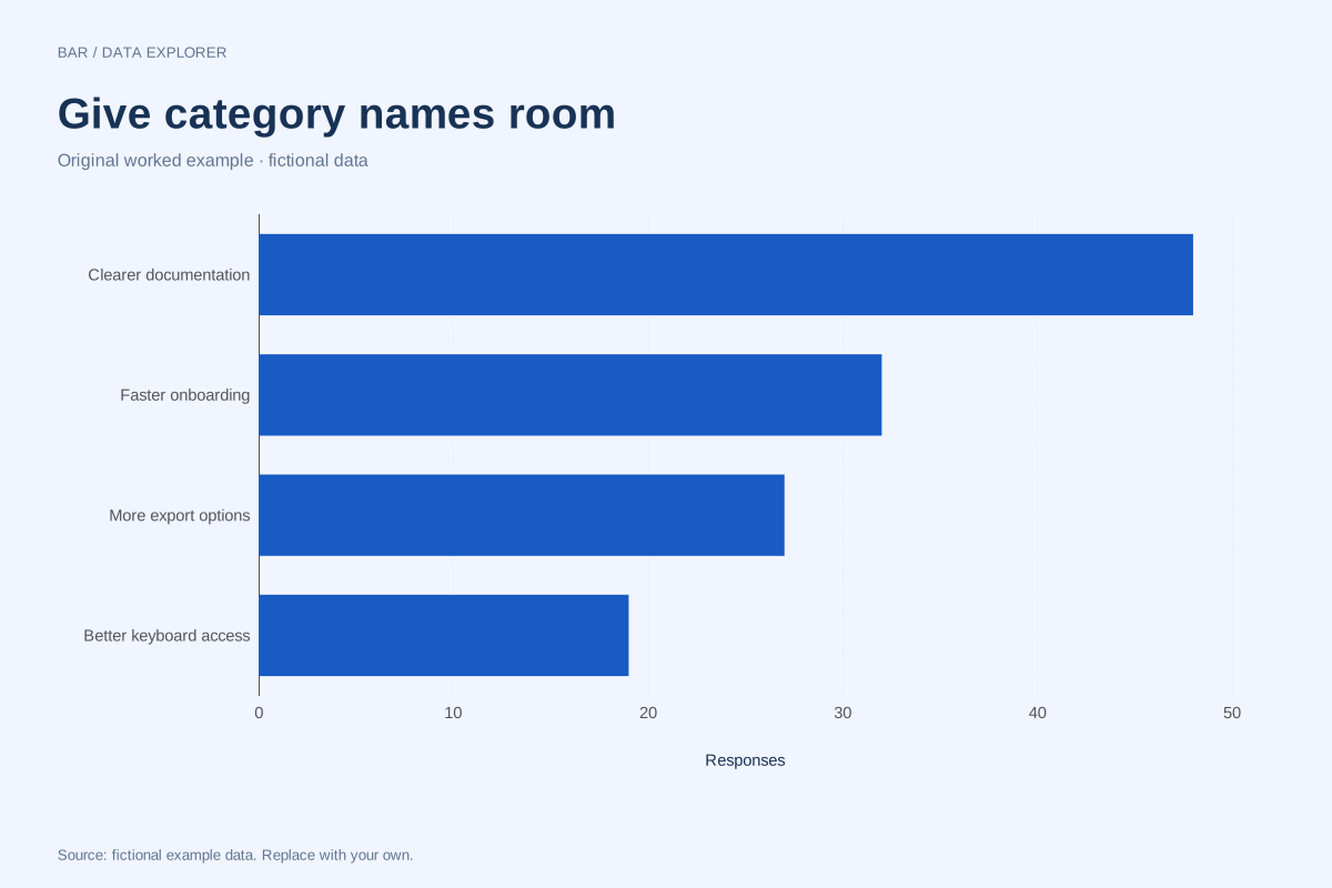
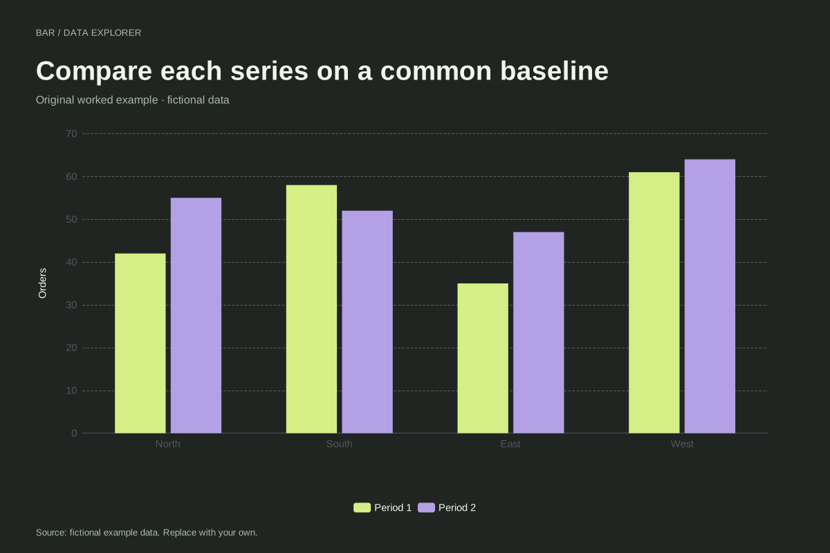
Bars compare magnitudes through length. A numeric axis that includes zero makes those lengths interpretable. Negative values extend in the opposite direction. Category labels are kept in the supplied order, so a chronological or meaningful custom order survives import. Use a Pareto chart if you intentionally want a descending ranking and cumulative share.
Method background: ONS: axes and gridlines.
Created by SupaMakers for ChartsAI · September 8, 2026. Source and reuse terms.