A trend needs context.
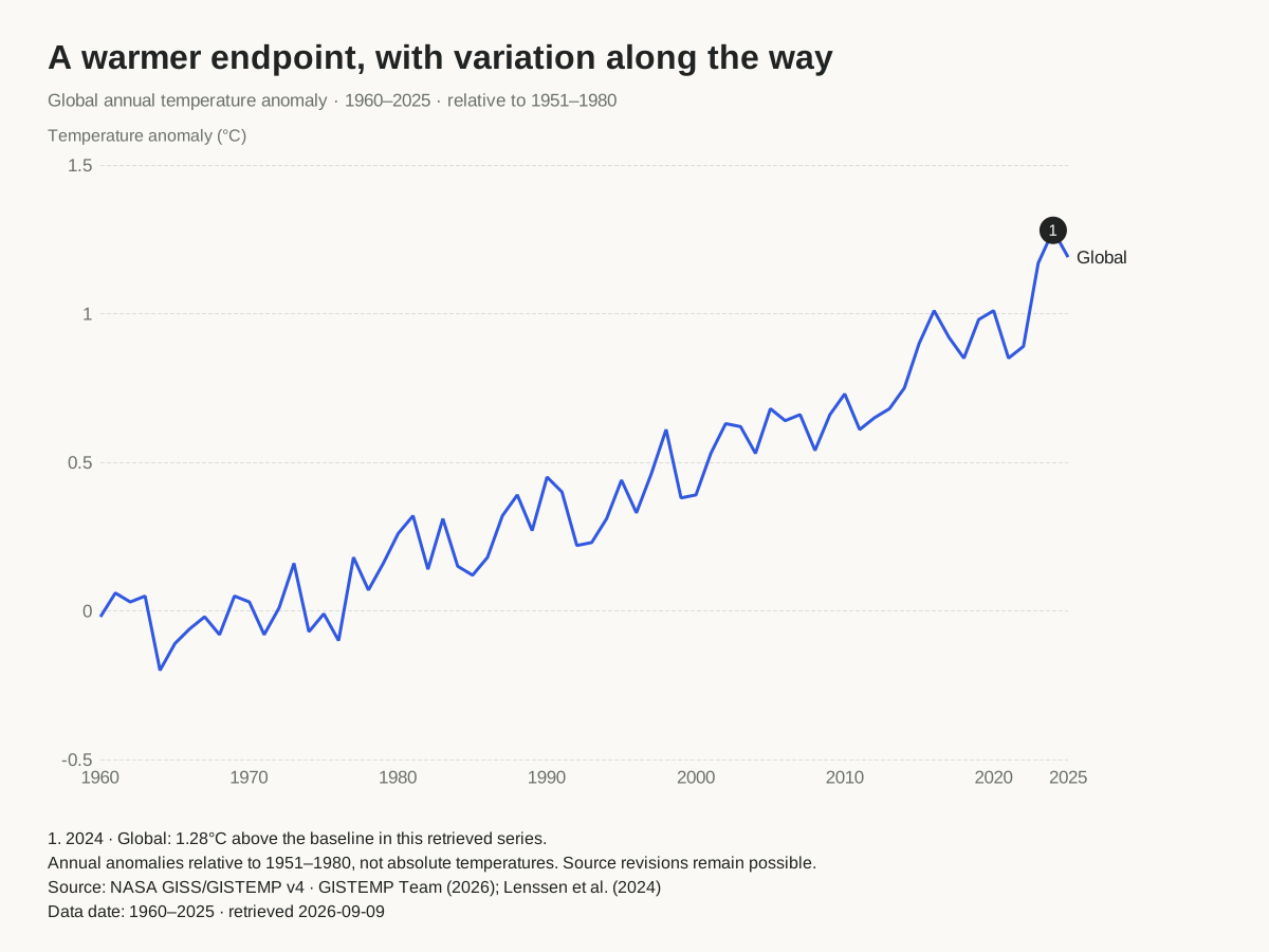
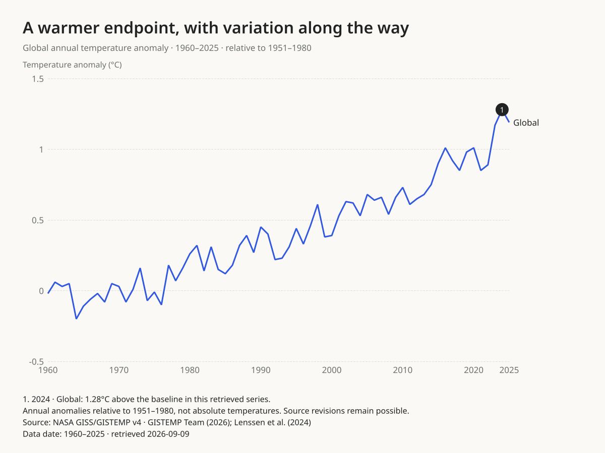
An annotated line chart should tell readers what the values measure, what the reference point means and which observation a note describes. This example makes those choices explicit using a pinned NASA GISTEMP dataset.
By ChartsAI / SupaMakers · Reviewed September 9, 2026. Source retrieved September 9, 2026.
What does zero mean?
These are anomalies relative to the 1951–1980 average, not absolute temperatures and not a pre-industrial baseline. Zero marks that reference average. The example includes zero on the vertical axis so the reference remains visible. Replacing the baseline label without recalculating the values would misrepresent the data.
Keep the note attached to the observation
The numbered marker refers to the Global series in the 2024 row. It moves with that data coordinate when the canvas changes. Its complete text appears below the plot, where it can be read without hover. The editor rejects an annotation that refers to a missing row or series; replacing the data clears previous annotations explicitly.
A useful note identifies a supported observation. It should not invent a cause for a rise or fall. The line joins consecutive annual estimates and does not claim to describe daily temperatures. The CSV and data table let readers check the point independently of the graphic.
Selection and calculations
We selected the J-D annual column for every year from 1960 through 2025: 66 values, with no omissions, interpolation or smoothing. We did not average the monthly columns ourselves. The horizontal scale uses numeric years, and the labels retain the source’s two decimal places. This pinned example does not include incomplete 2026 data or update automatically.
NASA’s estimates may be revised. A retrieved snapshot makes this chart reproducible; it does not make the values permanently final. This graphic does not include the uncertainty ensemble. Consult the primary method and uncertainty publication when making scientific claims from the record.
Source and scientific citation
GISTEMP Team (2026), GISS Surface Temperature Analysis, version 4, NASA GISS, accessed 2026-09-09. Also cite Lenssen et al. (2024), A GISTEMPv4 observational uncertainty ensemble. NASA’s GISTEMP page provides citation and image-credit guidance; retain the source acknowledgment when reusing this example. ChartsAI created this graphic from the source values; NASA has not endorsed the presentation.
All 66 source values · anomaly in °C
| Year | Global anomaly (°C) |
|---|---|
| 1960 | -.02 |
| 1961 | .06 |
| 1962 | .03 |
| 1963 | .05 |
| 1964 | -.20 |
| 1965 | -.11 |
| 1966 | -.06 |
| 1967 | -.02 |
| 1968 | -.08 |
| 1969 | .05 |
| 1970 | .03 |
| 1971 | -.08 |
| 1972 | .01 |
| 1973 | .16 |
| 1974 | -.07 |
| 1975 | -.01 |
| 1976 | -.10 |
| 1977 | .18 |
| 1978 | .07 |
| 1979 | .16 |
| 1980 | .26 |
| 1981 | .32 |
| 1982 | .14 |
| 1983 | .31 |
| 1984 | .15 |
| 1985 | .12 |
| 1986 | .18 |
| 1987 | .32 |
| 1988 | .39 |
| 1989 | .27 |
| 1990 | .45 |
| 1991 | .40 |
| 1992 | .22 |
| 1993 | .23 |
| 1994 | .31 |
| 1995 | .44 |
| 1996 | .33 |
| 1997 | .46 |
| 1998 | .61 |
| 1999 | .38 |
| 2000 | .39 |
| 2001 | .53 |
| 2002 | .63 |
| 2003 | .62 |
| 2004 | .53 |
| 2005 | .68 |
| 2006 | .64 |
| 2007 | .66 |
| 2008 | .54 |
| 2009 | .66 |
| 2010 | .73 |
| 2011 | .61 |
| 2012 | .65 |
| 2013 | .68 |
| 2014 | .75 |
| 2015 | .90 |
| 2016 | 1.01 |
| 2017 | .92 |
| 2018 | .85 |
| 2019 | .98 |
| 2020 | 1.01 |
| 2021 | .85 |
| 2022 | .89 |
| 2023 | 1.17 |
| 2024 | 1.28 |
| 2025 | 1.19 |
Reuse the workflow
Open the publication line maker, inspect the source example, then import your own table. Keep the unit and reference period close to the headline. The publishing guide explains SVG, HTML, captions and the optional AnimCharts file handoff. For multiple overlapping trends, compare the small multiples maker.