Box plot maker.
Upload a CSV or Excel file, or paste your data. Choose the columns to plot, preview your box plot, and download it free.
Preview your box plot
Each box summarizes a group. Outliers remain visible as individual points.
Blueprint styleDownload your chart
PNG for slides · SVG for editing · PDF for printing
Calculated values
Whiskers end on observations. Flagged values remain in the data and appear as points.
| Group | N | Minimum | Q1 | Median | Q3 | Maximum | Low whisker | High whisker | IQR | Flagged observations |
|---|---|---|---|---|---|---|---|---|---|---|
| Morning | 8 | 10 | 11.75 | 13.5 | 15.25 | 17 | 10 | 17 | 3.5 | 0 |
| Evening | 8 | 8 | 11.5 | 15 | 18.5 | 22 | 8 | 22 | 7 | 0 |
Inspect every input row (16)
| Group | Value |
|---|---|
| Morning | 10 |
| Morning | 11 |
| Morning | 12 |
| Morning | 13 |
| Morning | 14 |
| Morning | 15 |
| Morning | 16 |
| Morning | 17 |
| Evening | 8 |
| Evening | 10 |
| Evening | 12 |
| Evening | 14 |
| Evening | 16 |
| Evening | 18 |
| Evening | 20 |
| Evening | 22 |
How to make a box plot
Compare distributions using calculated quartiles, medians and whiskers. Choose linear-interpolated quartiles or the exclusive median-of-halves method, and keep outlying observations visible.
- Upload a file or paste spreadsheet cells. Choose the columns and check the preview before creating your chart.
- Inspect every selected row. Missing or invalid numbers need correction; they are never filled with zero.
- Set the calculation options, then inspect the calculated values below the chart.
- Edit the title, labels and source note. Download an image, PDF, original CSV or ECharts configuration.
The editor accepts up to 2,000 observations for distributions and scatter plots, eight box-plot groups, or 50 bar/Pareto categories. A bar chart can include up to five series. Spreadsheet preview accepts files up to 8 MB, 2,000 rows and 100 columns. Data stays in your browser.
Choose a quartile convention
The default uses linear interpolation at rank (n − 1)p in the sorted sample, equivalent to R quantile type 7. At p = 0.25, 0.5 and 0.75 this gives Q1, the median and Q3. The alternate method takes medians of the lower and upper halves, excluding the middle observation when the sample size is odd. These methods can give different results for the same small sample.
Fences and whiskers are different
The IQR is Q3 minus Q1. With the 1.5 × IQR rule, the lower fence is Q1 − 1.5 × IQR and the upper fence is Q3 + 1.5 × IQR. Whiskers stop at the most extreme observed values within those fences. They are not usually located exactly on the fence. Observations beyond the fences appear as separate points and stay in the input data.
Compare groups with their sample sizes
Use long-format data: a group name followed by one observation on each row. Repeat the group name for its other observations. This handles unequal group sizes without inventing blank values. The summary table includes each group’s N, full minimum and maximum, quartiles, IQR, whiskers and number of flagged observations.
Understand the limits of the picture
The standard box spans the middle half of the data. Its width does not encode sample size, and the tool does not add notches, confidence intervals or a significance test. Minimum-to-maximum whiskers are available as an explicit alternative. Selecting them changes the displayed summary; it does not remove or correct unusual values.
Method references
Built by SupaMakers. Inspect the open source calculations and reuse terms.
Worked box plot examples
Explore the collection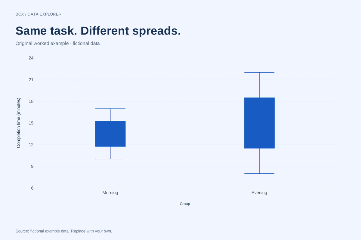
Side-by-side box plots comparing two groups
These box plots compare fictional morning and evening completion times. Both groups contain eight observations, but the evening sample has a wider middle spread and a higher median.
Explore chart & data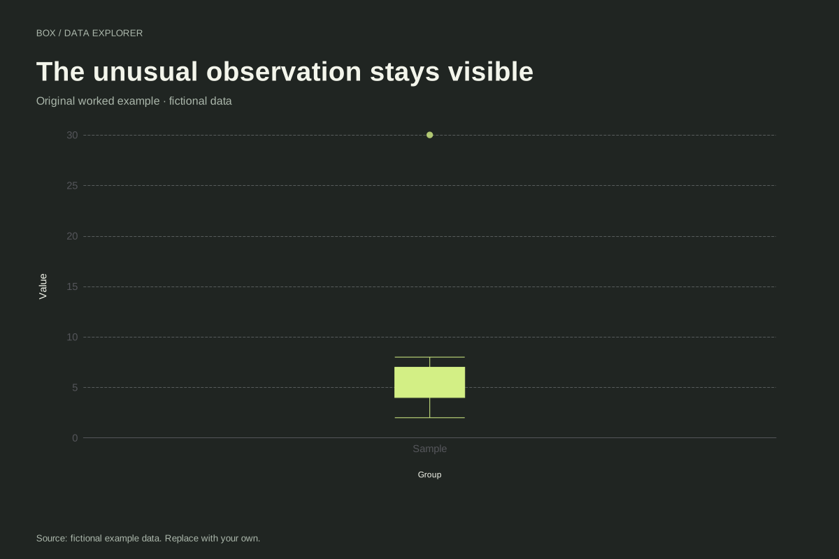
Box plot with an outlier and visible fences calculation
This box plot keeps a large fictional observation visible as a separate point. The nine values run from 2 to 30, with most between 2 and 8. The 1.5 × IQR rule determines where the whiskers stop.
Explore chart & data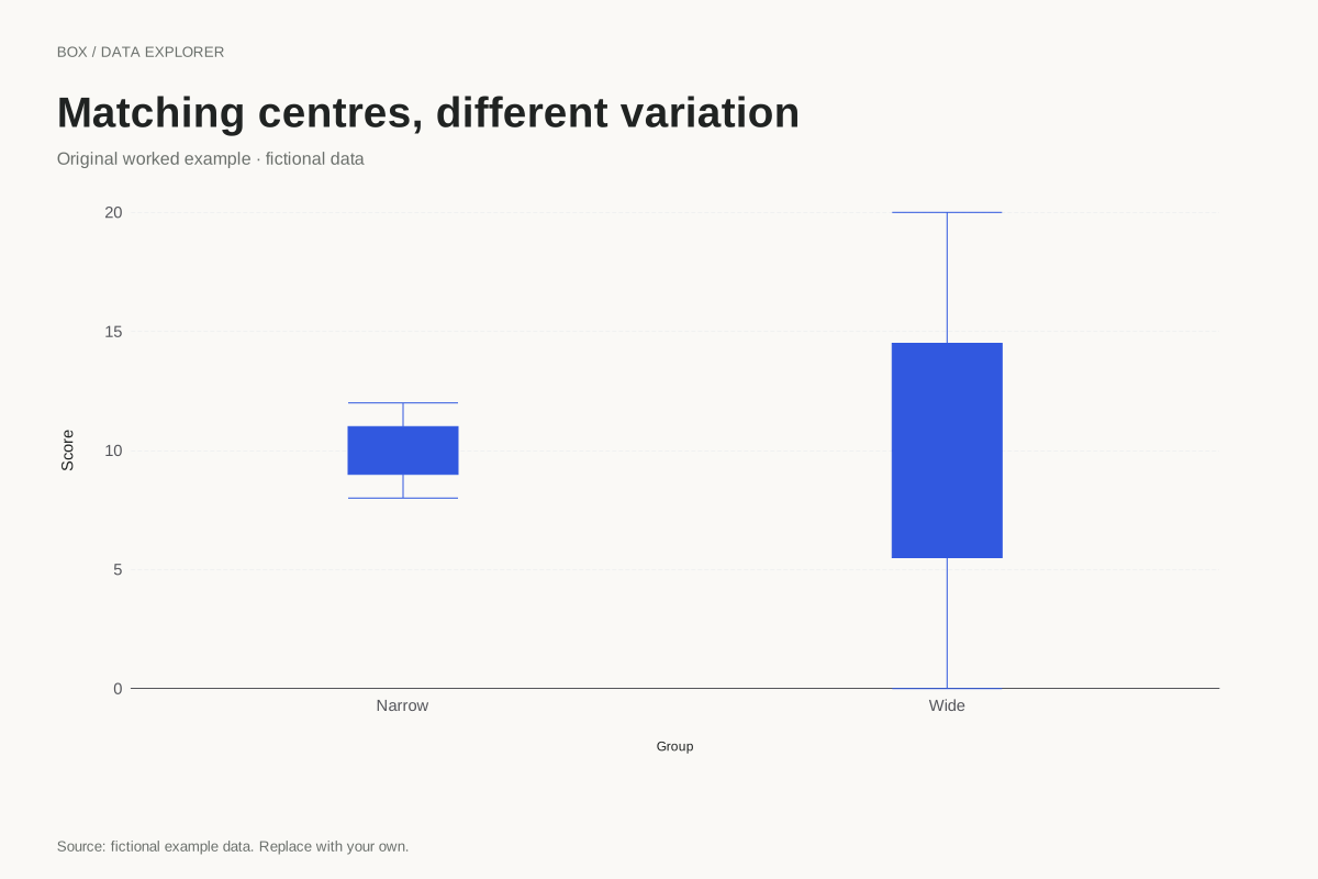
Box plots with equal medians and different spreads
Two groups can have the same median while looking very different in a box plot. These fictional samples both centre on 10, but the wide group has a much larger IQR and observed range.
Explore chart & data
Box plot quartiles for a five-value sample
Quartile conventions can visibly change a small-sample box plot. This example uses 2, 4, 7, 10 and 16 with the median-of-halves method, excluding the overall middle observation when forming the halves.
Explore chart & data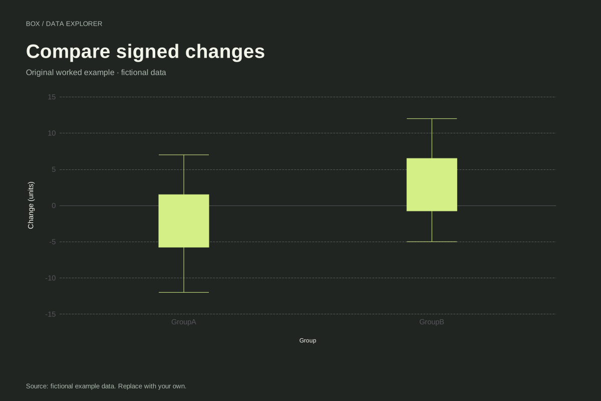
Box plots of signed changes around zero
These box plots compare signed fictional changes for two groups. Negative observations remain valid values, and the zero reference helps distinguish decreases from increases without forcing the whole distribution above zero.
Explore chart & data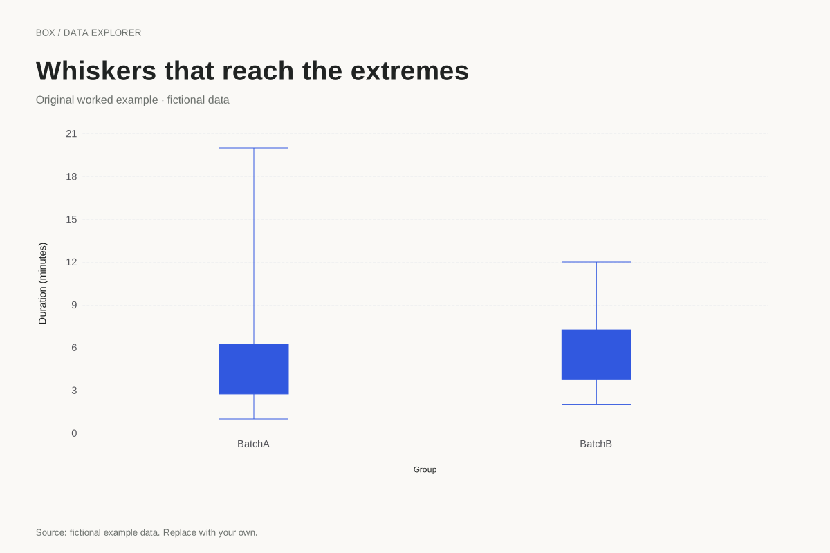
Minimum-to-maximum box plot whiskers
A box plot can use whiskers that reach the observed minimum and maximum. This example selects that convention explicitly, so large observations are included in the whisker range rather than drawn as separate IQR flags.
Explore chart & data