How to read this chart
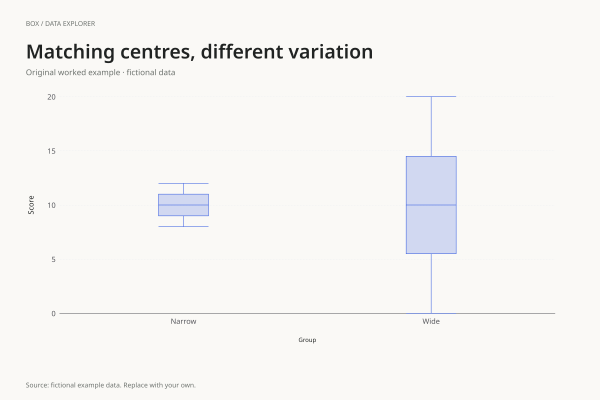
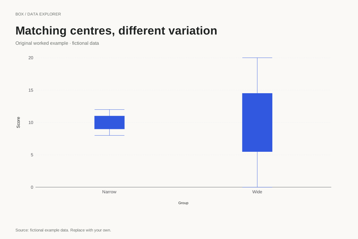
The narrow group has Q1 9, median 10 and Q3 11 under linear interpolation. Its IQR is 2 and its values range from 8 to 12. The wide group has Q1 5.5, median 10 and Q3 14.5, giving an IQR of 9 and a range from 0 to 20.
Both samples have eight observations. The two middle values are 10 and 10 in each list, which explains the equal medians. Looking only at that shared centre would omit how tightly or loosely the other values are distributed around it.
Try the calculation yourself
Read the data table next to the chart and count observations on either side of 10. Then try replacing one extreme value without changing the two middle positions. The median can remain fixed while the whisker, range or outlier status changes, depending on the replacement.
Open this exact example, change the data or calculation settings, and compare the result. The CSV preserves the input rows; the ECharts JSON contains drawing options.
What this example cannot tell you
A smaller spread is not automatically better. That judgement depends on the measure and purpose. These scores are fictional, and the chart does not calculate consistency targets or compare population variances.
Does the same median mean the same distribution?
No. The median describes a central position in an ordered sample. It does not specify the range, IQR, shape or frequency of exact values. This pair is a worked example of how identical centres can accompany very different variation.
Calculation convention
The default uses linear interpolation at rank (n − 1)p in the sorted sample, equivalent to R quantile type 7. At p = 0.25, 0.5 and 0.75 this gives Q1, the median and Q3. The alternate method takes medians of the lower and upper halves, excluding the middle observation when the sample size is odd. These methods can give different results for the same small sample.
Method background: NIST: box plot and fence interpretation. R documentation: quantile methods.
Created by SupaMakers for ChartsAI · September 8, 2026. Source and reuse terms.