Box plot examples
Compare distributions using calculated quartiles, medians and whiskers. Choose linear-interpolated quartiles or the exclusive median-of-halves method, and keep outlying observations visible. These worked examples make the input values, method and interpretation available together.
Make your own box plot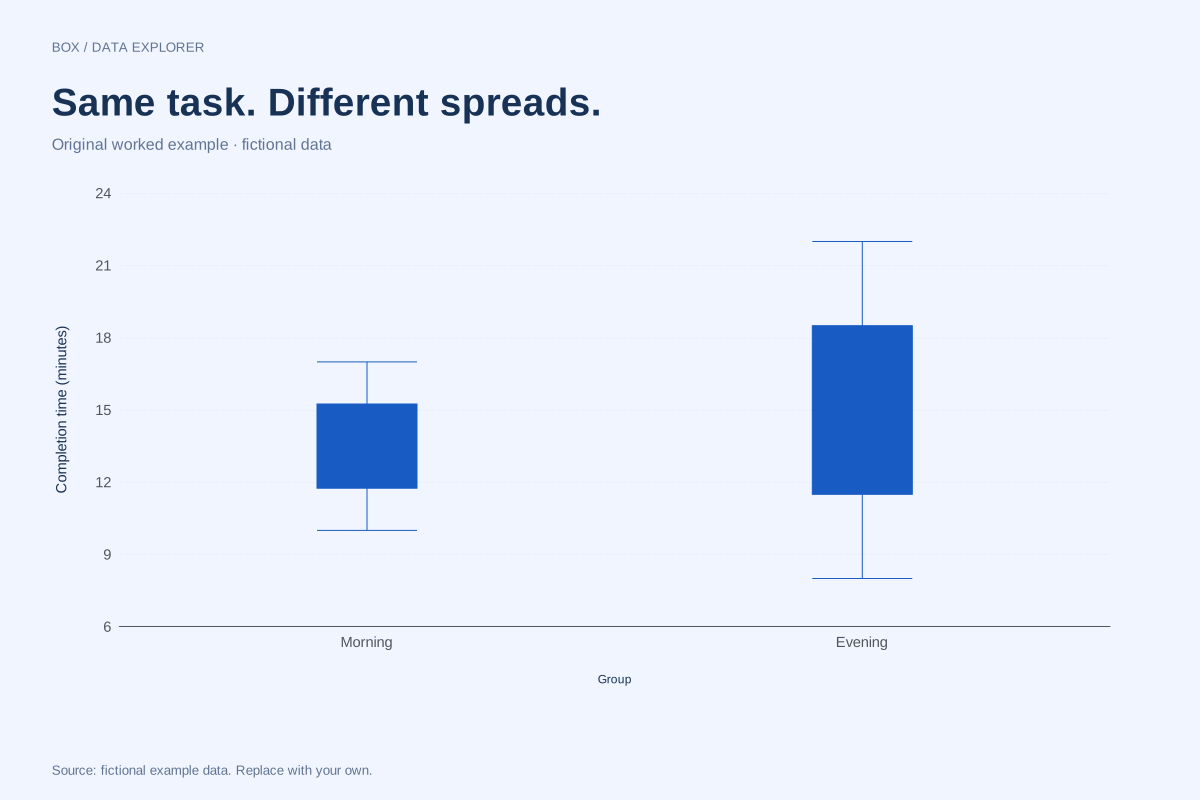
Side-by-side box plots comparing two groups
These box plots compare fictional morning and evening completion times. Both groups contain eight observations, but the evening sample has a wider middle spread and a higher median.
Explore chart & data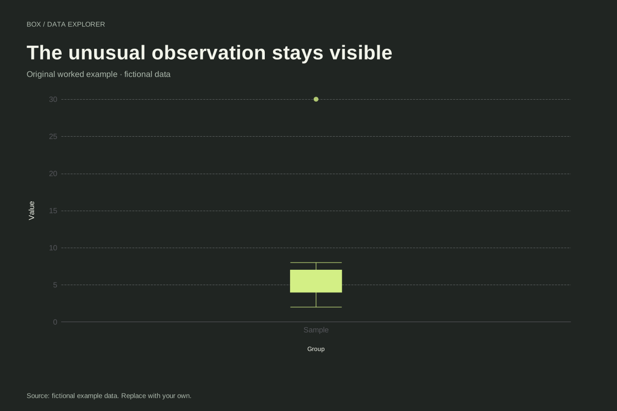
Box plot with an outlier and visible fences calculation
This box plot keeps a large fictional observation visible as a separate point. The nine values run from 2 to 30, with most between 2 and 8. The 1.5 × IQR rule determines where the whiskers stop.
Explore chart & data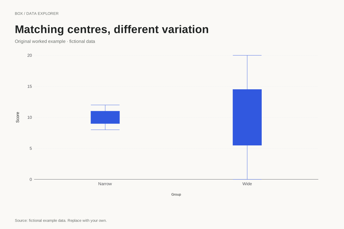
Box plots with equal medians and different spreads
Two groups can have the same median while looking very different in a box plot. These fictional samples both centre on 10, but the wide group has a much larger IQR and observed range.
Explore chart & data
Box plot quartiles for a five-value sample
Quartile conventions can visibly change a small-sample box plot. This example uses 2, 4, 7, 10 and 16 with the median-of-halves method, excluding the overall middle observation when forming the halves.
Explore chart & data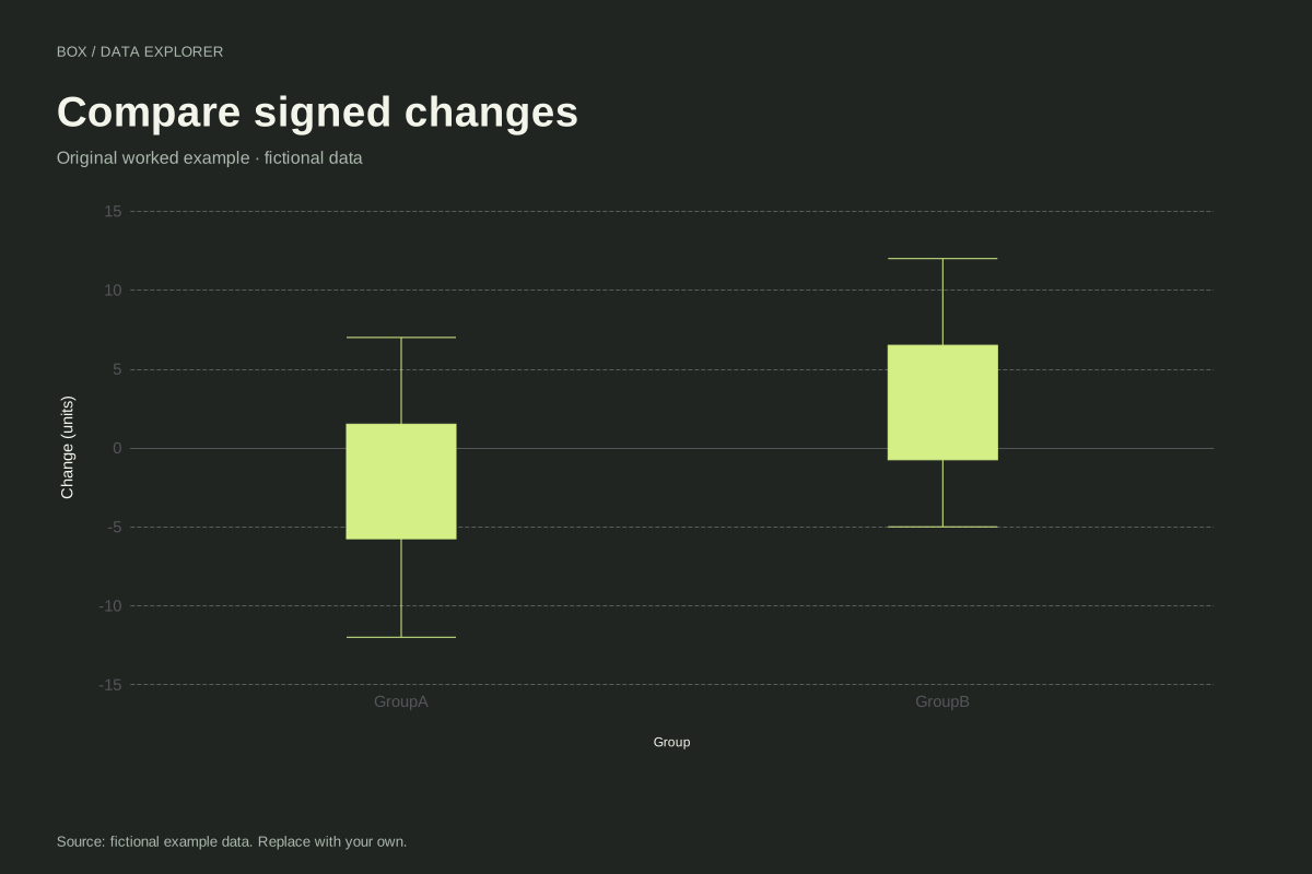
Box plots of signed changes around zero
These box plots compare signed fictional changes for two groups. Negative observations remain valid values, and the zero reference helps distinguish decreases from increases without forcing the whole distribution above zero.
Explore chart & data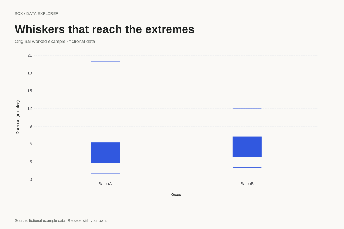
Minimum-to-maximum box plot whiskers
A box plot can use whiskers that reach the observed minimum and maximum. This example selects that convention explicitly, so large observations are included in the whisker range rather than drawn as separate IQR flags.
Explore chart & dataStart with the comparison you need to make
The two-group example compares completion times with equal sample sizes, while the equal-median example shows why a shared centre can hide different variation. Signed changes place boxes on both sides of a meaningful zero reference. These cases help separate sample size, centre and spread: a longer box describes the middle numeric range, not the number of observations or whether a group performed better.
Use the convention cases to check another calculation
The five-observation example is small enough to calculate quartiles by hand. Switching between linear interpolation and medians of halves changes its box edges without changing its median. The outlier example distinguishes a calculated fence from an observed whisker endpoint. The range-whisker example shows the same data under a convention that reaches the minimum and maximum. These are explicit method differences, not alternative measurements.
Keep the observations available after summarizing
A box plot compresses a distribution and can conceal repeated values, gaps and multiple peaks. Download the full list when those details matter. To make your own comparison, repeat a group label beside each individual observation and check N in the summary. Unequal sample sizes, different collection conditions or subjective group definitions need explanation outside the box geometry. The editor does not supply a significance test or decide whether an unusual point should be excluded.
Every dataset in this collection is original and fictional. Use the examples to learn a calculation or start a chart, and replace the source note when adding your own observations. Explore the complete chart library.