How to read this chart
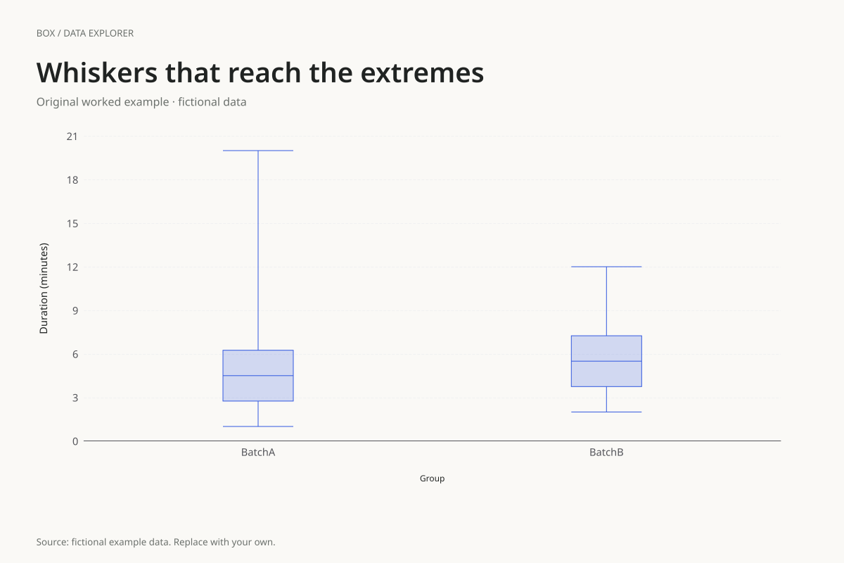
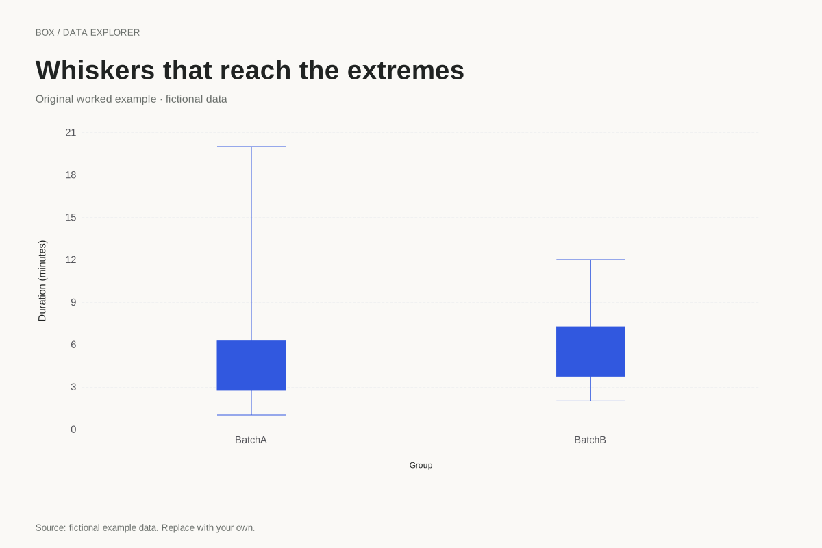
Group A spans 1 to 20 and Group B spans 2 to 12. Their medians are 4.5 and 5.5. Linear-interpolated quartiles are 2.75 and 6.25 for A, and 3.75 and 7.25 for B. Both IQRs equal 3.5.
For A, the upper 1.5 × IQR fence would be 11.5, below the observation at 20. Under the selected range convention, the whisker still reaches 20. If you switch to IQR whiskers, it stops at 7 and shows 20 as a separate point.
Try the calculation yourself
Toggle the whisker rule while preserving the quartile method. The box and median should remain unchanged because only the whisker convention changes. When comparing published box plots, check both rules before concluding that their source data differ.
Open this exact example, change the data or calculation settings, and compare the result. The CSV preserves the input rows; the ECharts JSON contains drawing options.
What this example cannot tell you
A range whisker does not say every value between its endpoints was observed. The long upper whisker in A connects a summary endpoint, not a continuous measurement series. All original observations remain available in the table.
Does no separate outlier point mean there are no unusual values?
No. Under minimum-to-maximum whiskers this chart does not flag observations using the IQR rule. The absence of separate points reflects the selected display convention. Whether a value needs investigation depends on its context and source record.
Calculation convention
The default uses linear interpolation at rank (n − 1)p in the sorted sample, equivalent to R quantile type 7. At p = 0.25, 0.5 and 0.75 this gives Q1, the median and Q3. The alternate method takes medians of the lower and upper halves, excluding the middle observation when the sample size is odd. These methods can give different results for the same small sample.
Method background: NIST: box plot and fence interpretation. R documentation: quantile methods.
Created by SupaMakers for ChartsAI · September 8, 2026. Source and reuse terms.