Line graph examples
Line graph examples show change across ordered categories, numeric intervals or dates. Explore eight worked examples, from monthly sales to distance–time and cumulative frequency graphs. Each includes editable data, a finished chart and a calculation you can check.
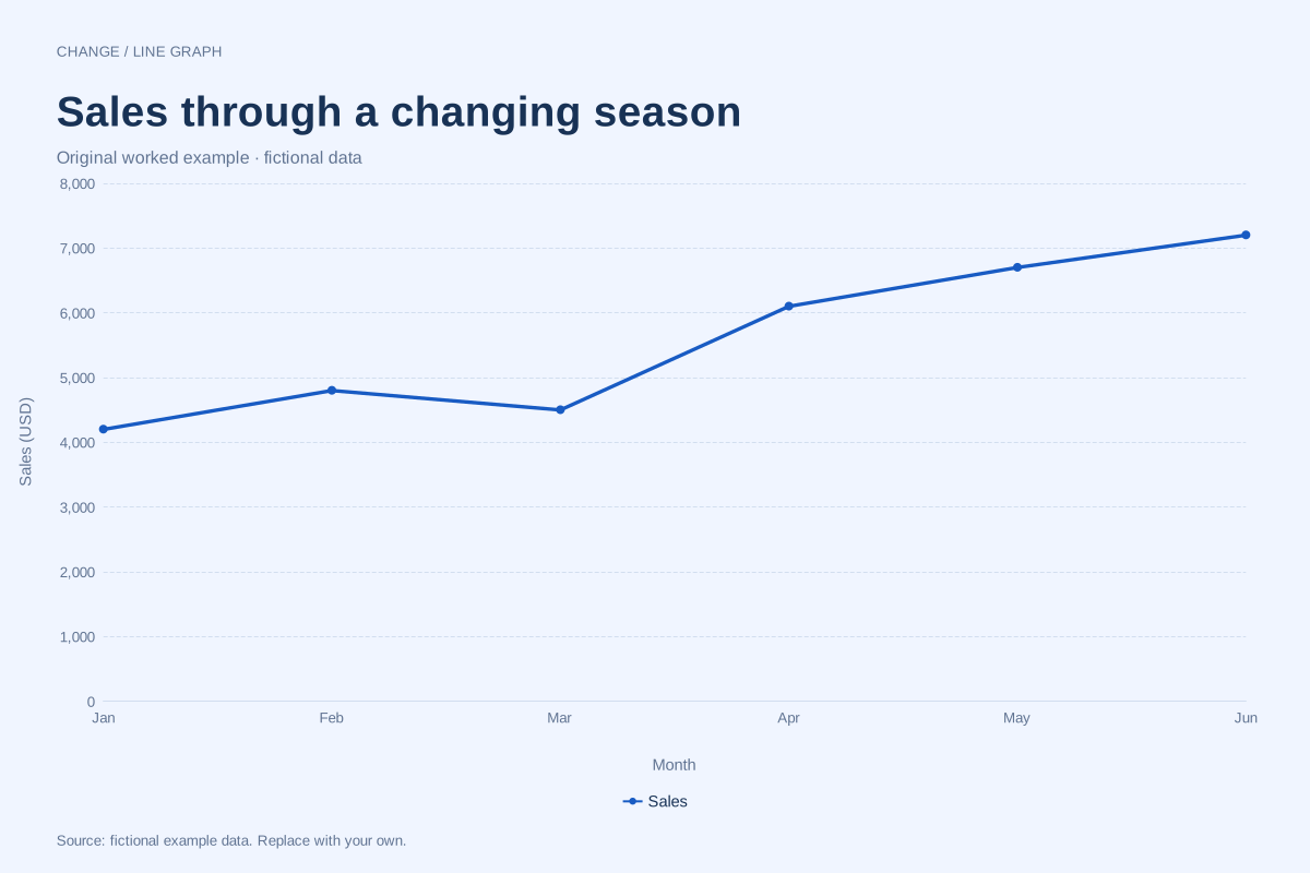
Line graph · Worked exampleA monthly sales line chart connects sales totals in calendar order. This editable example shows six fictional monthly totals in US dollars, including a March dip and a stronger second quarter.
Editable chart + original data 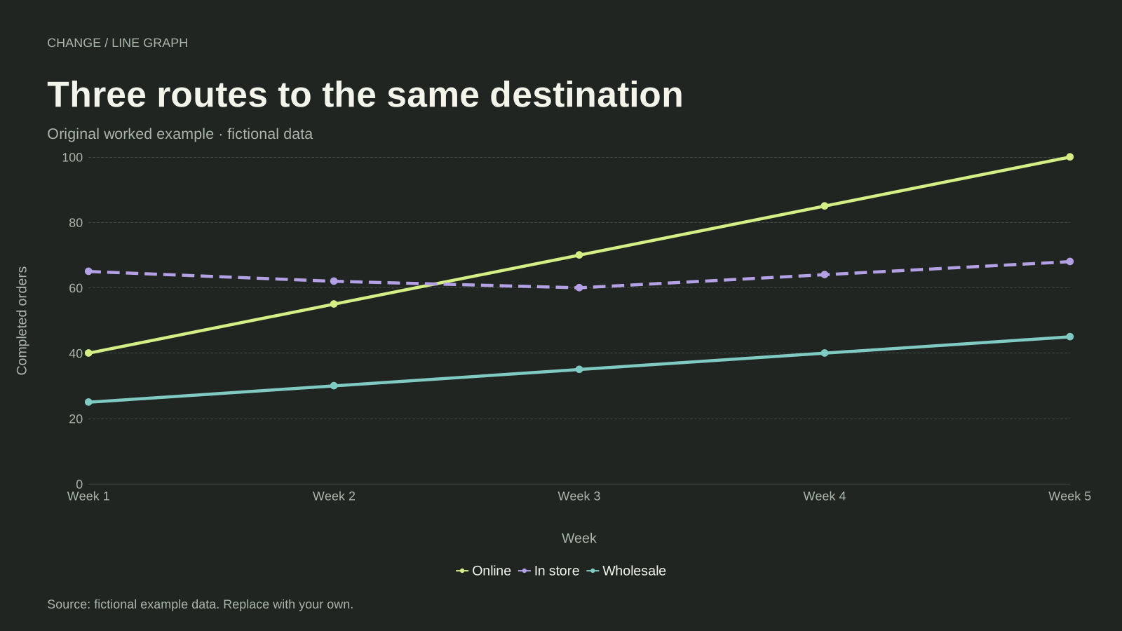
Line graph · Worked exampleA multiple line graph compares two or more series on the same ordered axis. This example follows online, in-store and wholesale orders over five weeks, using one shared unit and a separate line for each channel.
Editable chart + original data 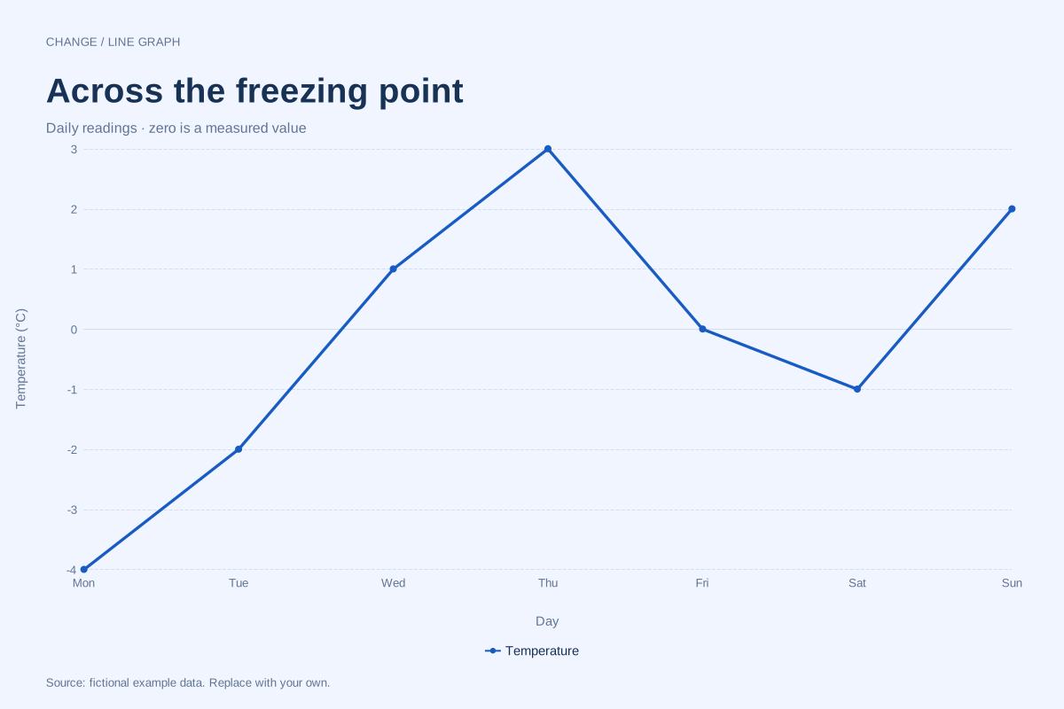
Line graph · Worked exampleA line graph can show positive, zero and negative observations on the same numeric axis. This fictional week of temperature readings crosses 0°C several times, making the sign of each value meaningful.
Editable chart + original data 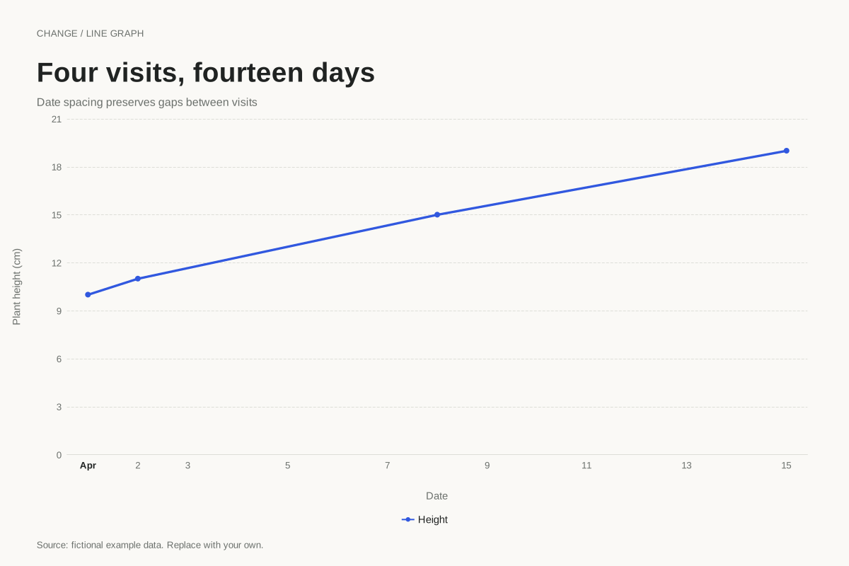
Line graph · Worked exampleUse a time axis when observations occur on irregular dates. This plant-height example spaces four visits by their actual dates, preserving gaps of one, six and seven days instead of making every visit look equally far apart.
Editable chart + original data 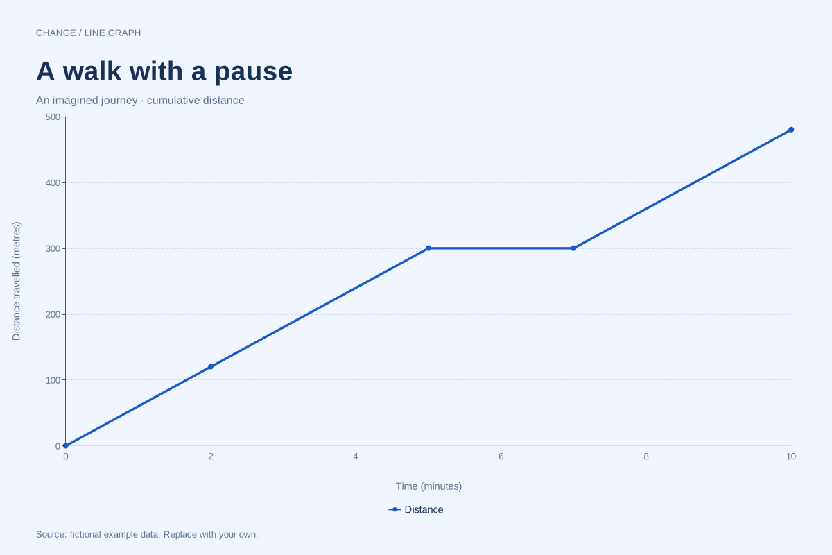
Line graph · Worked exampleA distance–time graph plots cumulative distance travelled against elapsed time. In this worked example, a walker covers 300 metres in five minutes, pauses for two minutes, then reaches 480 metres at ten minutes.
Editable chart + original data 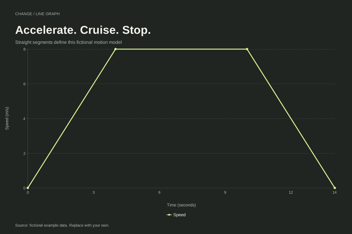
Line graph · Worked exampleA speed–time graph shows how speed changes over time. This example accelerates from 0 to 8 m/s in four seconds, stays at 8 m/s for six seconds, and returns to rest at fourteen seconds.
Editable chart + original data 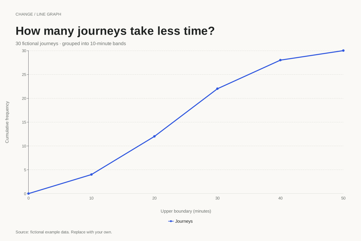
Line graph · Worked exampleA cumulative frequency graph shows how many observations fall below successive boundaries. This example accumulates 30 fictional journey times in ten-minute bands, starting at zero and ending at the full sample count.
Editable chart + original data 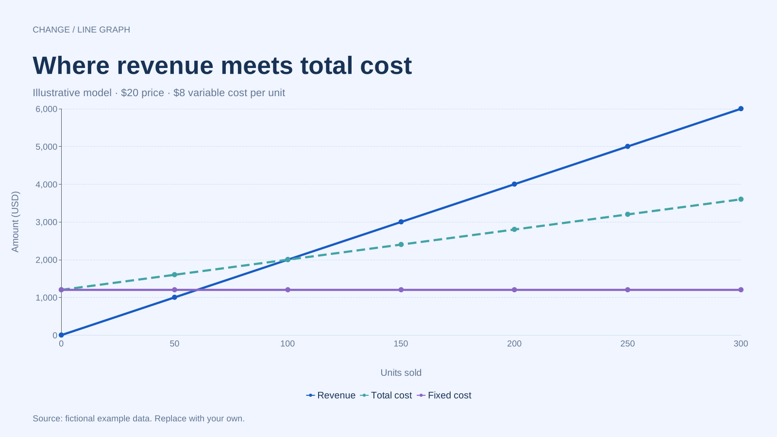
Line graph · Worked exampleA break-even chart compares revenue with total cost at different sales volumes. This fictional example uses a $20 selling price, an $8 variable cost per unit and $1,200 in fixed costs, reaching break-even at 100 units.
Editable chart + original data Choose the right horizontal axis
Consecutive months can use equally spaced category labels. Elapsed minutes need a numeric axis, and irregular observation dates need a time axis. Equal spacing would distort the meaning of slopes when the intervals differ. Compare the journey and plant-height examples to see the difference.
Read the units before reading the slope
A distance–time slope describes speed, while a speed–time slope describes change in speed. The same flat shape can mean a pause in one graph and continued motion in another. Every example states the axis units and explains what its straight connections assume.
Use the complete example
Open any chart to inspect its exact values, worked interpretation and limitations. Download the original SVG, PNG or CSV, or load the complete settings into the free line graph maker. All datasets are fictional teaching examples; replace them with your own observations before presenting findings.
Open the free line graph maker
Browse all 50 chart examples