How to read this chart
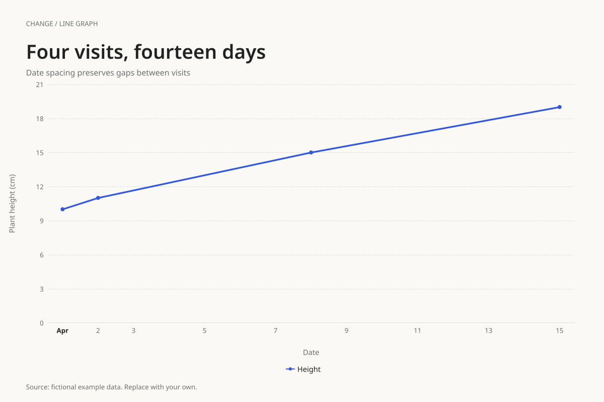
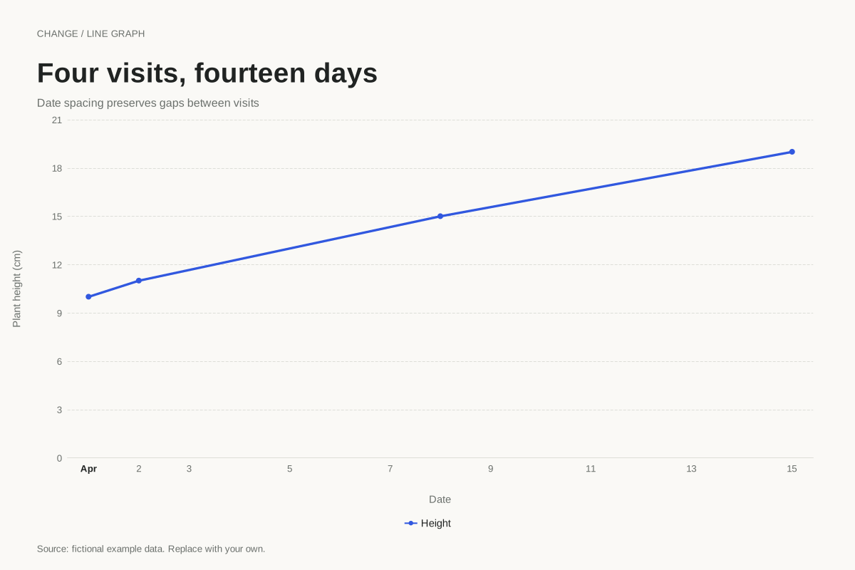
The first two readings are 10 cm on April 1 and 11 cm on April 2. The next reading is 15 cm on April 8, followed by 19 cm on April 15. The last two increases are both 4 cm, but they occur over different durations.
The average increase between the first two visits is 1 cm per day. Between April 2 and April 8 it is about 0.67 cm per day; between April 8 and April 15 it is about 0.57 cm per day. Actual time spacing makes those different average rates visible in the slopes.
Build it with your own data
Use unambiguous ISO dates such as 2026-04-08 in the first column and measured heights in the second. Choose the editor’s date/time axis mode. Keep observations in chronological order; the line connects the rows you provide.
The supplied table deliberately omits days without observations. It does not insert estimated daily measurements. You can change the dates and heights, but retain real intervals if the purpose is to compare rates rather than simply list visits. Keep the unit and measurement procedure consistent.
Open this example in the line graph maker Replace the data, inspect the preview and download your version. SVG, PNG and PDF exports are available in the editor.
What this example cannot tell you
A straight line between visits assumes a linear visual connection, not proof of constant biological growth. The plant and measurements are invented. There are no observations of what happened between visits, and the chart does not fit a growth model.
Why not label the points Visit 1, Visit 2, Visit 3 and Visit 4?
That is useful for comparing visits as categories, but equal spacing hides elapsed time. When the question involves change per day, use dates on a time axis so a one-day interval and a seven-day interval occupy different widths.
Created and reviewed by SupaMakers for ChartsAI · September 8, 2026. Source code and reuse terms.