How to read this chart
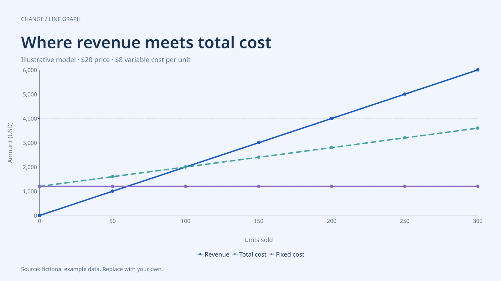
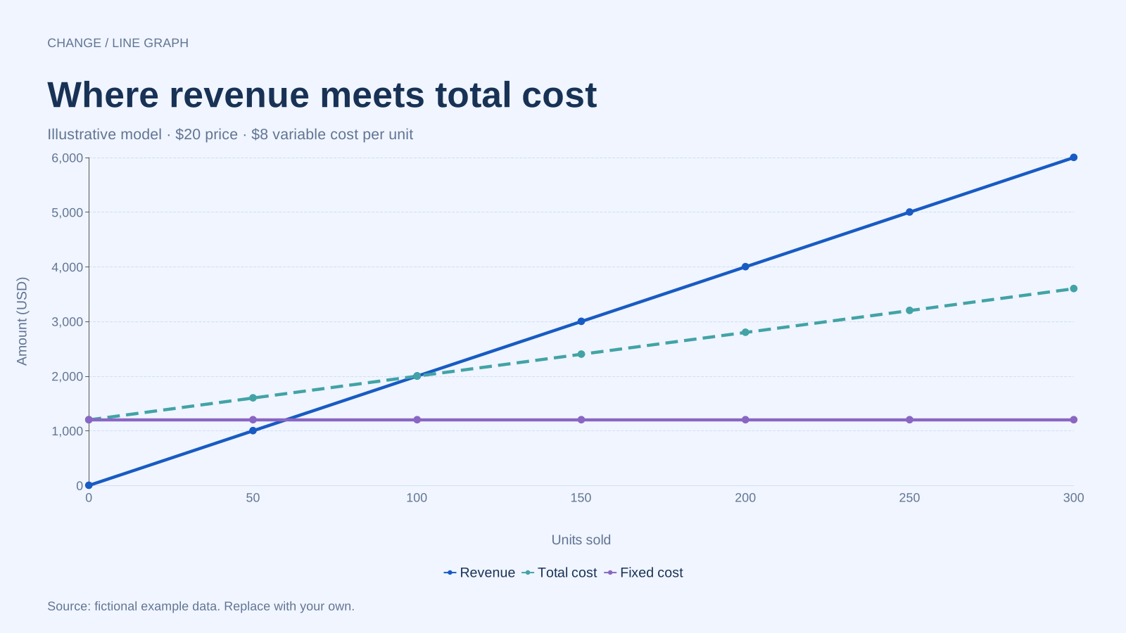
Revenue is 20 × units sold. Total cost is 1,200 + 8 × units sold. At 100 units, both are $2,000, so the model’s profit is zero. The fixed-cost line remains at $1,200 throughout the illustrated volume range.
At 50 units, revenue is $1,000 and total cost is $1,600: a $600 loss in this model. At 200 units, revenue is $4,000 and total cost is $2,800: a $1,200 profit. The vertical gap between the revenue and total-cost lines gives that difference.
Build it with your own data
Calculate the table before plotting. The per-unit contribution is $20 − $8 = $12, and fixed cost divided by contribution gives 1,200 ÷ 12 = 100 units. Each row then evaluates the same revenue and cost formulas at its stated volume.
Use a numeric units-sold axis so spacing corresponds to sales volume. Keep all amounts in the same currency and period. The downloaded CSV contains the resulting numbers, not spreadsheet formulas; changing a price in the subtitle will not recalculate the lines.
Open this example in the line graph maker Replace the data, inspect the preview and download your version. SVG, PNG and PDF exports are available in the editor.
What this example cannot tell you
This simplified illustration assumes constant unit price and variable cost, fixed costs within the shown range, and sales of every counted unit. It excludes taxes, inventory timing and capacity changes. It is a worked chart example, not a financial forecast or an interactive break-even calculator.
What if the variable cost is equal to or above the selling price?
Then contribution per unit is zero or negative. With positive fixed costs, this simple model has no positive-volume break-even point. Do not apply the example’s 100-unit result to another cost structure; rebuild the table using its actual assumptions.
Method background: US Small Business Administration: planning and break-even analysis. Our dataset and worked calculation are original fictional examples.
Created and reviewed by SupaMakers for ChartsAI · September 8, 2026. Source code and reuse terms.