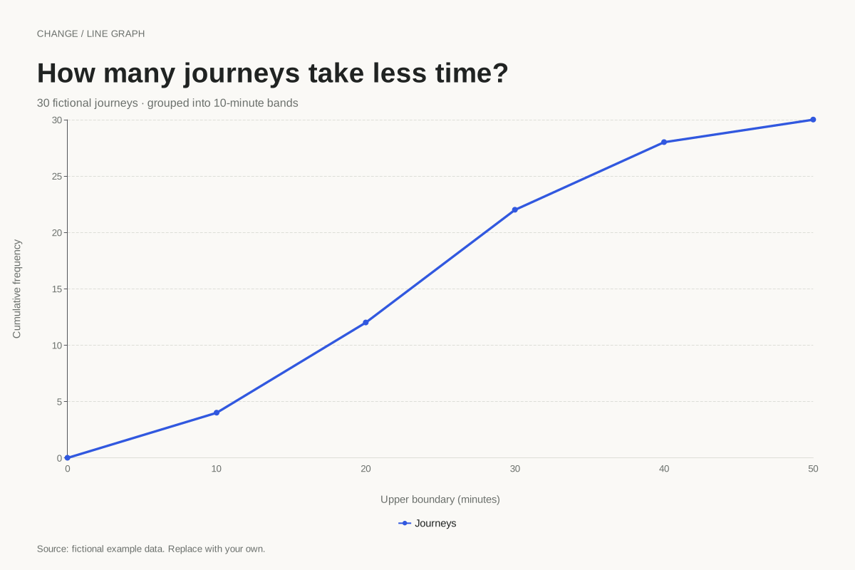
How to read this chart
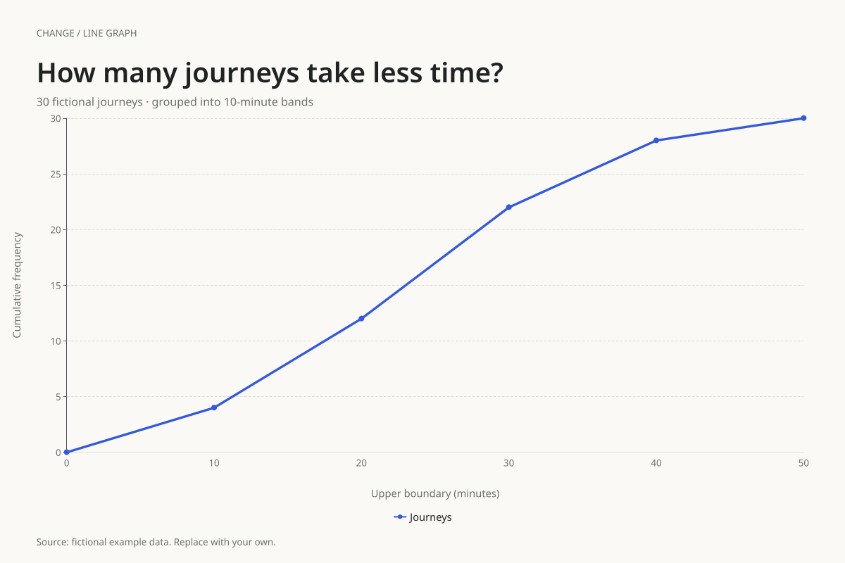
The underlying band frequencies are 4, 8, 10, 6 and 2 for 0–under 10, 10–under 20, 20–under 30, 30–under 40 and 40–under 50 minutes. Adding them successively gives 4, 12, 22, 28 and 30.
At the 30-minute boundary, the cumulative count is 22: twenty-two journeys are shorter than 30 minutes under this boundary convention. The middle cumulative position is 15. Linear interpolation within the 20–30 minute band gives 20 + ((15 − 12) ÷ 10) × 10 = 23 minutes as a grouped median estimate.
Build it with your own data
Use upper class boundaries as numeric x values and cumulative counts as y values. Include the lower starting boundary with zero. Plot counts that never decrease and check that the final count equals the total number of observations.
This editor draws the values supplied in your table; it does not turn raw journey times into grouped frequencies. Calculate the bands and running totals first. Keep a consistent convention for observations exactly on a boundary, and state that convention alongside the chart.
Open this example in the line graph maker Replace the data, inspect the preview and download your version. SVG, PNG and PDF exports are available in the editor.
What this example cannot tell you
The joining segments are a grouped-data approximation. They do not reveal exact individual times, and the estimated median is not an exact median calculated from raw observations. There is no evidence here that journeys are uniformly distributed within each band.
Is this an empirical cumulative distribution function?
This example is a grouped cumulative-frequency polygon, often taught as an ogive. An exact empirical cumulative distribution from raw observations is a step function. The straight segments here support approximate readings between class boundaries and should be described as estimates.
Method background: CIMT: cumulative frequency worked lessons. Our dataset and worked calculation are original fictional examples.
Created and reviewed by SupaMakers for ChartsAI · September 8, 2026. Source code and reuse terms.