Line graph maker.
Upload a CSV or Excel file, or paste your table. Choose labels, numeric series and horizontal spacing, then preview and download your line graph.
Preview your line graph
Lines connect your rows in the supplied order. Check the horizontal spacing before downloading.
Editorial styleDownload your chart
PNG for slides · SVG for editing · PDF for printing
Equal spacing: labels follow your row order. Use numeric or date spacing for irregular intervals.
Add direct labels, data-point annotations, a caption and source link. Export an editable project or a self-contained HTML figure.
Start with a finished example.
Original examples with fictional data.
The starting point is yours to change.
Daily temperature
Illustrative temperatures, including a day below zero. Not weather observations.
Use this exampleSample CSVTimed experiment
Fictional measurements with irregular numeric intervals; the spacing preserves elapsed minutes.
Use this exampleSample CSVWhat is a line graph?
A line graph connects successive observations with straight segments. The horizontal axis shows an ordered variable, such as time, and the vertical axis shows a numeric value. Multiple lines compare series using the same horizontal positions and units.
Use a line graph to show change over time or another ordered variable. Use equal spacing for category labels, numeric spacing for measured intervals, or date spacing for elapsed days. For unrelated categories, a bar chart is usually easier to interpret.
How we handle data & calculationsFrom data to download
Bring your observations
Paste spreadsheet cells or import CSV, TSV, TXT or XLSX. Choose the label column and one to five numeric series in the preview.
Check order and spacing
Keep the row order you intend. Choose numeric distance or YYYY-MM-DD dates for irregular intervals; equally spaced labels do not represent elapsed time.
Label, style and download
Add a title, axis units and source note. Choose a visual theme, then download PNG, SVG or PDF. Save your input table as CSV.
Good to know.
Built by SupaMakers.
Updated September 8, 2026.
Is this line graph maker free?+
Yes. Create and download line charts without an account, payment or watermark. PNG, SVG, PDF, CSV and ECharts configuration downloads are included.
Can I create a graph with multiple lines?+
Yes. Plot one to five named series across two to 300 points. Every line shares the horizontal positions and vertical scale. Use the same units so the comparison makes sense.
What data format do I need?+
Use one column for horizontal labels and one or more numeric columns for values. You can paste cells, select a sheet from Excel, choose a row range, transpose the table and map columns before importing. Files stay on your device.
How do I handle dates and irregular intervals?+
After importing, choose Elapsed days and enter valid YYYY-MM-DD dates, or choose Numeric distance for measured positions. These modes preserve interval sizes and require strictly increasing positions. Equal spacing instead treats each row as the next equally spaced label.
Does the tool fill missing values or sort my data?+
No. Missing or invalid values block the chart until corrected. Rows are never silently dropped, sorted, aggregated or interpolated. Numeric and date positions cannot repeat; resolve duplicate positions in your source or use equally spaced labels deliberately.
Can I show negative values or change the vertical scale?+
Yes. Negative values and zero are retained. The vertical axis includes zero by default. In Design & details you can turn that off to fit the range more closely; the preview explains that the scale may no longer include zero.
Are line graphs and line charts the same?+
The terms are commonly used for the same visualization. This tool uses straight segments between observations. It does not calculate a regression, forecast or smoothed trend.
Worked examples with data
All line graph examples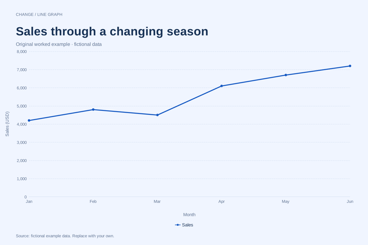
Monthly sales line chart example
A monthly sales line chart connects sales totals in calendar order. This editable example shows six fictional monthly totals in US dollars, including a March dip and a stronger second quarter.
Editable chart + original data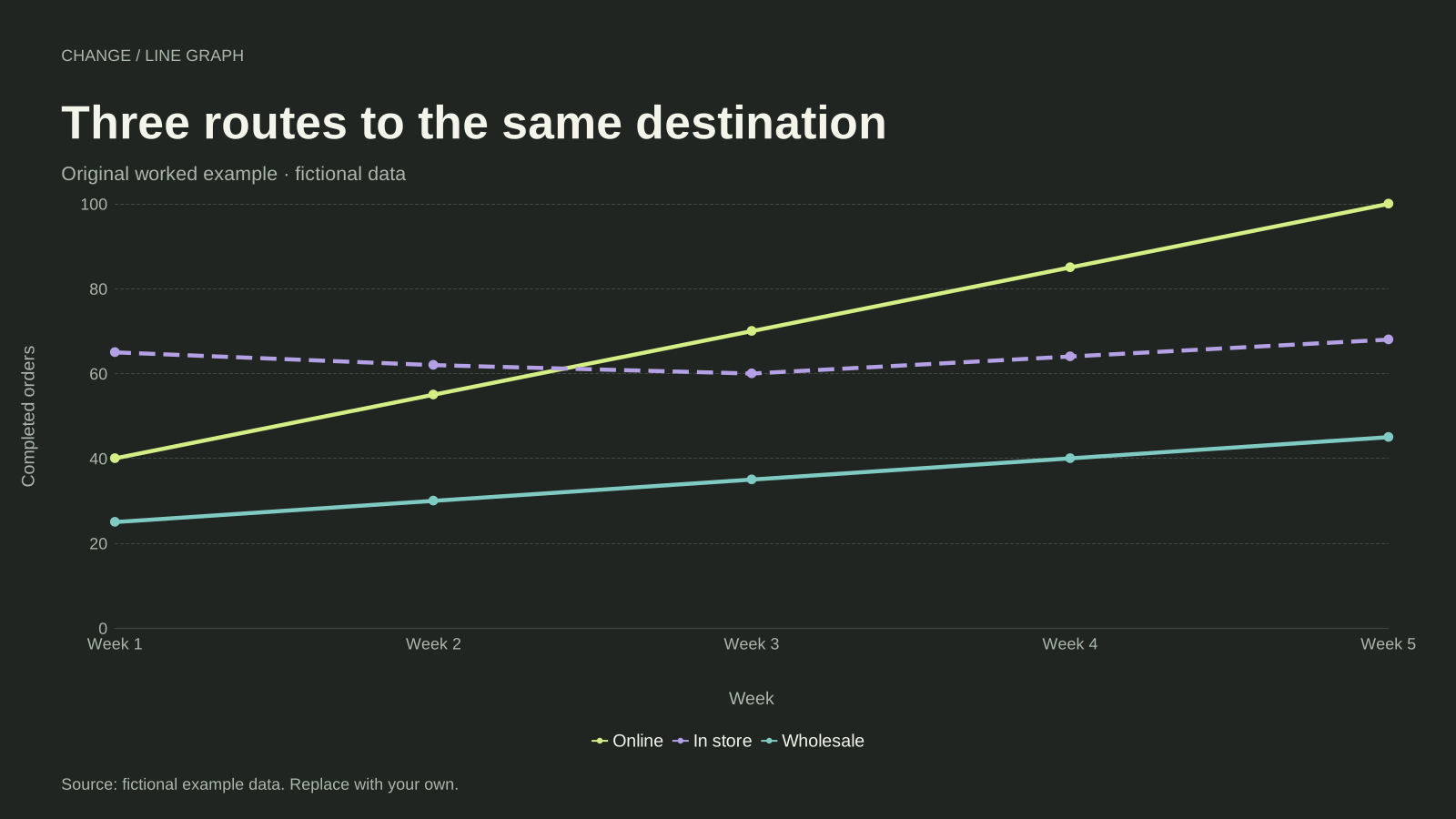
Multiple line graph example with three series
A multiple line graph compares two or more series on the same ordered axis. This example follows online, in-store and wholesale orders over five weeks, using one shared unit and a separate line for each channel.
Editable chart + original data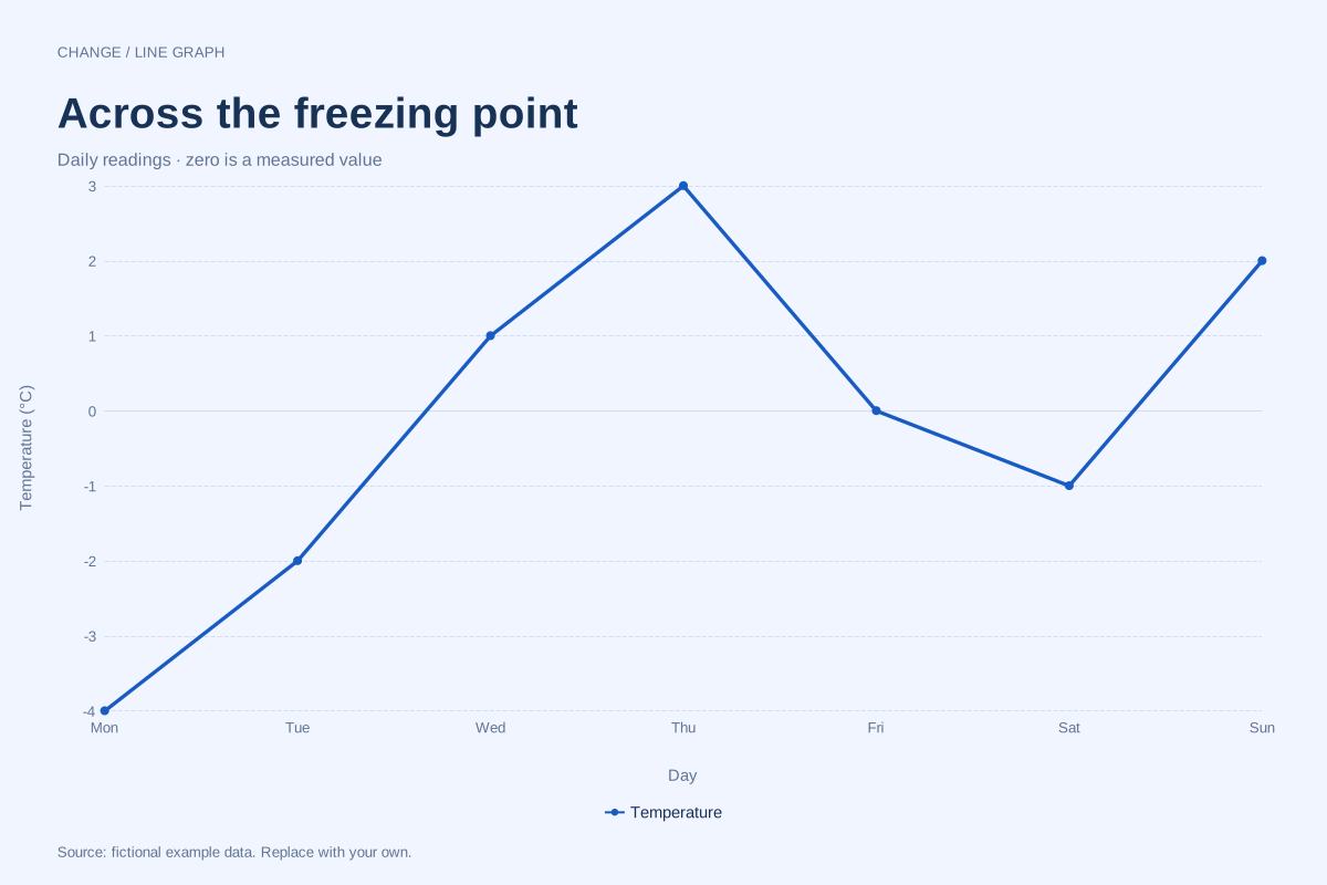
Line graph with negative values: temperature example
A line graph can show positive, zero and negative observations on the same numeric axis. This fictional week of temperature readings crosses 0°C several times, making the sign of each value meaningful.
Editable chart + original dataRead and draw this chart on paper
Try free line graph worksheets with answers, with editable data and printable practice packs.