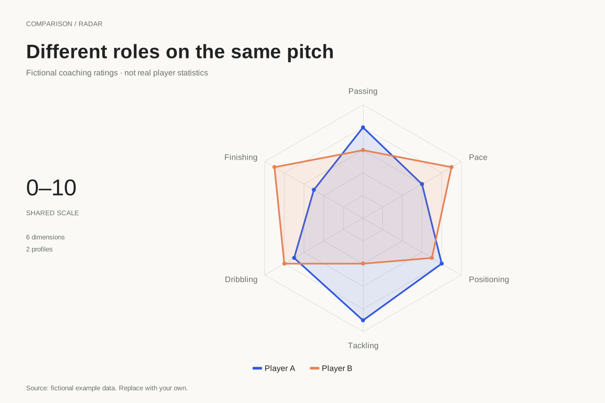
How to read this chart
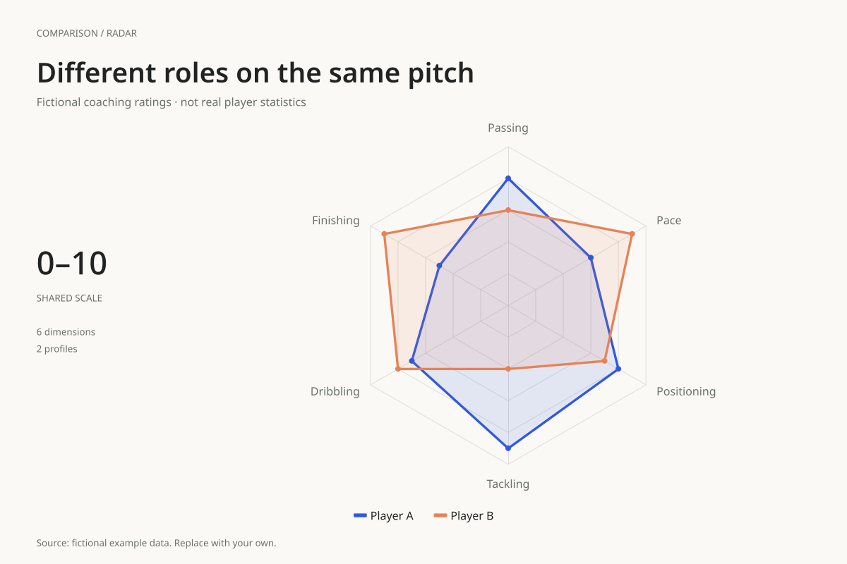
Player A has higher passing, tackling and positioning ratings: 8 versus 6, 9 versus 4, and 8 versus 7. Player B has higher finishing, dribbling and pace ratings: 9 versus 5, 8 versus 7, and 9 versus 6.
The largest difference is tackling, with a five-point gap. That describes this made-up rating table, not a count of successful tackles. The profiles suggest different strengths for discussion; they do not establish which player is better for every role or match situation.
Build it with your own data
Use comparable measures and define their meaning before plotting. These axes are subjective ratings, so the editor uses the numbers as supplied. It does not fetch match statistics, calculate percentiles or adjust for minutes played, position, league or possession.
If you build a real statistical version, choose a consistent comparison population and time window. Document any per-90 conversion and percentile calculation outside the chart. Change the labels to match the actual transformed measure, and preserve the same scale across the compared players.
Open this example in the radar chart maker Replace the data, inspect the preview and download your version. SVG, PNG and PDF exports are available in the editor.
What this example cannot tell you
No real athlete, scouting record or performance dataset is represented here. A rating of 8 is not an 80th percentile unless you explicitly calculate and label it that way. Filled area is not a player-quality index, and role context matters when interpreting dimensions.
Can I paste raw goals, passes and tackles into one radar?
The editor can plot numbers, but those quantities have different units and ranges. A meaningful shared-scale comparison needs a documented transformation first. Otherwise a large count may dominate the picture simply because it is measured on a larger numeric scale.
Created and reviewed by SupaMakers for ChartsAI · September 8, 2026. Source code and reuse terms.