How to read this chart
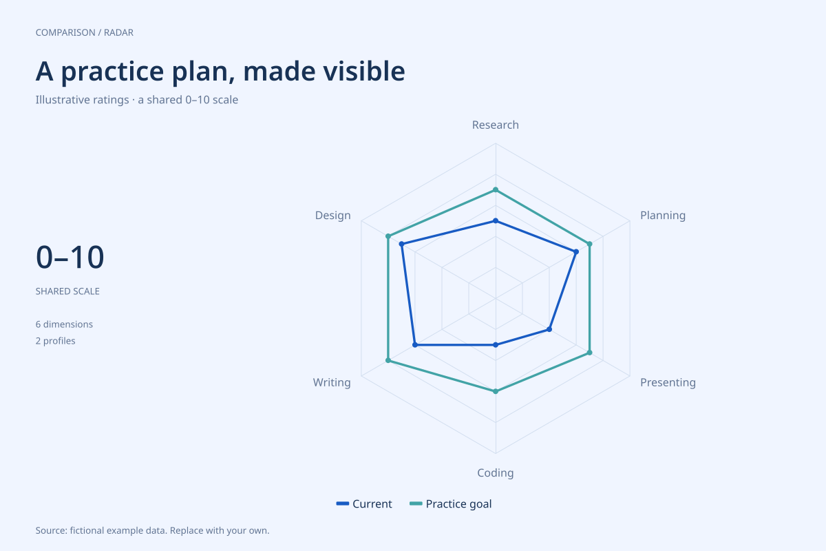
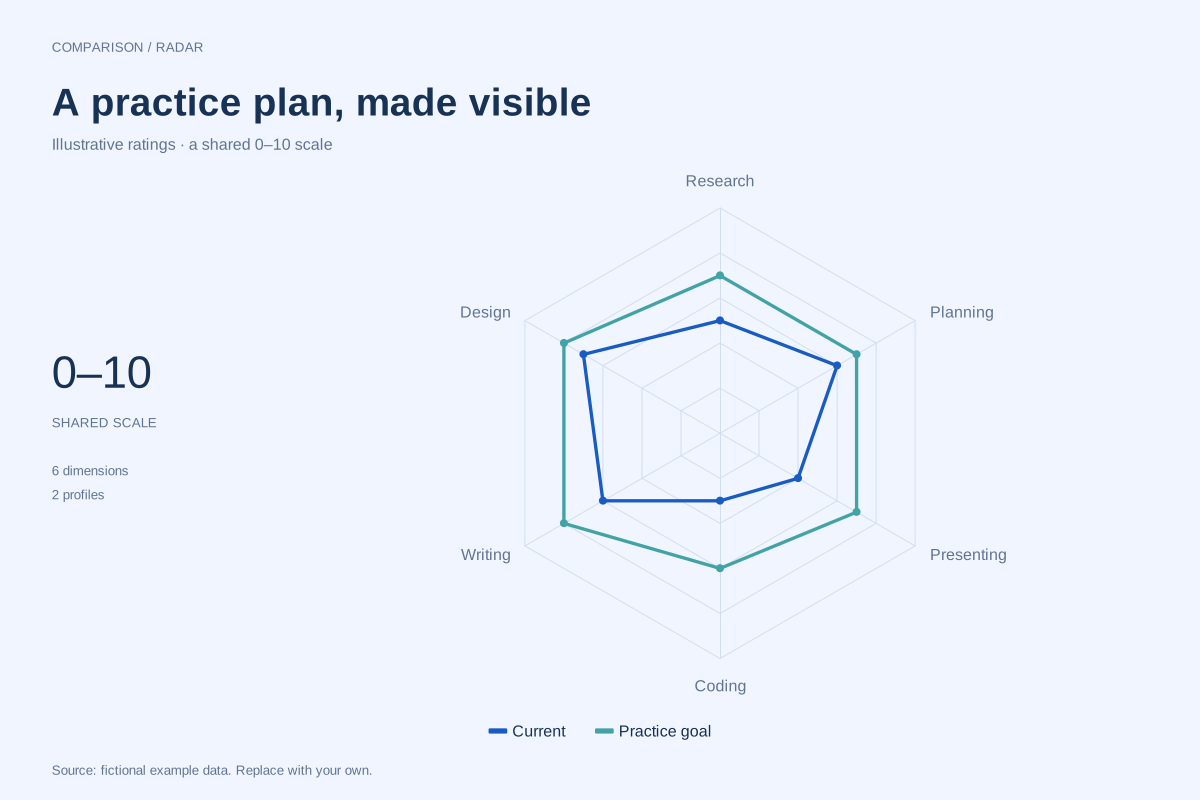
Coding moves from a current rating of 3 to a goal of 6, and presenting from 4 to 7. Those are the largest gaps at three scale points each. Design begins at 7 and has a goal of 8, a smaller gap of one point.
Research and writing each have two-point gaps, while planning has a one-point gap. The outline format keeps both series readable without overlapping filled areas. The gaps describe stated ratings and intentions, not a measured rate of learning or a probability of achieving the goal.
Build it with your own data
Use one row per skill and a column for each assessment. Define what values on the shared 0–10 scale mean before scoring. For example, agree on observable tasks associated with selected levels rather than treating a higher number as self-explanatory.
Keep the same dimensions, axis order and maximum when comparing later assessments. Update the source and subtitle with the assessment context. The editor accepts the supplied scores directly; it does not evaluate competence, assign a rubric or normalize different kinds of evidence.
Open this example in the radar chart maker Replace the data, inspect the preview and download your version. SVG, PNG and PDF exports are available in the editor.
What this example cannot tell you
These ratings are invented and are not a validated assessment instrument. A goal is not an observed result. Polygon area is not an overall skill score, and changing axis order can change the visual shape without changing any underlying rating.
Can I use this to rank team members?
The chart can display scores, but ranking requires a fair, consistent assessment process that this example does not provide. For a practice conversation, focus on specific behaviours and evidence behind each dimension. Avoid turning the polygon’s size into an unsupported performance grade.
Created and reviewed by SupaMakers for ChartsAI · September 8, 2026. Source code and reuse terms.