How to read this chart
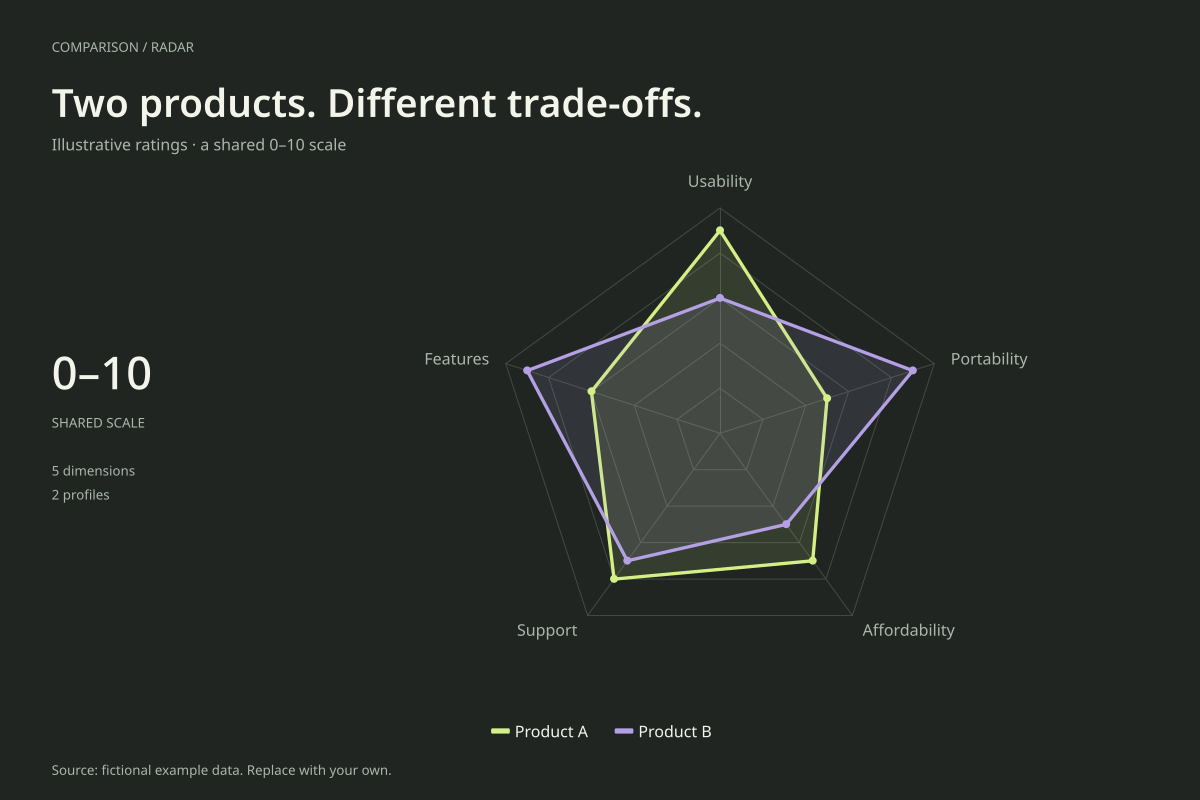
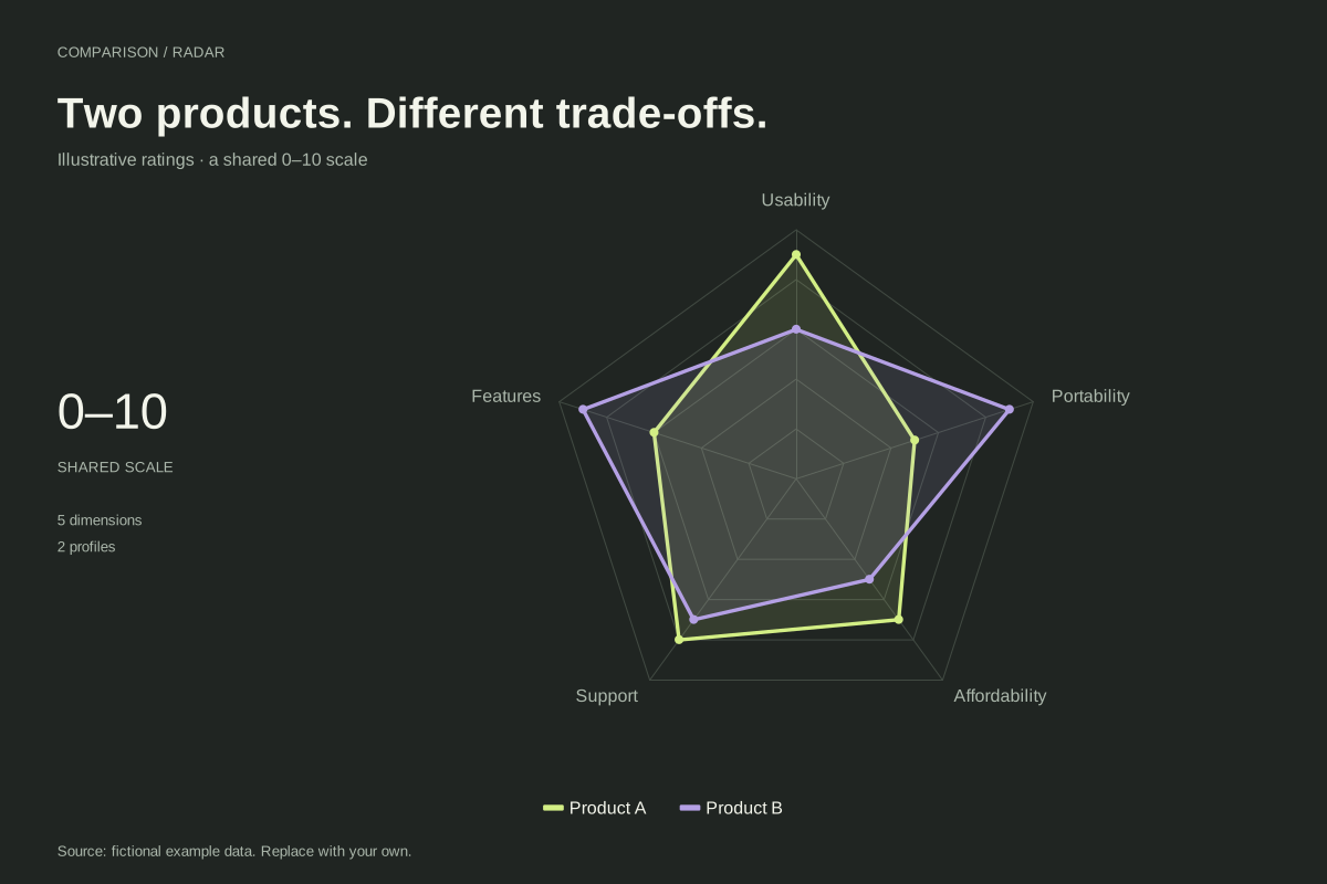
Product A scores 9 for usability and 8 for support, compared with Product B’s 6 and 7. Product B scores 9 for both features and portability, where Product A scores 6 and 5. Neither option has the higher rating on every dimension.
Affordability is a rating: Product A receives 7 and Product B receives 5. Those numbers are not dollar prices. The comparison makes trade-offs visible, but it does not specify whether portability matters more than support for a particular buyer.
Build it with your own data
Choose criteria that match the intended use and define the scoring rubric. Make higher values consistently mean a more favourable result. A raw price, battery duration and satisfaction score cannot be placed on this common scale without an explicit, documented transformation.
Use identical axes and maximum values for both products. Replace the fictional labels and ratings with your evidence, and include sources and observation dates. Keep factual measurements separate from judgement-based ratings so readers can understand how each score was produced.
Open this example in the radar chart maker Replace the data, inspect the preview and download your version. SVG, PNG and PDF exports are available in the editor.
What this example cannot tell you
Product A and Product B are placeholders, not reviews of real products. The filled polygon is a visual profile, not a weighted recommendation. Axis order changes polygon area, so the larger-looking shape should not be treated as the objectively better purchase.
How should I show actual prices?
Use a table or a separate chart with currency units. If this radar uses an affordability score, publish the rule that converts price into that score and state the relevant pricing date. Never label a 0–10 rating as a price measurement.
Created and reviewed by SupaMakers for ChartsAI · September 8, 2026. Source code and reuse terms.