How to read this chart
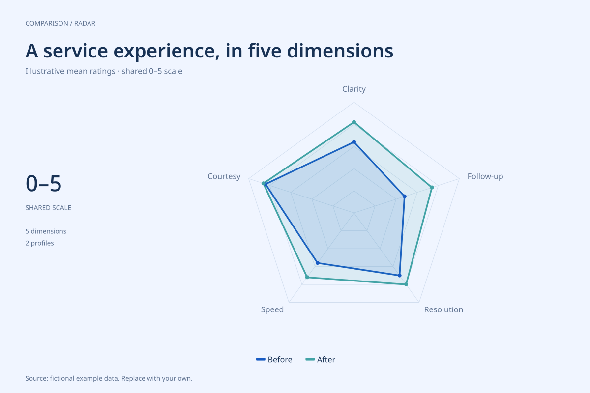
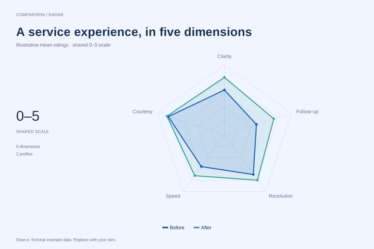
Follow-up rises from 2.4 to 3.7, a gain of 1.3 rating points. Clarity rises by 0.9, speed by 0.8, resolution by 0.5 and courtesy by 0.1. Follow-up shows the largest absolute difference between the two supplied profiles.
Courtesy remains the highest rated dimension after the change at 4.3, while speed is the lowest at 3.6. These comparisons describe synthetic summary values. The chart does not tell us how varied individual responses were or whether the same people answered both times.
Build it with your own data
Use a row for each question or dimension and columns for the comparison periods. Keep question wording, response scale and scoring direction consistent. If the survey response choices run from 1 to 5, state that separately: the plotting axis here begins at zero.
Calculate the summaries from your survey data before importing them. Record response counts, dates and the treatment of unanswered questions in the accompanying report. The editor plots supplied means; it does not collect responses, weight samples or perform a significance test.
Open this example in the radar chart maker Replace the data, inspect the preview and download your version. SVG, PNG and PDF exports are available in the editor.
What this example cannot tell you
The before-and-after values are invented and do not demonstrate the effect of a real intervention. Without respondent-level data, sampling details and uncertainty, visual differences cannot establish causation or statistical significance. Treat 1.3 as rating points, not a 1.3% improvement.
Does an outward line mean the service definitely improved?
It means the supplied rating is higher on that dimension. Whether a real difference reflects a service change depends on the survey design, sample and uncertainty. Show that context alongside the chart and avoid turning a visual change into a causal claim.
Created and reviewed by SupaMakers for ChartsAI · September 8, 2026. Source code and reuse terms.