How to read this chart
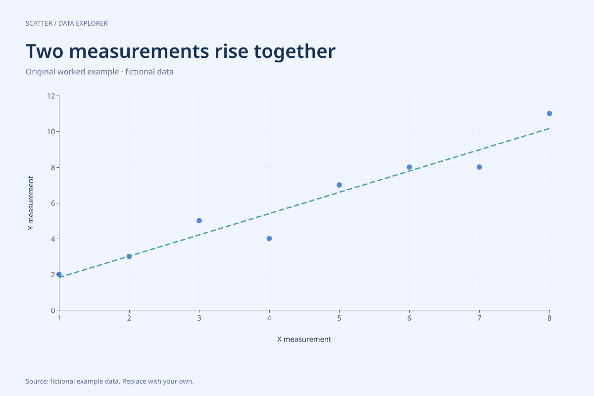
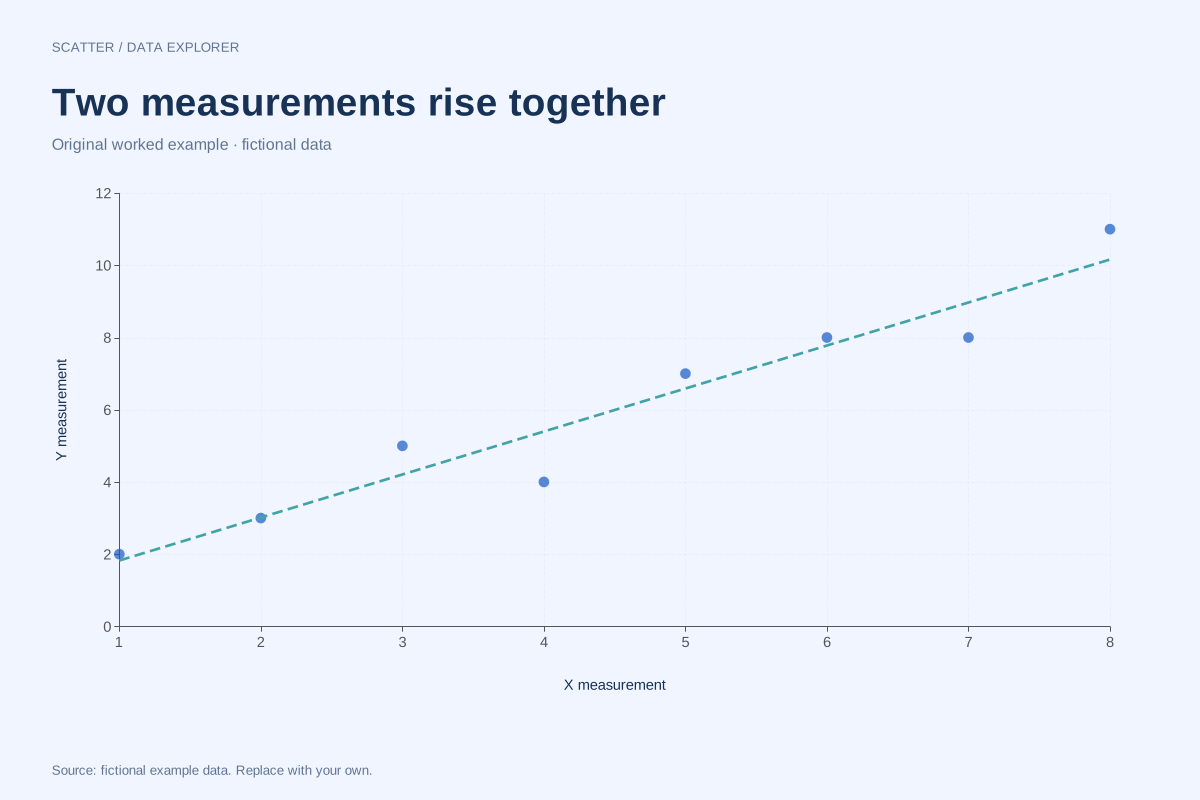
The eight X values run from 1 to 8, while Y ranges from 2 to 11. The points do not sit perfectly on a straight line: Y falls from 5 at X = 3 to 4 at X = 4. Positive association does not require every adjacent pair to increase.
The fitted slope is 1.1904762 and the intercept is about 0.6428571. These come from the centred sums of products and squares, using all eight pairs. The calculated panel reports the unrounded computational results, while the plotted line spans only the observed X range.
Try the calculation yourself
Turn the fitted line off and inspect the points first. Then turn it back on and compare which points lie above or below it. Use the original CSV to reproduce the slope in another program with an intercept included; fitting through the origin would answer a different calculation.
Open this exact example, change the data or calculation settings, and compare the result. The CSV preserves the input rows; the ECharts JSON contains drawing options.
What this example cannot tell you
The measurements were invented to demonstrate association. No real exposure or outcome is represented. A positive slope does not prove that changing X causes Y to change, nor that the relationship will hold outside these eight observations.
Is a positive correlation always a perfect line?
No. Positive correlation describes the direction of a linear association. Points can vary around that trend. A perfect positive linear relationship has r = 1 when both variables vary; this example includes deviations and should be read as an imperfect association.
Calculation convention
Every row supplies one X and one Y measurement for the same observation. The chart does not sort, merge or connect the points. Repeated X values are allowed and repeated pairs remain in the data, although exact overlaps can appear as one mark. Use consistent units and keep subject matching intact before importing.
Method background: NIST: scatter plot interpretation.
Created by SupaMakers for ChartsAI · September 8, 2026. Source and reuse terms.