How to read this chart
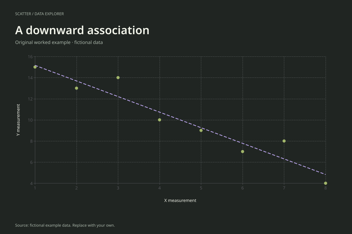
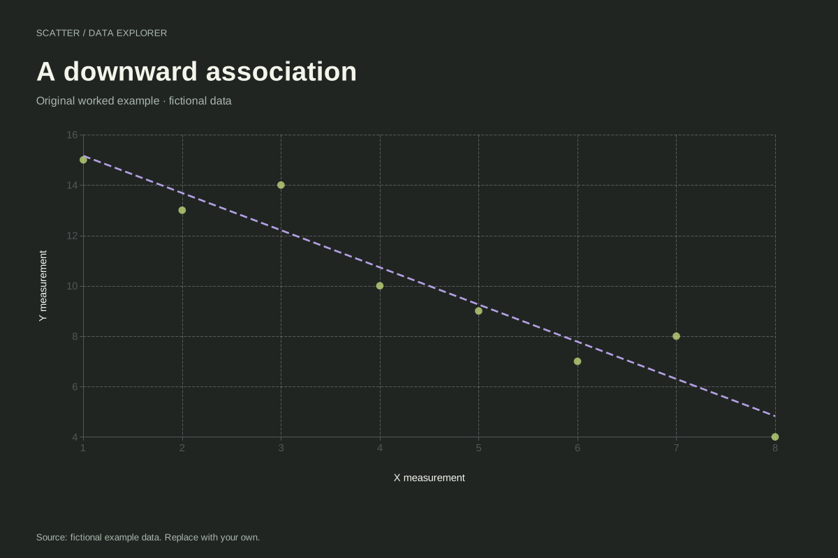
The first point is (1, 15) and the last is (8, 4). Between them, Y briefly rises from 13 to 14 and later from 7 to 8. Those local reversals do not cancel the overall negative association across the full set of eight pairs.
The ordinary least-squares slope is about −1.476190 and the intercept about 16.642857. The negative sign describes the fitted change in Y per one-unit increase in X. It does not imply that either variable must itself contain negative observations.
Try the calculation yourself
Inspect the numerical correlation and compare its sign with the slope. In a simple fitted line with an intercept, both indicate the same linear direction when defined. Keep axis units and the pairing intact when substituting your own data, and avoid sorting the X and Y columns independently.
Open this exact example, change the data or calculation settings, and compare the result. The CSV preserves the input rows; the ECharts JSON contains drawing options.
What this example cannot tell you
This is a constructed pattern with no causal interpretation. The line summarizes vertical errors in Y and does not model measurement error in both axes. It also provides no confidence band or guarantee about a future observation.
Can correlation be negative when all values are positive?
Yes. Correlation concerns how values vary together around their means. Both axes in this example contain positive values, yet high X generally accompanies low Y. The direction of association is separate from the sign of the measurements.
Calculation convention
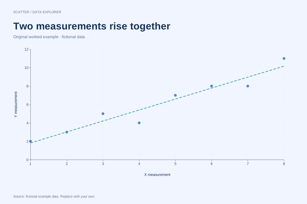
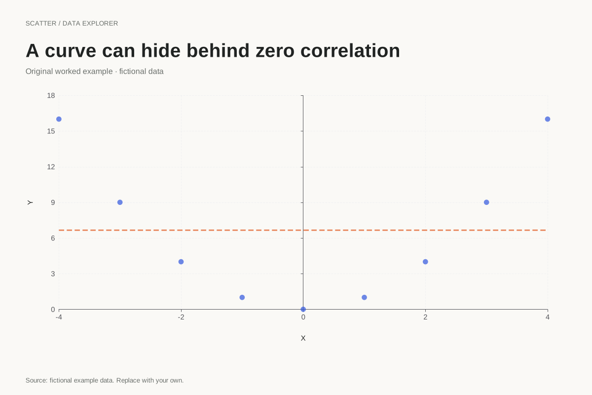
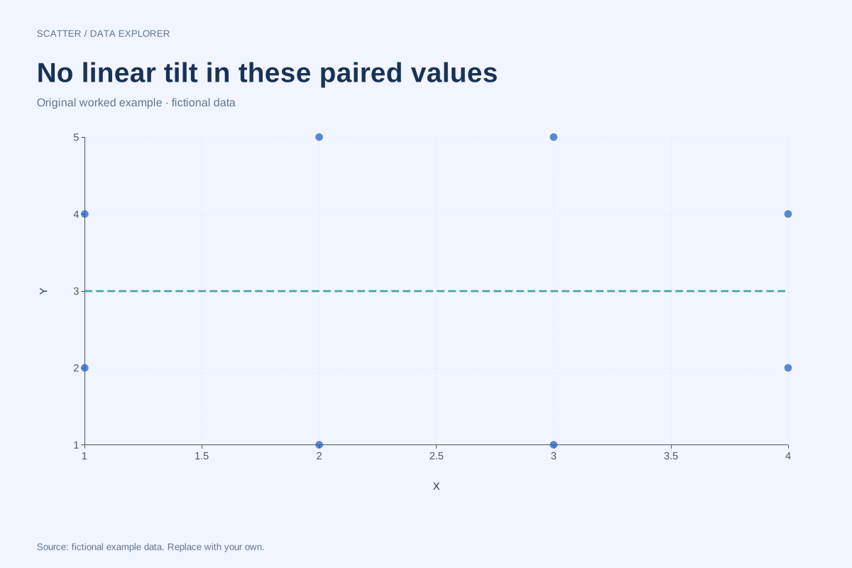
Every row supplies one X and one Y measurement for the same observation. The chart does not sort, merge or connect the points. Repeated X values are allowed and repeated pairs remain in the data, although exact overlaps can appear as one mark. Use consistent units and keep subject matching intact before importing.
Method background: NIST: scatter plot interpretation.
Created by SupaMakers for ChartsAI · September 8, 2026. Source and reuse terms.