Scatter plot examples
Plot paired X and Y measurements without joining the observations. Inspect Pearson correlation and optionally draw the ordinary least-squares regression line with an intercept. These worked examples make the input values, method and interpretation available together.
Make your own scatter plot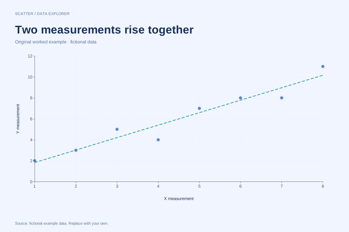
Positive correlation scatter plot with a fitted line
This fictional scatter plot shows a positive linear association: larger X measurements generally accompany larger Y measurements. Each point is one paired observation, and the dashed line is an optional least-squares summary.
Explore chart & data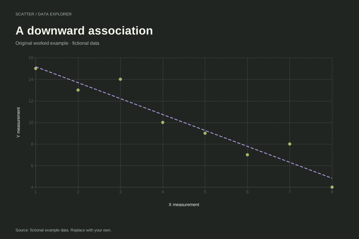
Negative correlation scatter plot example
This fictional scatter plot shows an overall downward relationship. Larger X values tend to accompany smaller Y values, while individual observations still depart from a perfectly descending line.
Explore chart & data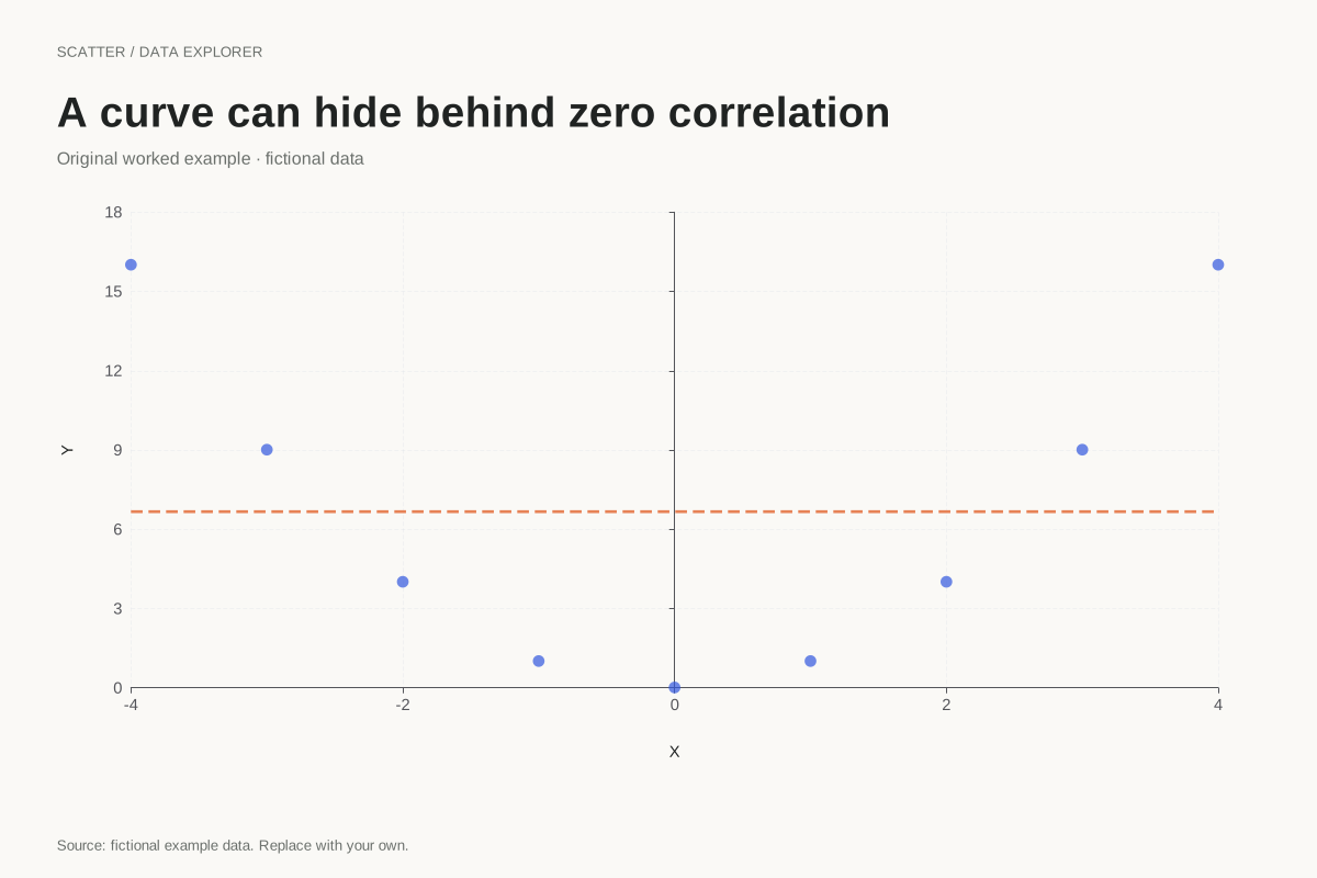
Curved scatter plot with zero Pearson correlation
A zero Pearson correlation does not mean there is no relationship. This exact teaching example uses Y = X² for nine X values from −4 to 4, producing a clear U-shaped pattern with zero linear correlation.
Explore chart & data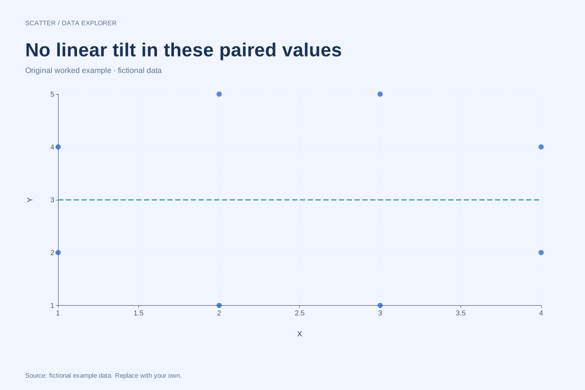
Scatter plot with no linear correlation
This balanced set of eight fictional pairs has zero Pearson correlation. Its points show no overall rising or falling straight-line trend, while the complete coordinates remain available for checking the calculation.
Explore chart & data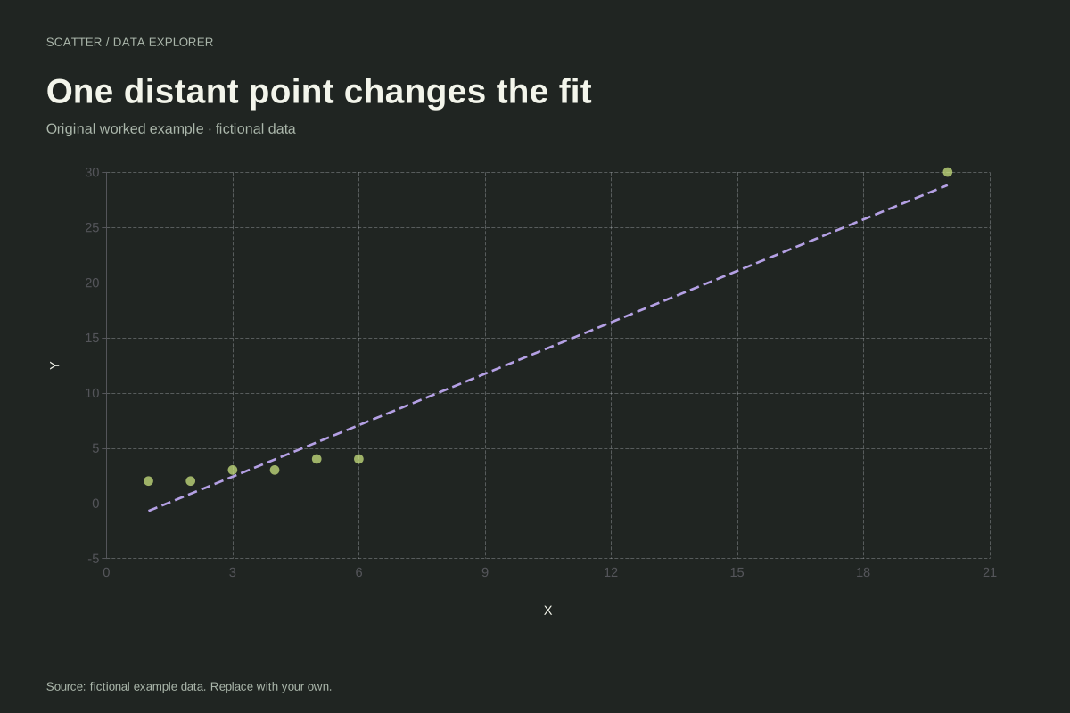
Scatter plot with an influential high-X observation
An observation far from the other X values can strongly affect a fitted line. This fictional example contains six nearby pairs and one point at (20, 30), making its influence on the linear summary easy to inspect.
Explore chart & data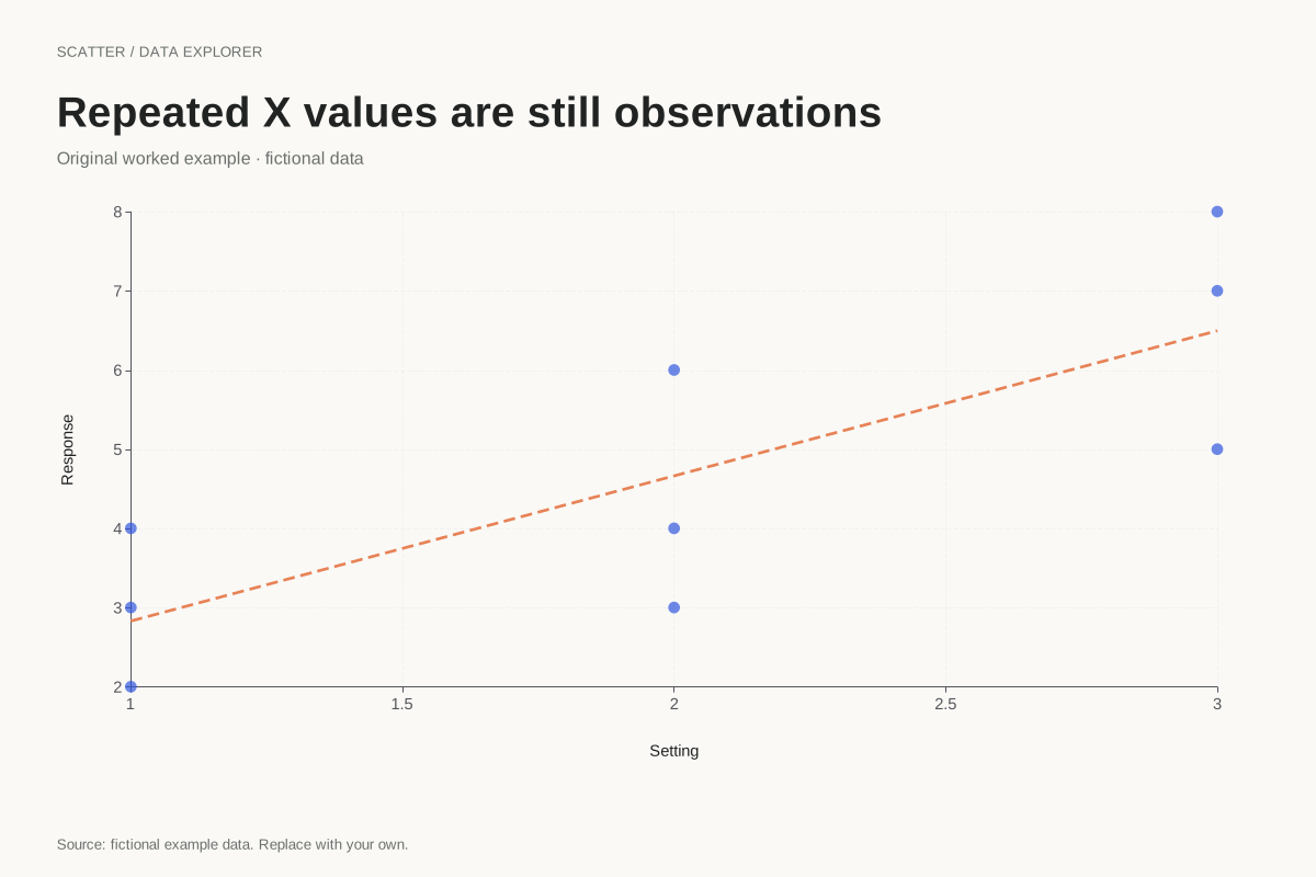
Scatter plot with repeated X measurements
Repeated X values are valid in a scatter plot. This example keeps nine paired observations at three X positions, showing the variation in Y within each position without aggregating the observations into averages.
Explore chart & dataRead patterns before reading one coefficient
The positive and negative examples show overall linear directions with local deviations. The curved case gives an exact U shape with zero Pearson correlation, while a separate balanced example also has zero correlation with a different point pattern. Comparing them makes a practical point: a coefficient describes a particular property of the pairs, not the complete relationship. Every example keeps the coordinates available beside the picture.
Check what a fitted line depends on
The influential-point case adds a distant observation to a nearby cluster. It provides a starting point for an explicit sensitivity comparison, without automatically removing the point. The repeated-X case shows why several measurements at one setting remain valid observations. A fitted line can use those repeats as long as X varies somewhere in the sample. The editor reports undefined correlation or slope when constant variables prevent the corresponding calculation.
Preserve pairing when adapting an example
Keep X and Y from the same observation on one row. Sorting the columns separately destroys that association, even if both columns still contain the original numbers. Start with the paired CSV, select exactly two numeric columns and inspect all selected rows. Add an appropriate title and units, then decide whether a straight-line summary is useful. The optional fit does not establish causality, provide uncertainty bands or justify extrapolating beyond the observed X range.
Every dataset in this collection is original and fictional. Use the examples to learn a calculation or start a chart, and replace the source note when adding your own observations. Explore the complete chart library.