How to read this chart
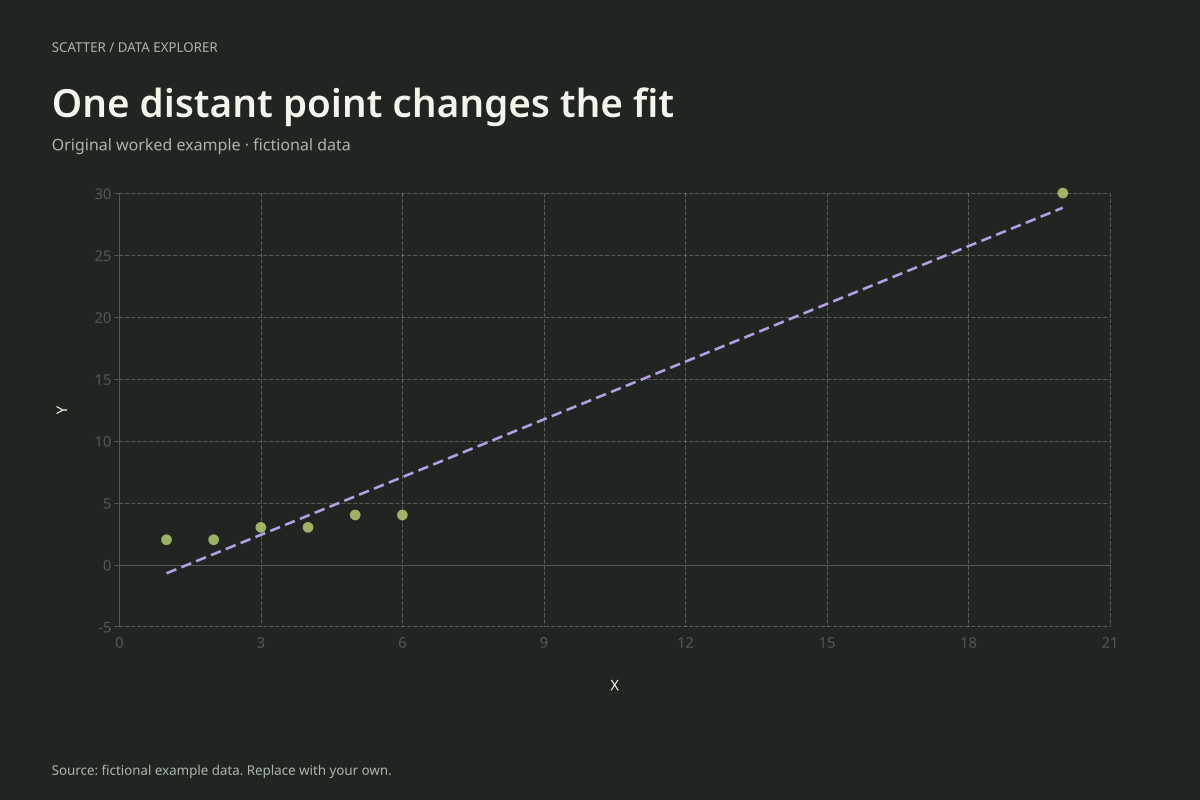
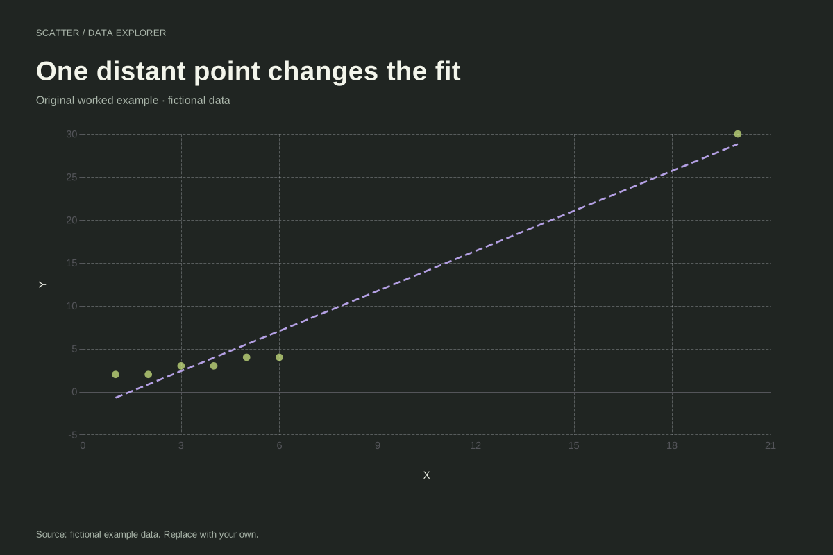
The first six points have X from 1 to 6 and Y from 2 to 4. The final point extends both ranges substantially. It has high leverage in the descriptive sense that its X value sits far from the sample mean relative to the main cluster.
A line fitted to all seven pairs balances squared vertical residuals across all seven. It can therefore give a different summary from a line fitted only to the first six. The editor does not remove the distant point or decide whether it is erroneous.
Try the calculation yourself
Download the original CSV, then explicitly create a second six-row version without the final point. Compare the slopes and report that this is a sensitivity check. Investigate the source record before choosing which dataset should support a real conclusion.
Open this exact example, change the data or calculation settings, and compare the result. The CSV preserves the input rows; the ECharts JSON contains drawing options.
What this example cannot tell you
The coordinates are invented to illustrate sensitivity. A distant observation can be valid and informative, or it can reflect an error. Geometry alone cannot decide. The editor provides a simple fit, not formal influence diagnostics or a robust regression model.
Should I delete the point to improve the chart?
No automatic deletion is justified. Verify its measurement and context, and explain any exclusion. A sensitivity comparison can show how much the fit depends on the observation without pretending that the preferred-looking pattern is necessarily the correct one.
Calculation convention
Every row supplies one X and one Y measurement for the same observation. The chart does not sort, merge or connect the points. Repeated X values are allowed and repeated pairs remain in the data, although exact overlaps can appear as one mark. Use consistent units and keep subject matching intact before importing.
Method background: NIST: scatter plot interpretation.
Created by SupaMakers for ChartsAI · September 8, 2026. Source and reuse terms.