Scatter plot maker.
Upload a CSV or Excel file, or paste your data. Choose the columns to plot, preview your scatter plot, and download it free.
Preview your scatter plot
Each point uses X and Y from the same row. A trend does not establish causation.
Blueprint styleDownload your chart
PNG for slides · SVG for editing · PDF for printing
Calculated values
Pearson r measures linear association. A fitted line does not establish causation.
| Statistic | Value |
|---|---|
| Paired observations | 8 |
| Pearson r | 0.9643959372630744 |
| Slope | 1.1904761904761905 |
| Intercept | 0.6428571428571432 |
| R squared | 0.9300595238095237 |
Inspect every input row (8)
| X measurement | Y measurement |
|---|---|
| 1 | 2 |
| 2 | 3 |
| 3 | 5 |
| 4 | 4 |
| 5 | 7 |
| 6 | 8 |
| 7 | 8 |
| 8 | 11 |
How to make a scatter plot
Plot paired X and Y measurements without joining the observations. Inspect Pearson correlation and optionally draw the ordinary least-squares regression line with an intercept.
- Upload a file or paste spreadsheet cells. Choose the columns and check the preview before creating your chart.
- Inspect every selected row. Missing or invalid numbers need correction; they are never filled with zero.
- Set the calculation options, then inspect the calculated values below the chart.
- Edit the title, labels and source note. Download an image, PDF, original CSV or ECharts configuration.
The editor accepts up to 2,000 observations for distributions and scatter plots, eight box-plot groups, or 50 bar/Pareto categories. A bar chart can include up to five series. Spreadsheet preview accepts files up to 8 MB, 2,000 rows and 100 columns. Data stays in your browser.
Keep the pairing intact
Every row supplies one X and one Y measurement for the same observation. The chart does not sort, merge or connect the points. Repeated X values are allowed and repeated pairs remain in the data, although exact overlaps can appear as one mark. Use consistent units and keep subject matching intact before importing.
Read Pearson correlation carefully
Pearson r measures linear association by dividing the centred cross-product sum by the square root of the two centred sums of squares. A value near zero can coexist with a strong curved pattern. Correlation is undefined when either variable is constant, which the calculated table reports instead of returning a misleading zero.
Understand the fitted line
The optional line is ordinary least squares with an intercept: slope is the centred cross-product sum divided by the X sum of squares, and intercept is mean Y minus slope times mean X. The line minimizes squared vertical residuals. It is drawn only over the observed X range; the tool does not provide prediction intervals or imply reliable extrapolation.
Check the observations before the summary
Inspect the pattern, unusual points and sample size together. The reported R squared is r squared for this simple regression with an intercept when both variables vary. Constant X prevents a fitted slope. A scatter plot and a regression calculation alone cannot establish causation, remove confounding or justify a population claim.
Method references
Built by SupaMakers. Inspect the open source calculations and reuse terms.
Worked scatter plot examples
Explore the collection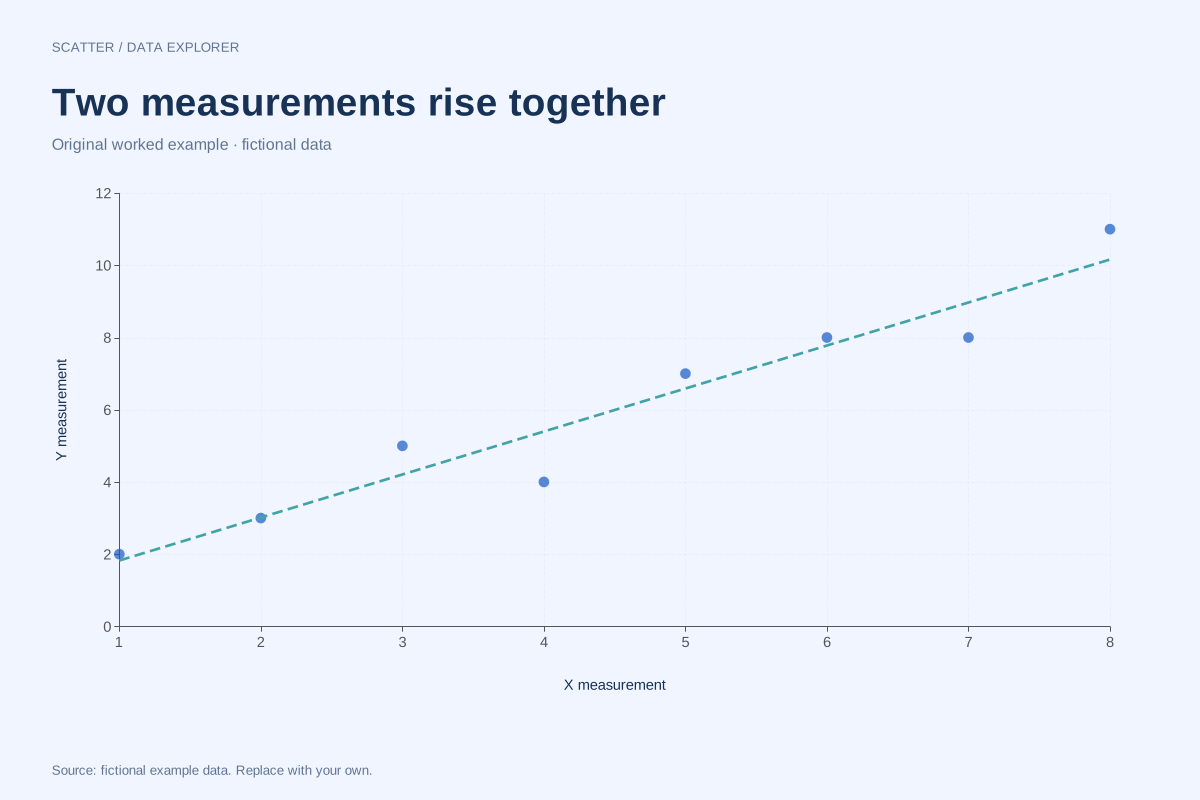
Positive correlation scatter plot with a fitted line
This fictional scatter plot shows a positive linear association: larger X measurements generally accompany larger Y measurements. Each point is one paired observation, and the dashed line is an optional least-squares summary.
Explore chart & data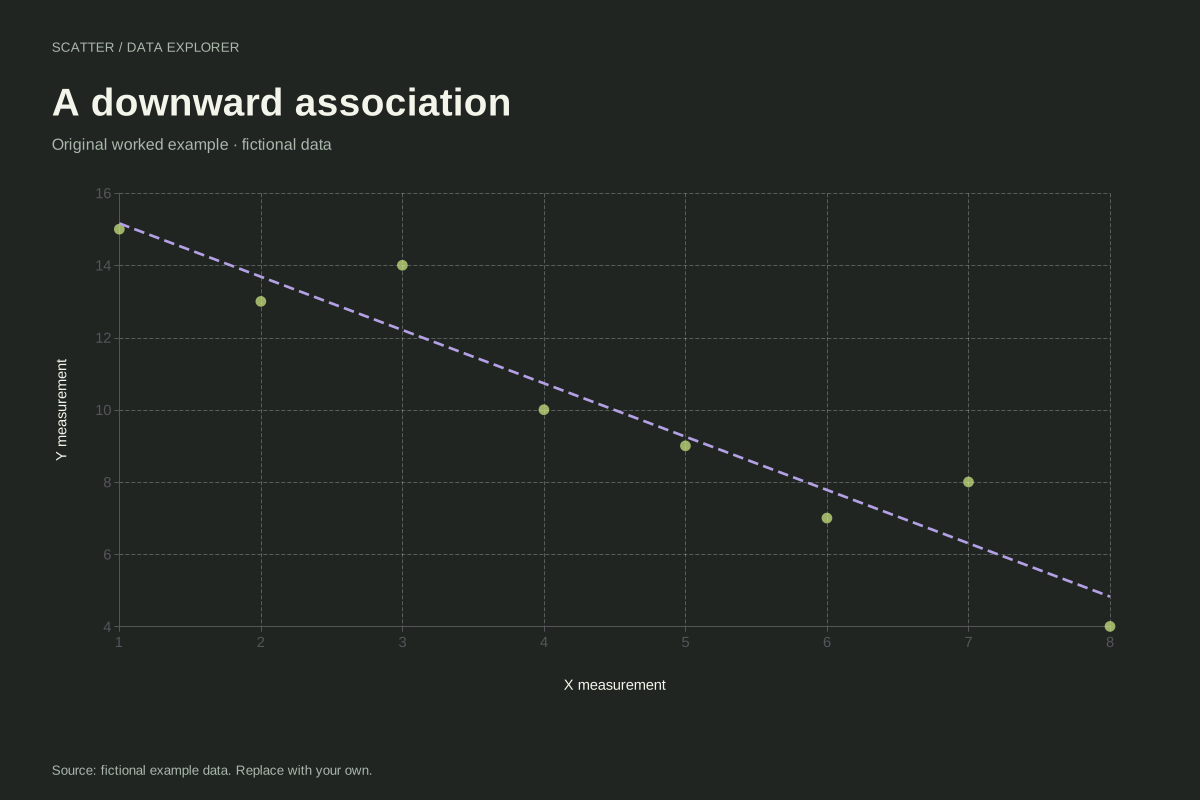
Negative correlation scatter plot example
This fictional scatter plot shows an overall downward relationship. Larger X values tend to accompany smaller Y values, while individual observations still depart from a perfectly descending line.
Explore chart & data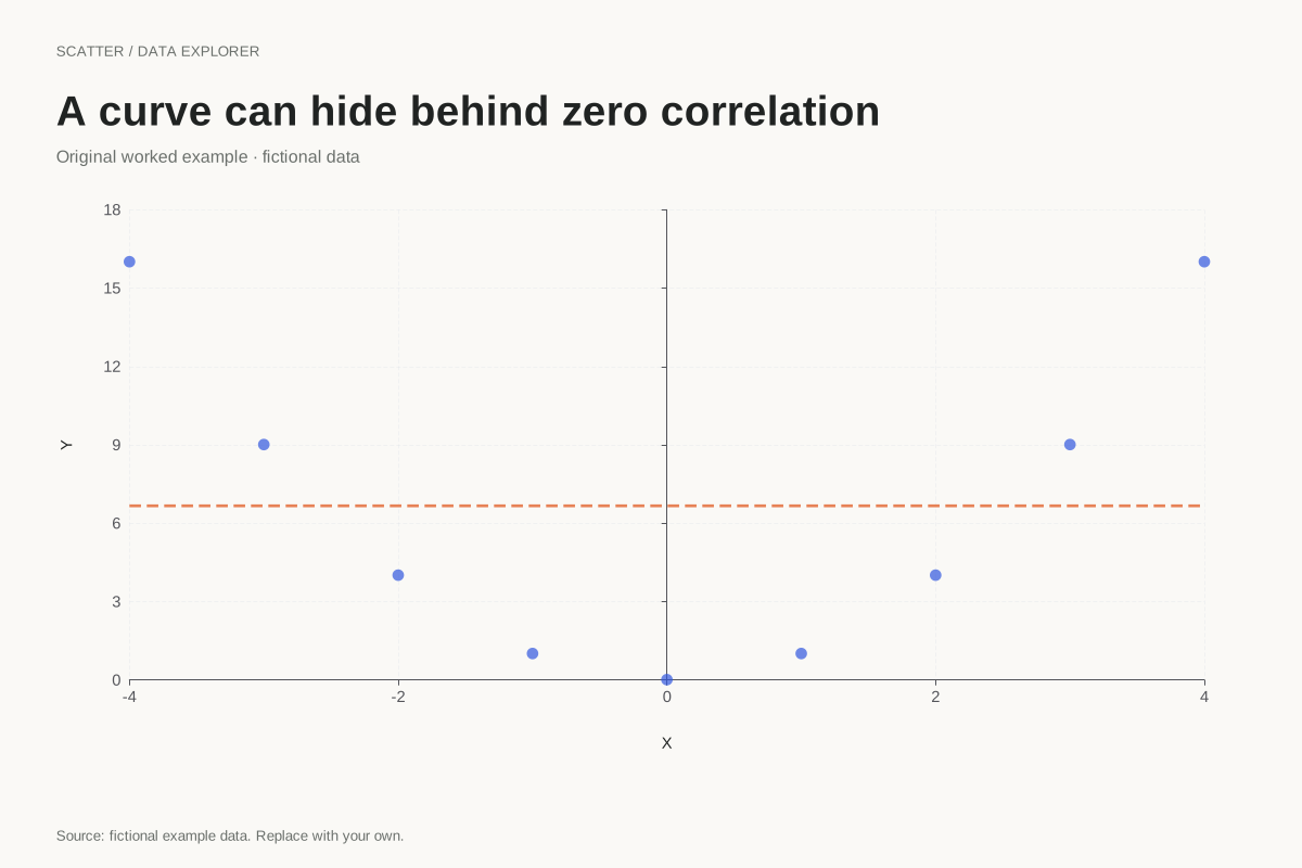
Curved scatter plot with zero Pearson correlation
A zero Pearson correlation does not mean there is no relationship. This exact teaching example uses Y = X² for nine X values from −4 to 4, producing a clear U-shaped pattern with zero linear correlation.
Explore chart & data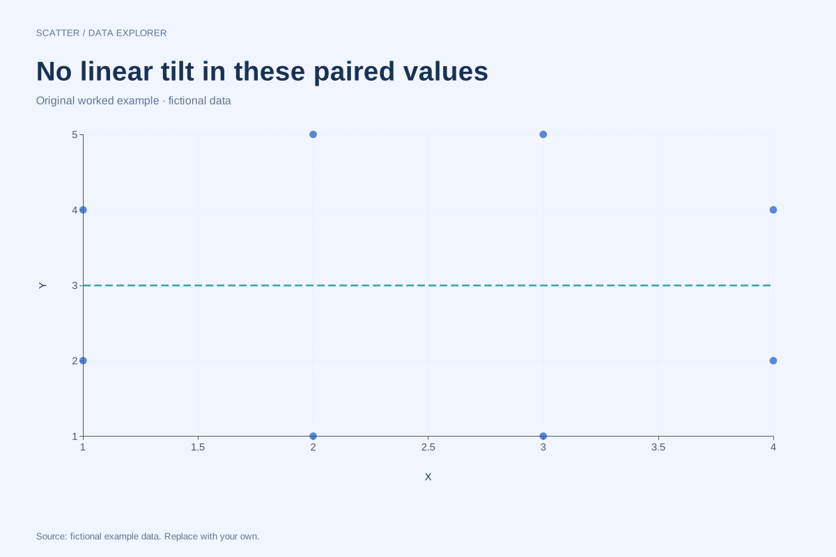
Scatter plot with no linear correlation
This balanced set of eight fictional pairs has zero Pearson correlation. Its points show no overall rising or falling straight-line trend, while the complete coordinates remain available for checking the calculation.
Explore chart & data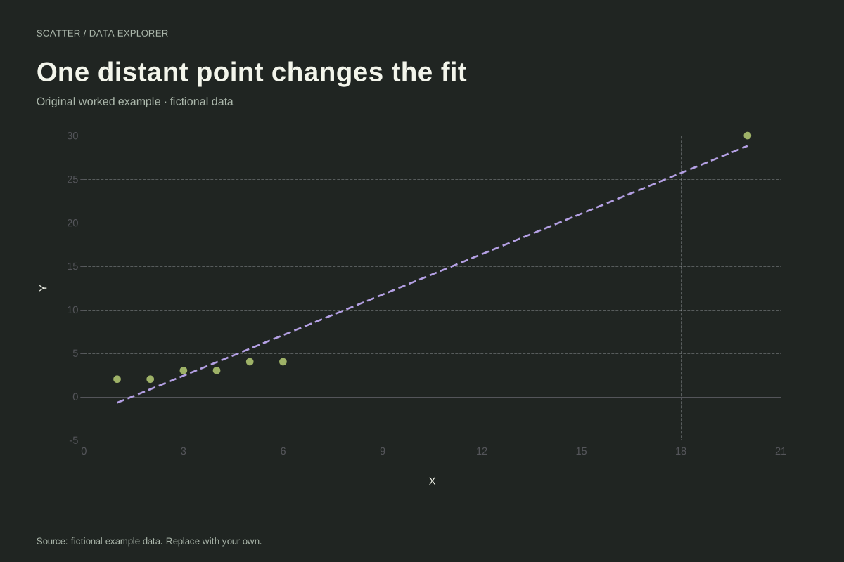
Scatter plot with an influential high-X observation
An observation far from the other X values can strongly affect a fitted line. This fictional example contains six nearby pairs and one point at (20, 30), making its influence on the linear summary easy to inspect.
Explore chart & data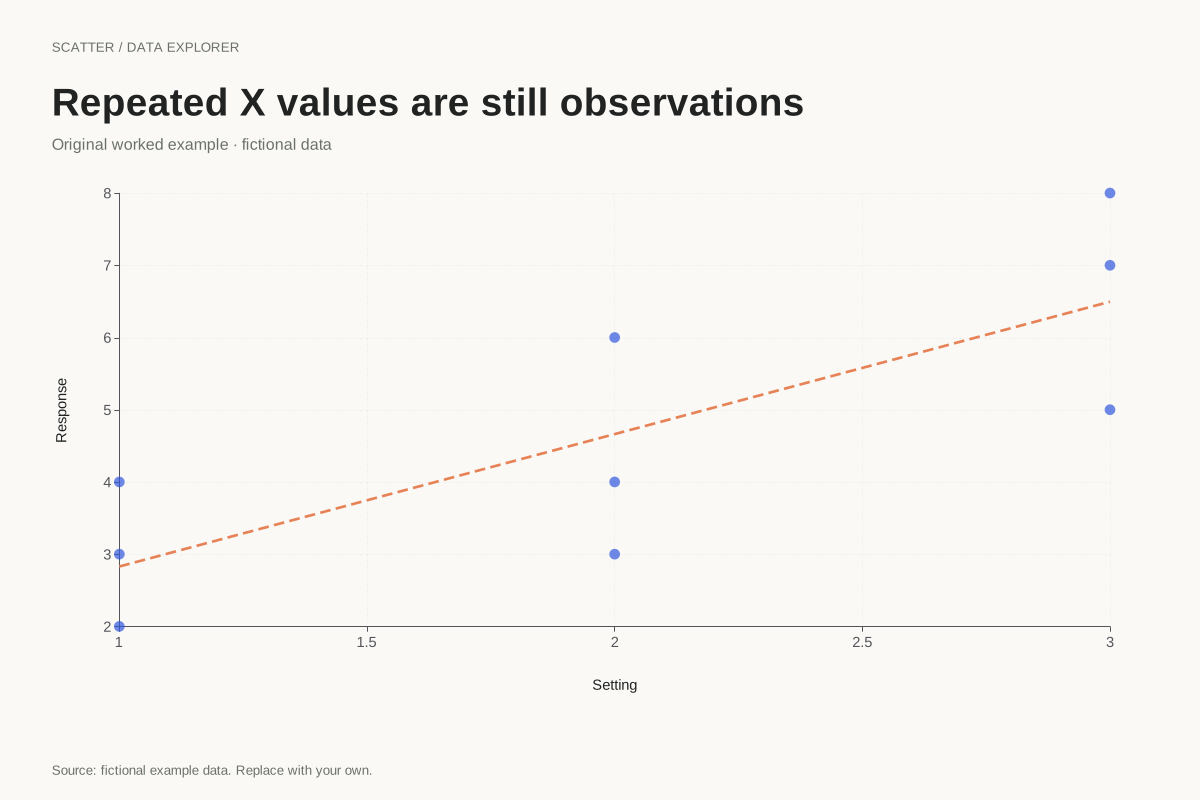
Scatter plot with repeated X measurements
Repeated X values are valid in a scatter plot. This example keeps nine paired observations at three X positions, showing the variation in Y within each position without aggregating the observations into averages.
Explore chart & data