How to read this chart
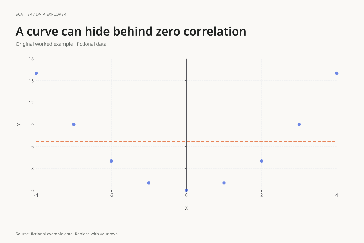
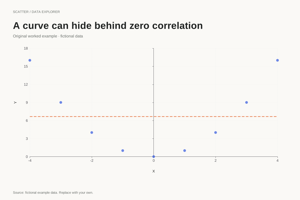
The paired values are symmetric: X = −4 and X = 4 both have Y = 16, while −1 and 1 both have Y = 1. The positive and negative centred cross-products cancel, giving a Pearson correlation of zero despite the deterministic quadratic relationship.
The least-squares straight line has slope zero and intercept 60 ÷ 9, or about 6.666667. It runs horizontally through the mean Y. That line cannot follow the U shape, illustrating why a single linear statistic is an incomplete description.
Try the calculation yourself
Turn the regression line off to inspect the geometry without its horizontal summary. Then compare the raw pairs with the rule Y = X². The editor fits only a straight line, so a curved model must be specified and evaluated separately rather than inferred from a low r value.
Open this exact example, change the data or calculation settings, and compare the result. The CSV preserves the input rows; the ECharts JSON contains drawing options.
What this example cannot tell you
These pairs were calculated from an exact formula, not measured in an experiment. There is no random noise or uncertainty. The example demonstrates a limitation of linear correlation rather than establishing a model for a real process.
Does r = 0 prove independence?
No. In this dataset Y is completely determined by X², so the variables are related even though their linear correlation is zero. Independence is a stronger property that cannot be concluded merely from a zero sample Pearson coefficient.
Calculation convention
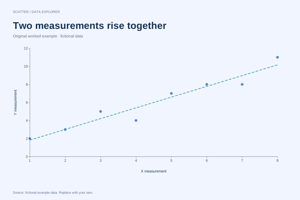
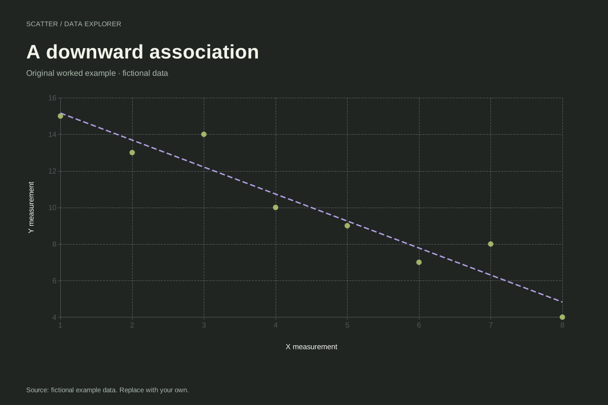
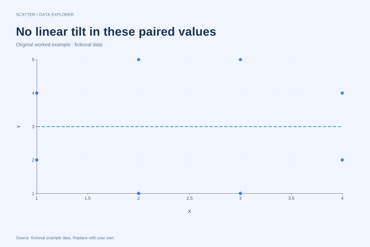
Every row supplies one X and one Y measurement for the same observation. The chart does not sort, merge or connect the points. Repeated X values are allowed and repeated pairs remain in the data, although exact overlaps can appear as one mark. Use consistent units and keep subject matching intact before importing.
Method background: NIST: scatter plot interpretation.
Created by SupaMakers for ChartsAI · September 8, 2026. Source and reuse terms.