Pareto chart examples
Sort category values from largest to smallest and calculate their running share of the total. Bars show the chosen measure; the line uses a separate 0–100% axis. These worked examples make the input values, method and interpretation available together.
Make your own pareto chart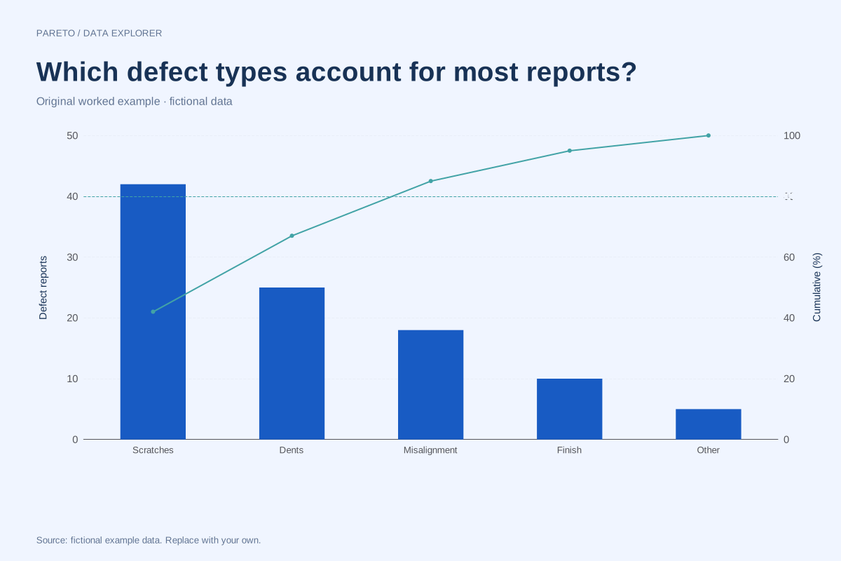
Pareto chart of defect counts with cumulative percentages
This Pareto chart ranks five fictional defect categories by reported count. The bars show the counts, and the line tracks their cumulative share of the 100 reports in the example.
Explore chart & data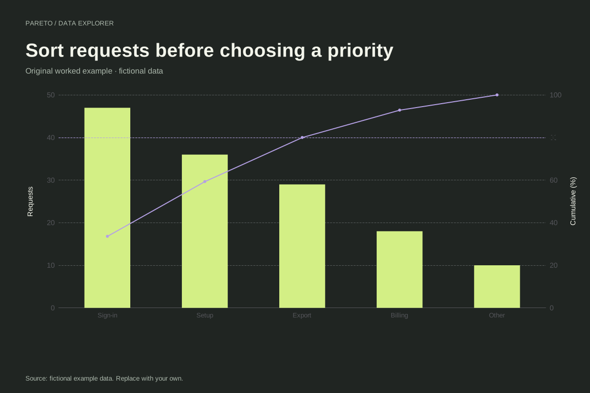
Pareto chart of support requests
This fictional support example begins with unsorted category counts. The Pareto maker places sign-in, setup, export, billing and other requests in descending order and recalculates cumulative percentages.
Explore chart & data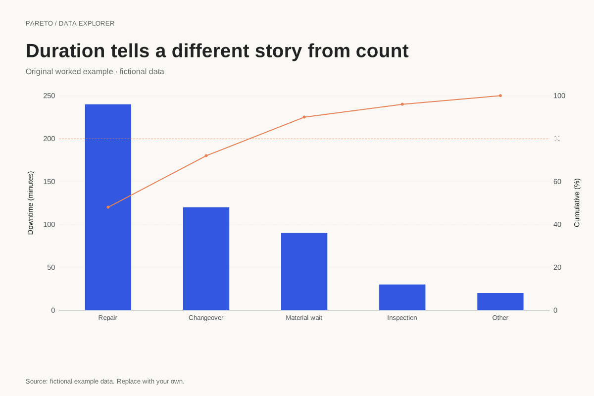
Pareto chart of downtime measured in minutes
A Pareto chart can rank duration rather than incident count. This fictional example totals 500 downtime minutes across five categories, so the largest bars identify where the recorded time accumulated.
Explore chart & data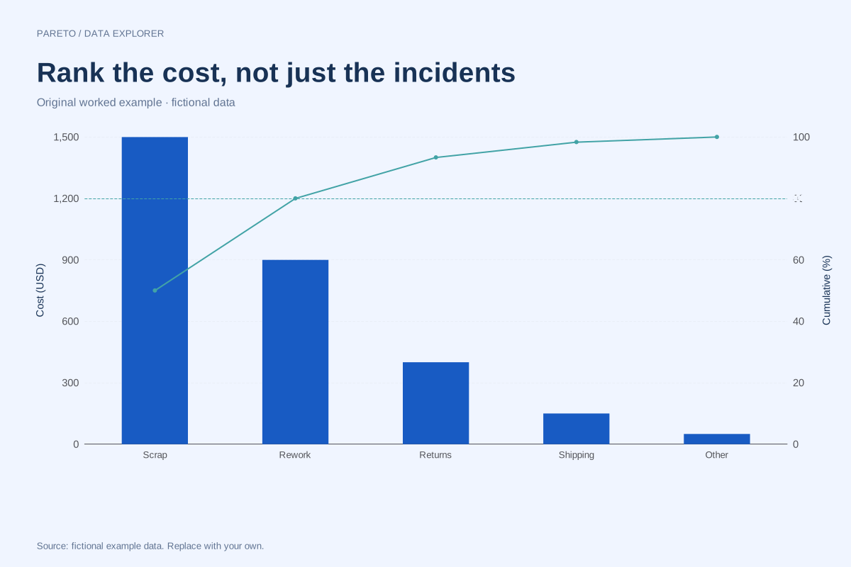
Cost-based Pareto chart with a different priority measure
A cost-based Pareto ranks categories by a shared monetary measure rather than incident frequency. This fictional example totals 3,000 units of cost, making the cumulative calculation reproducible without implying a real business benchmark.
Explore chart & data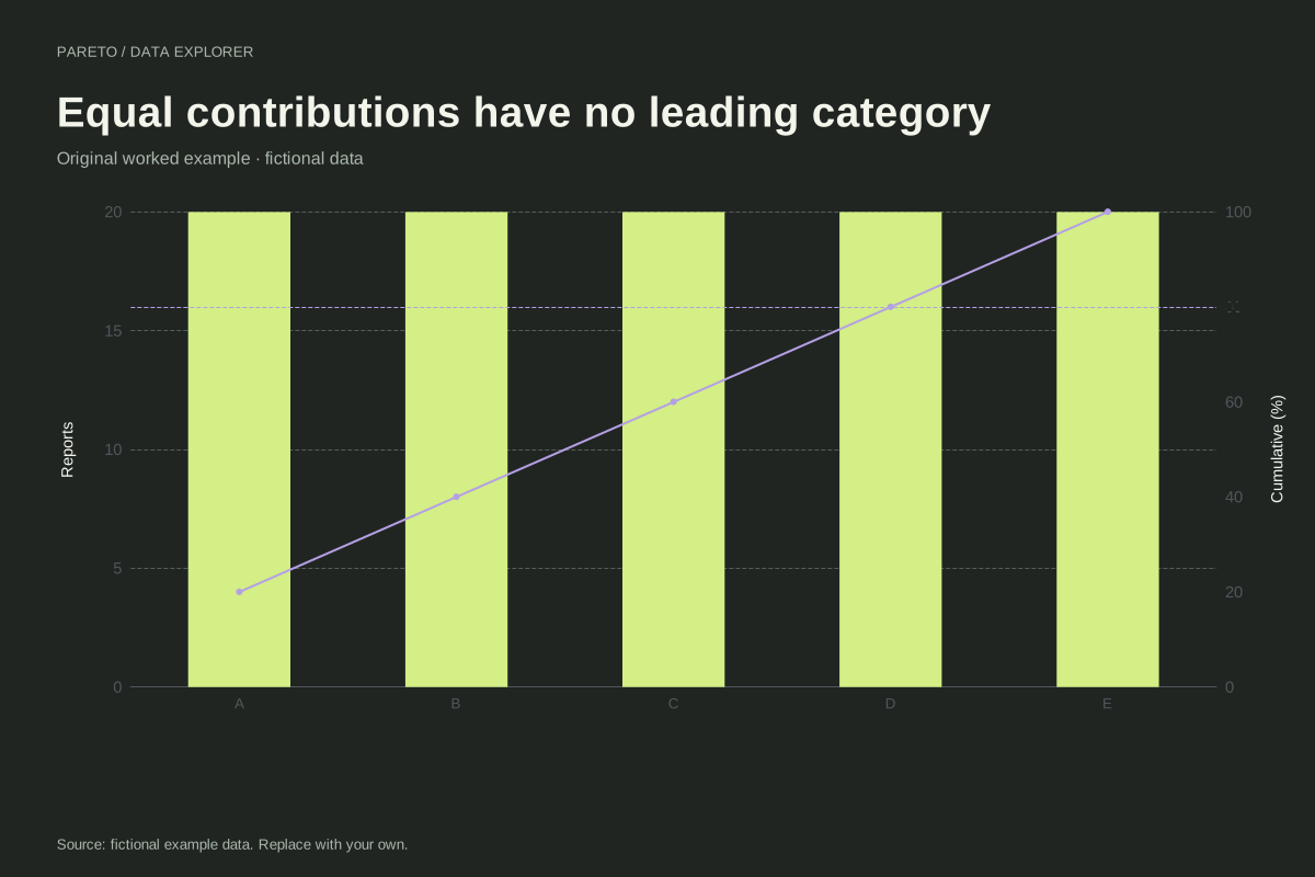
Pareto chart where every category has equal weight
A Pareto chart need not reveal a dominant category. This example assigns 20 observations to each of five fictional categories, creating equal bars and a cumulative line that rises in identical steps.
Explore chart & data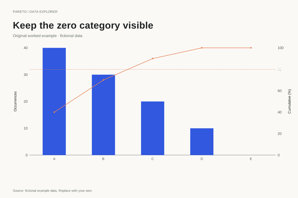
Pareto chart retaining a zero-count category
A zero-count category can remain in a Pareto chart when the overall total is positive. This fictional example places an explicit zero after four positive categories, leaving the cumulative line at 100% for the final step.
Explore chart & dataThe measure determines the ranking
The defect and support examples rank report counts. The downtime case ranks minutes, and the cost case ranks monetary amounts. These are different decision measures and can produce different orders for the same underlying events. Each example uses one compatible unit throughout its values column, then sorts categories from largest to smallest and calculates a running share of the positive total.
Test the 80% reference against the actual table
The defect example needs three of five categories to pass 80%, while the support example reaches exactly 80% after its first three. Equal categories need four of five to reach that level. None is required to follow a universal 80/20 pattern. The zero-category case also keeps an explicit zero at the end, where it adds no further percentage and leaves the cumulative line flat.
Turn a ranking into a considered next step
A high bar identifies the largest supplied amount, not the cause of the problem or the best intervention. Compare frequency with severity, cost and feasibility using separately defined evidence. Keep category rules stable across reporting periods and explain whether one incident can contribute to several categories. The original CSV preserves input order, while the chart and calculated table show the descending ranking. That distinction makes the transformation inspectable instead of leaving readers to guess why the order changed.
Every dataset in this collection is original and fictional. Use the examples to learn a calculation or start a chart, and replace the source note when adding your own observations. Explore the complete chart library.