How to read this chart
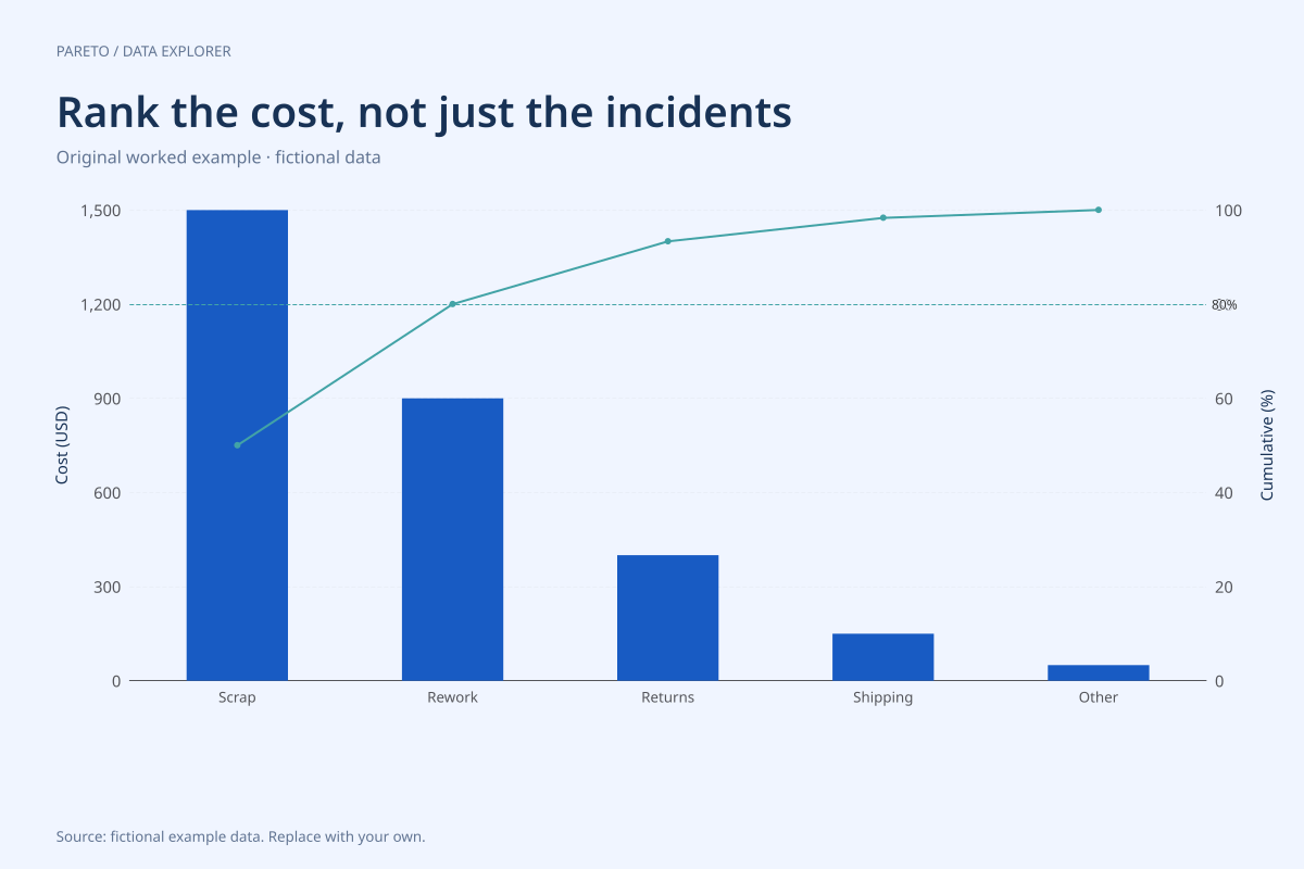
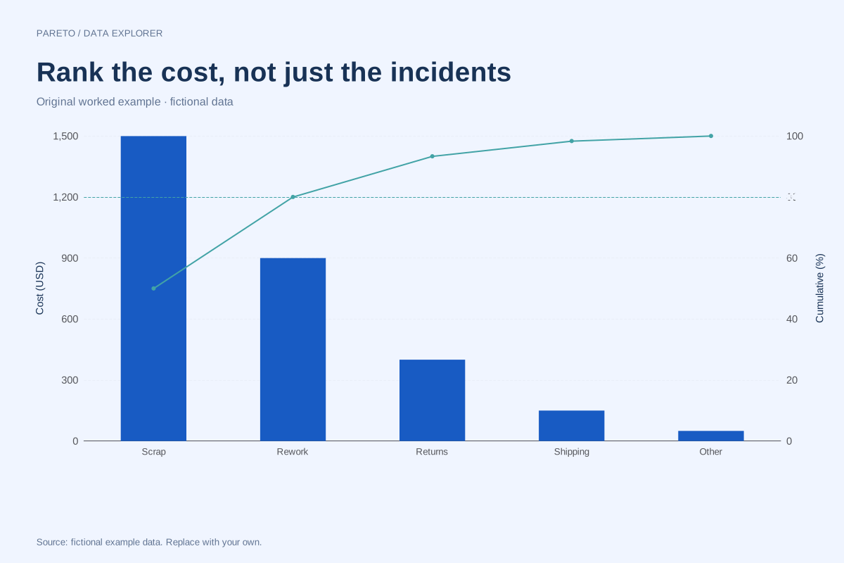
Scrap contributes 1,500, rework 900, returns 400, shipping 150 and other 50. The first two categories total 2,400, exactly 80% of 3,000. The cumulative shares are 50%, 80%, about 93.33%, about 98.33% and 100%.
The two largest categories are 40% of the five categories. Their 80% cost share is an observed feature of this constructed table, not an automatic 80/20 relationship. Ranking by incident count could produce a different ordering entirely.
Try the calculation yourself
Define which costs are included before preparing a real table: direct expense, estimated lost revenue and labour time are different quantities. Use one currency and consistent accounting period. The chart sorts supplied numeric totals but does not estimate costs from category names.
Open this exact example, change the data or calculation settings, and compare the result. The CSV preserves the input rows; the ECharts JSON contains drawing options.
What this example cannot tell you
All amounts are fictional. Costs alone do not show avoidability, uncertainty or the price of an intervention. Preventing a high-cost category may require more effort than another improvement, so the rank is an input to a decision rather than a complete recommendation.
Can I combine counts and costs in one Pareto chart?
No meaningful cumulative percentage comes from adding unlike units. Prepare separate count-based and cost-based charts, then compare their rankings. Within one chart every category must use the same measure and compatible definitions.
Calculation convention
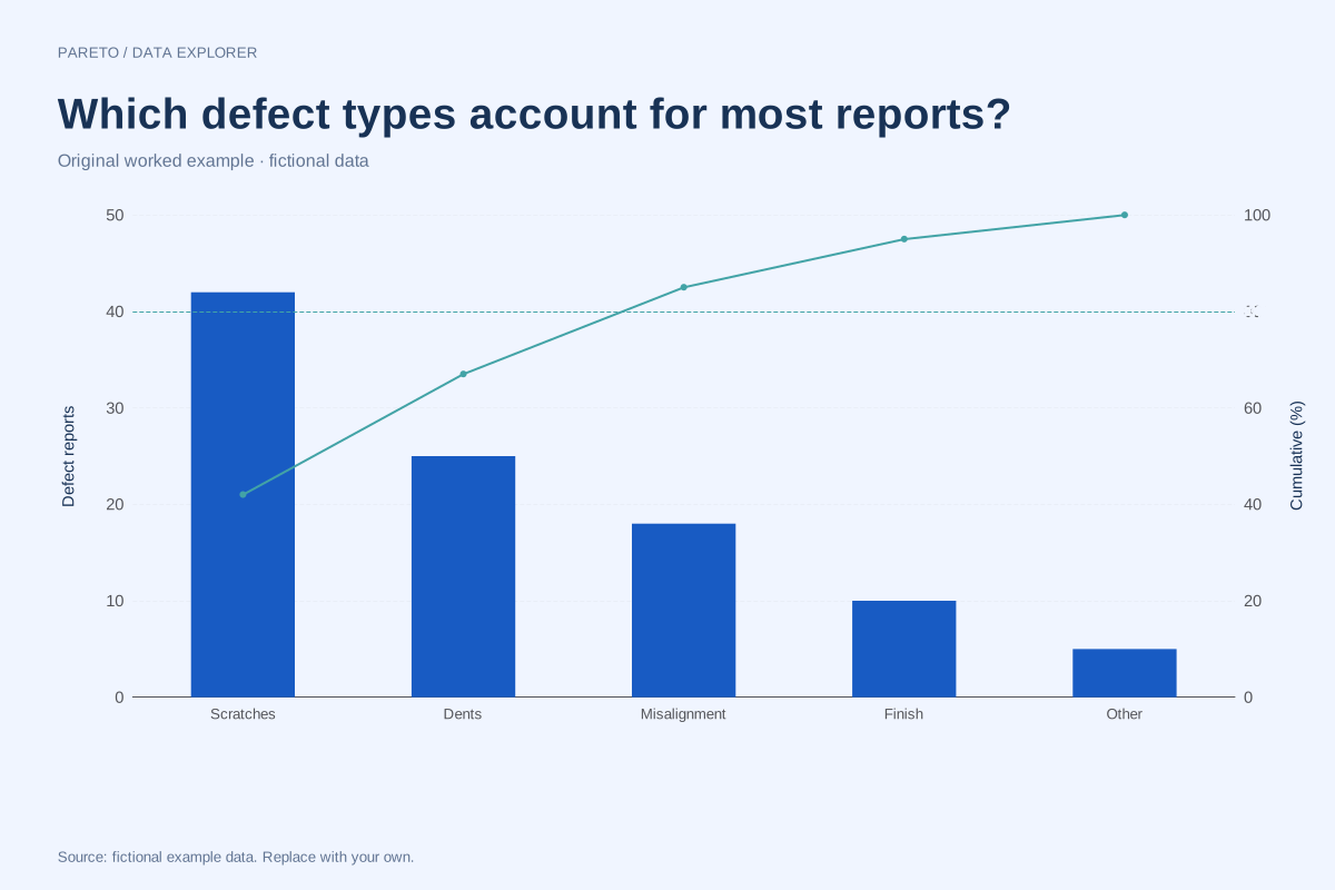
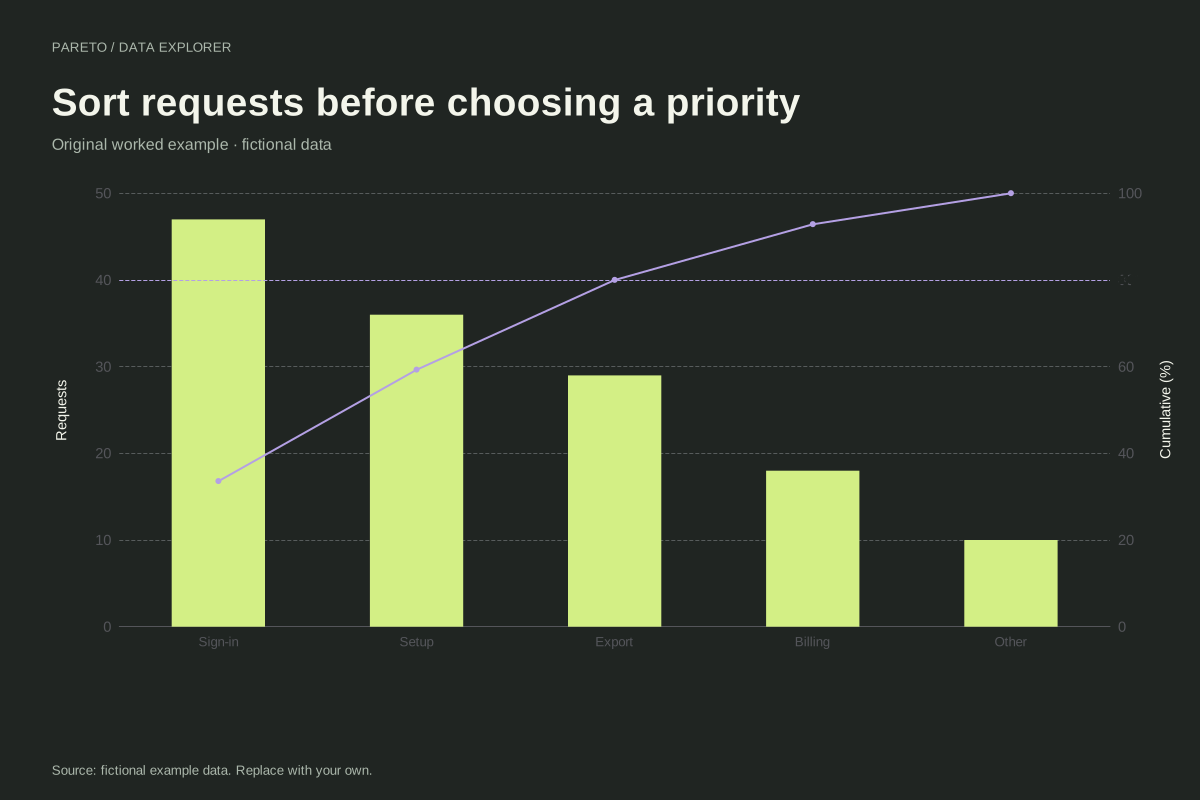
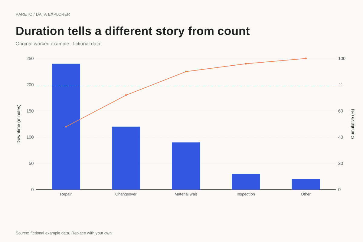
Enter one nonnegative value for each unique category. That value may be an incident count, a cost or a duration, provided the unit is consistent across rows. A category that leads by count may not lead by cost. Choose the measure that answers the decision question and make its unit visible on the left axis.
Method background: ASQ: Pareto chart procedure.
Created by SupaMakers for ChartsAI · September 8, 2026. Source and reuse terms.