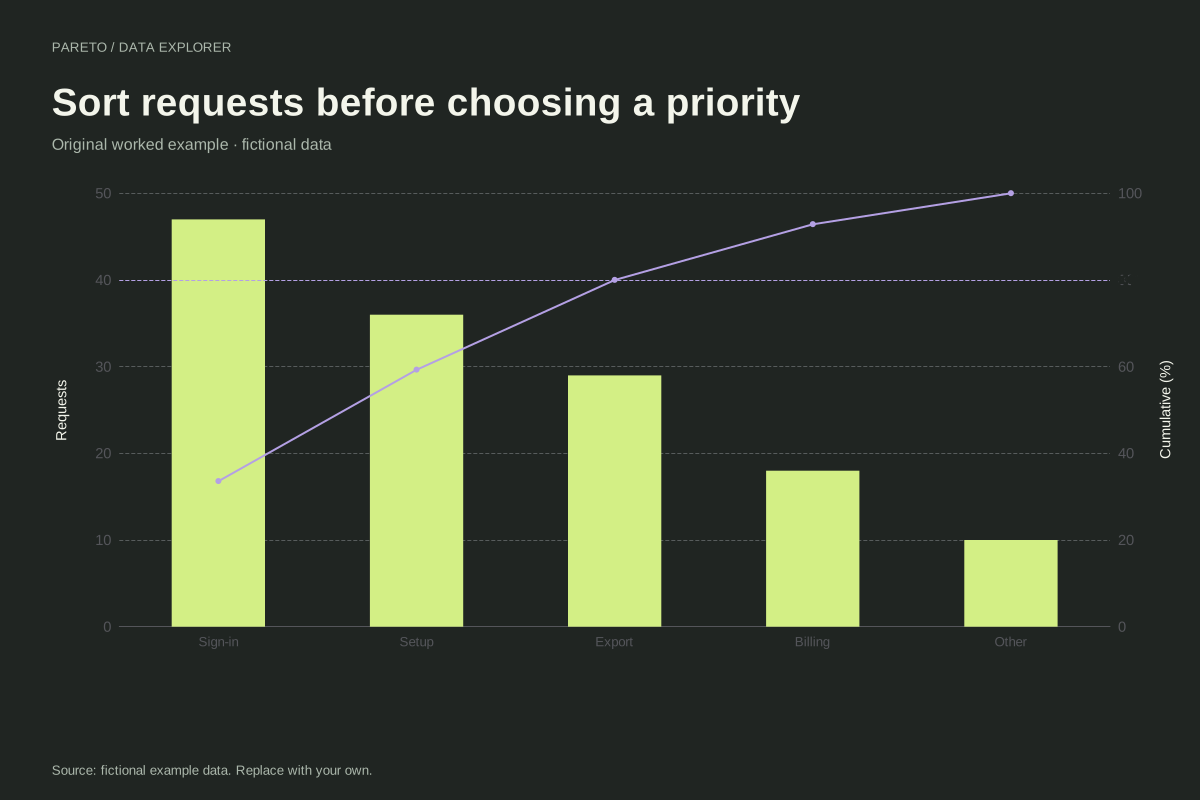
How to read this chart
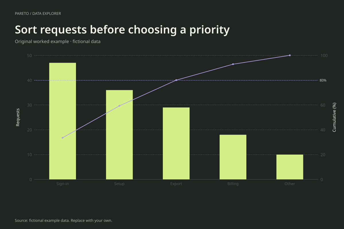
The original counts are billing 18, sign-in 47, export 29, setup 36 and other 10. After sorting, the cumulative counts are 47, 83, 112, 130 and 140. Sign-in alone accounts for about 33.57% of the 140 requests.
The first three categories account for exactly 112 ÷ 140 = 80%. Their position on the line matches the reference. The final two categories still represent 28 requests and remain part of the dataset; reaching a threshold does not make them disappear.
Try the calculation yourself
Use consistent category rules when preparing a real ticket summary. Decide whether a reopened ticket counts once or again, and whether one ticket can have multiple categories. Enter aggregated values only after that decision; the tool rejects repeated category labels rather than silently merging them.
Open this exact example, change the data or calculation settings, and compare the result. The CSV preserves the input rows; the ECharts JSON contains drawing options.
What this example cannot tell you
The example does not describe actual support traffic. Counts may reflect ticket classification, reporting effort or user volume as well as product friction. A Pareto ranking cannot establish why sign-in requests occurred or how much work any category requires.
Why did the order change after import?
Descending order is an explicit part of this Pareto calculation. The input CSV keeps your supplied order, while the calculated table and chart show the ranking. For a chart that retains a custom order, use the standard bar chart maker instead.
Calculation convention
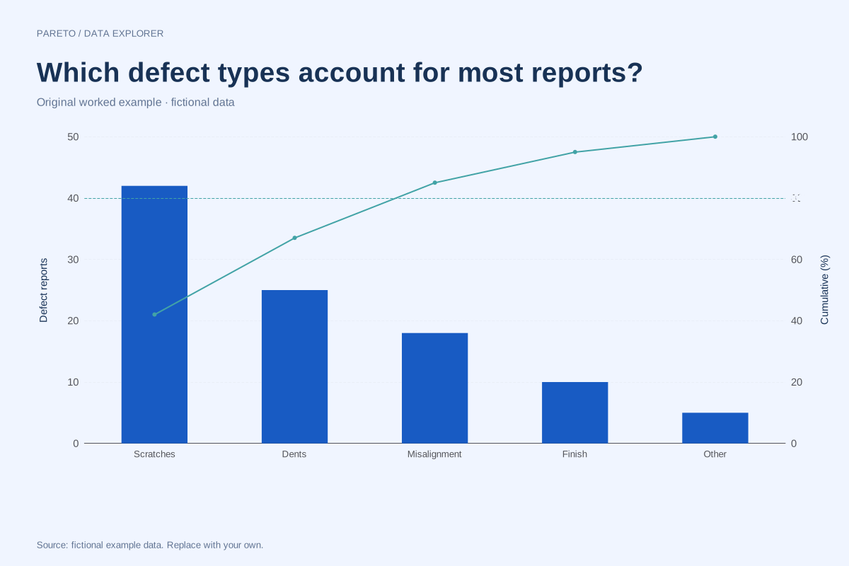
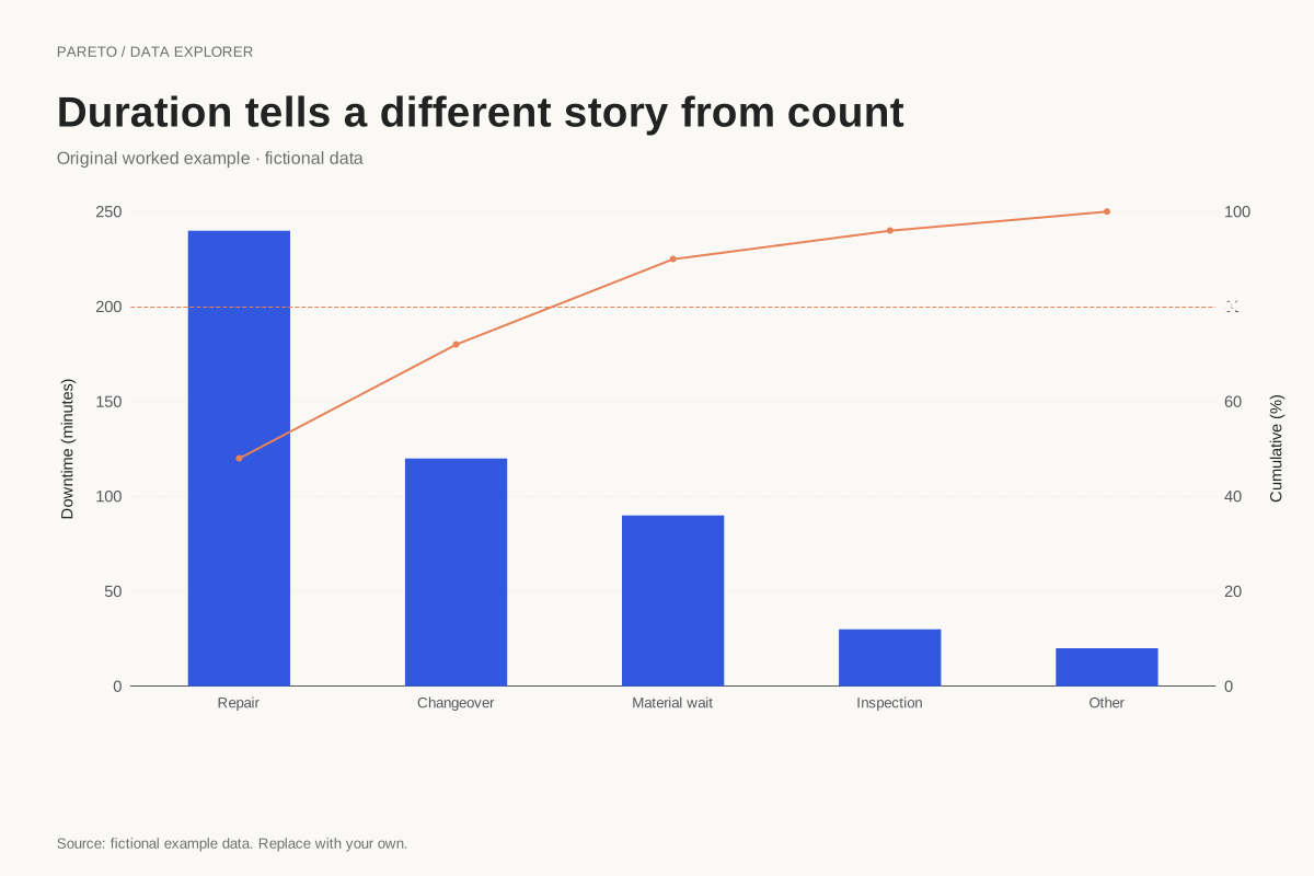
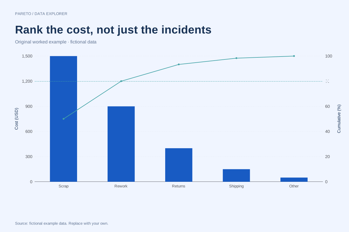
Enter one nonnegative value for each unique category. That value may be an incident count, a cost or a duration, provided the unit is consistent across rows. A category that leads by count may not lead by cost. Choose the measure that answers the decision question and make its unit visible on the left axis.
Method background: ASQ: Pareto chart procedure.
Created by SupaMakers for ChartsAI · September 8, 2026. Source and reuse terms.