How to read this chart
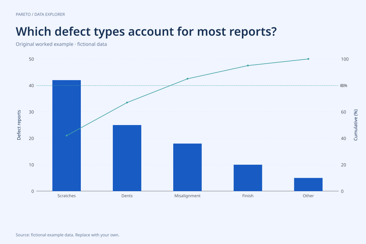
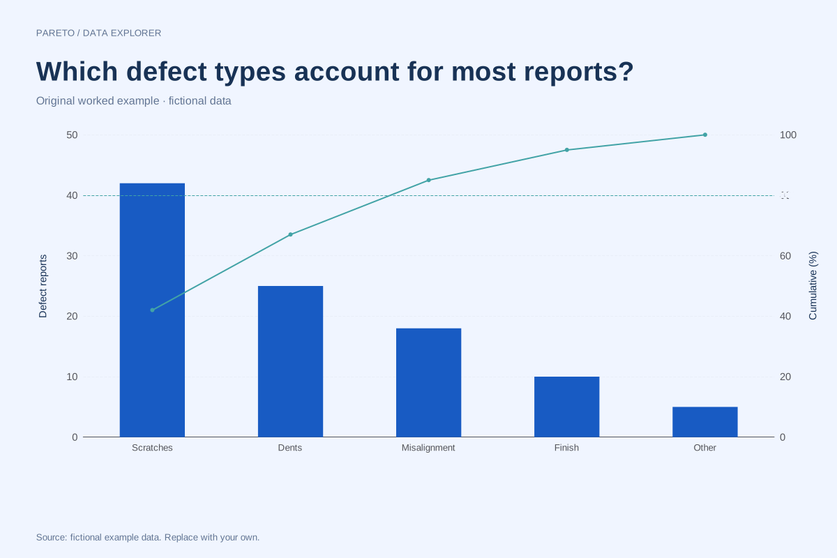
Scratches account for 42 reports, dents 25, misalignment 18, finish 10 and other 5. The cumulative shares are therefore 42%, 67%, 85%, 95% and 100%. The first three categories are needed to reach or exceed the 80% reference.
Three of five categories represent 60% of the categories, not 20%. Their combined share is 85% of reports. This is why the plotted data should be read directly rather than assuming that every Pareto chart must exhibit an exact 80/20 split.
Try the calculation yourself
Inspect the ranked table and verify the running addition: 42 + 25 + 18 = 85. If using your own defect records, decide whether you are counting defects or defective items. An item with two recorded defect types can produce two reports, so the unit matters.
Open this exact example, change the data or calculation settings, and compare the result. The CSV preserves the input rows; the ECharts JSON contains drawing options.
What this example cannot tell you
These invented counts identify no real manufacturing cause or intervention. Frequency alone omits severity, repair cost and whether a fix is practical. The chart ranks the supplied categories; it does not discover causes from raw incident descriptions.
Is the highest bar automatically the first problem to fix?
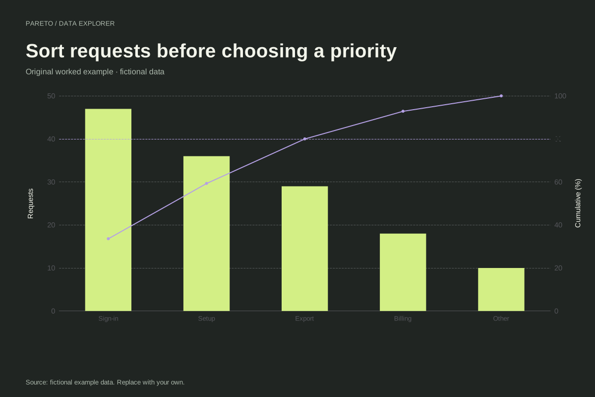
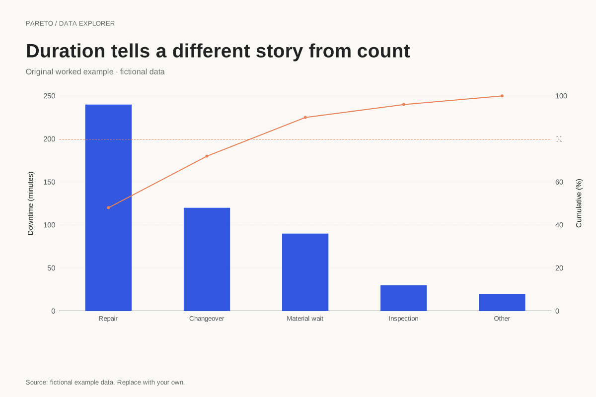
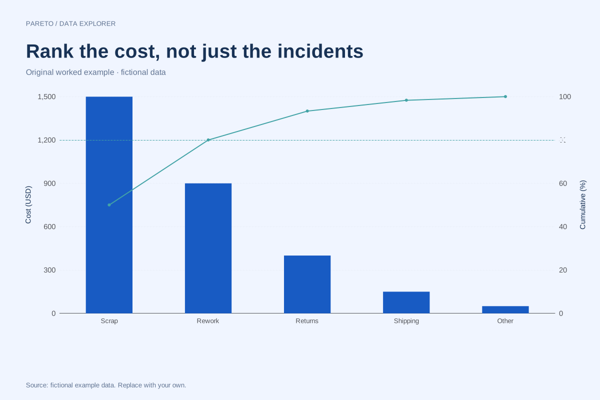
It is the most frequent category under this counting scheme. Choosing an action also depends on impact, cost and feasibility. A separate cost-based Pareto may produce a different order, so state the decision measure before treating a ranking as a priority list.
Calculation convention
Enter one nonnegative value for each unique category. That value may be an incident count, a cost or a duration, provided the unit is consistent across rows. A category that leads by count may not lead by cost. Choose the measure that answers the decision question and make its unit visible on the left axis.
Method background: ASQ: Pareto chart procedure.
Created by SupaMakers for ChartsAI · September 8, 2026. Source and reuse terms.