How to read this chart
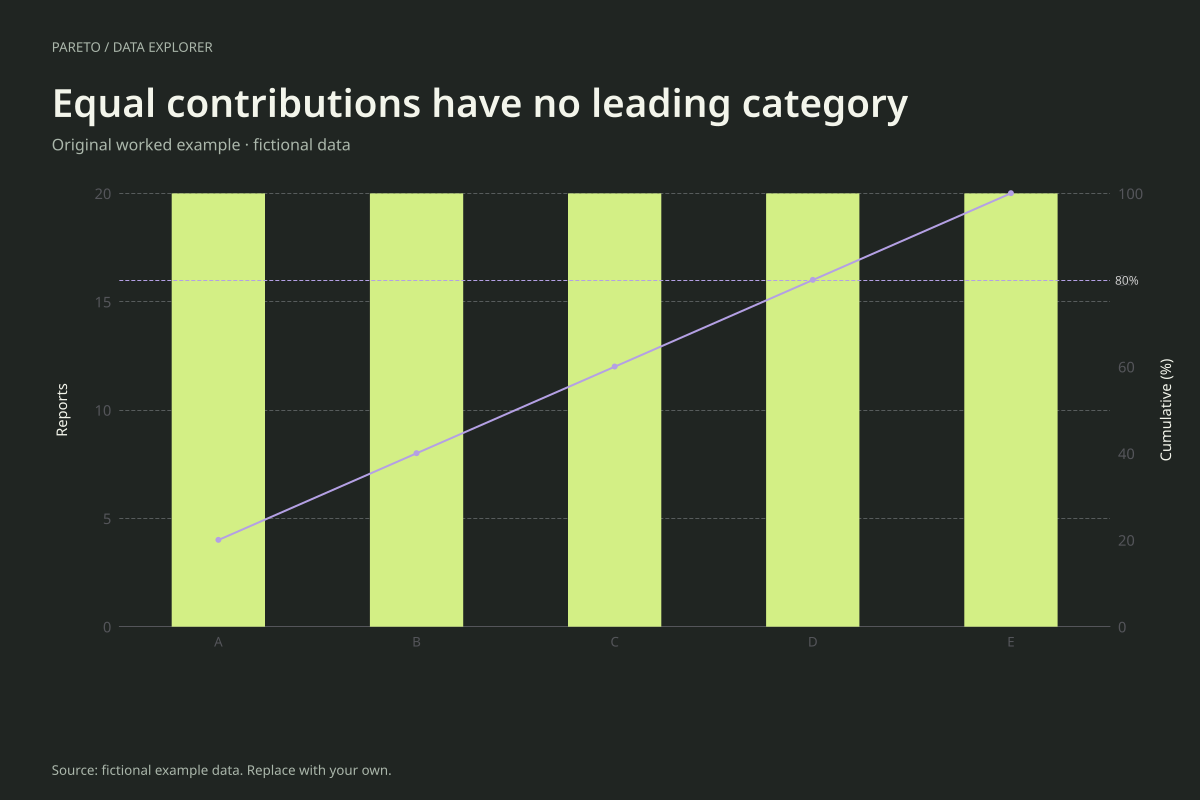
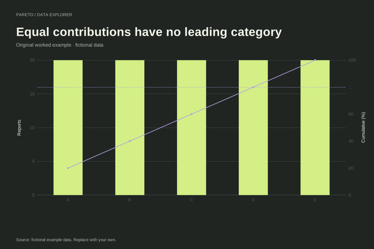
The total is 100 and each category contributes 20%. The cumulative shares are 20%, 40%, 60%, 80% and 100%. Four of the five categories are required to reach the 80% reference, so the data have no concentrated few under this categorization.
All five values are tied. The maker preserves their supplied order when sorting equal values. Changing the order of tied categories changes their positions but not the bar heights or cumulative percentages. Position alone cannot establish greater importance among ties.
Try the calculation yourself
Use this case as a check against expecting every Pareto chart to support the same story. When categories are evenly weighted, investigate a different measure only if it answers a useful question. Do not keep redefining categories solely to manufacture a dramatic ranking.
Open this exact example, change the data or calculation settings, and compare the result. The CSV preserves the input rows; the ECharts JSON contains drawing options.
What this example cannot tell you
The equal values are constructed for teaching. Real rounded counts can appear tied while underlying impacts differ. This chart only ranks the supplied measure; it has no information about severity, cost, uncertainty or practical intervention options.
Is the Pareto chart broken if there is no 80/20 pattern?
No. It correctly displays descending values and their running share. The 80% reference is a reading aid, not a condition for valid data. Here reaching 80% requires 80% of the categories, which is a useful result in itself.
Calculation convention
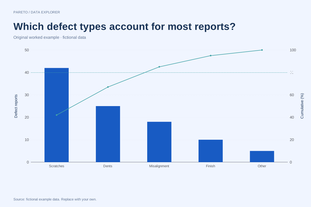
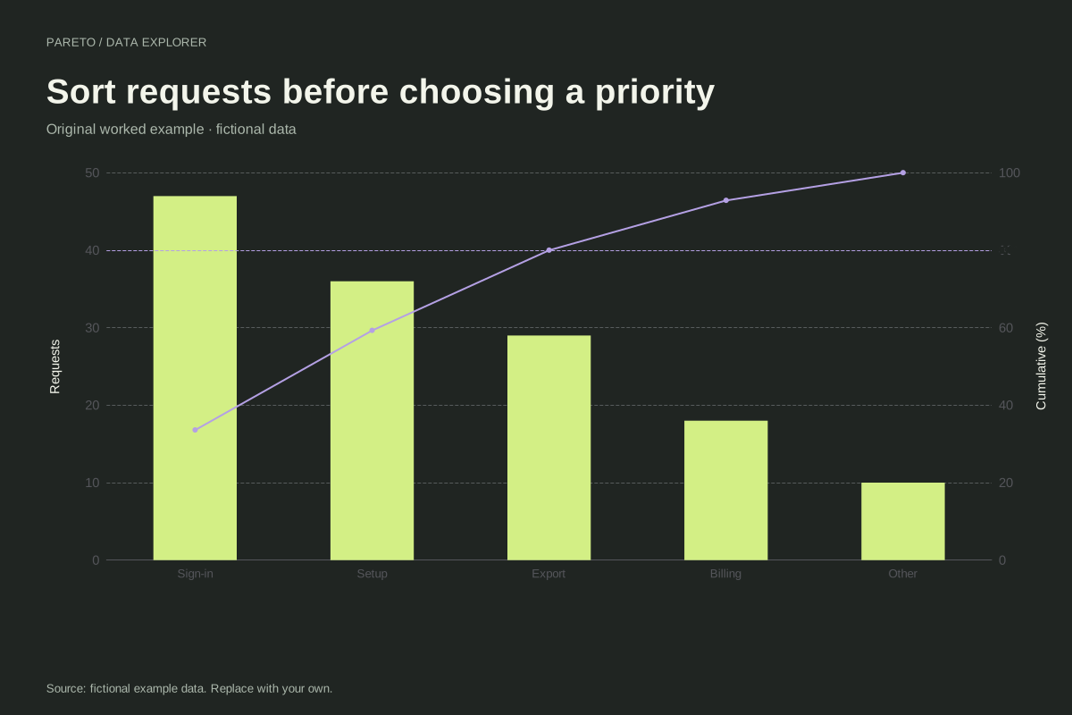
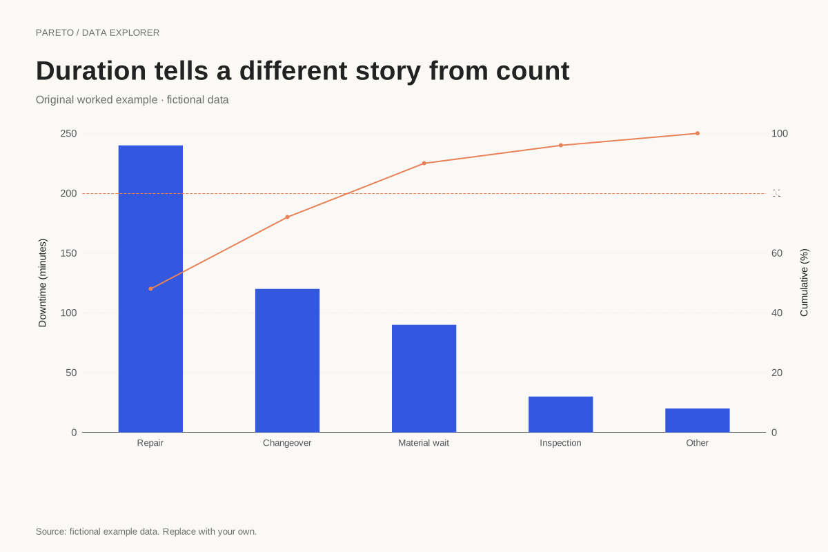
Enter one nonnegative value for each unique category. That value may be an incident count, a cost or a duration, provided the unit is consistent across rows. A category that leads by count may not lead by cost. Choose the measure that answers the decision question and make its unit visible on the left axis.
Method background: ASQ: Pareto chart procedure.
Created by SupaMakers for ChartsAI · September 8, 2026. Source and reuse terms.