How to read this chart
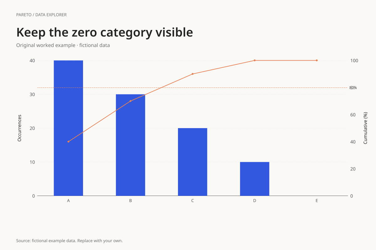
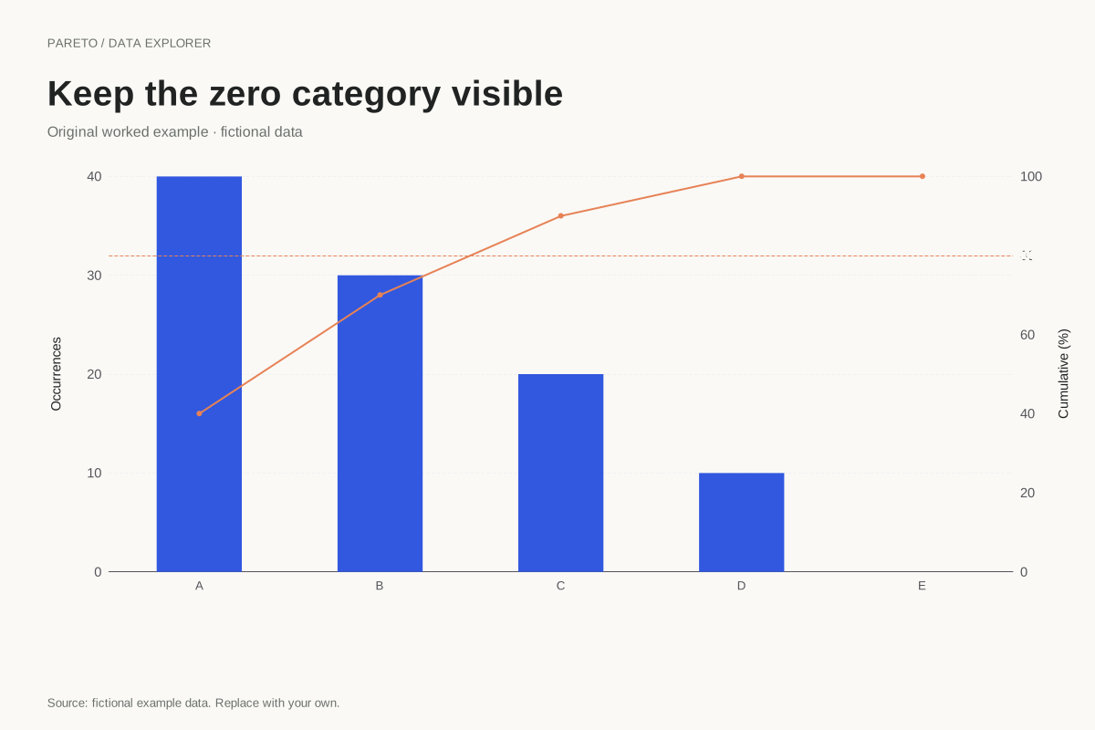
The counts are 40, 30, 20, 10 and 0, totalling 100. Cumulative percentages are 40%, 70%, 90%, 100% and 100%. The final category adds no count, so it adds no percentage to the running total.
Keeping the final label distinguishes an observed zero from an omitted category. The chart cannot determine whether the zero means no events, no exposure or a collection issue. That definition belongs in the source context accompanying a real analysis.
Try the calculation yourself
Compare the calculated table with the CSV and verify that the zero row remains present. Then test an all-zero table separately: it has no positive denominator, so the editor reports that cumulative percentages are undefined rather than inventing a line.
Open this exact example, change the data or calculation settings, and compare the result. The CSV preserves the input rows; the ECharts JSON contains drawing options.
What this example cannot tell you
The categories and counts are fictional. A zero does not demonstrate elimination of a problem or predict future absence. It is simply the supplied value for that category in this example, and it should not replace missing or uncollected data.
Why does the line stay flat at the end?
The previous categories already account for the entire positive total. Adding a category with value zero changes neither the running count nor its percentage. A flat final segment is therefore the correct calculation, not a rendering error.
Calculation convention
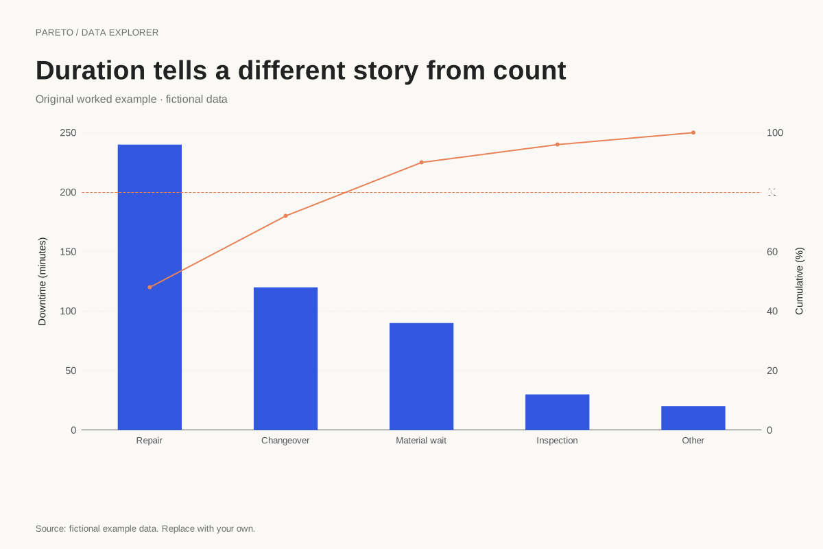
Enter one nonnegative value for each unique category. That value may be an incident count, a cost or a duration, provided the unit is consistent across rows. A category that leads by count may not lead by cost. Choose the measure that answers the decision question and make its unit visible on the left axis.
Method background: ASQ: Pareto chart procedure.
Created by SupaMakers for ChartsAI · September 8, 2026. Source and reuse terms.