Pareto chart maker.
Upload a CSV or Excel file, or paste your data. Choose the columns to plot, preview your Pareto chart, and download it free.
Preview your Pareto chart
Categories are ranked by your measure, with a cumulative percentage line.
Blueprint styleDownload your chart
PNG for slides · SVG for editing · PDF for printing
Calculated values
Categories are sorted by the supplied measure. The 80% reference is a guide, not a rule the data must follow.
| Category | Value | Cumulative percent |
|---|---|---|
| Scratches | 42 | 42 |
| Dents | 25 | 67 |
| Misalignment | 18 | 85 |
| Finish | 10 | 95 |
| Other | 5 | 100 |
Inspect every input row (5)
| Category | Defect reports |
|---|---|
| Scratches | 42 |
| Dents | 25 |
| Misalignment | 18 |
| Finish | 10 |
| Other | 5 |
How to make a pareto chart
Sort category values from largest to smallest and calculate their running share of the total. Bars show the chosen measure; the line uses a separate 0–100% axis.
- Upload a file or paste spreadsheet cells. Choose the columns and check the preview before creating your chart.
- Inspect every selected row. Missing or invalid numbers need correction; they are never filled with zero.
- Set the calculation options, then inspect the calculated values below the chart.
- Edit the title, labels and source note. Download an image, PDF, original CSV or ECharts configuration.
The editor accepts up to 2,000 observations for distributions and scatter plots, eight box-plot groups, or 50 bar/Pareto categories. A bar chart can include up to five series. Spreadsheet preview accepts files up to 8 MB, 2,000 rows and 100 columns. Data stays in your browser.
Choose a measure before ranking
Enter one nonnegative value for each unique category. That value may be an incident count, a cost or a duration, provided the unit is consistent across rows. A category that leads by count may not lead by cost. Choose the measure that answers the decision question and make its unit visible on the left axis.
Follow the cumulative calculation
The tool orders categories from the largest supplied value to the smallest, retaining input order for ties. It then adds values from left to right and divides each running total by the overall total. Bars use the original measure; the line uses the right-hand percentage axis and finishes at 100%.
Use the 80% reference as a reading aid
The horizontal reference helps find the first category at which the cumulative share reaches or exceeds 80%. It does not force an 80/20 relationship. Equal contributions, dispersed problems or a dominant category can produce very different curves. Read the actual proportions from the table instead of assuming the first fifth of categories explains four fifths of the total.
Preserve context and small categories
Zero-value categories remain visible at the end and add nothing to the cumulative line. A dataset with a zero total cannot produce meaningful cumulative percentages and is rejected. Rankings do not identify root causes, severity or feasible fixes. Keep collection period, classification rules and any aggregation process alongside the exported chart.
Method references
Built by SupaMakers. Inspect the open source calculations and reuse terms.
Worked pareto chart examples
Explore the collection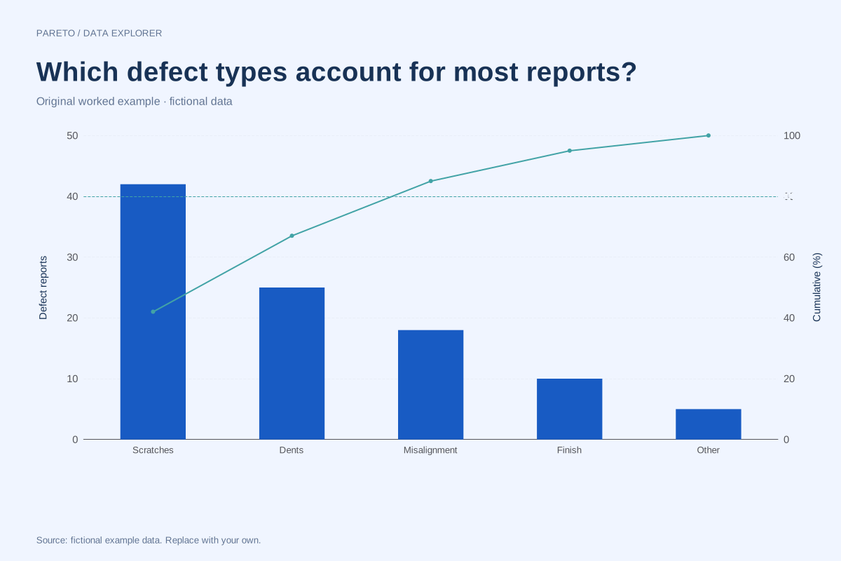
Pareto chart of defect counts with cumulative percentages
This Pareto chart ranks five fictional defect categories by reported count. The bars show the counts, and the line tracks their cumulative share of the 100 reports in the example.
Explore chart & data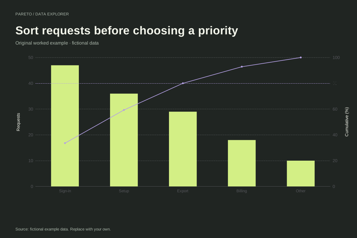
Pareto chart of support requests
This fictional support example begins with unsorted category counts. The Pareto maker places sign-in, setup, export, billing and other requests in descending order and recalculates cumulative percentages.
Explore chart & data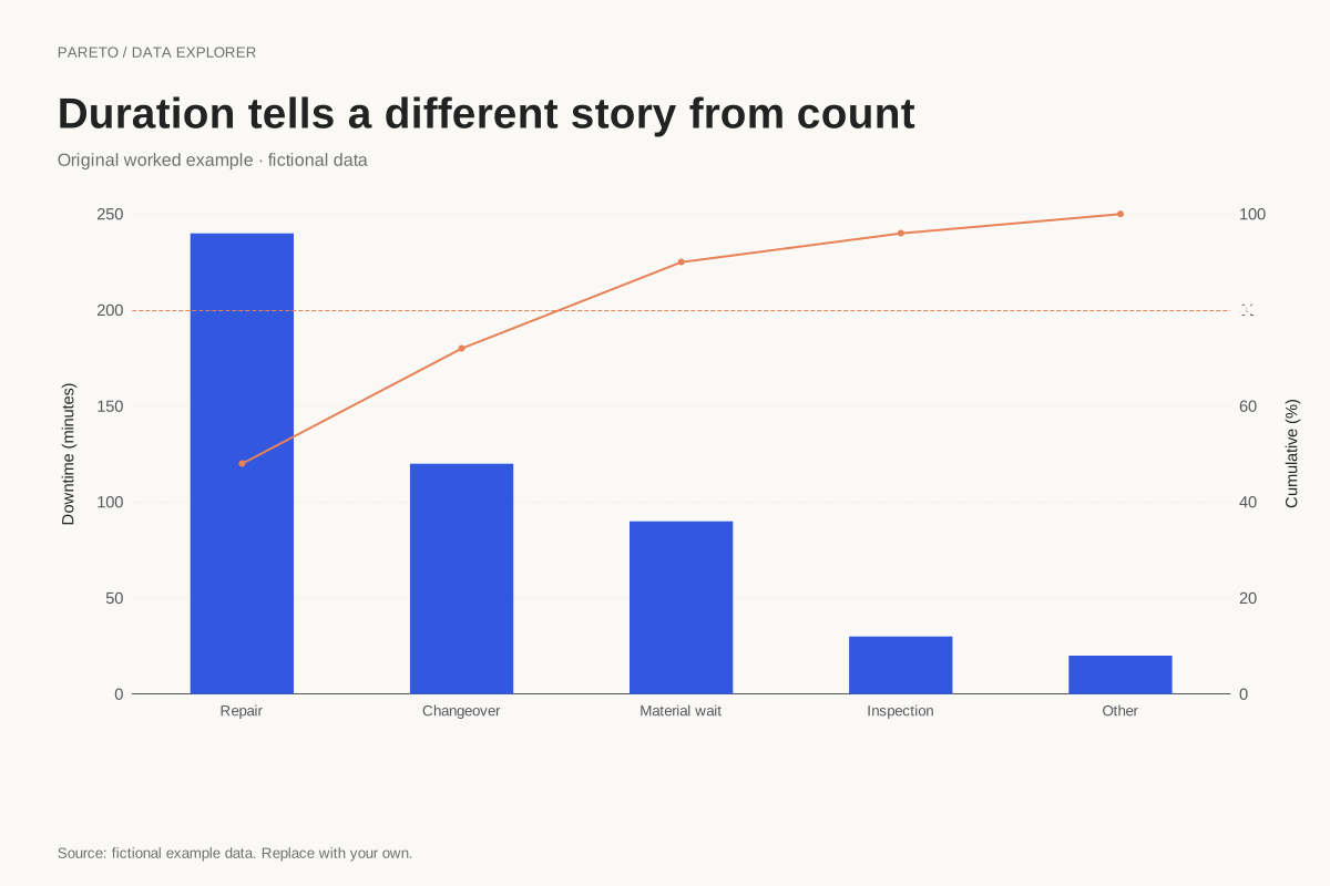
Pareto chart of downtime measured in minutes
A Pareto chart can rank duration rather than incident count. This fictional example totals 500 downtime minutes across five categories, so the largest bars identify where the recorded time accumulated.
Explore chart & data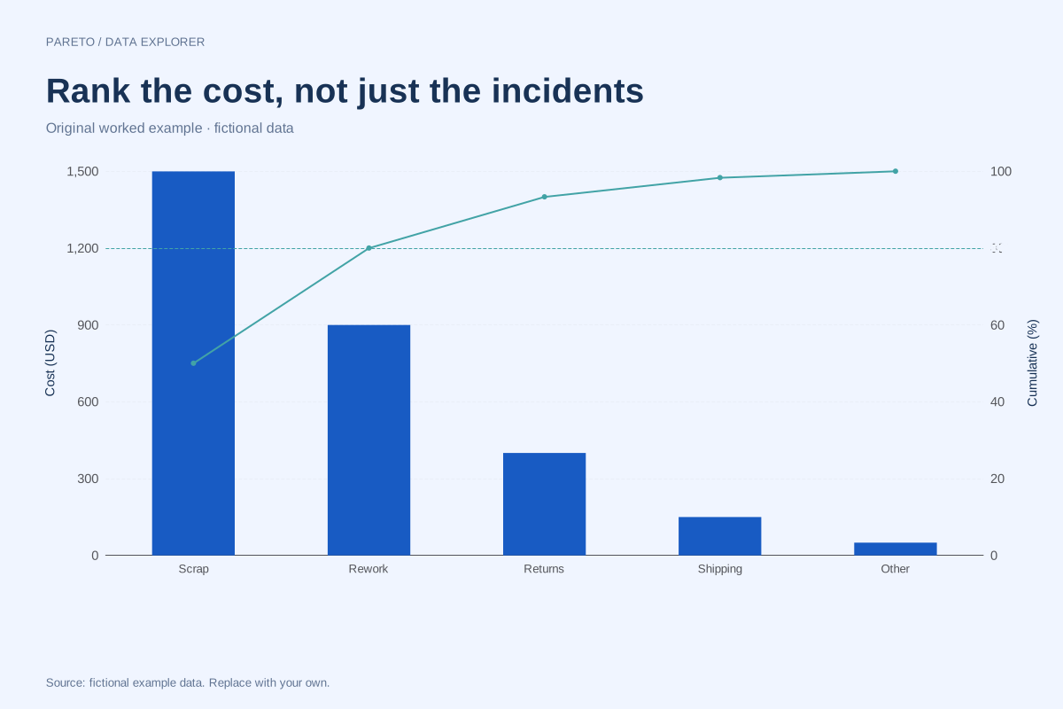
Cost-based Pareto chart with a different priority measure
A cost-based Pareto ranks categories by a shared monetary measure rather than incident frequency. This fictional example totals 3,000 units of cost, making the cumulative calculation reproducible without implying a real business benchmark.
Explore chart & data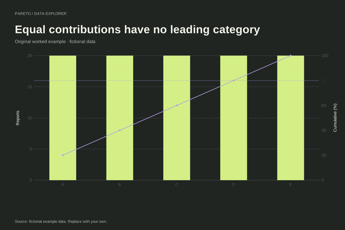
Pareto chart where every category has equal weight
A Pareto chart need not reveal a dominant category. This example assigns 20 observations to each of five fictional categories, creating equal bars and a cumulative line that rises in identical steps.
Explore chart & data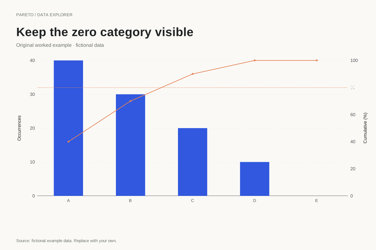
Pareto chart retaining a zero-count category
A zero-count category can remain in a Pareto chart when the overall total is positive. This fictional example places an explicit zero after four positive categories, leaving the cumulative line at 100% for the final step.
Explore chart & data