How to read this chart
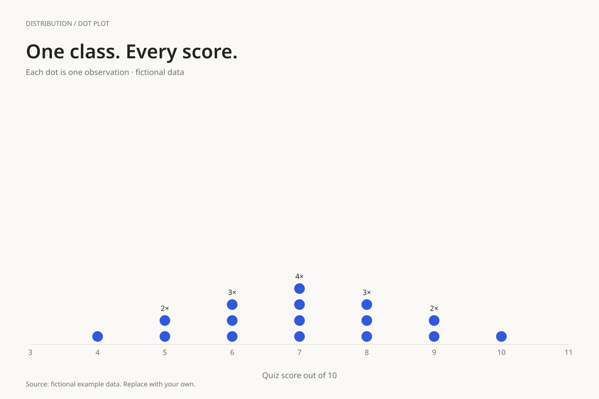
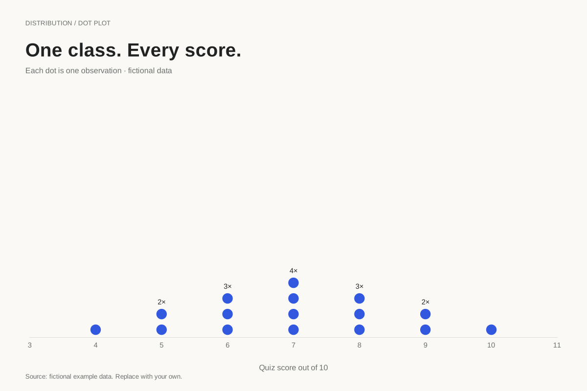
Four students have a score of 7, making 7 the most frequent score. Three students score 6 and three score 8. The single dots at 4 and 10 are the lowest and highest observations; the observed range is 10 − 4 = 6 points.
The ordered middle observations, in positions 8 and 9, are both 7, so the median is 7. Seven of the sixteen scores are 8 or higher. Counting dots gives the sample size directly without needing to estimate the height of a bar or combine histogram intervals.
Build it with your own data
Enter the individual scores, keeping repetitions. Four observations of 7 require four entries of 7, not a row containing the value 7 and the count 4. The chart stacks exact repeats automatically and preserves every observation.
The horizontal coordinate represents the score; vertical stacking represents frequency. The vertical position of one dot does not indicate a second student attribute. The mean reference is disabled in this example to keep the first reading focused on counts, modes and the median.
Open this example in the dot plot maker Replace the data, inspect the preview and download your version. SVG, PNG and PDF exports are available in the editor.
What this example cannot tell you
The class and quiz are fictional, and the scores do not show educational progress or explain why any student received a result. A different marking scale would require new labels. Avoid including student names when sharing a class distribution.
Is this the same as a dot chart comparing categories?
No. This is a stacked frequency dot plot of individual numeric observations. A category dot chart places a summarized value beside each named category. Here the repeated dots at one score count observations; they do not represent separate labelled categories.
Created and reviewed by SupaMakers for ChartsAI · September 8, 2026. Source code and reuse terms.