These six stacked dot plot examples show individual observations, repeated values and distribution shapes. Learn to read a class score distribution, calculate mean and median, and examine outliers, fractions, skew and two modes using the exact plotted data.
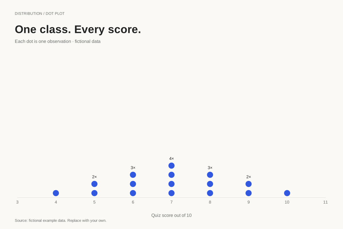
A stacked dot plot places one dot for each observation above its numeric value. This example shows all 16 fictional quiz scores on a ten-point scale, so repeated scores are visible as taller stacks.
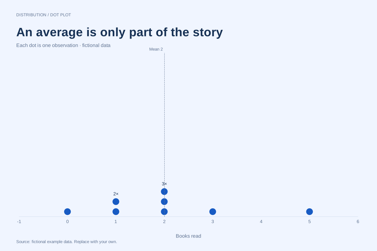
A dot plot can show the observations behind the mean and median. In this eight-person fictional reading example, the values are 0, 1, 1, 2, 2, 2, 3 and 5 books: both the mean and median are 2.
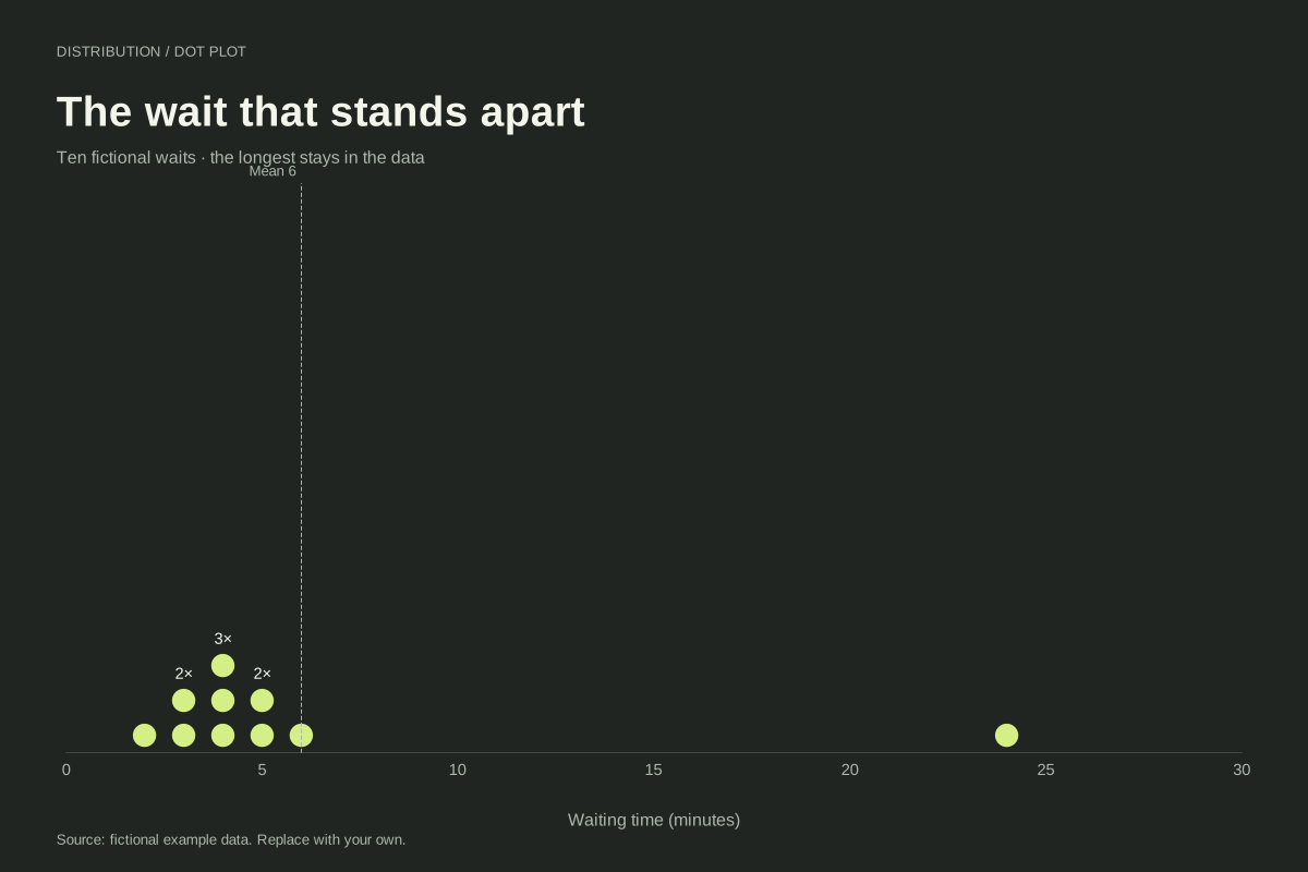
A dot plot keeps an unusually large observation visible beside the rest of a dataset. Here nine fictional waits lie between 2 and 6 minutes, while one wait lasts 24 minutes. All ten observations remain in the chart.
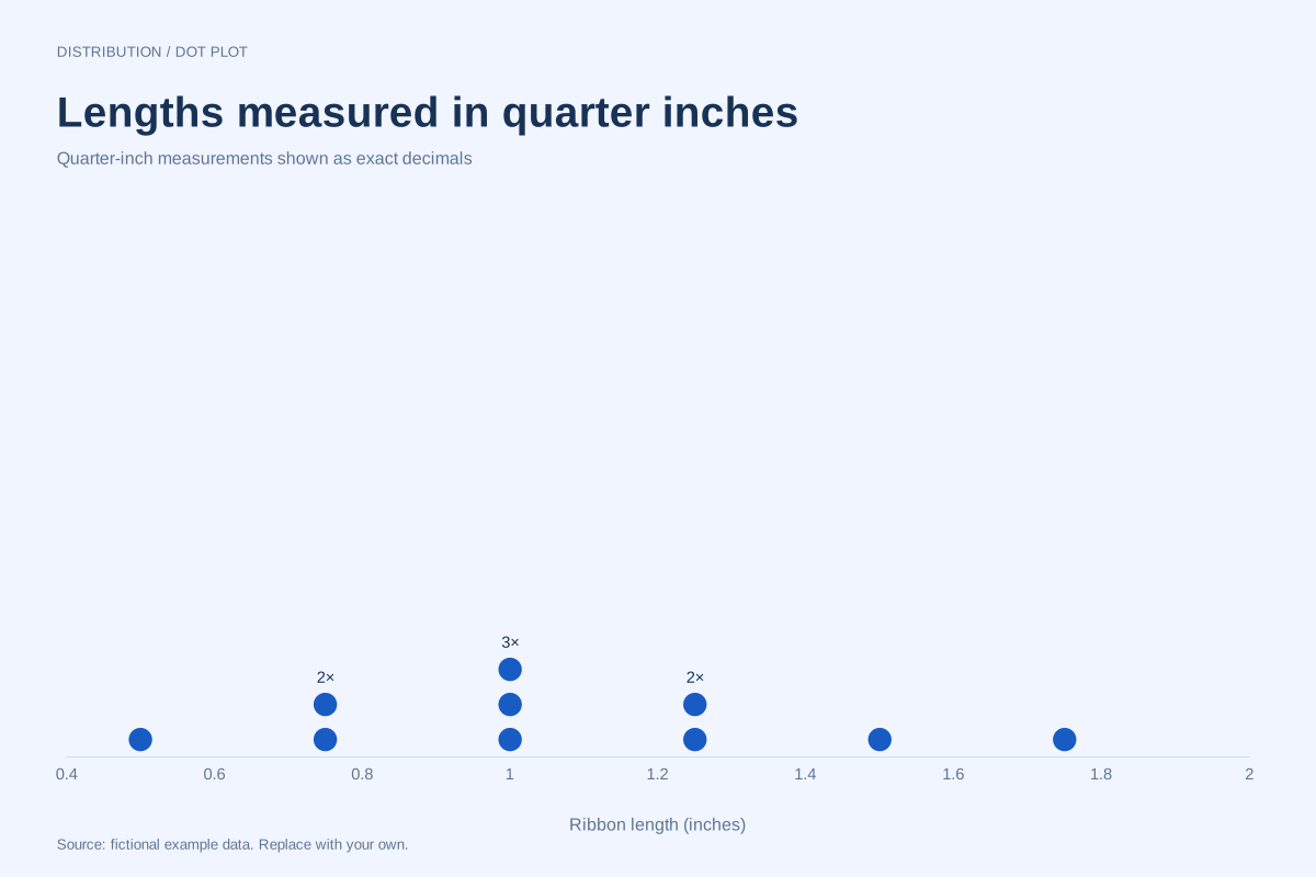
This fraction dot plot represents quarter-inch ribbon lengths using exact decimal equivalents. Each dot is one ribbon, with repeated lengths stacked together. The axis displays decimals such as 0.75 and 1.25 rather than typeset fractions.
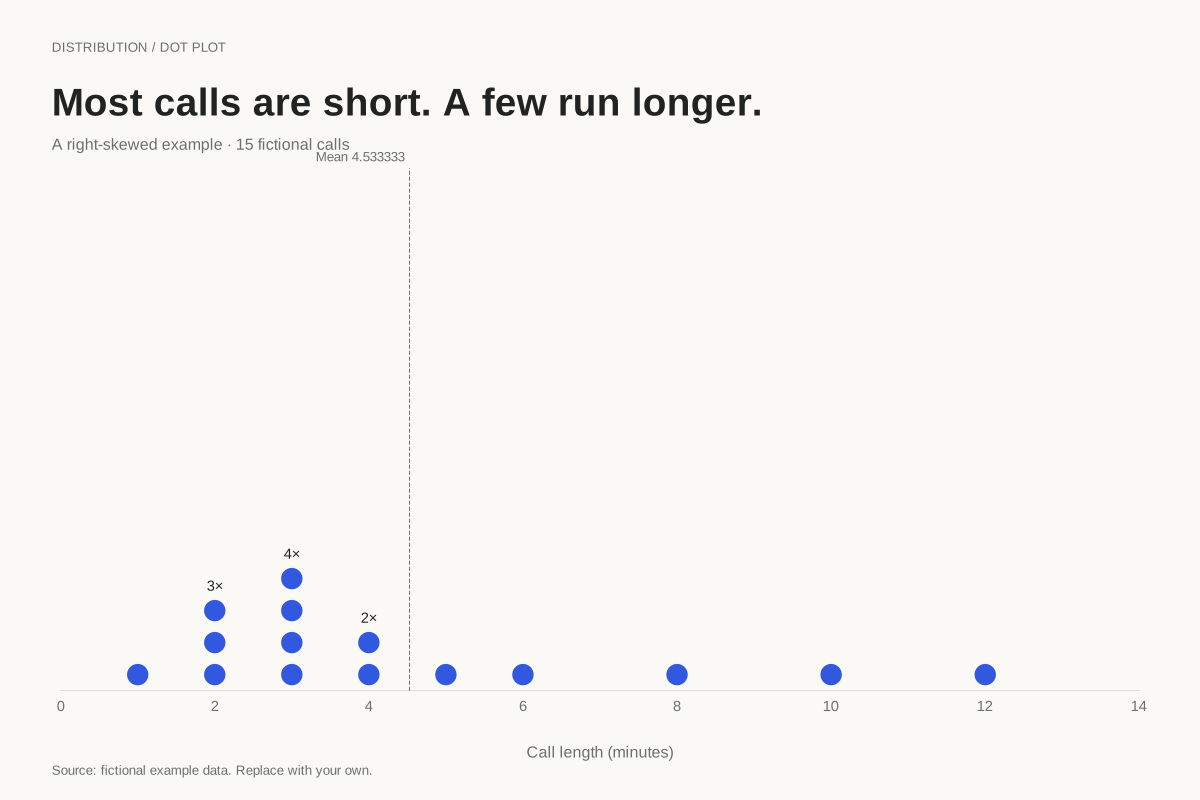
A right-skewed dot plot has a longer tail toward larger values. This fictional collection of fifteen call lengths concentrates around two to four minutes, with a few longer calls extending the right side to twelve minutes.
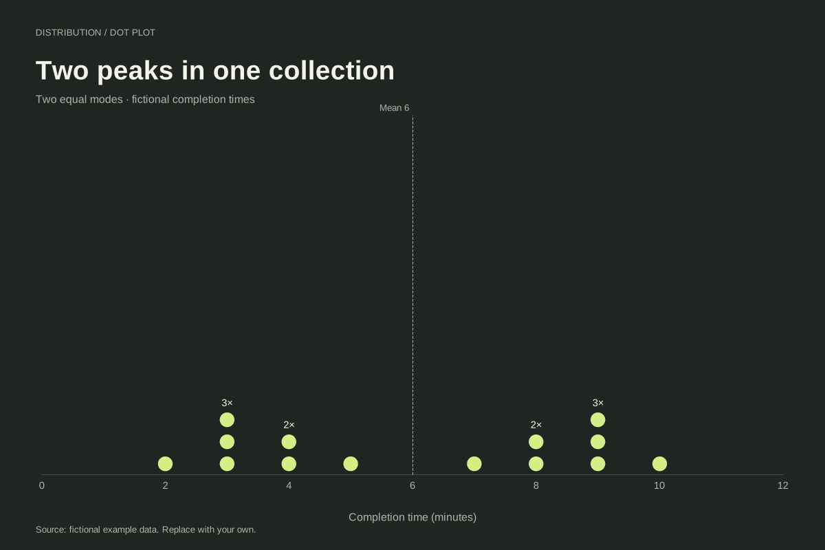
A bimodal dot plot has two peaks or concentrations, which need not be equally high. This constructed completion-time dataset has equally tall stacks at 3 and 9 minutes, creating two peaks with a gap around the centre.
Editable chart + original data
One dot means one observation
These are frequency dot plots. Repeated values stack vertically above a numeric axis. They differ from category dot charts, which position a summarized value next to each category name. The data downloads preserve individual observations, including every repetition and genuine zero.
Go beyond the average
The outlier example shows how one large value changes the mean. The bimodal example has a mean and median in an empty gap between its two peaks. Reading the dots alongside the summaries helps avoid describing a whole distribution with one number.
Prepare numbers without changing their meaning
Use consistent units and convert quarter fractions to their exact decimal equivalents. Do not remove unusual observations or substitute zero for missing values automatically. Each worked example includes the original list, downloadable files and a direct link to the dot plot editor.