How to read this chart
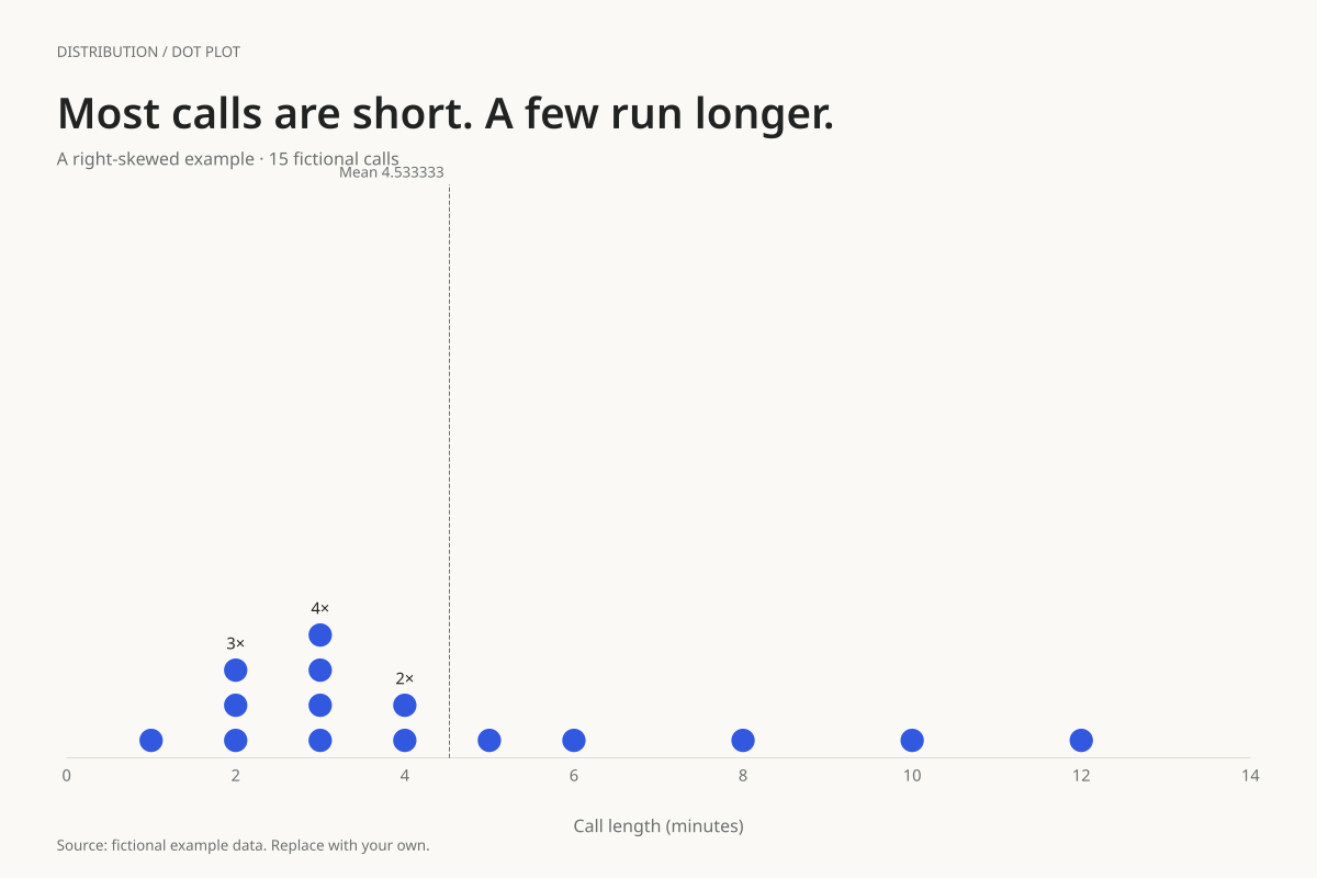
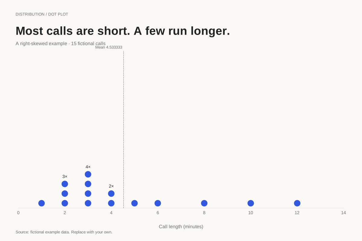
The sorted values are 1, 2, 2, 2, 3, 3, 3, 3, 4, 4, 5, 6, 8, 10 and 12. The eighth observation is 3, making the median 3 minutes. The total is 68 minutes, so the mean is 68 ÷ 15, approximately 4.53 minutes.
The mean lies to the right of the median in this example because the longer calls pull the arithmetic average upward. Four calls last exactly 3 minutes, the most frequent value. The tail direction refers to where the distribution stretches, not where the tallest stack sits.
Build it with your own data
Plot individual durations using a shared numeric unit and include the longer calls. One dot represents one call; a stack of four at 3 minutes means four separate three-minute observations. The dashed line shows the mean calculated from all fifteen values.
Describe the shape together with sample size and a relevant summary. A median answers a different question from total workload: the median here is 3 minutes, but staffing time for all these calls depends on the full 68-minute total. Choose the summary that matches the decision.
Open this example in the dot plot maker Replace the data, inspect the preview and download your version. SVG, PNG and PDF exports are available in the editor.
What this example cannot tell you
This is an illustrative shape, not a fitted probability distribution or evidence about a real call centre. A small sample’s appearance can change substantially when more observations arrive. Longer calls need not be mistakes and should not disappear during cleaning.
Is right-skewed the same as most values being on the right?
No. Skew direction describes the longer tail. In this chart most values are toward the lower end, while a small number of larger values extend to the right. Read the entire spread rather than naming the shape from the tallest stack alone.
Created and reviewed by SupaMakers for ChartsAI · September 8, 2026. Source code and reuse terms.