How to read this chart
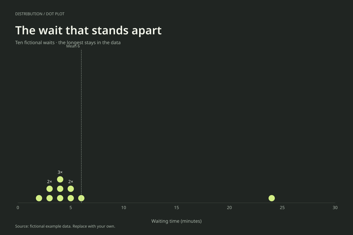
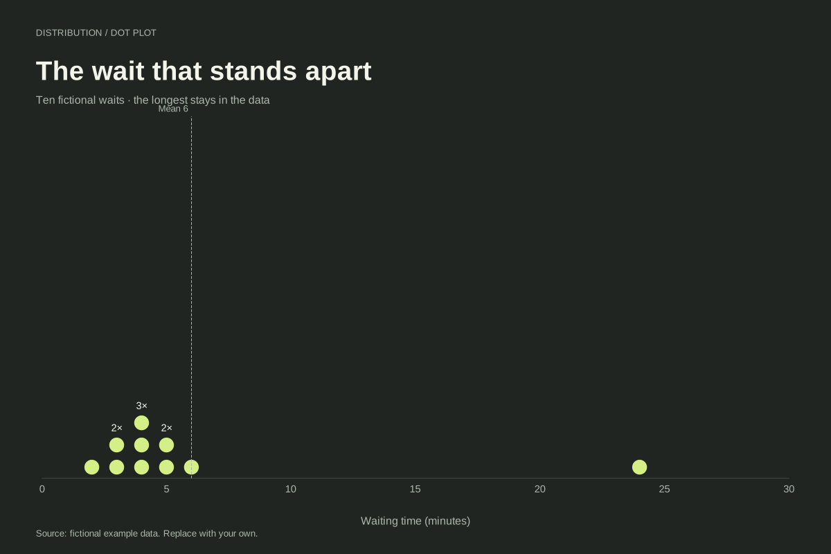
The full set totals 60 minutes across 10 observations, giving a mean of 6 minutes. The fifth and sixth sorted values are both 4, so the median is 4 minutes. The long right-hand gap makes the 24-minute wait easy to notice.
For comparison only, the nine waits excluding 24 total 36 minutes and have a mean of 4. That two-minute difference illustrates the mean’s sensitivity to a large observation. It does not establish that the longest wait was an error or should be removed.
Build it with your own data
Enter every observed wait as its own numeric value. Exact repeats stack vertically. Keep a continuous numeric horizontal axis so the large gap between 6 and 24 minutes is represented honestly rather than visually compressed into adjacent categories.
Investigate the unusual record in the original source if this pattern appears in your data. Check its unit, collection conditions and transcription. If a correction is justified, document the reason and preserve an audit trail instead of silently dropping the inconvenient point.
Open this example in the dot plot maker Replace the data, inspect the preview and download your version. SVG, PNG and PDF exports are available in the editor.
What this example cannot tell you
The 24-minute value is visually unusual in this constructed example. The tool does not run an outlier test or classify data errors. Small samples can produce unstable summaries, and a single unusual observation may represent an important real experience.
Does the dot plot automatically remove outliers?
No. The editor plots the valid numeric observations you supply and calculates summaries from them. The dashed mean line includes the 24-minute value here. Any exclusion must be your explicit, justified data decision, not an automatic chart-cleaning step.
Created and reviewed by SupaMakers for ChartsAI · September 8, 2026. Source code and reuse terms.