The same 16 waits: exact repeats or grouped counts
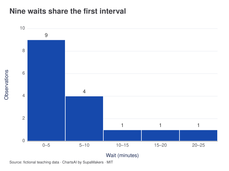
Three separate dots sit at two minutes. In the histogram, nine waits fall in the first interval from 0 up to (but not including) 5 minutes. That bar combines values 1, 2, 3 and 4; it does not mean nine people waited the same amount of time.
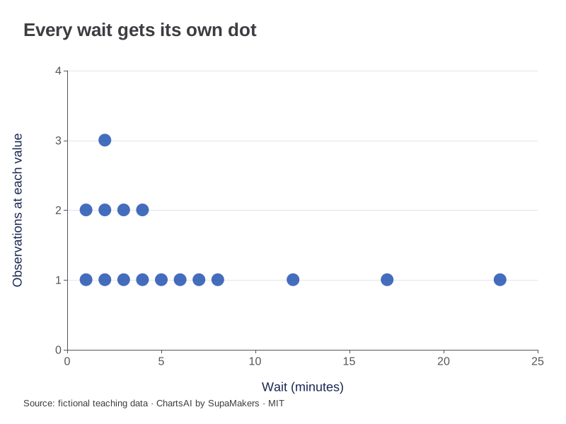
Frequencies at 1, 2, 3 and 4 minutes are 2, 3, 2 and 2. N = 16.
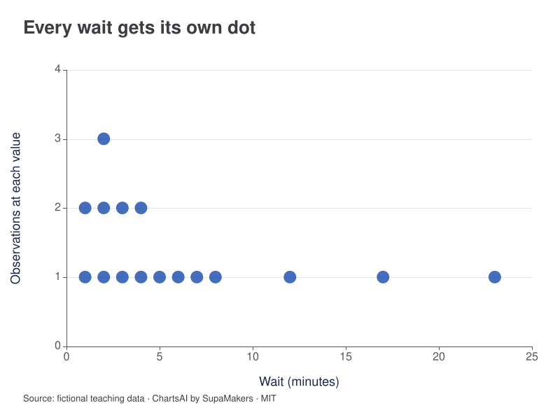
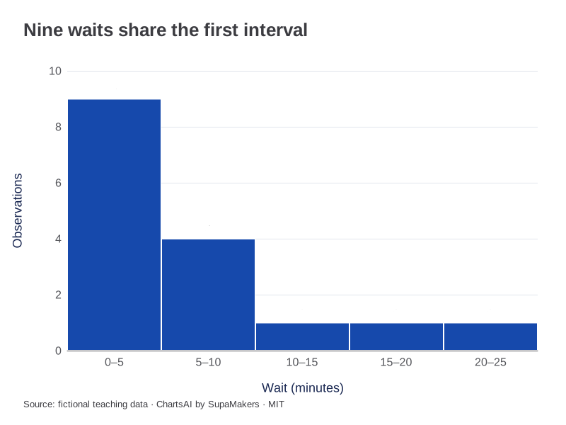
Width 5; start 0. Counts: 9, 4, 1, 1, 1. N = 16.
Inspect the original data and method
Each dot preserves one original observation, including duplicates. Histogram bins start at 0 with width 5; intervals include the left boundary and exclude the right, except the final bin includes its right boundary. Neither view rounds or drops a wait.
| Wait (minutes) |
|---|
| 1 |
| 1 |
| 2 |
| 2 |
| 2 |
| 3 |
| 3 |
| 4 |
| 4 |
| 5 |
| 6 |
| 7 |
| 8 |
| 12 |
| 17 |
| 23 |
Each CSV contains the input for that view. A box-plot CSV adds the same sample label to each observation; it does not substitute quartiles for raw values. Downloaded graphics use the same rendering specification as these previews.
The comparison at a glance
| Need | Prefer |
|---|---|
| Count repeated exact values | Stacked dot plot |
| Inspect a small sample | Stacked dot plot |
| Summarize interval frequencies | Histogram |
| Recover exact values from bins | Neither: obtain the original data |
What one mark represents
In a stacked dot plot, each dot represents one observation and repeated values stack. In a histogram, one bar can represent several distinct values and repeated observations together. A bar with count six does not mean the same exact number occurred six times. That distinction matters in classroom exercises about the mode.
Read a waiting-time example
Our waiting-time data include two waits at one minute, three at two minutes, two at three minutes and two at four minutes. A five-minute histogram combines these nine observations into its first interval. The histogram makes the short-wait cluster obvious; a dot plot preserves the exact repeat pattern within that cluster.
Choose detail deliberately
For a small integer list, dots may answer both frequency and distribution questions with little explanation. As the number of distinct decimal values grows, individual marks can become crowded. Binning trades exact-value detail for a more compact shape. That is a useful transformation when the grouping is declared and the original data remains available.
Do not invent precision
A histogram does not recover exact observations from grouped counts. Likewise, placing dots at interval midpoints would create representative values that were never measured. If only a frequency table is available, present it as grouped data. In ChartsAI, the dot maker and histogram maker both expect actual observations; use the CSV accompanying each example to preserve their meaning.
References and reproducibility
The worked arithmetic and teaching examples on this page are original. Background reading: NIST histogram background. Source code and reuse terms expose the implemented calculations.
Written by SupaMakers for ChartsAI · Reviewed September 9, 2026.