The comparison at a glance
| Question | Histogram | Bar graph |
|---|---|---|
| Horizontal position | Numeric interval | Category |
| Input | Individual values | Category and measure |
| Order | Numeric order | Deliberate category order |
| Empty group | Keep numeric gap | Keep known zero categories |
The same number can play different roles
A score of 72 is a measurement on a numeric scale. A class named Room 72 is a category label. For scores, a histogram asks how many observations fall between chosen boundaries. For classrooms, a bar chart might compare enrolment counts. Treating a room number as a continuous measurement would create intervals with no useful interpretation.
Work through twenty scores
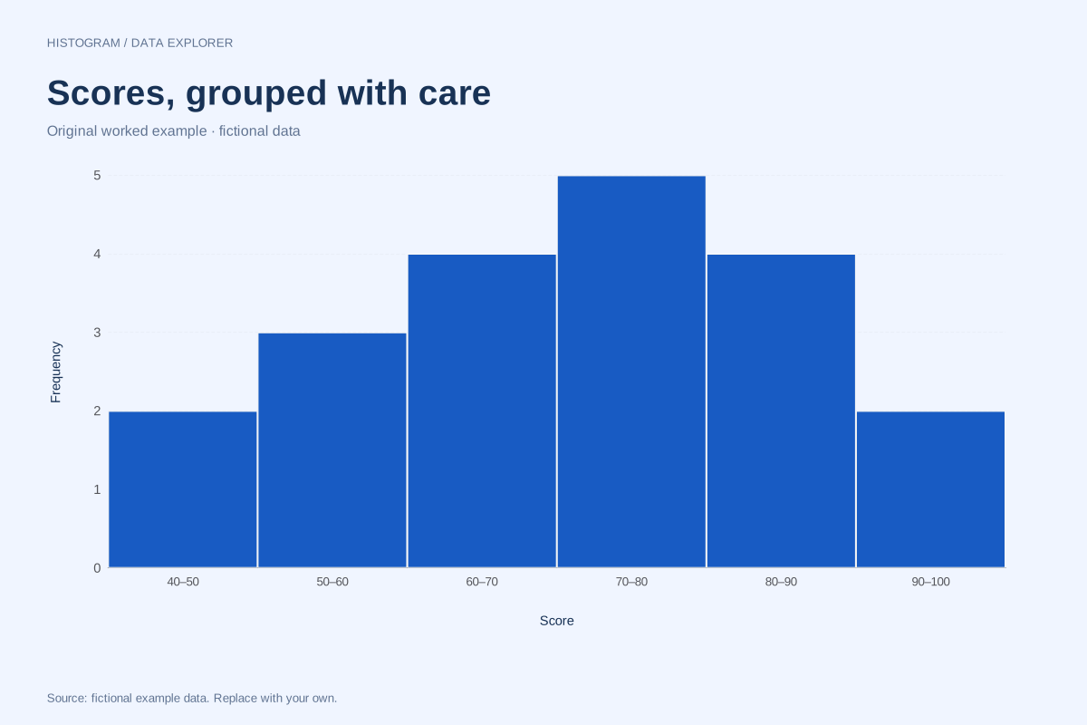
Our score example has six ten-point bins with counts 2, 3, 4, 5, 4 and 2. The 70–under 80 bin contains five individual scores. If you already have a table of these six counts, a raw-data histogram import should not treat 2, 3, 4, 5, 4 and 2 as six observed scores. That would be a different distribution. Keep raw observations and frequency summaries distinct.
Ordering carries information
Numeric intervals must remain in scale order and preserve empty ranges. Category order can instead follow rank, alphabet or a meaningful sequence. Sorting histogram bins by height would break the distribution shape. Sorting product categories by count can make their comparison easier. Both choices depend on what a horizontal position represents.
Prepare the right input
For the histogram maker, select one numeric column with one observation per row. For the bar maker, provide unique category names and one or more numeric measures. Neither tool should guess whether repeated names need aggregation. If your source is already grouped, document the grouping and retain the original observations when available.
A related chart you can inspect
References and reproducibility
The worked arithmetic and teaching examples on this page are original. Background reading: NIST histogram background. Source code and reuse terms expose the implemented calculations.
Written by SupaMakers for ChartsAI · Reviewed September 8, 2026.